Somewhere in your business there is a spreadsheet with four coloured boxes in it.
Someone built it — you, your accountant, your general manager, the free template that came with your point-of-sale system. It sorted every dish into Stars, Plowhorses, Puzzles and Dogs. It was genuinely interesting. It said the ribeye was a problem, the pasta was quietly carrying the section, and three items should probably go.
And then nothing happened.
Not because anyone disagreed with it. Because acting on it meant changing a physical object. That object has a fixed amount of space on it, a unit cost, a lead time, a laminate that cannot be edited, and 140 copies of itself sitting in a drawer that somebody paid for. The analysis produced decisions. The menu could not absorb them. So the file was saved, and the menu stayed exactly as it was, and eight months later somebody made a new spreadsheet.
This is the actual failure mode, and it is invisible in the literature, because the literature comes in two halves that never meet.
Search menu engineering and you get point-of-sale companies and accounting firms. Every one of them explains the four quadrants correctly and then ends on the sentence "feature your Stars prominently," which is not an instruction, it is a wish. Search menu size and you get printers and template libraries, all of whom will tell you that 8.5 by 11 is standard and that 4.25 by 11 suits a drinks list, and none of whom knows or cares what your contribution margins are.
Between those two literatures sit all the decisions that determine whether any of it works: how many items your chosen size can hold at a type size people can actually read in your dining room, which layer of the menu a price is allowed to live on, what a reprint costs and how long it takes, and what happens to every one of those decisions when the same menu appears on a phone through a QR code and again on a delivery marketplace where a commission has quietly halved the margin you just optimised.
This is that join. It runs in order: the analysis, the constraint the analysis has to survive, the space you are actually working with, the layout decisions that hold up under measurement, the production specification, the four surfaces your menu now lives on, and the calendar that keeps it all current.
Part 1 — The analysis, done properly
Contribution margin, not food cost percentage
Start here, because getting this wrong invalidates everything downstream and it is the single most common error in restaurant analysis.
Food cost percentage is a ratio. Contribution margin is a number of pounds or dollars. Your landlord, your payroll and your bank are all interested exclusively in the second one.
Here is a real dinner menu section over a four-week period. One thousand mains sold.
| Item | Sold | Mix % | Price | Plate cost | Contribution margin | Total CM | Food cost % |
|---|---|---|---|---|---|---|---|
| Roast chicken | 220 | 22.0% | 24.00 | 6.60 | 17.40 | 3,828 | 27.5% |
| Ribeye | 90 | 9.0% | 42.00 | 18.90 | 23.10 | 2,079 | 45.0% |
| Burger | 290 | 29.0% | 19.00 | 7.60 | 11.40 | 3,306 | 40.0% |
| Mushroom risotto | 70 | 7.0% | 21.00 | 4.20 | 16.80 | 1,176 | 20.0% |
| Sea bass | 60 | 6.0% | 32.00 | 12.80 | 19.20 | 1,152 | 40.0% |
| Pasta pomodoro | 150 | 15.0% | 18.00 | 3.60 | 14.40 | 2,160 | 20.0% |
| Lamb shank | 80 | 8.0% | 29.00 | 11.60 | 17.40 | 1,392 | 40.0% |
| Veggie wrap | 40 | 4.0% | 16.00 | 5.60 | 10.40 | 416 | 35.0% |
| Total | 1,000 | 100% | — | — | — | 15,509 | — |
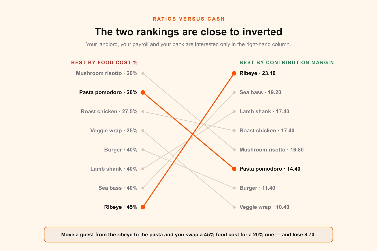
Rank that menu by food cost percentage and the ribeye is your worst item at 45 per cent and the pasta is your best at 20 per cent. Every operator who has ever been told to "get food cost down" reads that table and starts pushing the pasta.
Rank it by contribution margin and the ribeye returns $23.10 a plate and the pasta returns $14.40. Every guest you successfully move from the ribeye to the pasta improves your food cost percentage by a fraction of a point and takes $8.70 out of the till.
That is not a subtlety. It is the difference between a menu that looks efficient and a menu that pays the rent.
Two other things the table shows that a ratio never will. The burger is a mediocre item on a per-plate basis and yet it is the second-largest contributor on the menu — $3,306 against the ribeye's $2,079 — purely on volume, which is why demoting a Plowhorse is usually the wrong move. And the roast chicken is the best item you have on both axes at once, which means the correct design decision for it is simply do not break it.
The two thresholds
The classification needs a line on each axis, and both lines are relative to this menu, not to any industry benchmark.
The profitability line is the weighted average contribution margin. Total contribution margin divided by total items sold: $15,509 ÷ 1,000 = $15.51. Anything above that line is a high-margin item on this menu.
The popularity line is 70 per cent of fair share. With eight items, fair share is 100 ÷ 8 = 12.5 per cent. Seventy per cent of that is 8.75 per cent. Anything selling above 8.75 per cent of the section's volume is popular. The 70 per cent factor is the convention from the original Kasavana and Smith method and it exists to stop a menu from mechanically condemning everything below dead average, which would be half your menu by definition.
Note what happens when you add items: fair share falls, the threshold falls, and previously unpopular items pass it. Menu length is not neutral to the analysis. A 40-item menu has a fair share of 2.5 per cent and a threshold of 1.75 per cent, which is why long menus almost never produce Dogs and almost always produce a kitchen that cannot execute any of it well.
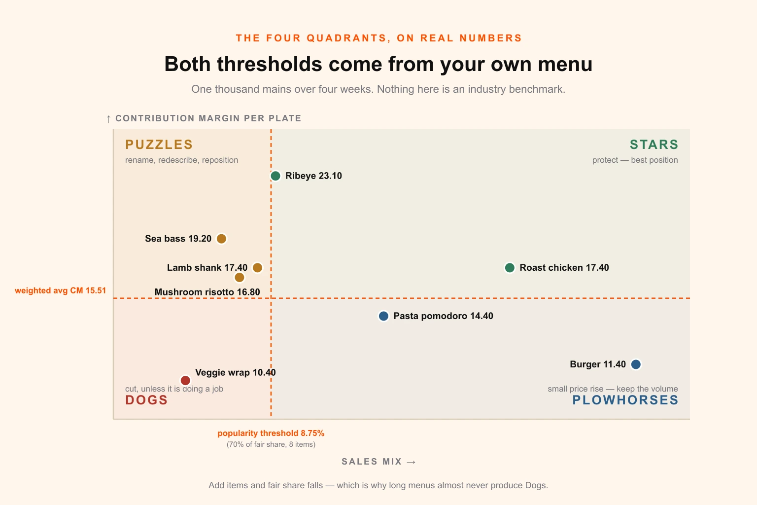
What each quadrant actually means
| Quadrant | Definition | Our items | The move | The mistake |
|---|---|---|---|---|
| Star | Above avg CM, above 8.75% mix | Roast chicken, Ribeye | Protect. Best position. Do not touch the recipe, the portion or the price without evidence. | Raising the price because it is selling. Stars are where your reputation lives. |
| Plowhorse | Below avg CM, above 8.75% mix | Burger, Pasta pomodoro | Small price rise, or reduce plate cost. Keep the position — you need the volume. | Demoting it. It is the second-biggest contributor on this menu. |
| Puzzle | Above avg CM, below 8.75% mix | Risotto, Sea bass, Lamb shank | Rename, redescribe, reposition to the first or last slot in its section. Consider a small price cut. | Assuming nobody wants it. Usually nobody has been given a reason to. |
| Dog | Below avg CM, below 8.75% mix | Veggie wrap | Remove — unless it is doing a job the numbers cannot see. | Deleting a dietary-requirement item and losing the whole table that came with it. |
That last cell matters more than its size suggests. The advice to delete your Dogs is correct maybe three times out of four. The exceptions are specific and worth naming before you cut anything:
- The dietary-requirement item. A single vegan or gluten-free main sells forty covers and looks like a Dog. It is not competing with your other mains; it is deciding whether a party of six books at all. Its real contribution margin is the table, not the plate.
- The price anchor. A very expensive item that barely sells is often earning its place by making the item below it look reasonable. Remove the anchor and watch the item under it stop selling too.
- The signature. Something you are known for, that appears in every review, that a small number of people come specifically for. Kill it and you find out what it was worth afterwards.
- The recent arrival. An item that launched six weeks ago has not had time to establish a mix. Give it a full quarter before you judge it.
Everything else in that box should go, and the space it frees is the most valuable space on your menu, because it is the only free space you will get.
Getting the data clean first
The analysis is only as good as what your point-of-sale hands you, and point-of-sale data is dirtier than people assume. Before you classify anything:
- Reconcile modifiers into the plate cost. If half your burgers go out with bacon and cheese as paid modifiers, the burger's real average price and real average plate cost are both higher than the base item. Analyse the item as it is actually sold.
- Strip comps, voids and staff meals. They inflate volume with zero revenue and will push a Dog over the popularity line.
- Decompose combos and set menus. An item that only ever appears inside a prix fixe has no independent mix and no independent price; analyse the set as a unit.
- Use a full, representative window. Four weeks minimum, and be careful about a window that spans a holiday, a heatwave, a local event or a price change. If you have seasonality, compare like periods year on year rather than quarter on quarter.
- Load the plate cost properly. Not just the protein. Garnish, sauce, oil, the bread that comes with it, the yield loss on trim, and the portion your kitchen actually serves rather than the one on the spec sheet. Under-costed plates are the most common reason a menu analysis produces a happy result and the P&L does not move.
- Analyse within categories, not across them. Starters, mains, desserts and drinks have wildly different margin structures. A single matrix across all of them will classify every dessert as a Star and tell you nothing.
The price decision, as a number of guests
The most valuable thing you can do with a Plowhorse is raise its price slightly. The reason operators hesitate is that the conversation is always framed as a guess about whether guests will notice. It should be framed as arithmetic.
Break-even volume after a price rise = old volume × (old contribution margin ÷ new contribution margin).
The burger sells 290 at $19.00 with a plate cost of $7.60, so the margin is $11.40 and the section earns $3,306 from it.
Raise it to $19.95. The margin becomes $12.35. Break-even volume is 290 × (11.40 ÷ 12.35) = 268 covers.
You can lose 22 covers — 7.7 per cent of the burger's volume — before the rise costs you a penny. If volume holds, the four-week gain is $275, which annualises to roughly $3,580 from one item and one decision.
Now hold that number, because it is about to collide with the rest of this article. Repositioning items on a page — the thing menu design is usually hired to do — typically moves a few per cent of mix. Moving five per cent of burger volume onto the roast chicken is worth 14.5 covers × $6.00 = $87 per four weeks, about $1,130 a year.
Repricing beats repositioning by roughly three to one on this menu. Which means the most valuable thing your menu design can do for you is not persuasion. It is making repricing cheap enough to do every quarter.
That is a design and production problem, and it is where almost every restaurant loses the money the analysis just found.
Part 2 — The reprint wall
Menu engineering has an unstated assumption baked into it: that you can change the menu. In a spreadsheet, changing a price costs nothing. On a laminated 14 pt cover menu, changing a price costs the entire remaining print run, a design fee, a proof cycle and two to three weeks of lead time — during which the old price is still on the table.
This is the reprint wall, and it is what your analysis cadence is actually set by.
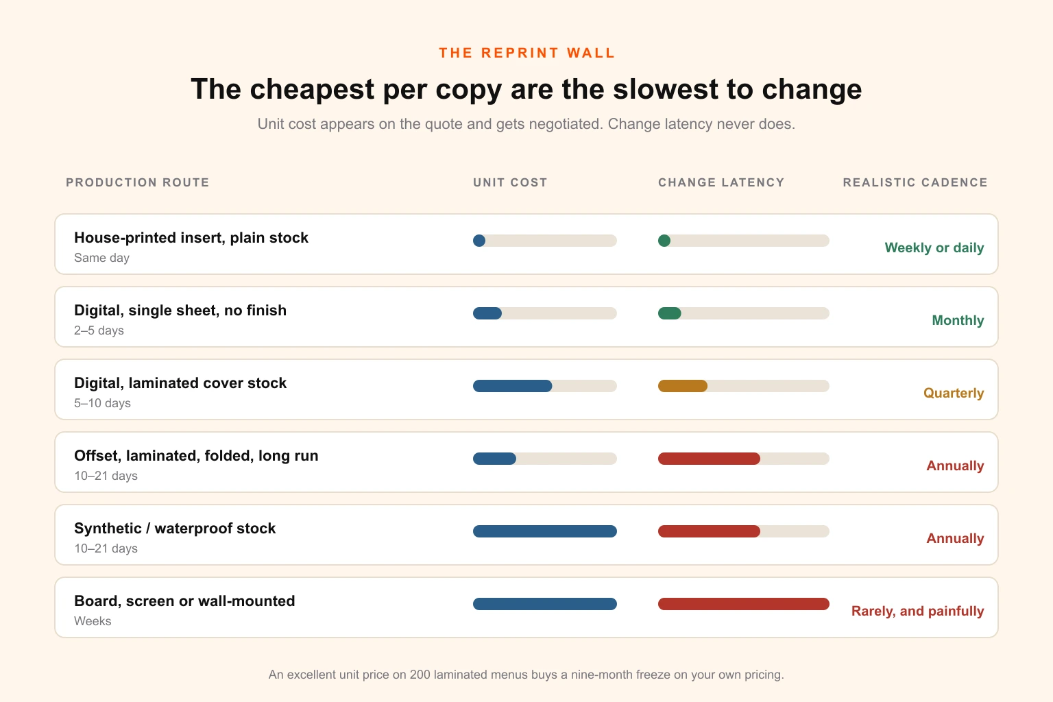
The two numbers that gate every decision
Unit economics. Multiply your copies in circulation by the unit cost, then by how many times a year you would like to change something.
Change latency. The elapsed time between deciding to move a price and the new price reaching a guest. Design turnaround, plus proof and approval, plus print production, plus delivery, plus the physical swap across every table, holder, host stand and outdoor case.
| Production route | Indicative unit cost | Change latency | Realistic cadence |
|---|---|---|---|
| House-printed insert on plain text stock | Pennies | Same day | Weekly, or daily |
| Digital print, single sheet, no finish | Low | 2–5 working days | Monthly |
| Digital print, laminated cover stock | Medium | 5–10 working days | Quarterly |
| Offset, laminated, folded, longer run | Low per unit, high per run | 10–21 working days | Annually |
| Synthetic / waterproof stock | Highest per unit | 10–21 working days | Annually |
| Screen, board or wall-mounted | Highest, plus installation | Weeks | Rarely, and painfully |
The trap is legible in that table. The routes with the best unit cost have the worst latency, and unit cost is what gets negotiated, because it is the number on the quote. Latency never appears on a quote at all, so it is never negotiated — and latency is what decides whether your quarterly analysis can ever be executed.
An operator who orders 200 beautifully laminated menus at an excellent unit price has not saved money. They have bought a nine-month freeze on their own pricing, and they will discover it the first time beef goes up.
The architectural fix: shell and insert
The way out is not to print more cheaply. It is to stop printing one object.
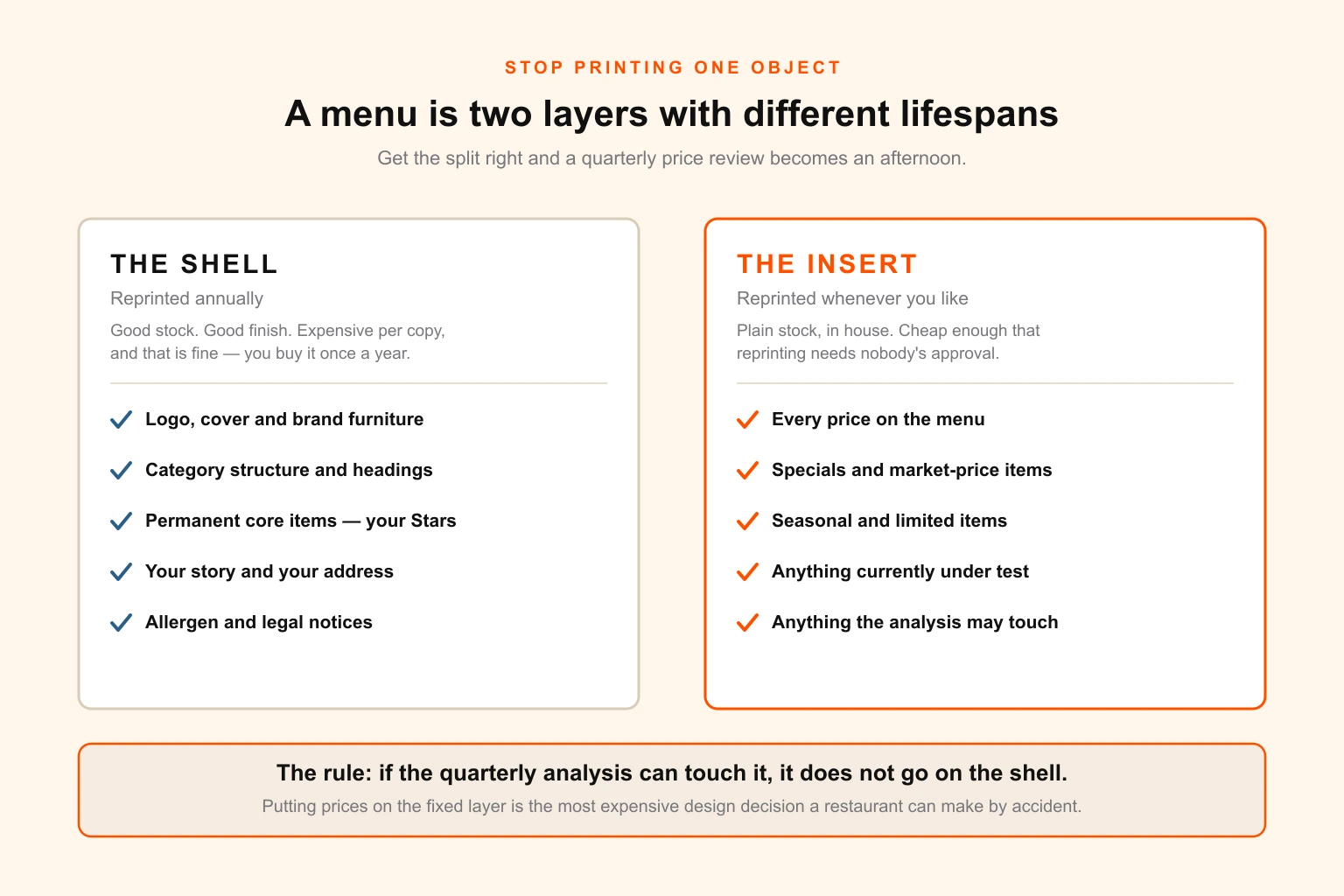
Split the menu into two layers with different lifespans:
The shell — reprinted annually. Brand, cover, structure, category headings, the permanent items that will not change, your story, your address, the design work that makes it feel like your restaurant. Print this properly: good stock, good finish, the version you are proud to hand over. It is expensive per copy and that is fine, because you buy it once a year.
The insert — reprinted whenever you like. Prices. Specials. Seasonal items. Anything currently under test. Anything the analysis is likely to touch. Print this on plain stock, in-house or from a fast digital supplier, at a unit cost low enough that reprinting it is not a decision anybody has to approve.
| Element | Layer | Why |
|---|---|---|
| Logo, cover, brand furniture | Shell | Changes on rebrand, not on analysis |
| Category structure and headings | Shell | Structural; changing it is a redesign |
| Permanent core items (your Stars) | Shell | By definition, the things you are not changing |
| All prices | Insert | The single most frequently changed element on any menu |
| Specials, seasonal, market-price items | Insert | Change weekly by nature |
| Items under evaluation | Insert | You are explicitly planning to change these |
| Allergen and legal notices | Shell | Must be present regardless of insert |
| Wine and drinks list | Separate insert | Different change cadence entirely |
The design decisions that make this work are unglamorous and specific. The shell needs a defined aperture — a pocket, a slot, a band, a tipped-on panel, a die-cut window — that the insert lands in cleanly, with a tolerance that survives a hurried swap by someone doing it two hundred times before service. The insert needs a trim that a house printer can produce without a guillotine. And the typographic system has to be shared across both layers so the insert does not look like an apology.
Get that right and the entire reprint wall disappears. A quarterly price review becomes an hour of typesetting and a stack of paper.
The same reasoning applies to anything printed that carries a price: table talkers, A-boards, window vinyl, the poster behind the counter. If your prices are silkscreened onto something, they are permanent in every sense that matters. For the outdoor and large-format side of that estate, resolution and viewing distance change the file requirements substantially — a menu board read from four metres has different rules from a menu read at forty centimetres.
Part 3 — The item budget
Now the space. And here is the reframe that makes size decisions tractable:
A trim size is not a size. It is an item budget.
Nobody chooses 8.5 by 11 because they want a piece of paper 8.5 inches wide. They choose it because of how many dishes it holds, and that number is almost never calculated. It should be, because it is straightforward arithmetic and it settles arguments that otherwise run for weeks.
The calculation
Every item on a menu occupies a vertical block:
- Name and price line: at 10 pt on 12 pt leading ≈ 0.17 in
- Description: 9 pt on 11 pt leading, one line ≈ 0.15 in, two lines ≈ 0.31 in
- Space after the item: 6–8 pt ≈ 0.10 in
So an item costs roughly 0.25 in with no description, 0.42 in with one line, 0.57 in with two. Add a category heading with its space every six items or so and amortise it across them — about 0.07 in per item.
Effective cost per item: 0.32 in / 0.49 in / 0.64 in.
Then measure your usable linear column inches: (page height − header reserve − footer reserve) × number of columns × number of usable panels.
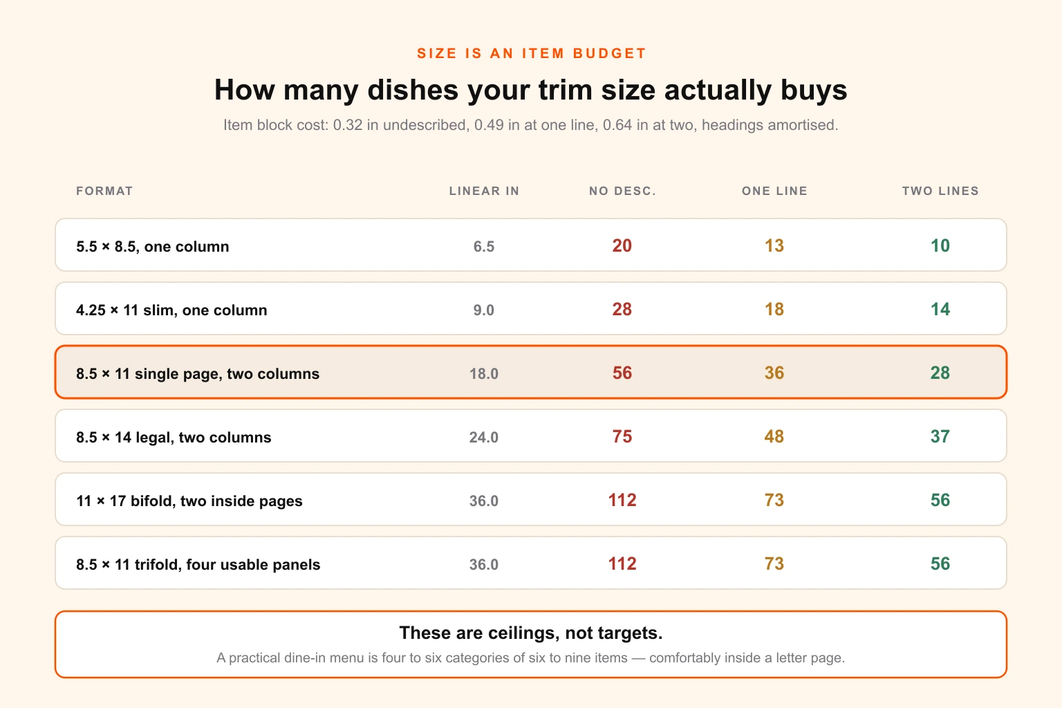
| Format | Usable linear inches | No description | One-line | Two-line |
|---|---|---|---|---|
| 5.5 × 8.5, one column | 6.5 | 20 | 13 | 10 |
| 4.25 × 11 slim, one column | 9.0 | 28 | 18 | 14 |
| 8.5 × 11 single page, two columns | 18.0 | 56 | 36 | 28 |
| 8.5 × 14 legal, two columns | 24.0 | 75 | 48 | 37 |
| 11 × 17 bifold, two inside pages × two columns | 36.0 | 112 | 73 | 56 |
| 8.5 × 11 trifold, four usable panels | 36.0 | 112 | 73 | 56 |
Two things to say about this table immediately.
These are ceilings, not targets. Fifty-six items on a letter page is arithmetically true and it is what a takeaway menu looks like — dense, undescribed, unreadable, and impossible to engineer because everything is competing with everything. A practical target for a dine-in menu is four to six categories of six to nine items, which is 24 to 54 items and comfortably inside a letter page with one-line descriptions.
Descriptions are the expensive variable, not the item count. Going from one line to two costs you 30 per cent of your budget. That is a real trade: descriptions demonstrably help the items that carry them, so the correct move is not to shorten every description, it is to give descriptions only to the items that need selling — your Puzzles and your Stars — and let the obvious items stand on their names.
The collision, and how to resolve it
Run this properly and you will hit a conflict. The analysis says cut to 24 items. The size you already print holds 36. There is now space on the page, and space on a page exerts a gravitational pull on restaurant owners that is very hard to resist.
Resolve it in favour of the analysis, every time, and spend the recovered space on white space, larger type and better descriptions for the items that remain. Three reasons, in ascending order of importance: a shorter menu is executed better by the kitchen, it holds less inventory and produces less waste, and a guest making a choice from nine options makes it faster and with less regret than a guest facing thirty.
The cheapest way to make a menu feel more expensive is to put fewer things on it. The cheapest way to make it feel cheaper is to fill it.
Legibility sets the floor
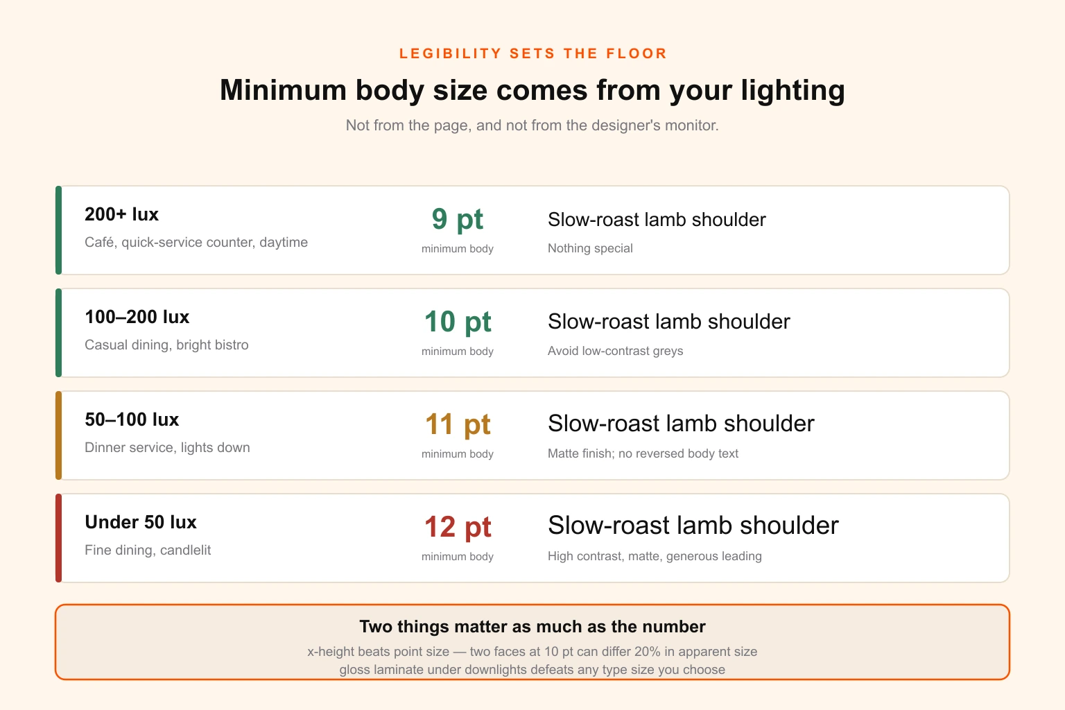
The other input to the item budget is the type size you can legally get away with in your own dining room, and this is decided by your lighting, not by your page.
| Room light level | Typical setting | Minimum body size | Additional requirement |
|---|---|---|---|
| 200+ lux | Café, QSR counter, daytime service | 9 pt | Nothing special |
| 100–200 lux | Casual dining, bright bistro | 10 pt | Avoid low-contrast greys |
| 50–100 lux | Dinner service, lights down | 11 pt | Matte finish; no reversed body text |
| Under 50 lux | Fine dining, candlelit | 12 pt | High contrast, matte, generous leading |
Three notes that matter more than the numbers:
- X-height beats point size. Two typefaces set at the same size can differ by 20 per cent or more in apparent size. Choose the face for its x-height and its performance at small sizes, then set the point size. The serif and sans-serif decision is about voice; the x-height decision is about whether anybody can read it.
- Gloss lamination is a legibility decision. Under the overhead downlights most dining rooms use, a gloss surface produces specular glare that will defeat any type size you choose. Matte laminate costs the same and solves it.
- Test it in the actual room. Print the menu, take it to a table during service with the lights at their normal setting, sit down and read it at arm's length. Then hand it to the oldest person you can find. This test takes four minutes and catches more problems than any amount of proofing on a bright monitor.
Part 4 — Layout that survives measurement
Now the placement decisions the analysis has been waiting for. This is the part of menu design with the most folklore attached to it, so it is worth separating what replicates from what merely circulates.
The golden triangle, honestly
The most repeated claim in menu design is that the eye lands in the centre of the page, moves to the top right, then to the top left, and that these three zones are prime real estate. It appears in almost every article on the subject.
Treat it as weak. It comes from trade lore rather than from strong published measurement, and eye-tracking work by Sybil Yang published in the International Journal of Hospitality Management found that guests largely read menus sequentially, more like a list than a scanned image. If that is right — and it matches what anyone who has watched a table order can observe — then designing around a triangle is designing around a shape that is not there.
What does replicate: position within the category
The finding that holds up, and that is far easier to execute, is serial position. Items at the beginning and the end of a list within a category are chosen measurably more often than items in the middle. Work by Dayan and Bar-Hillel published in Judgment and Decision Making found meaningful shifts in ordering from position alone.
That converts into a rule you can actually give a designer:
In every category, the first and last items are your best real estate. Put a Star or a Puzzle in each. Bury nothing you want to sell in the middle of a list of nine.
You do not need to know where the golden triangle is. You need to know which item is first in each section, and that is a decision you can make in ten minutes with your matrix open.
Boxing, and why it has a budget
Enclosing an item in a box, a tint or a rule reliably draws attention to it. It also reliably stops working the moment there are three of them, because the mechanism is contrast and contrast is a scarce resource.
One highlighted item per category, maximum. Ideally one or two on the whole menu. Spend them on Puzzles — high-margin items that nobody is ordering — because that is where the attention has somewhere useful to go. Spending a box on a Star is spending a scarce resource on an item that was already selling.
Prices
The evidence here is thinner than the confidence with which it is usually stated, but the design consensus is consistent and low-risk:
- No dotted leaders. A row of dots running from the dish name to the price creates a column of prices and invites the guest to read down it, comparing on cost. This is the single most damaging conventional menu device.
- No right-aligned price column, for the same reason. Set the price immediately after the description, in the body size, at the end of the line.
- Numerals only. A Cornell study by Yang, Kimes and Sessarego found guests spent more when prices were shown as bare numerals than with currency symbols or written out. The effect is modest; the cost of adopting it is zero.
- No .99 in table service. Charm pricing signals value and volume, which is correct for quick service and wrong in a dining room. Round or use .50.
- Do not set prices smaller than the body text. It reads as concealment, and guests who feel a price was hidden do not become repeat guests.
Descriptions
Descriptions cost you 30 per cent of your item budget, so spend them where they work:
- Give them to Puzzles first. A high-margin item that nobody orders is usually an item nobody understands.
- Name the provenance and the technique, not the adjective. "Slow-cooked for six hours" and "from the farm ten miles up the road" carry information. "Delicious" and "mouth-watering" carry none and cost the same space.
- Cap at two lines. Three-line descriptions on a dining menu are read by almost nobody.
- Keep them true. A description that oversells produces a disappointed guest, which is a worse outcome than an unordered dish.
Category order and sequence
If guests read sequentially, then the order of your categories is a design decision with revenue attached. Put the section you most want ordered from where the reading starts. Keep sections short enough that "first and last" covers a meaningful share of the items in them — a nine-item section has two prime slots out of nine, a twenty-item section has two out of twenty.
For anyone briefing this work out rather than doing it in-house, the layout decisions above are exactly the sort of thing that belongs in a written brief rather than a conversation; a good design brief should name the Stars and Puzzles by dish, not just ask for "a menu that sells more."
Part 5 — The production specification
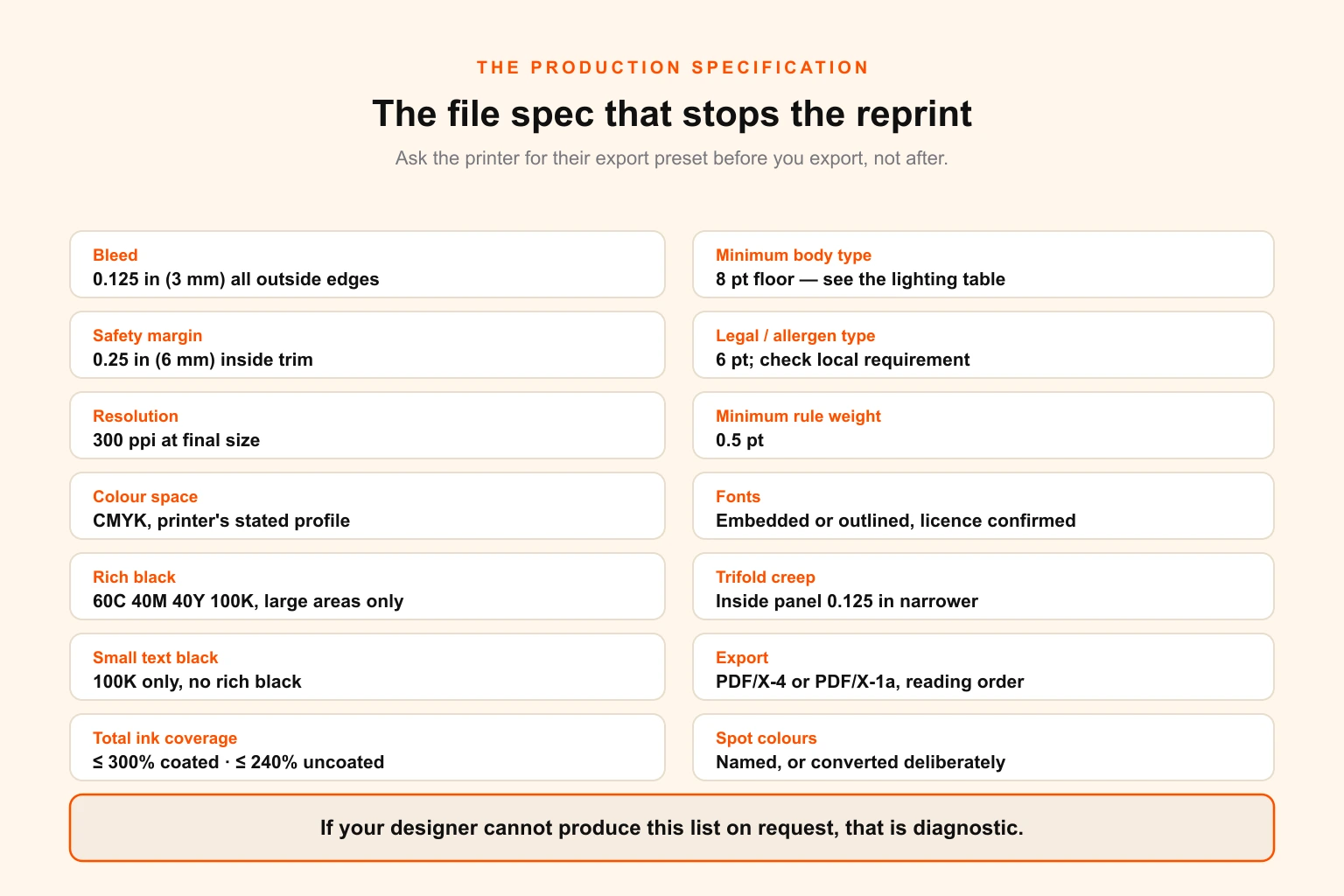
Everything above is worthless if the file fails at the printer or the object fails on the table. This is the specification sheet — hand it to whoever is producing the artwork.
The file
| Specification | Value | Why it matters |
|---|---|---|
| Trim size | Your chosen size, stated exactly | Ambiguity here causes the most reprints |
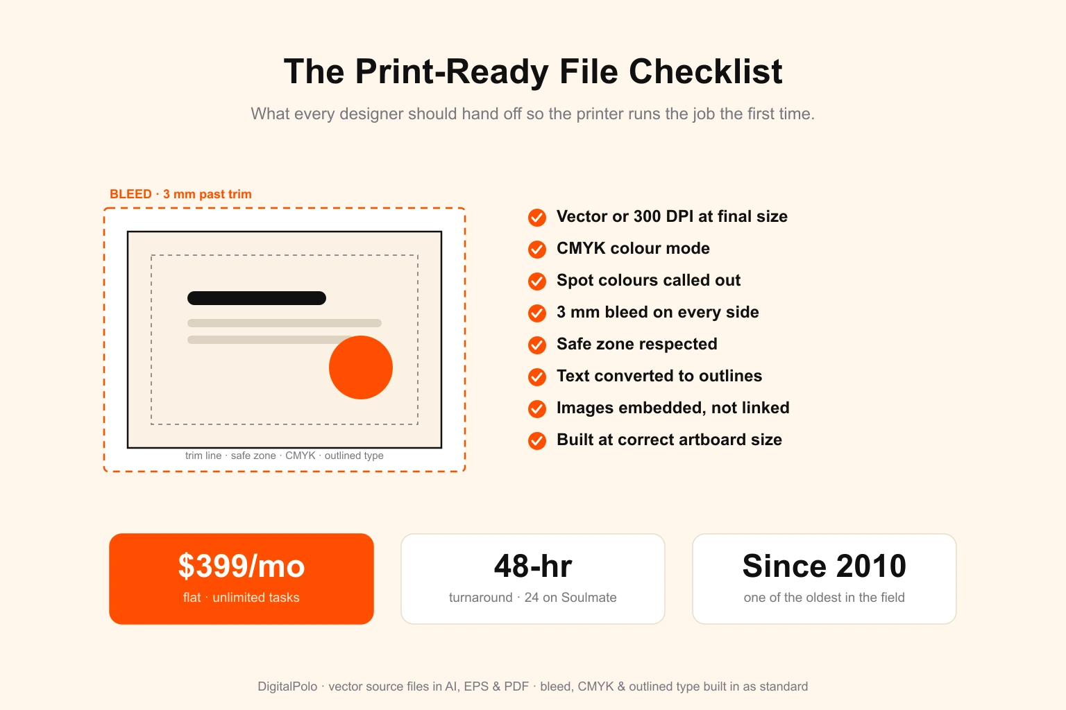
| Bleed | 0.125 in (3 mm) all outside edges | Guillotine tolerance; without it you get white slivers |
| Safety margin | 0.25 in (6 mm) inside trim | All live text and prices inside this line |
| Resolution | 300 ppi at final size | Not 300 ppi at half size scaled up — check the arithmetic |
| Colour space | CMYK at the printer's stated profile | RGB conversions shift food photography badly |
| Rich black | 60C 40M 40Y 100K for large areas | 100K alone prints as washed grey on coated stock |
| Small text black | 100K only, no rich black | Rich black under 24 pt causes registration fringing |
| Total ink coverage | ≤ 300% coated, ≤ 240% uncoated | Over-inked stock offsets and never dries properly |
| Minimum body type | 8 pt absolute floor; see lighting table | Below this, legibility fails before printing does |
| Minimum legal / allergen type | 6 pt | Check your local requirement |
| Minimum rule weight | 0.5 pt | Hairlines disappear on uncoated stock |
| Fonts | Embedded or outlined; licence confirmed | Font licensing is not transferred by handing over a file |
| Trifold panel creep | Inside-folding panel 0.125 in (3 mm) narrower | Otherwise the fold buckles |
| Export | PDF/X-4 or PDF/X-1a, single file, reading order | Ask the printer for their preset first |
| Spot colours | Named and specified, or converted deliberately | Convert Pantone to CMYK knowingly, not by accident |
If your designer cannot produce this list on request, that is diagnostic. Our full print-ready file checklist covers the same ground across every print format, and the print-ready design service exists precisely because this is where most in-house artwork fails.
The physical object
Choose the stock from how the menu will be handled, not from how it should feel in a photograph.
| Handling model | Stock | Finish | Realistic life |
|---|---|---|---|
| Printed daily / single use | 70–100 lb text (105–150 gsm) uncoated | None | One service |
| Weekly insert | 100 lb text / 80 lb cover | None or soft-touch | 1–2 weeks |
| Standard wipe-clean, high volume | 14–16 pt C2S cover | Matte laminate, 1.5–3 mil, both sides | 3–9 months |
| Outdoor, poolside, heavy handling | Synthetic (polypropylene, Teslin, waterproof paper) 8–10 mil | None required | 12 months+ |
| Fine dining presentation | 100–130 lb uncoated cover, foil or letterpress | None | Replaced when soiled |
Three specification notes that cause more grief than they should:
- Matte over gloss, nearly always. Durability is identical; glare is not.
- Laminate both sides or neither. Single-sided lamination curls within a week.
- Order 10–15 per cent over your circulation. Menus are stolen, spilled on and lost at a rate that surprises new operators, and running out mid-run forces exactly the panicked reprint you designed the shell and insert to avoid.
Part 6 — The four surfaces
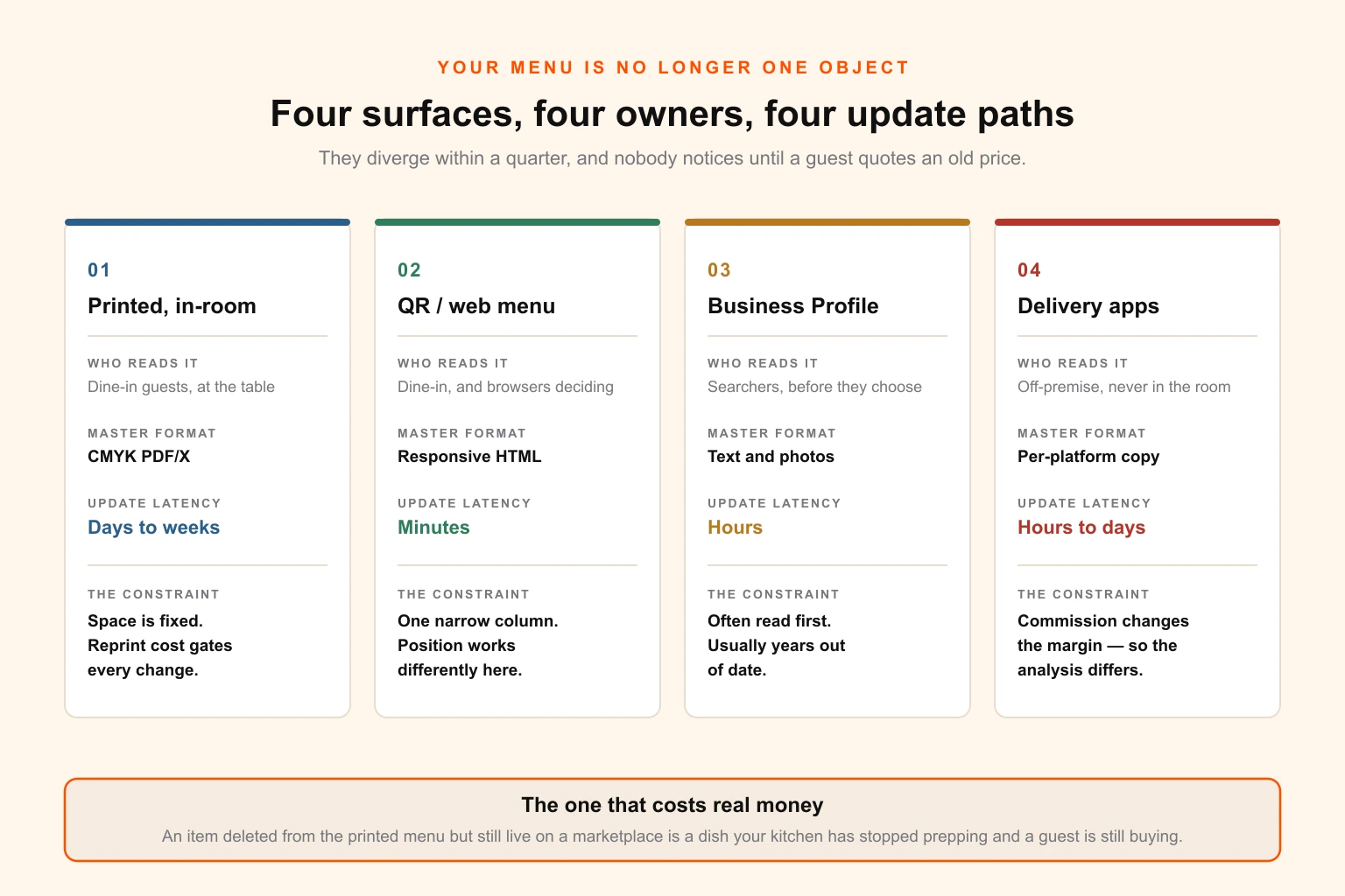
Your menu is no longer one object, and this is where most of the engineering quietly unwinds.
| Surface | Who reads it | Master format | Update latency | The constraint nobody plans for |
|---|---|---|---|---|
| Printed, in-room | Dine-in guests, at the table | CMYK PDF/X | Days to weeks | Space is fixed and reprint cost gates every change |
| QR / web menu | Dine-in guests, and browsers deciding | Responsive HTML | Minutes | One narrow column. Layout position works differently |
| Google Business Profile | Searchers, before they choose you | Text and photos | Hours | Often the first menu anyone reads, and usually years old |
| Delivery marketplaces | Off-premise, never enters the room | Per-platform copy and images | Hours to days | Commission changes the margin, so the analysis is different |
Four surfaces, four different update mechanisms, four different owners inside most businesses. They diverge within about a quarter of going live, and nobody notices until a guest arrives quoting a price from a search result.
The QR menu is not your print PDF
This is the most common self-inflicted wound in the category. A print menu is a fixed-width, multi-column object designed for a page held at arm's length in two hands. A phone is a single narrow column, held one-handed, often in a dim room, frequently by someone who has already had a glass of wine.
Put your print PDF behind a QR code and the guest gets a document they must pinch, zoom and pan, seeing perhaps a third of it at once. Every serial-position decision you made is destroyed, because "first in the category" only works if the category is visible as a unit.
Build the QR destination as responsive HTML, one column, real text, with the Star or Puzzle in the first and last slot of every section — where the position effect still works, and works arguably harder than on paper because the guest can only see a few items at a time. Keep the PDF as a downloadable fallback for the people who ask for one. If your web presence is being rebuilt anyway, this belongs in the scope from the start rather than bolted on afterwards; menu content is a first-class part of a hospitality site, not a link at the bottom of it.
Delivery is a different menu, and the maths proves it
Here is the finding that justifies the separate menu, and it is exact rather than rhetorical.
A marketplace commission does not reduce your margin by the commission rate. It reduces it by:
margin erosion = commission rate ÷ contribution margin ratio
Where contribution margin ratio is your margin as a share of the price. Run it on the same eight items at a 30 per cent commission:
| Item | Price | Plate cost | Food cost % | CM ratio | Margin lost at 30% commission |
|---|---|---|---|---|---|
| Pasta pomodoro | 18.00 | 3.60 | 20% | 80% | 37.5% |
| Mushroom risotto | 21.00 | 4.20 | 20% | 80% | 37.5% |
| Roast chicken | 24.00 | 6.60 | 27.5% | 72.5% | 41.4% |
| Veggie wrap | 16.00 | 5.60 | 35% | 65% | 46.2% |
| Burger | 19.00 | 7.60 | 40% | 60% | 50.0% |
| Sea bass | 32.00 | 12.80 | 40% | 60% | 50.0% |
| Lamb shank | 29.00 | 11.60 | 40% | 60% | 50.0% |
| Ribeye | 42.00 | 18.90 | 45% | 55% | 54.5% |
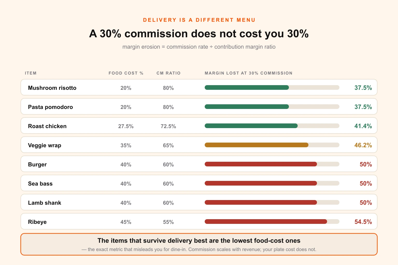
A 30 per cent commission takes half the margin on your burger and more than half on your ribeye. And notice the ordering: the items that survive delivery best are the ones with the lowest food cost percentage — the exact metric that misleads you for dine-in.
That is the whole argument for a separate delivery menu in one line. Food cost percentage is the wrong lens in your dining room and the right lens on a marketplace, because commission scales with revenue while your plate cost does not.
Three further adjustments before you publish a delivery menu:
- Add packaging to the plate cost. A container, a lid, a bag, cutlery and a sauce pot is a real per-order cost that dine-in does not carry.
- Subtract the drinks and dessert attachment. A dine-in main often carries margin it did not earn. On delivery it usually travels alone.
- Remove what travels badly. A dish that arrives soggy generates a refund, which is a negative contribution margin event plus a permanent rating.
The practical result is a delivery menu that is shorter, tilted toward low food-cost items, priced separately where the platform allows it, and re-analysed on its own numbers rather than inherited from the room.
The divergence audit
Once a quarter, in one sitting, open all four and check the same six items:
- Does every item on the printed menu exist on the web menu, and vice versa?
- Do the prices match — allowing for a deliberate delivery uplift, which should be documented rather than accidental?
- Are the allergen and dietary markers identical everywhere?
- Is the Google Business Profile menu link live, and does it point at the current menu rather than a PDF from two refreshes ago?
- Are the delivery photos current, and do they show the dish as it is served now?
- Are the removed items actually removed everywhere, including the delivery platform where they are still being ordered?
That last one costs real money. An item deleted from the printed menu but left live on a marketplace is a dish your kitchen has stopped prepping and a guest is still buying.
For groups running this across several sites, the divergence problem multiplies rather than adds — and the answer is a controlled template system rather than more auditing. Brand compliance across multiple locations is the same discipline applied to everything else the sites print, and a full asset inventory is what makes it possible to know what is out there in the first place.
Part 7 — The change cycle
Put the whole thing on a calendar, because the reason menu engineering fails is almost never analysis quality. It is that nobody owns the next step.
| Cadence | Activity | Owner | Output |
|---|---|---|---|
| Weekly | Specials and market-price items | Kitchen | New insert, printed in house |
| Monthly | Plate costing refresh on the top ten items by volume | GM / finance | Updated cost sheet |
| Quarterly | Full matrix, price decisions, position changes | GM + owner | New insert; brief for any shell changes |
| Quarterly | Four-surface divergence audit | Marketing | Corrections list |
| Annually | Shell redesign, photography, structural changes | Owner + designer | New shell print run |
| On trigger | Supply shock, minimum wage change, rent review | Owner | Out-of-cycle price review |
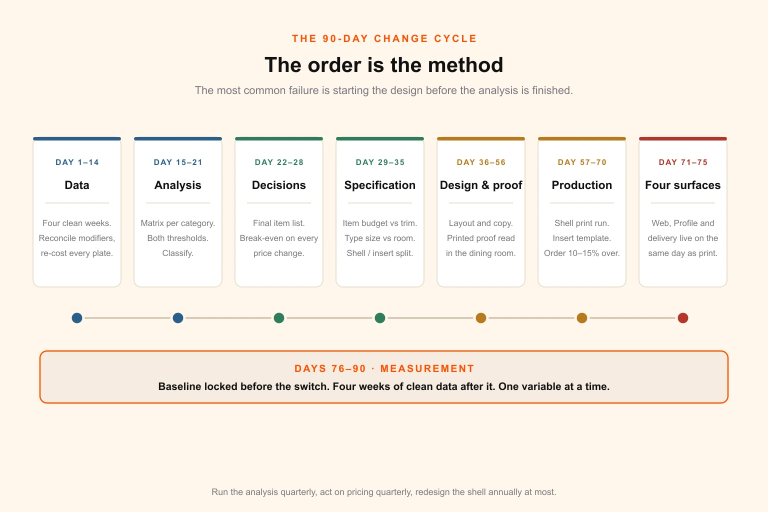
The 90-day sequence for a full refresh
If you are starting from a menu that has not been touched in years, run it in this order. The order matters — every step depends on the one before it, and the most common failure is designing before the analysis is finished.
Days 1–14 — Data. Pull four weeks of clean item-level sales. Reconcile modifiers, strip comps and voids, decompose set menus. Re-cost every plate properly, including garnish, yield loss and the portion actually served.
Days 15–21 — Analysis. Build the matrix per category. Calculate the weighted average contribution margin and the popularity threshold. Classify. List the Dogs and check each against the four exceptions before cutting.
Days 22–28 — Decisions. Decide the final item list. Run the break-even calculation on every price change. Assign the first and last slot in each category. Choose which items earn a description and which earn the one box.
Days 29–35 — Specification. Fix the item budget against the trim size. Confirm the type size against your actual room lighting. Decide the shell-and-insert split and where the aperture goes. Get the printer's export preset.
Days 36–56 — Design and proof. Layout, copywriting, photography if it is being commissioned. One printed proof read in the dining room at service lighting, by someone who did not design it. Then a second proof, because there is always a second proof.
Days 57–70 — Production. Shell print run. Insert set up as a house-printable template. Order 10–15 per cent over circulation.
Days 71–75 — The four surfaces. Web menu rebuilt as responsive HTML. Google Business Profile updated. Delivery menus re-analysed on delivery economics and republished. Everything live on the same day the printed menu hits the tables.
Days 76–90 — Measurement. Baseline locked before the switch. Four weeks of clean post-change data. One variable at a time.
Measuring whether it worked
Three metrics, in order of usefulness:
- Total contribution margin per cover. The number that matters. Revenue can rise while this falls, and frequently does.
- Item mix percentage, per item, compared like-for-like. Use percentages, never raw counts — a busy month makes everything look like a success.
- Category mix. Whether the structural changes moved guests between sections at all.
And the discipline that makes those numbers mean anything:
- Change one variable at a time. Reprice and relayout in the same week and you will never know which did the work. If you must do both, do the pricing first — it is worth more and it is easier to measure.
- Four weeks minimum, or two full trading cycles. Whichever is longer.
- Lock the baseline before you switch, not afterwards from memory.
- Watch for the confounders: weather, local events, a competitor opening or closing, a delivery platform promotion, a staffing change on the floor.
- Expect modest numbers. Repositioning moves a few per cent of mix. Repricing moves more. Both compound quarterly, which is where the real return lives — a menu you can revise four times a year will beat a beautiful menu you revise once, comfortably, every time.
The mistakes that cost the most
- Optimising food cost percentage. You bank dollars, not ratios. This one error reverses most of the decisions in the analysis.
- Putting prices on the fixed layer. The single most expensive design decision available to a restaurant, and it is usually made by accident.
- Deleting a Dog that was doing a job. Check every cut against the dietary, anchor, signature and recency exceptions first.
- Treating a trim size as a size rather than an item budget. Calculate the budget, then choose the size — not the other way round.
- Filling the space the analysis just freed. A shorter menu is executed better, wastes less and converts faster.
- Boxing everything. Contrast is scarce. Spend it on one Puzzle.
- Descriptions that describe nothing. "Delicious" costs the same space as "aged 30 days" and does none of the work.
- Running the matrix on dirty POS data. Modifiers, comps, voids and set menus will invert your classifications.
- Gloss laminate under downlights. A durability decision made without checking it was also a legibility decision.
- Sending the print PDF to the QR code. Destroys the layout work and the guest's patience simultaneously.
- Treating delivery as the same menu. The margin ranking is different, and the item that wins in the room can lose on the platform.
- Reprinting the whole run to fix a typo. That is what the insert layer exists to prevent.
- Changing the menu without telling the kitchen. Par levels, prep lists and ordering all move with it.
- Redesigning annually because it feels stale. Redesign when the analysis or the brand requires it. Novelty is not a business case, and every redesign resets the data you were building.
Where design actually earns its keep here
Read back through the numbers and a pattern emerges that is slightly deflating for the design profession and extremely useful for an operator.
Repositioning items on a page is worth low four figures a year on a mid-sized menu. Repricing a single high-volume Plowhorse is worth three times that. Deleting three Dogs is worth more than either, in prep time, waste and kitchen focus.
So the highest-value contribution design makes to a menu is not persuasion. It is removing the friction between a decision and a printed object — the shell-and-insert architecture, the item budget calculated before anyone opens a layout application, the type size checked against the actual room, the four surfaces kept in sync, and a production file that does not fail at the printer.
That is a systems problem, and it is why menus reward an ongoing design relationship far more than a one-off project. A menu redesigned once and then frozen for three years loses to a modest menu revised four times a year, every time. If the reason yours is frozen is that every change means a quote, a brief and a two-week wait, that is the thing to fix — a flat-rate design subscription turns a quarterly insert refresh from a project into a request, and the pricing is deliberately simple for exactly that reason. If you are still comparing approaches, our breakdown of what design actually costs covers the per-project, freelance, in-house and subscription options side by side, and the portfolio shows the print and hospitality work.
For a restaurant group, the same logic applies with more zeros: the constraint is never the design of any single menu, it is the cost of keeping forty of them current. That is the case for hiring or partnering rather than reprinting.
Your next steps
This week. Pull four clean weeks of item-level sales. Re-cost your top ten items by volume, properly. Calculate your weighted average contribution margin and your popularity threshold.
Next week. Classify. List your Dogs and test each against the four exceptions. Run the break-even calculation on your two highest-volume Plowhorses.
The week after. Count your usable linear column inches and calculate your real item budget. Print the current menu and read it in your own dining room at service lighting.
Then. Decide where the line between shell and insert falls, and never put a price above it again.
The spreadsheet with the four coloured boxes was not the problem. It was always correct. What it needed was somewhere to go — and that is a design decision, taken before the analysis, that determines whether the analysis can ever be acted on at all.
If your menu is one of the frozen ones, tell us what you are working with and we will start with the shell-and-insert split. It is the change that makes every subsequent one cheap.
Related reading
- 5 Tips For a Tasteful Restaurant Menu Design — the craft and aesthetic side of the same object, covering typography, colour and photography choices
- Print-Ready File Checklist — what a designer should hand over, by format
- 13 Proven Growth Hacks for Quick Service Restaurant Outlets — the wider QSR marketing picture the menu sits inside
- Brand Compliance at Scale — keeping forty locations on one system
- 8 Visual Merchandising Techniques to Boost Retail Store Sales — the same attention economics applied to physical space
- Color Theory for Brand Design — choosing a palette that survives print
- Stock Asset Licensing for Print Runs — what your food photography licence actually permits
- 12 Signs Your Business Has Outgrown Canva and a Virtual Assistant — when the template approach stops scaling