
If a design feels off but you cannot put a finger on why, the answer is almost always one of the seven principles of design. They are the rules designers use to organise visual elements into compositions that work — and the diagnostic checklist working designers reach for when a layout is fighting them.
This is the 2026 guide. The seven principles, what each one means in practical terms, and the elements they organise.
Quick answer: The seven principles of design are balance, contrast, emphasis, movement, pattern, proportion, and unity. They are the organising rules a designer uses to arrange the elements of design (line, shape, colour, value, texture, space) into compositions that work. Elements are what you place; principles are how you place them.
Elements vs. Principles: The Core Distinction
Before the seven principles: the elements of design are the raw materials — line, shape, form, colour, value, texture, space. They are the components you place on the page.
The principles are how you organise those elements — the rules and patterns. Elements are the words; principles are the grammar.
A composition with poor principles but rich elements is decorative but confusing. A composition with strong principles but spare elements is clean and effective. Designers who know the elements but not the principles tend to produce work that looks busy without communicating. Designers who know both produce work that reads at a glance.
The 7 Principles of Design
1. Balance
Balance is the distribution of visual weight in a composition so it feels stable.
Three kinds:
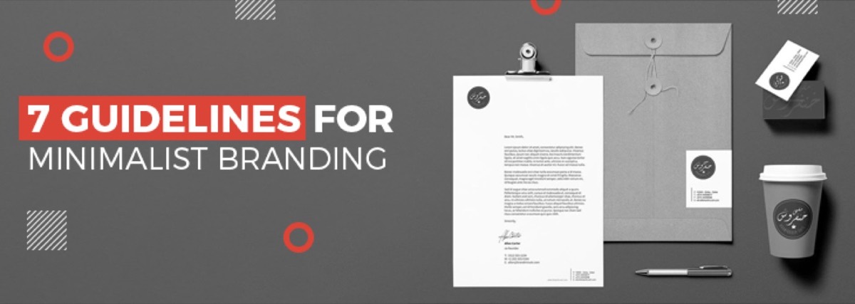
- Symmetrical balance — left mirrors right (or top mirrors bottom). Feels formal, classical, traditional. Used for institutional brands, government documents, classical editorial.
- Asymmetrical balance — different elements on each side but equal visual weight. Feels dynamic, modern, energetic. The dominant pattern in contemporary brand design and web layout.
- Radial balance — elements arranged around a central point. Feels rotational, decorative, ceremonial. Used for medallions, official seals, mandalas.
Quick check: If you mentally fold the composition in half, do the two halves feel like they weigh the same? If yes, balance is working. If one side feels heavier, the composition feels unstable.
2. Contrast
Contrast is the visible difference between two elements — light vs. dark, big vs. small, thick vs. thin, warm vs. cool, ornate vs. plain.
Contrast is what makes hierarchy possible. Without contrast, every element reads at the same level of importance — which is to say, nothing reads as important.
Common kinds: tonal contrast (dark text on light background), scale contrast (large headline beside small body), weight contrast (heavy display weight beside light body weight), colour contrast (one accent against many neutrals), shape contrast (geometric beside organic), space contrast (dense areas beside open areas).
Quick check: Are the things you want the viewer to notice meaningfully different from the things you don't? If a poster has 8 elements at similar visual weight, the viewer reads none.
3. Emphasis
Emphasis is where the eye goes first — the focal point of the composition.
Every effective design has one (and only one) primary emphasis. Magazines call it the dominant headline. Posters call it the hero image. Websites call it the hero block. Without emphasis, the viewer's eye wanders and the message dilutes.
Common ways to create emphasis: scale (make the focal element much larger), colour (give the focal element the brightest or most saturated colour), isolation (surround the focal element with white space), contrast (make the focal element visually distinct from everything around it), framing (use lines or shapes to point the eye at the focal element).
Quick check: When you squint at the composition, what do you see first? That is the emphasis. If the answer is "everything looks the same," there is no emphasis.
4. Movement
Movement is the path the viewer's eye travels through the composition.
Strong compositions guide the eye intentionally — from emphasis to secondary point to supporting detail to call-to-action. Weak compositions let the eye wander or get stuck.
Common ways to create movement: directional lines (an arrow, a glance, a road, an architectural line that points), gradient or value transitions (the eye follows light-to-dark or dark-to-light), scale stepping (large to medium to small), Z-pattern or F-pattern reading flows (used in web layout because that's how Western readers scan a page).
Quick check: Trace where your eye goes through the composition. Is that the path you intended? If the eye gets stuck on a busy area or skips the call-to-action, movement is broken.
5. Pattern (Repetition)
Pattern is the rhythmic repetition of visual elements across a composition or system.
Repeated shapes, colours, type treatments and spacing create pattern. Pattern unifies a composition (and across multiple compositions, unifies a brand system). It also creates rhythm — predictable repetition with intentional variation reads as designed.
Quick check: Does anything repeat consistently — colour, shape, type treatment, spacing? Or is every element treated uniquely? Some unique elements are fine; all unique elements feel chaotic.
6. Proportion (Scale)
Proportion is the relative size of elements to each other and to the composition.
The ratio of headline size to body size. The ratio of an image to its caption. The ratio of margin to content. The ratio of feature size to supporting feature size.
Strong proportion creates hierarchy and reads as intentional. Weak proportion (everything roughly the same size) reads as undifferentiated. Extreme proportion (one element dramatically larger than everything else) reads as dramatic and editorial.
Common proportional systems designers use: the golden ratio (~1.618), the rule of thirds (divide the composition into thirds and place focal elements at intersections), modular scales (1.25× or 1.5× type-size steps), classical canon proportions in figure illustration.
Quick check: Are the most important elements clearly the largest? Are supporting elements clearly smaller? Is the size ratio between hierarchy levels consistent across the design?
7. Unity (Harmony)
Unity is whether the composition feels like one designed thing rather than several parts stuck together.
Unity is the load-bearing principle. A composition can have great balance, contrast, emphasis, movement, pattern, and proportion — and still fail if the parts don't feel like they belong together. Unity comes from consistent type, consistent colour, consistent spacing, consistent edge treatment, consistent voice.
The opposite of unity is fragmentation — when a composition reads as a collage of unrelated elements (often because elements came from different sources, were designed at different times, or were assembled without a unifying system).
Quick check: Could you describe the whole composition with a single adjective? "Editorial." "Energetic." "Restrained." "Playful." If you can, unity is working. If the composition needs a paragraph to describe because it pulls in five different directions, unity is broken.
How to Use the Principles in Practice
The principles are most useful as a diagnostic checklist when something feels off.
Walk through them in this order:
- Emphasis — what does the eye see first? Is it what I wanted?
- Contrast — are hierarchy levels meaningfully different?
- Balance — does the composition feel stable?
- Movement — does the eye travel the intended path?
- Proportion — are the size ratios right?
- Pattern — is anything repeating consistently?
- Unity — does it all feel like one thing?
Whichever principle the composition is failing on is usually what needs fixing. You don't fix six principles at once; you fix the one that's broken.
The Elements of Design (For Reference)
The seven principles organise the elements of design:
- Line — the most basic mark. Straight, curved, thick, thin, continuous, broken. Lines lead the eye, divide space, and define edges.
- Shape — closed 2D forms. Geometric (circles, squares, triangles) or organic (free-form, natural).
- Form — shapes with implied 3D depth. Created with shading, perspective, or actual dimensionality.
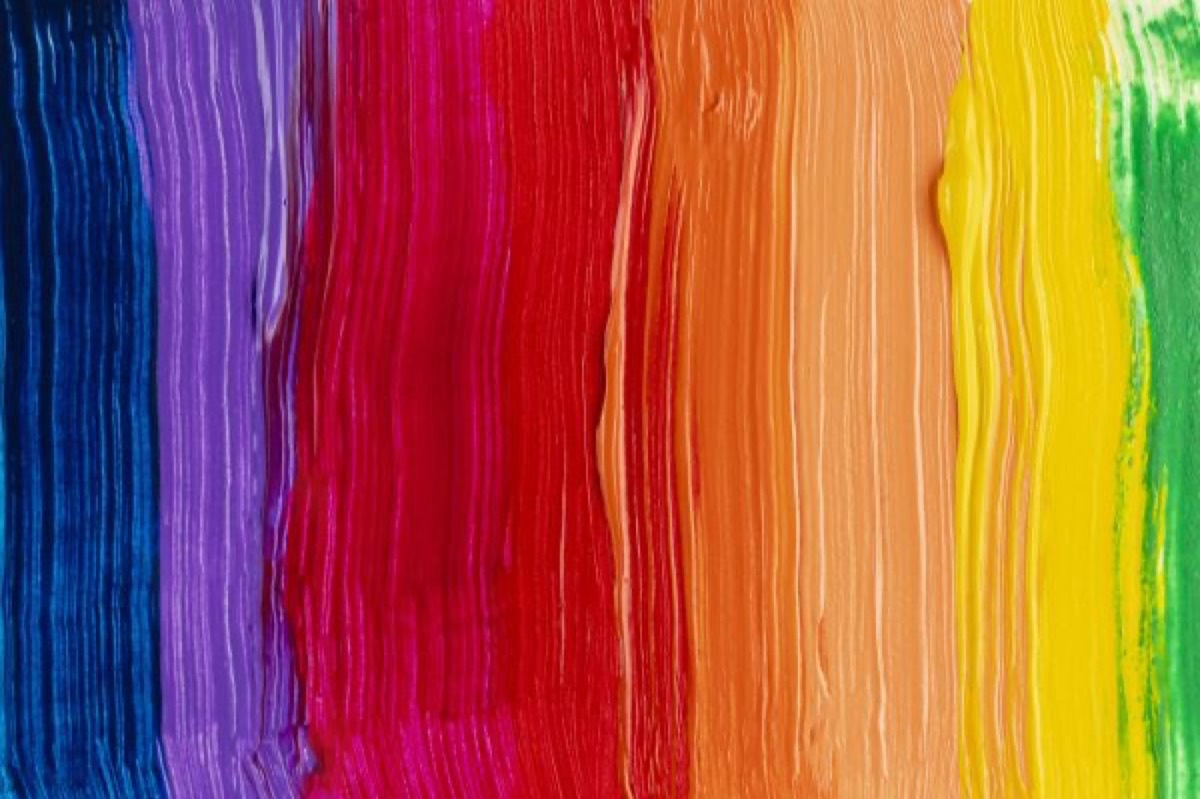
- Colour — hue, saturation and value. The most emotionally loaded element.
- Value — the lightness or darkness of an area. Independent of hue (a colour can be light or dark; a black-and-white image is value alone).
- Texture — the surface quality of an element. Actual (you can feel it) or implied (visual texture, like a noise overlay).
- Space — both the negative space around objects and the implied depth in a composition.
Master both — the elements you place and the principles that organise them — and your designs stop feeling accidental.
When You're Outsourcing Design Work
A designer who has internalised the principles will fix a brief that's structurally weak without being told. A designer who hasn't will execute the brief exactly and produce a composition that's technically correct but visually flat.
When you're hiring or outsourcing, the principles are a good interview test. Look at a designer's portfolio and ask which principle drove the strongest piece. If the answer is precise — "I used aggressive scale contrast to create emphasis on the headline" — they're thinking principles. If the answer is vague — "I just wanted it to look clean" — they're working from instinct alone.
DigitalPolo's design team has 16 years of operating history applying these principles across logos, brand identities, packaging, ad campaigns and websites. See plans → | Read about brand aesthetic →
Bottom Line
The seven principles of design are balance, contrast, emphasis, movement, pattern, proportion, and unity.
They are the rules designers use to organise the elements of design (line, shape, form, colour, value, texture, space) into compositions that read clearly and feel intentional.
Use the principles as a diagnostic checklist. When a design feels off, walk through the seven and find the one that's failing. Fix that one.
That is the working designer's view of the principles of design.