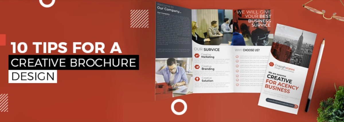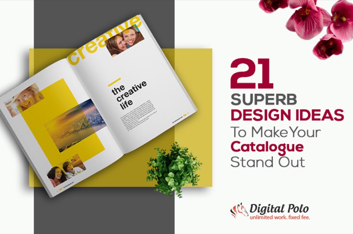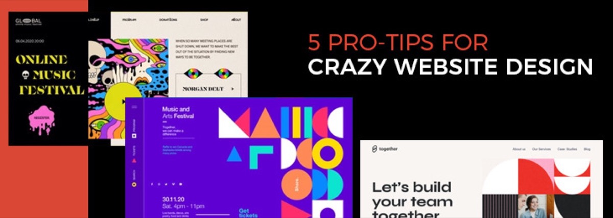
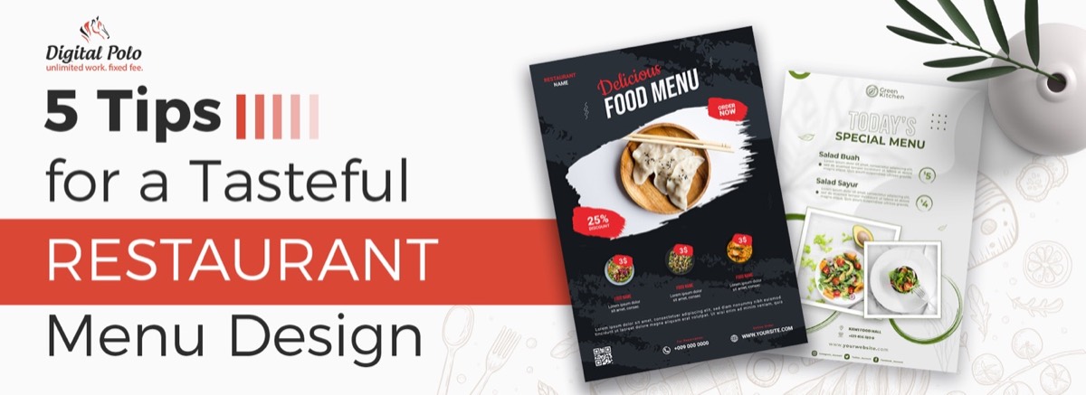
A creatively designed restaurant menu does more than list what's available — it stimulates appetite, communicates brand identity, and directly influences what customers order and how much they spend. Many of the same layout and typography principles that apply here also inform brochure design — the challenges of managing limited space and reader attention span are nearly identical.
According to research from Cornell University's Center for Hospitality Research, customers spend an average of 109 seconds looking at a menu. In that brief window, your restaurant menu design needs to guide the eye to high-margin items, communicate the restaurant's personality, and make ordering feel effortless.
Here are five essential tips for designing a restaurant menu that works as hard as everything else in your establishment.
1. Plan Item Placements Strategically
How you organize items on the menu affects both the customer experience and the restaurant's profitability.
Ideally, customers should be able to see the full menu at a glance — two-page spreads are the most manageable format. For restaurants with larger menus, organize items by category: entrees, mains, sides, and desserts. A separate dessert and drinks menu reduces visual clutter on the main menu and often increases dessert sales by presenting those items as a distinct experience.
On item placement within sections, the research has evolved. The traditional assumption that customers are drawn to the upper-right corner (the "sweet spot") is contested by newer eye-tracking studies showing that diners read menus more like a book — top to bottom, left to right. The safest approach is to lead each section with your highest-margin item, regardless of corner position. The same logic that governs catalogue design ideas — leading with your most compelling items and organizing by category — applies directly here.
Menu engineering principle: Place high-margin, high-popularity items first in their category. Reserve boxes, borders, or visual callouts for items you want to highlight — your most profitable dishes, not necessarily your cheapest.
2. Be Strategic About Food Photography
Too many photos can undermine a restaurant's perceived quality. High-end restaurants typically include no food photography at all — because professionally plated dishes speak for themselves, and because food photography is highly subjective.
Use food photography on your menu only if:
- You have professionally shot, high-quality images that flatter the dish
- The photography style is consistent across all items shown
- The images have been styled and lit to maximize appetite appeal
If professional food photography isn't in the budget, skip the photos entirely and use illustrations instead. Custom illustrations work well in menu design — they have broader appeal than photography, they can uniquely reflect your restaurant's personality, and they never make a dish look less appealing than the real thing.
Tired of menus that don't reflect your restaurant's quality? Digital Polo designs professional, brand-aligned menus for restaurants — delivered in 48 hours. See how it works →
3. Know What to Accentuate — and What to Downplay
Your menu is a sales tool. Thoughtful design guides the customer's eye toward the items you want them to order.
To draw attention to high-margin items:
- Use box designs or decorative borders around featured sections (e.g., "Chef's Recommendations" or "Most Popular")
- Apply a slightly larger or bolder font treatment to the names of featured items
- Consider a visual separator — a rule, a color block, or a texture — to distinguish a signature section from the rest
For pricing, research consistently shows that removing currency symbols (listing "14" instead of "$14.00") reduces price consciousness and increases average spend. Formatting all prices in the same size as the dish description — rather than right-aligning them — also makes the menu feel less transactional and more experience-oriented.
4. Choose Typography That Matches Your Brand
The fonts you use on your menu communicate your restaurant's personality before a single word is read.
Practical typography rules for restaurant menu design:
- Limit yourself to two typefaces — one for headings and item names, one for descriptions and pricing
- Serif fonts (Garamond, Bodoni, Caslon) convey elegance and tradition — well-suited for fine dining and upscale establishments
- Sans-serif fonts (Gill Sans, Futura, Proxima Nova) feel modern and approachable — better for casual dining, cafes, and fast-casual
- Script fonts work as accents for section headers but should never be used for body text — they become illegible at small sizes
Minimum readable body text size for menus: 9pt in print. For menus read in dim dining room lighting, aim for 11pt or above.
Using different typefaces to differentiate between item names and descriptions helps customers scan the menu faster — and a faster decision process means more confident ordering and better table turnover.
5. Choose Colors That Work for Your Restaurant Type
Color psychology is one of the most well-documented tools in restaurant branding. Warm tones stimulate appetite; cool tones suppress it; neutral tones signal sophistication.
Color guidance by restaurant type:
- Fast casual and family dining — warm reds, oranges, and yellows increase appetite and energy; they also subtly encourage faster eating and table turnover
- Mid-range bistros and casual dining — earthy tones (terracotta, warm browns, sage green) feel welcoming and relaxed without the urgency of fast-food palettes
- Fine dining and upscale restaurants — neutrals (off-white, cream, charcoal, deep navy, or classic black) signal restraint and exclusivity; avoid bright or neon tones entirely
Consistent use of your brand's color palette across your menu, signage, website, and social media reinforces brand recognition. Your menu should feel like a natural extension of your other materials — not a standalone document that happens to have your logo on it.
For the production and profitability side of the same object — contribution-margin analysis, the item budget your trim size actually buys, the full print specification and the reprint economics that decide how often you can change anything — see menu engineering and menu design specs.
What About Digital and QR Menus?
Post-2020, QR code menus have become standard in many markets. Restaurant menu design now needs to account for both print and digital formats.
For digital menus:
- Prioritize mobile readability — use larger text sizes than you would in print
- Single-column layouts work best on phones; avoid multi-column PDF designs that require pinching and zooming
- Keep digital menus updated — a QR menu with sold-out items and old prices damages trust faster than a printed menu would
The same principles that make a high-converting website design effective — clear hierarchy, minimal friction, and a single action per screen — translate directly to digital menu UX.
If you use QR menus, consider keeping physical menus available as well — some customers strongly prefer them, and a physical menu remains a touchpoint for brand perception.
Conclusion
Most restaurant owners design their menus once and treat them as a permanent fixture. But a quarterly refresh — even small adjustments to item placement, seasonal additions, or updated photography — keeps the menu feeling current and can directly impact order patterns.
Your menu is your most powerful sales tool. Get it designed by professionals for one flat monthly fee — no per-project costs, unlimited revisions. Start with the Partner plan at $399/mo → | Soulmate plan at $899/mo →
Frequently Asked Questions About Restaurant Menu Design
What makes a good restaurant menu design? A good restaurant menu design has a clear visual hierarchy, consistent brand colors and typography, strategic item placement that guides customers toward high-margin choices, and enough negative space to remain legible in dim lighting. The best menus balance aesthetics with function — they look great and make ordering feel effortless.
What colors are best for a restaurant menu? Warm tones (red, orange, yellow) stimulate appetite and suit casual dining. Neutral tones (white, cream, grey, deep navy, black) signal elegance and suit fine dining. Blue is generally avoided in food contexts — it is associated with appetite suppression. Choose colors that match your restaurant's atmosphere and target audience.
How do I make my menu more visually appealing without a big budget? Focus on consistent typography, generous whitespace, and limiting the number of items displayed. A clean, focused menu looks more professional than a cluttered one with many items competing for attention. If professional design isn't in budget immediately, a flat-rate subscription design service can deliver polished results at a predictable monthly cost.
Should I use photos on my restaurant menu? Only if you have high-quality, professionally shot food photography that flatters each dish consistently. Low-quality photos hurt perceived value. If you can't guarantee consistent quality across all items, custom illustrations are a safer, more versatile alternative — they can uniquely reflect your restaurant's character without any of the risk.
What is menu engineering and why does it matter? Menu engineering is the practice of strategically placing and presenting items on a menu to maximize profitability. High-margin, popular items (your "stars") should be easy to find and visually prominent. Good menu design supports this by controlling where the customer's eye travels — through placement, borders, typography weight, and color contrast.