Somebody on your team is about to spend four hours upsampling a photograph so a banner can hit 300 DPI, and it will make no difference to anything except the file size.
Somebody else is about to send a 72 PPI hero image straight to a wall graphic that visitors stand two feet away from, and that one will cost a reprint.
Both mistakes come from the same place: the number everyone learned for A4 leaflets, applied to a surface a hundred times larger, at a distance nobody accounted for. Large format resolution is not a scaled-up version of small format resolution. It runs on a completely different logic, the numbers are far lower than most designers are comfortable with, and the actual failures almost never happen where people are looking.
This guide gives you the number, the derivation behind it so you can defend it, the effective-resolution trap that causes the overwhelming majority of real-world soft prints, how to build files at scale when full size is physically impossible, and the substrate limits that cap sharpness no matter how much data you supply.
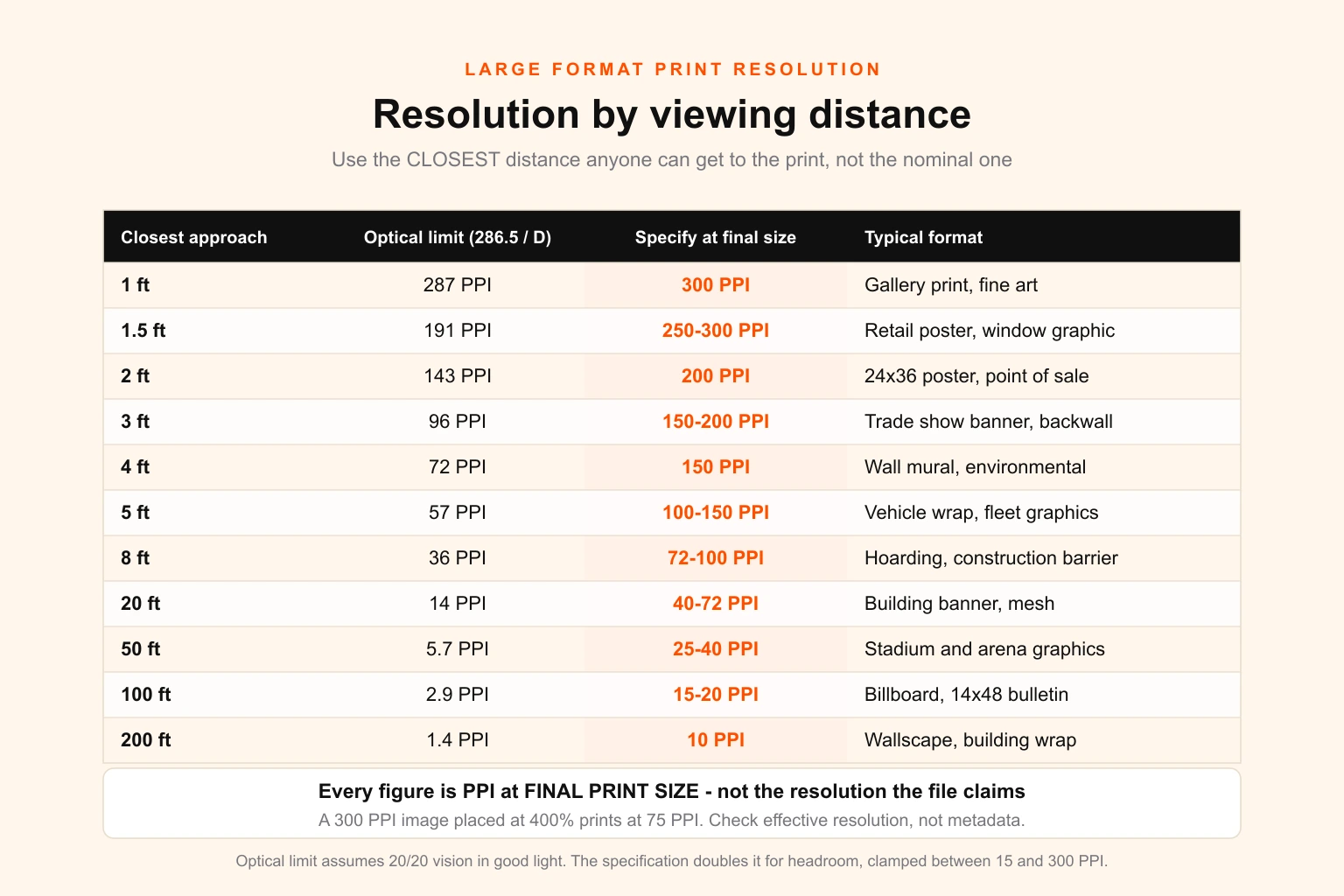
If you only need the number, the table above is the answer. If you need to defend it to a client, a printer or an art director who insists everything must be 300 DPI, keep reading.
The rule everyone learned, and why it stops working
300 DPI is not an arbitrary convention. It is a measurement of your eye.
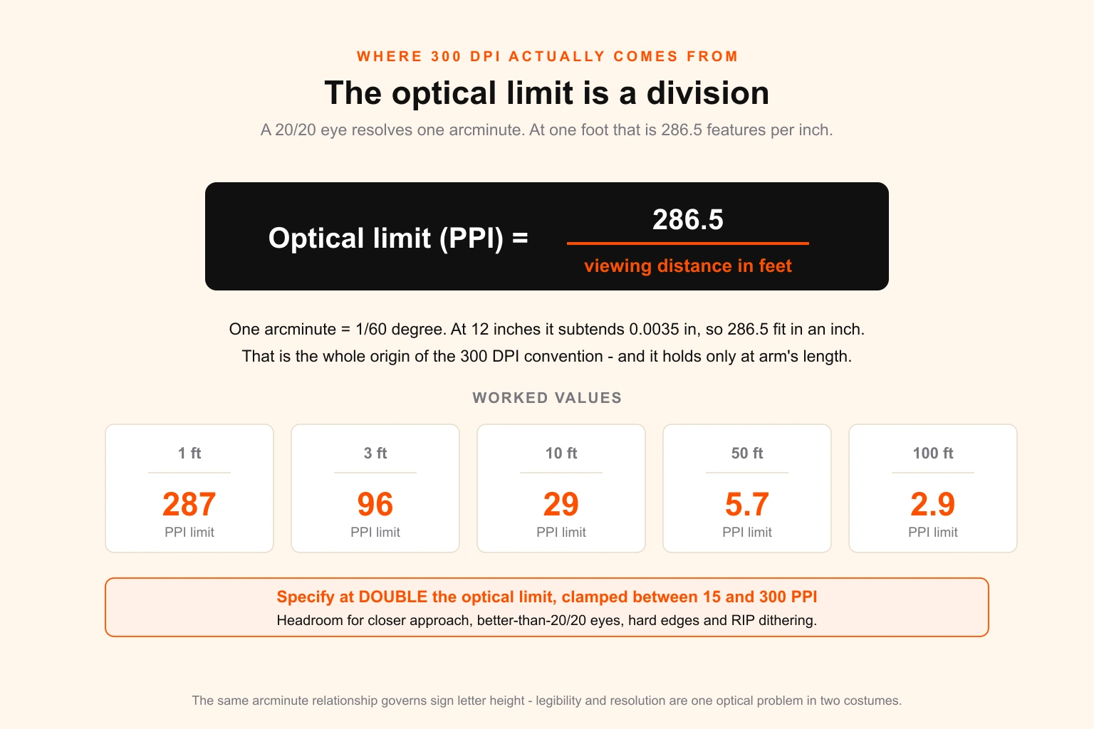
A person with 20/20 vision resolves detail down to about one arcminute — one sixtieth of a degree. At a viewing distance of one foot, one arcminute subtends 0.0035 inches. Invert that and you get 286.5 features per inch. Round it up for safety and you have 300.
That is the entire origin of the number. It is not about print quality, ink, paper or professionalism. It is the density at which a 20/20 eye stops being able to tell the difference, at a distance of twelve inches, which happens to be roughly how far a magazine sits from your face.
Change the distance and the number changes with it, in a straight line:
Optical limit (PPI) = 286.5 ÷ viewing distance in feet
At two feet, 143 PPI. At five feet, 57. At twenty feet, 14. At a hundred feet — the working distance for a highway bulletin — 2.9 PPI. Beyond those figures you are not adding quality. You are adding data that physically cannot reach the viewer's retina as distinct detail.
This is the same relationship that governs how tall sign letters need to be at a given viewing distance, and the constant is identical because it is the same eye doing the same job. Legibility and resolution are both angular problems wearing different clothes.
Why the working specification is double the optical limit
If the optics say 96 PPI at three feet, why does every experienced print producer specify 150 to 200?
Five reasons, all of them legitimate:
Nobody stands where you planned. The nominal viewing distance for a trade show backwall is quoted as ten feet. Visitors stand at the counter, eighteen inches away, reading the small print. The nominal distance is a fiction; the closest realistic approach is the real specification.
20/20 is not the ceiling. It is the median. A meaningful share of adults, particularly under forty, see at 20/15 or better, resolving a third more detail than the formula assumes.
Edges alias before tones do. Continuous-tone photography degrades gracefully as resolution drops. Hard edges — type, logos, rules, product silhouettes — go stair-stepped and visibly wrong well before the photograph next to them looks soft.
The RIP needs headroom. Halftone screening and stochastic dithering both consume some of your resolution to build tone. Supplying exactly the acuity limit leaves nothing for the process itself.
Files get resaved. Between your export and the press there is usually a colour conversion, a flatten, sometimes a JPEG round-trip. Headroom absorbs that.
So the working rule is: double the optical limit at the closest realistic approach distance, then clamp the result between about 15 and 300 PPI. The lower clamp exists because below roughly 15 PPI the RIP's own interpolation and the dither pattern become the limiting factor rather than your file. The upper clamp exists because nothing views print closer than a foot.
The number, by format
Every figure below is PPI at final print size. That qualifier is doing an enormous amount of work and the next section explains why.
| Format | Closest realistic approach | Optical limit | Specify at final size |
|---|---|---|---|
| Gallery print, fine art reproduction | 1 ft | 287 PPI | 300 PPI |
| Retail poster, window graphic, light box | 1.5 ft | 191 PPI | 250–300 PPI |
| 24×36 poster, point of sale | 1.5–2 ft | 143–191 PPI | 200 PPI |
| Trade show banner, roll-up, backwall | 2–3 ft | 96–143 PPI | 150–200 PPI |
| Wall mural, environmental graphic | 3–4 ft | 72–96 PPI | 150 PPI |
| Exhibition panel, museum graphic | 2–3 ft | 96–143 PPI | 200 PPI |
| Vehicle wrap, fleet graphics | 5 ft | 57 PPI | 100–150 PPI |
| Hoarding, construction barrier | 6–8 ft | 36–48 PPI | 72–100 PPI |
| Building banner, mesh | 15–25 ft | 11–19 PPI | 40–72 PPI |
| Stadium and arena graphics | 30–60 ft | 5–10 PPI | 25–40 PPI |
| Billboard, 14×48 bulletin | 100 ft+ | 2.9 PPI | 15–20 PPI |
| Wallscape, building wrap | 200 ft+ | 1.4 PPI | 10 PPI |
Two things about this table are worth stating explicitly, because they are where the arguments start.
The billboard row is correct. A 14 by 48 foot bulletin genuinely is built at 15 PPI at full size, and it looks flawless. The standard build is a working file at ten per cent scale at 150 DPI. Every out-of-home network in the world publishes a spec sheet that says approximately this, and every designer who has not done one before assumes it must be a typo.
The trade show row is where money gets lost. If you specify a backwall against its nominal ten-foot viewing distance you will land at 30 PPI, the graphic will be technically defensible and it will look cheap, because the person deciding whether to talk to your sales team is standing three feet away looking at it. Design the largest surfaces for the closest approach.
Effective resolution: the failure nobody sees coming
Here is the single most useful concept in this guide, and the reason most soft prints happen.
A file's stated resolution is a label. Its effective resolution is what prints.
Place a 300 PPI photograph into a layout and scale it to 400 per cent. The file metadata still says 300 PPI. The Photoshop Image Size dialogue still says 300. What lands on the substrate is 75 PPI, because you have spread the same pixels over four times the width.
Effective PPI = native PPI ÷ scale factor
or, more usefully: Effective PPI = pixel width ÷ final print width in inches
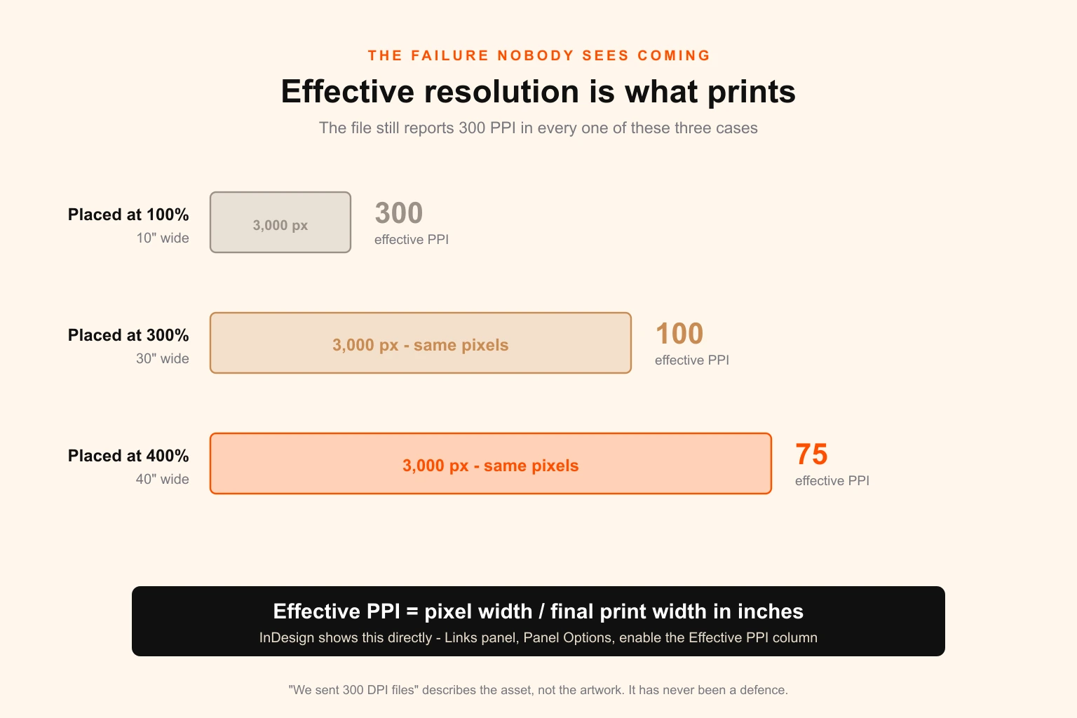
The second form is the one to internalise, because it needs no knowledge of what the file claims. A 3,000 pixel wide image printed 60 inches wide is 50 PPI, full stop, no matter what any dialogue box says about it.
This is why "we sent 300 DPI files" is not a defence and never has been. It describes the asset, not the artwork.
Where to check it, in four applications
| Application | Where to look |
|---|---|
| InDesign | Links panel → Panel Options → enable Effective PPI. Shows actual and effective side by side for every placed image. |
| Illustrator | Select the placed image; the Control bar reports the PPI after scaling. Document Info → Linked Images lists them all. |
| Photoshop | Image Size → uncheck Resample → type the final print width → read the resolution that results. |
| Acrobat | Preflight, or Output Preview → Object Inspector. The only one of the four that audits a supplied PDF you did not build. |
The InDesign Effective PPI column is off by default, which is a small piece of interface design responsible for a genuinely large amount of reprinting. Turn it on once, on every machine in the studio, and a whole category of error disappears.
The pre-flight number to actually check
For any raster element in a large format layout, compute:
effective PPI = image pixel width ÷ final placed width in inches
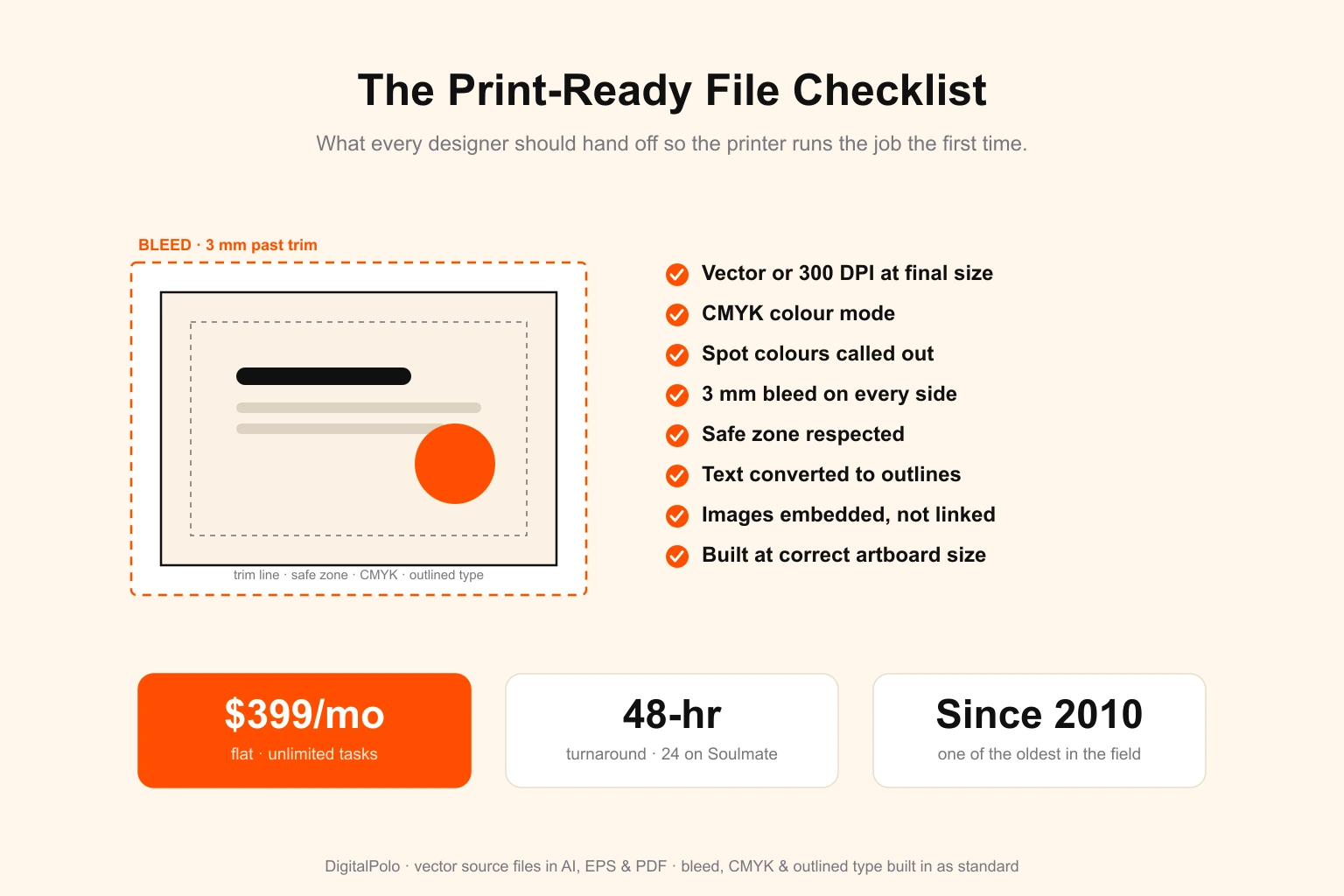
Then compare it against the table above. Anything below the specified figure is a decision, not an accident — sometimes an acceptable one. Anything below half the specified figure should be replaced, rebuilt or re-shot. This check belongs in your print-ready file checklist alongside bleed, colour mode and outlined type, and it is the one item on that list that cannot be verified by looking at the artwork on screen.
Working at scale, because full size is often impossible
At some size, a full-size working file stops being merely inconvenient and becomes technically impossible. Most designers discover this the hard way, mid-project.
The three ceilings you will hit
The PDF page size limit is 200 × 200 inches. The PDF specification describes pages in units of 1/72 inch with a 14,400-unit maximum, which works out to 200 inches — 16 feet 8 inches. A 48 foot billboard cannot be described as a full-size PDF page at all. This is not a software preference; it is the file format.
Illustrator artboards max out at 227 × 227 inches. Photoshop's PSD format caps at 30,000 pixels per side; the large-document PSB format extends to 300,000 pixels but produces files no RIP will happily consume. TIFF has a hard 4 GB ceiling in its classic form.
The pixel arithmetic gets absurd before any of that. This is the one worth showing.
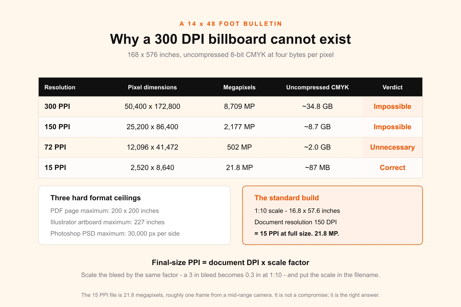
A 14 × 48 foot bulletin is 168 × 576 inches.
| At | Pixel dimensions | Megapixels | Uncompressed CMYK |
|---|---|---|---|
| 300 PPI | 50,400 × 172,800 | 8,709 MP | ~34.8 GB |
| 150 PPI | 25,200 × 86,400 | 2,177 MP | ~8.7 GB |
| 72 PPI | 12,096 × 41,472 | 502 MP | ~2.0 GB |
| 15 PPI | 2,520 × 8,640 | 21.8 MP | ~87 MB |
The 15 PPI file is 21.8 megapixels — about what a mid-range camera produces in a single frame — and it is the correct file. The 300 PPI version is not a better file. It is an unopenable one that describes detail no motorist will ever see.
The scale convention, and the only formula you need
Build the document at a fraction of final size and raise the document resolution by the inverse. The relationship is exact:
Final-size PPI = document DPI × scale factor
| Working scale | Document DPI | Final size PPI | Typical use |
|---|---|---|---|
| 1:1 (100%) | 150 | 150 | Banners and wall graphics under 16 ft |
| 1:1 (100%) | 300 | 300 | Posters, light boxes, rigid panels |
| 1:2 (50%) | 300 | 150 | Large banners, exhibition backwalls |
| 1:4 (25%) | 300 | 75 | Vehicle wraps, hoardings |
| 1:4 (25%) | 600 | 150 | High-detail wraps, close-approach murals |
| 1:10 (10%) | 300 | 30 | Building banners, stadium graphics |
| 1:10 (10%) | 150 | 15 | Standard billboard and bulletin build |
Three rules that make working at scale safe:
State the scale in the filename. bulletin-14x48_1-10-scale_150dpi.pdf is unambiguous. A file called final_v3.pdf at ten per cent scale is a mis-print waiting to happen, and it will be blamed on the printer.
Scale the bleed with the document. A 3 inch bleed at 1:10 is 0.3 inches in your working file. Bleeds, hems, pole pockets and grommet allowances are all real-world dimensions and all of them shrink by the same factor. Get this wrong and the artwork is right but the trim is not.
Keep everything that can be vector, vector. This is the escape hatch from the whole problem, and it deserves its own section.
The vector escape hatch
The resolution question only ever applies to raster content. Type, logos, flat shapes, rules and gradients built as vector are resolution-independent: mathematically perfect at 15 PPI and at 3,000.
This reframes the problem completely. You do not need a high-resolution billboard. You need a high-resolution photograph on a billboard where everything else is vector. The headline on a bulletin built at 15 PPI is not 15 PPI — it has no resolution at all, because it is an outline, and its edge is as clean as the cutter can render it.
That single decision is worth more than any amount of upsampling:
- Type: always vector, always converted to outlines before release. Live type at any scale is a font-substitution risk on the RIP.
- Logos: vector, from the master artwork. A logo pulled from a website is a 200 pixel PNG, and it will be the first thing that looks wrong.
- Backgrounds, panels, gradients: vector where possible. Large flat areas as raster consume enormous file size and gain nothing.
- Photography: raster, obviously — and this is where your entire pixel budget should go.
If the distinction between the two is not second nature to everyone in your studio, vector versus raster is the fundamental worth twenty minutes, because at large format the consequences are visible from across the street rather than under a loupe.
The four different numbers all called "DPI"
Most of the confusion in this subject comes from four unrelated measurements sharing one abbreviation. Separating them ends most spec arguments in a sentence.
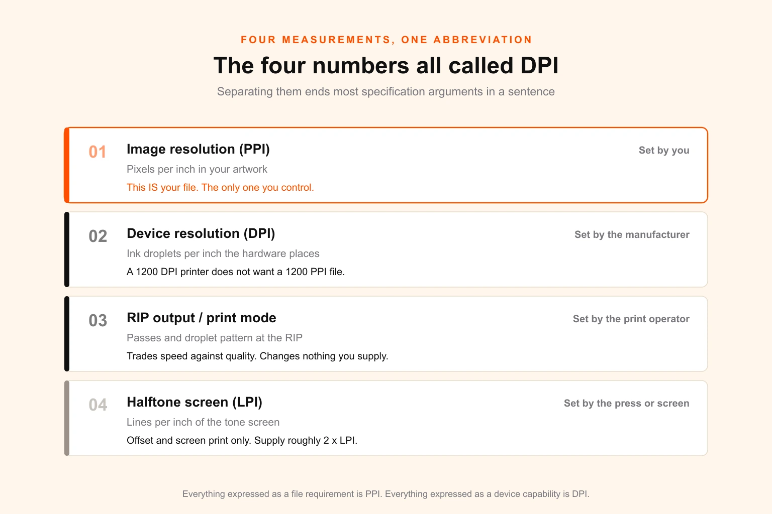
| Term | What it measures | Who sets it | Does it change your file? |
|---|---|---|---|
| Image resolution (PPI) | Pixels per inch in your artwork | You | This is your file |
| Device resolution (DPI) | Ink droplets per inch the hardware places | The manufacturer | No |
| RIP output / print mode | Passes and droplet pattern selected at the RIP | The print operator | No |
| Halftone screen (LPI) | Lines per inch of the tone screen | The press or screen setup | Only for offset and screen print |
Device DPI is the one that causes the trouble. A latex or eco-solvent roll printer commonly runs 1200 × 1200 DPI. That does not mean it wants a 1200 PPI file. The machine uses many droplets of a small number of fixed ink colours to simulate one continuous-tone pixel — that is what the extra droplets are for. A 1200 DPI device reproduces a 200 PPI image at full quality and gains nothing from 1200 PPI beyond a slower RIP.
LPI still matters where there is a real halftone. For offset-printed posters and screen-printed banners the traditional relationship holds: supply roughly 2 × LPI in image PPI. A 150 LPI offset poster wants 300 PPI. An 85 LPI screen-printed banner wants about 170. Large format inkjet uses stochastic dithering rather than a fixed line screen, so LPI simply does not apply — which is exactly why inkjet large format tolerates such low input resolutions gracefully.
The substrate is usually the real limit
You can supply a perfect file and still lose the detail, because the material caps what any device can reproduce. On large format this is frequently the binding constraint, and almost nobody accounts for it at design stage.
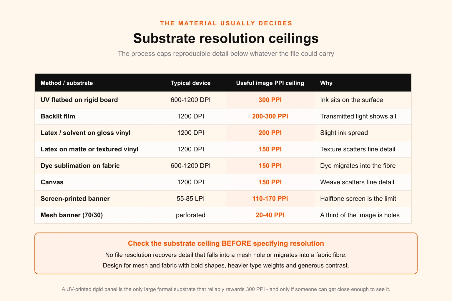
| Method / substrate | Typical device | Useful image PPI ceiling | Why |
|---|---|---|---|
| UV flatbed on rigid board | 600–1200 DPI | 300 PPI | Sharpest large format process; ink sits on the surface |
| Latex / eco-solvent on gloss vinyl | 1200 DPI | 200 PPI | Slight ink spread; excellent but not flatbed-sharp |
| Latex on matte or textured vinyl | 1200 DPI | 150 PPI | Surface texture scatters fine detail |
| Dye sublimation on fabric | 600–1200 DPI | 150 PPI | Dye migrates into the fibre, softening every edge |
| Backlit film | 1200 DPI | 200–300 PPI | Close approach and transmitted light expose everything |
| Screen-printed banner | 55–85 LPI | 110–170 PPI | Halftone screen is the limit, not the file |
| Mesh banner (70/30) | perforated | 20–40 PPI | The holes are the resolution; 30% of the image is absent |
| Canvas | 1200 DPI | 150 PPI | Weave texture at roughly the same scale as fine detail |
The mesh banner row is the clearest illustration. A 70/30 mesh is physically perforated across roughly a third of its area. No file resolution recovers detail that falls into a hole. Design for mesh with bold shapes, heavy type and generous contrast — the same discipline that governs any high-contrast application — and stop thinking about PPI entirely.
Dye sublimation catches people out for the opposite reason: the process looks premium, the fabric feels premium, and the client cannot understand why the fine serif type in their brand mark has gone slightly fuzzy. The dye moved. It always moves. Specify a heavier weight for fabric, or accept it.
Upsampling: when it helps, when it is theatre
Resampling upward adds no information. Everyone knows this, and it leads to a wrong conclusion, which is that upsampling is always pointless.
When upsampling genuinely helps: RIPs interpolate badly. Many use nearest-neighbour or bilinear scaling because they must process gigabytes at speed. If you supply a 100 PPI image that will be scaled up at the RIP, you have handed the worst interpolator in the chain the most important job. Resampling in Photoshop with Preserve Details 2.0 before export produces a visibly better edge than the RIP will.
Where the limit sits: about 200 per cent. Doubling linear dimensions is reliably safe with a good interpolator. Beyond that, artefacts — halos on high-contrast edges, plastic-looking skin, smeared texture — become visible at the exact viewing distance you were designing for.
When it is theatre: resampling a file purely to satisfy a number on a spec sheet. Take a 72 PPI image, resample it to 300 PPI, and you now have a file that reports 300 PPI, contains 72 PPI of information, and occupies seventeen times the disk space. Nothing improved. You have made the problem invisible to pre-flight rather than solved it, which is worse than leaving it visible.
The honest alternatives, in order of preference: source the original at native size, re-shoot, rebuild the element as vector, redesign the layout so the weak image is smaller, or use a machine-learning upscaler and inspect the result at 100 per cent before committing. Buying a correctly licensed high-resolution original is usually cheaper than the reprint, and it is worth knowing what your stock licence actually permits at production print runs before you scale anything to twenty feet.
Five failures that keep recurring
The nominal viewing distance fiction. Specifying a backwall for ten feet when visitors stand at three. Always design the largest surfaces for the closest realistic approach, not the average one.
The logo pulled from the website. Everything else in the file is immaculate and the brand mark is a 240 pixel PNG with a white box behind it. Large format magnifies this to the point of absurdity — a 240 pixel logo across four feet is 5 PPI, and it will be the first thing anyone notices. This is precisely what a proper brand guidelines document exists to prevent, by naming the master vector file and where it lives.
Bleed that did not scale. The artwork is right, the working file is at 1:10, and the 3 inch bleed was drawn at 3 inches instead of 0.3. Everything trims wrong. Compounding this, hems, pole pockets and grommet zones each eat real estate — a pole pocket takes 3 to 4 inches of your design out of view entirely.
Effective resolution never checked. Every linked asset is 300 PPI, several are scaled 400 per cent in the layout, nobody enabled the Effective PPI column, and the whole thing prints at 75. This is the most common cause of a genuinely soft large format print and the easiest to eliminate permanently.
Colour treated as an afterthought. Resolution gets all the attention and colour causes more rejections. Large format inkjet gamuts differ substantially from sheet-fed offset, and the same brand orange will not land the same on gloss vinyl, matte fabric and a UV-printed rigid board. Specify spot references and check the build — the reasoning behind CMYK versus RGB applies with less latitude at this scale, and a Pantone to CMYK reference is the fastest sanity check before anything goes to the shop.
The proof, before you commit
There is one test that settles any resolution argument in ten minutes and costs almost nothing.
Print a 1:1 tile. Take the most detailed region of the artwork — the area with the finest type, the tightest texture or the most important product detail — crop a portion at full print scale, and output it on A3 or a short strip of the actual media. Pin it up. Stand at the real viewing distance.
That is the whole test. It bypasses every argument about numbers because it substitutes the actual eye at the actual distance, which is what the numbers were approximating all along. Run it on the actual substrate where you can, because it also catches the dye migration, the texture scatter and the colour shift that no PPI figure describes.
For anything above about $2,000 of production, a 1:1 tile is not an optional refinement. It is the cheapest insurance available.
Two worked examples
A 10 × 8 foot fabric backwall for a trade show. Nominal viewing distance ten feet; realistic closest approach two to three feet at the counter. Specify 200 PPI at final size. Full size at 200 PPI is 24,000 × 19,200 pixels, or 461 megapixels — heavy but not impossible. The practical build is 1:2 scale at 400 DPI, which is the same 200 PPI at final size in a file a quarter the area. Dye sublimation caps useful detail at roughly 150 PPI anyway, so the 200 figure is providing headroom for the closest approach rather than raw detail. Type and logos vector throughout; photography is the only raster content. Keep critical content 3 inches inside the trim on every edge for the silicone edge gasket, and remember that the production lead time on fabric is longer than on vinyl — colour approval, not printing, is what makes it late.
A 14 × 48 foot bulletin. Viewing distance 100 feet and upward, at 55 mph. Optical limit 2.9 PPI; specify 15 PPI at final size. Build at 1:10 scale — 16.8 × 57.6 inches — at 150 DPI. Note that this is also the only way to produce a PDF at all, since 48 feet exceeds the format's 200 inch page limit. All type and the logo are vector, so the message edges are perfect regardless. The photography needs to be 8,640 pixels wide at minimum, which any full-frame camera file exceeds comfortably. Three words maximum on the headline, because the reading time available at speed is under four seconds and no amount of resolution buys you a fourth word.
The spec to send, and the spec to ask for
When you brief a printer, ask two questions and the ambiguity disappears:
- What PPI do you want at final print size?
- At what scale do you want the file built?
When you release artwork, state both in writing and in the filename. A release note that says "1:10 scale, 150 DPI document, 15 PPI at final size, bleed 0.3in in-file equals 3in at full size, all type outlined, spot colours as Pantone references" removes every reasonable way for the job to come back wrong.
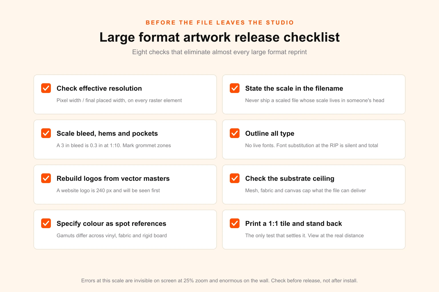
- Check effective resolution on every raster element — pixel width ÷ final placed width, compared against the format table. Not the file's stated PPI.
- State the scale in the filename and in the release note. Never ship a scaled file whose scale is only in someone's head.
- Scale the bleed, hems and pole pockets by the same factor as the document, and mark grommet and pocket zones on a locked layer.
- Outline all type; rebuild all logos from vector masters. No live fonts, no web-sourced marks.
- Check the substrate ceiling before specifying resolution — mesh, fabric and canvas cap what the file can deliver.
- Specify colour as spot references where the brand depends on it, not as a process build alone.
- Confirm the RIP's preferred format — most large format shops want PDF/X-4 or flattened TIFF, not a native application file.
- Print a 1:1 tile of the most detailed region on the real substrate and view it at the real distance before releasing the full run.
If you already run a print-ready file checklist for general production work, treat this as its large format extension. The fundamentals are shared with every other print-ready discipline — from packaging dielines to cut lines on vinyl decals to label artwork. What changes at large format is the scale of the consequence and the fact that the usual number is the wrong one.
Getting it produced
Large format is unforgiving in a specific way: the errors are invisible on screen and enormous on the wall. A 75 PPI effective resolution looks identical to 300 in your layout at 25 per cent zoom, and looks like a mistake from across a room.
Digital Polo has produced print and large format artwork for brand owners, print shops and resellers since 2010, including white-label production for sign and banner shops, wrap installers and print businesses who need scale-correct, RIP-ready files without carrying a studio. If large format sits inside a wider identity programme, the resolution and scale conventions belong in the brand guidelines alongside colour and typography, so the twentieth banner comes out right without anyone re-deriving the arithmetic.
For teams producing print continuously, our design plans cover print-ready artwork on a flat monthly fee, and agencies, printers and manufacturers reselling design under their own name can do the same white-label. Print shops weighing whether to build this capability in-house or buy it should look at the utilisation maths first, and at what design work is actually worth charging for.
If you would rather just check a number, the large format resolution calculator is free, needs no sign-up, and will tell you the optical limit, the working specification and the pixel dimensions for any size and distance you give it.