If you have ever sent a beautifully saturated design to a printer and got back something that looked drained, washed out and slightly grey — you have run into the CMYK vs RGB problem. It is the single most common reason "what I see on my screen" doesn't match "what the printer ships."
This guide is the full 2026 explainer. What the four-letter abbreviations actually mean, why files look different on screen and paper, the conversion gotchas that ruin print runs, and how to set the colour mode correctly the first time.
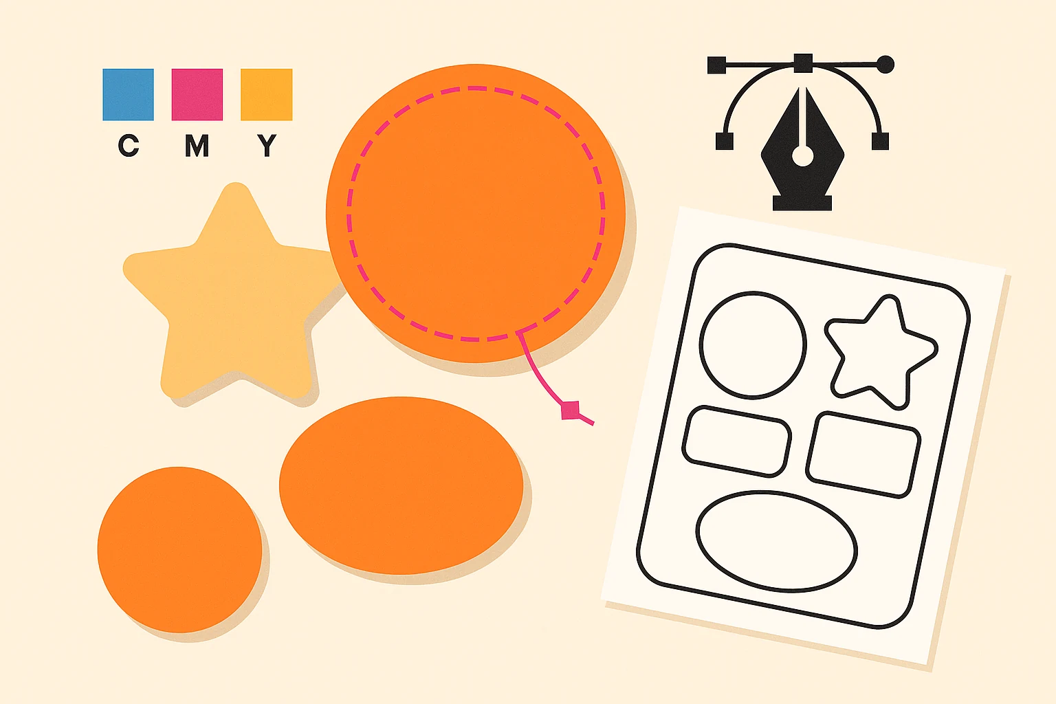
Quick answer: CMYK (Cyan, Magenta, Yellow, Key/black) is used for printing. RGB (Red, Green, Blue) is used for screens. Use CMYK for anything that touches paper, fabric, vinyl, or any physical substrate. Use RGB for anything that lives on a screen. Files designed in one mode and exported in the other will shift colour — sometimes a little, sometimes dramatically.
What CMYK Actually Means
CMYK stands for Cyan, Magenta, Yellow, Key. Key means black — the abbreviation uses K instead of B to avoid confusion with Blue. The four inks are laid down as percentages from 0% to 100% and overlapping percentages produce the full range of printable colours.
CMYK is a subtractive colour model. The printed inks absorb (subtract) wavelengths of light, and the colours you see are what is reflected back from the paper. White is achieved by printing nothing — the paper itself reflects all wavelengths. Black is the densest combination (or just K-100, much cheaper than mixing 100% of all four).
You will find CMYK in:
- Commercial offset printing (brochures, magazines, packaging)
- Digital printing (short-run brochures, business cards, postcards)
- Inkjet and laser printers
- Most screen-printing setups
- Sublimation and DTG with adjusted gamut compensation
What RGB Actually Means
RGB stands for Red, Green, Blue. Every pixel on every screen emits a mix of red, green and blue light at values from 0 to 255 each. Adding all three at full intensity produces white. Setting all three to zero produces black (the screen is off). Mixing values produces every colour your screen can display.
RGB is an additive colour model. The screen is emitting light directly into your eye, so wavelengths add together to produce the colour you see.
You will find RGB in:
- Every website, mobile app, and digital interface
- Social media graphics (Instagram, Facebook, LinkedIn, TikTok, X)
- Digital ads (Google, Meta, programmatic)
- Email templates and HTML campaigns
- Presentation decks (Google Slides, Keynote, PowerPoint)
- Video thumbnails and YouTube assets
Side by Side: CMYK vs RGB
| CMYK | RGB | |
|---|---|---|
| Stands for | Cyan, Magenta, Yellow, Key (black) | Red, Green, Blue |
| Used for | Print (paper, card, fabric, vinyl) | Screens (web, social, video) |
| Model | Subtractive — inks absorb light | Additive — pixels emit light |
| Channels | 4 (cyan, magenta, yellow, black) | 3 (red, green, blue) |
| Channel range | 0% to 100% per channel | 0 to 255 per channel |
| Gamut size | Smaller (~70% of human visible range, depending on substrate) | Larger (~90% of human visible range on sRGB) |
| Vivid greens, blues, oranges | Often duller in CMYK | Bright and saturated on screen |
| Black | Pure K-100 or "rich black" (e.g., C40 M30 Y30 K100) | RGB (0, 0, 0) |
| White | The paper showing through (no ink) | RGB (255, 255, 255) |
| Final output | Printed on a physical substrate | Displayed on a screen |
Why Your CMYK File Looks Duller Than Your RGB Version
Because the CMYK gamut is smaller than the RGB gamut.
The gamut of a colour model is the range of colours it can reproduce. RGB on a typical monitor can produce vivid neon greens, electric blues, and saturated oranges that simply cannot be reproduced by mixing four printing inks on paper. When you convert an RGB file to CMYK, your design software finds the closest CMYK approximation for every out-of-gamut RGB colour — and that approximation is usually duller and slightly shifted.
This is not a bug. It is a physical limitation of the difference between emitting light directly (RGB monitor) and absorbing and reflecting light off a paper surface (CMYK print).
The fix is not to try to make CMYK look like RGB. The fix is to design in CMYK from the start when print is the goal, so you are working inside the printable gamut from the first decision.
The Five Conversion Gotchas That Ruin Print Runs
- The brand-blue dulls catastrophically. Many tech-brand blues sit just outside the CMYK gamut and shift to a grey-blue on conversion. Specify the brand colour as a Pantone reference for print and let the printer mix the spot ink instead of relying on CMYK process.
- The rich black goes muddy. Pure K-100 is fine for body type but looks grey at large fill areas. Use rich black (typical formula: C40 M30 Y30 K100, or check your printer's preferred mix) for large dark fields, but never for small body type — registration shifts will make tiny text look fuzzy.
- Bright greens go olive. Vivid greens with high green channel values in RGB shift toward olive or muddy green in CMYK. Either accept the shift, design with the printable green from the start, or use a Pantone spot for brand greens.
- The conversion happens twice. Some workflows convert RGB → CMYK on export and then the printer's RIP software converts again to its own ICC profile. Each conversion compounds the shift. Ask your printer for their preferred ICC profile and export directly to it.
- Photographs lose punch. Photos taken in sRGB often have saturated areas that shift on conversion. For photo-heavy print work, soft-proof in your design software before export so you see the conversion preview at design time.
How to Convert RGB to CMYK Without Ruining Your Design
Three rules that almost always hold:
- Convert as late as possible in your workflow. Edit in RGB. Convert to CMYK on export, or in a final pass before sending to print. This keeps maximum editability throughout the design phase.
- Use your software's built-in conversion with the right ICC profile. Photoshop: Image → Mode → CMYK Colour. Illustrator: File → Document Colour Mode → CMYK Colour. Both use embedded ICC profiles (US Web Coated SWOP v2 is the most common North American default; Coated FOGRA39 is the European default — ask your printer which they use).
- Soft-proof and adjust the saturated areas manually if they shift too far. In Photoshop: View → Proof Setup → Custom → pick your CMYK profile → enable View → Proof Colours. You'll see the CMYK preview without leaving RGB mode. Adjust the worst colour shifts manually.
For brand-critical colours specify a Pantone reference and let the printer mix the spot ink. CMYK process is fine for everything else.
Should I Use CMYK or RGB for a Logo File?
Deliver both. A proper logo package includes:
- A master vector file (AI / EPS) in CMYK for print applications.
- A sibling export in RGB (or sRGB specifically) for web, social, and digital.
- A version with Pantone references called out for any brand-critical colours that must look consistent across substrates.
Brand guidelines should specify all three — CMYK values, RGB values, and Pantone references — for every brand colour. That way the logo on a business card matches the logo in the website header matches the logo on a vehicle wrap.
What About Pantone, Hex, HSL and LAB?
While we are here:
- Pantone is a library of pre-mixed spot inks. Pantone 186 C is a specific physical formula, not a CMYK approximation. Pantone produces more consistent colour across print runs but costs more per print job because each Pantone colour needs its own plate. Premium brands and packaging often add 1–2 Pantone spot colours alongside CMYK.
- Hex (#FF4F01) is a six-digit RGB shorthand used in web design. Every hex code is an RGB triplet — #FF4F01 means R-255, G-79, B-1.
- HSL (Hue, Saturation, Lightness) is another way to describe a colour on a screen. It is mathematically related to RGB but easier for humans to reason about — "make this colour 10% lighter" is a clear instruction in HSL but ambiguous in RGB.
- LAB is a device-independent colour model that approximates human vision. Designers rarely work in LAB directly, but it's the colour space many ICC profiles use internally during conversion.
For day-to-day work: pick CMYK for print, RGB (or hex) for screen, and specify Pantone for brand-critical colours.
When You're Outsourcing Design Work, Spec the Colour Mode
If you are outsourcing design — to a freelancer, an agency, or an unlimited graphic design subscription — always specify the output colour mode in the brief.
- "Brochure for print, CMYK, 3mm bleed" → designer works in CMYK from the start
- "Instagram carousel, RGB" → designer works in RGB and exports at the right pixel dimensions
- "Logo, both modes please" → designer delivers a CMYK master and an RGB sibling
This avoids the most common back-and-forth in print production: "We sent you a file but the colours don't match what we sent" — usually a colour-mode mismatch that could have been avoided with one line in the original brief.
DigitalPolo's unlimited graphic design service delivers files in the colour mode you specify, with Pantone references called out on brand colours, and 3mm bleed by default on anything print-bound. See our plans →
Bottom Line
CMYK for print. RGB for screens. Convert as late as possible. Soft-proof before exporting. Specify Pantone for brand-critical colours. Deliver logos in both modes.
The single rule that fixes 90% of "why does my print look different from my screen" complaints: design in the colour mode that matches the final output, from the first decision, not as an afterthought before exporting.
That is the whole CMYK vs RGB story.