There is a particular kind of Tuesday that only happens at volume.
Eleven posts are scheduled for the week. Four have images. One editor is in Canva at four in the afternoon, resizing someone else's template because the headline ran to three lines and the type no longer fits. Two posts go live with a stock photograph of a laptop on a desk that has appeared on the blog nine times already. One goes live with no image at all, which means the social preview renders as a grey rectangle and the Slack share looks like a broken link. Nobody has done anything wrong. The system simply has no capacity, because there is no system.
At four posts a month the featured image is a design decision. At forty it is a production line, and production lines fail differently from design decisions. They fail on throughput, on variance, on handoffs and on the absence of a named owner — not on taste. Which is why the question almost every content team eventually asks, template system or bespoke, is the wrong question in a specific and expensive way.
It is wrong because it asks for a policy where the situation calls for a ratio. Forty posts do not carry equal weight. Three of them will be pushed to paid social, sent to the list and linked from the pricing page. Twenty-eight of them will be read by people who arrived from search, never saw the card in the archive grid, and will never encounter the image anywhere else. Applying one production standard to both groups guarantees you are either overspending on twenty-eight posts or underspending on three, and most teams manage to do both at once.
What follows is the arithmetic behind that ratio, the three-tier model that most publishing operations converge on once they have been burned by both extremes, a scoring rule for deciding which post gets which tier before anyone has an opinion about it, the master canvas and crop-safety specs that stop the whole thing breaking on surfaces you do not control, the performance budget, and the governance that determines whether your template system is still a system in eight months or has quietly become four private copies in four different accounts.
If you are earlier than this — if the question is still whether images are worth the trouble at all — how to use images in blog posts to boost engagement and how to make blog posts more engaging with relevant images are the upstream reads. This article assumes you are already convinced and are now trying to produce them at a rate that does not consume a person.
The arithmetic nobody runs before choosing
Start with the numbers, because they settle most of the argument before the aesthetics get involved.
A genuinely bespoke featured image — original illustration, a custom diagram, a directed photograph, something that did not exist before the brief — takes a competent designer sixty to a hundred and twenty minutes including revisions and export. Call it ninety minutes as a planning figure. Forty of those is sixty designer hours a month.
A fully templated image, produced inside a locked template where the only inputs are a headline, a category and a background choice, takes five to eight minutes. Call it six. Forty of those is four hours a month.
That is a fifteen-to-one ratio, and it is why the template argument wins every spreadsheet it enters. But the spreadsheet is measuring the wrong thing, because it compares two production methods on cost while treating their outputs as equivalent. They are not equivalent, and the difference shows up exactly where you can least afford it.
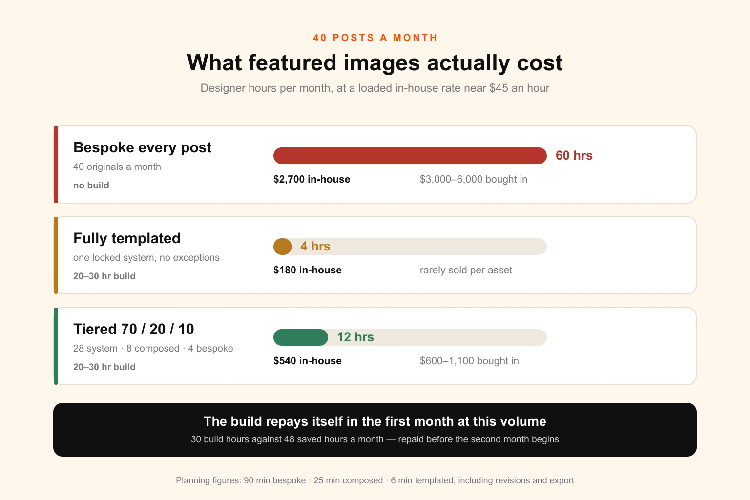
Here is the same picture in money, using a loaded in-house cost of around $45 an hour and a typical freelance range of $75 to $150 per finished image.
| Model | Designer hours / month | In-house cost at $45/hr | Bought per image | One-off build |
|---|---|---|---|---|
| Bespoke every post | 60 | $2,700 | $3,000–$6,000 | — |
| Fully templated | 4 | $180 | rarely sold this way | 20–30 hrs |
| Tiered 70 / 20 / 10 | ~12 | $540 | $600–$1,100 | 20–30 hrs |
Three things in that table are worth more attention than the headline figures.
The first is that the template build is real work and it is not optional. Twenty to thirty hours is what it takes to do properly: a type scale tested against your longest actual headline rather than a convenient one, palette routes mapped to your categories, crop-safe zones established, background treatments built, layers locked, and the whole thing documented well enough that someone who was not in the room can use it. Teams routinely budget two hours for this, produce a nice-looking single artboard, and then discover over the following four months that they built a starting point rather than a system.
The second is that the build pays for itself almost immediately at this volume. Thirty hours against a monthly saving of forty-eight hours is a payback inside the first month, and everything after that is margin. The payback stays short further down the volume curve too — roughly two months at ten posts a month, five or six at four — so the honest argument against building one at low volume is not the payback period. It is that the absolute saving at four posts a month is under six hours, and thirty hours is a large indivisible block of design time to commit against it when it is competing with everything else on the board.
The third is that the per-image freelance model punishes the templated tier specifically. Paying $75 for a job that takes six minutes is a poor trade, and it is a trade almost every freelance arrangement forces on you, because per-asset pricing does not distinguish between assembly and creation. This is the structural reason content teams with real volume tend to end up on a retainer or a subscription rather than a per-asset relationship — the work is unpredictable in composition and predictable in volume, which is precisely the shape that per-asset pricing handles worst.
What a template system actually is
A folder of Canva files is not a template system. This distinction matters more than it sounds, because the folder is what most teams have when they believe they have a system, and it explains why their measured time-per-image never falls to the six minutes the model promised.
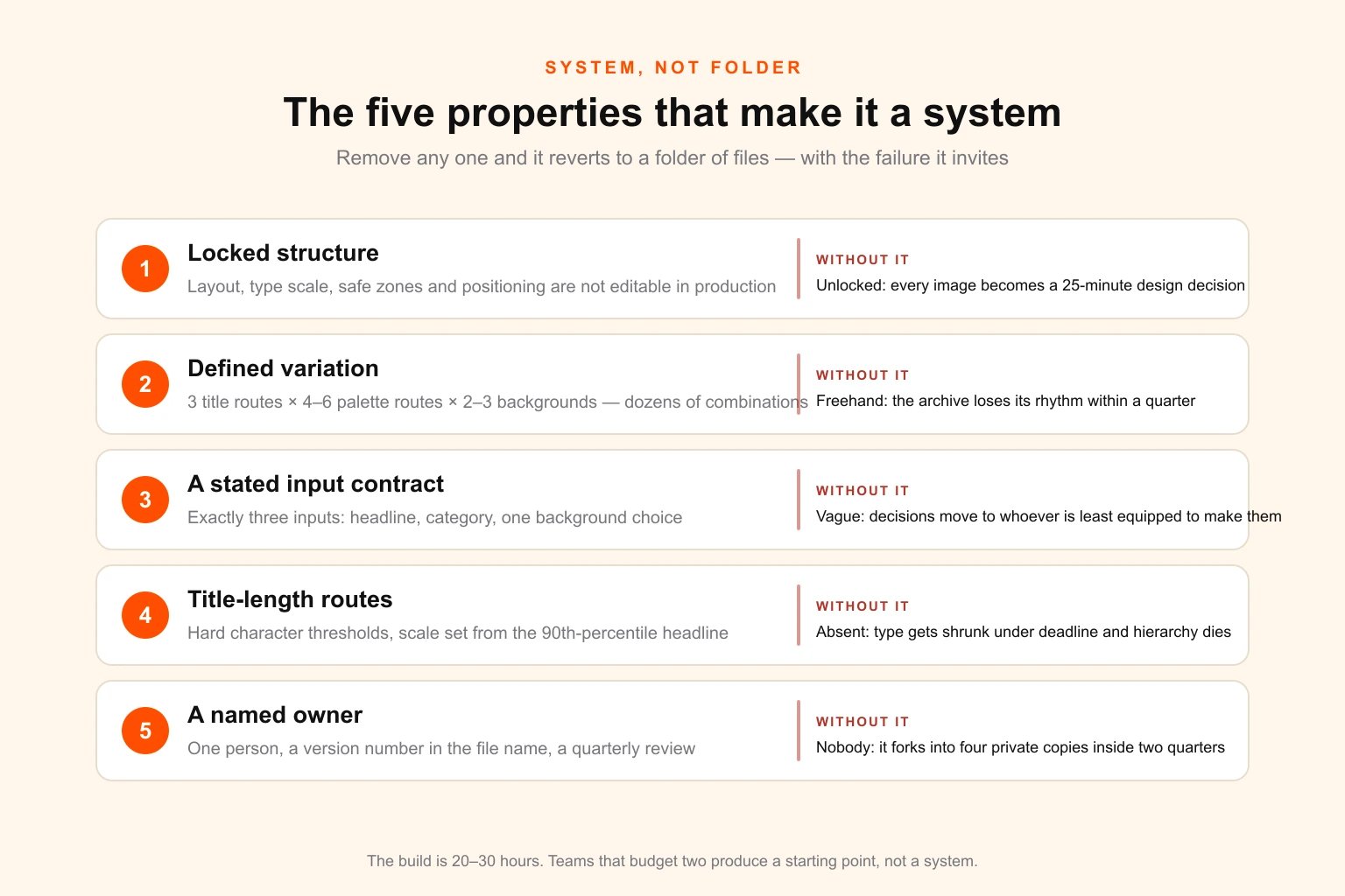
A template system has five properties, and the absence of any one of them turns it back into a folder.
Locked structure. The layout, the type scale, the safe zones and the positioning are not editable during production. If the person making Tuesday's image can move the headline block, they will, and then they are making a design decision — which means the job now takes twenty-five minutes and the archive grid loses its rhythm. Locking is not distrust. It is what converts a design job into an assembly job, which is the entire economic premise.
Defined variation. The system's variety comes from a small set of interchangeable parts, not from freehand. In practice: one type scale with two or three defined title-length routes, four to six palette routes tied to your content categories, and two or three background treatments. That combinatorial space is comfortably in the dozens, which is enough that no two adjacent posts look identical, and small enough that one person can hold it in their head. This is the same logic as design tokens — a constrained set of named decisions, applied consistently, rather than a fresh judgement every time.
A stated input contract. The person running the template supplies exactly three things: a headline, a category, and one of the defined background choices. Nothing else. If they also have to choose a colour, judge a crop, or decide whether the title is too long, you have not removed the design decisions, you have relocated them to someone less equipped to make them.
Title-length routes. The single most common failure point. Your headlines are not all sixty characters, and a system that only works at sixty characters will be broken by the first hundred-and-forty-character title, usually by someone shrinking the type until the hierarchy collapses. Set the type scale from your longest real headline, define two or three explicit size routes with hard character thresholds, and make the route a rule rather than a judgement.
A named owner. Not a team. A person, with a calendar reminder.
If you already maintain brand documentation, this system belongs inside it rather than alongside it. The distinction between a set of rules and a set of usable components is exactly the ground covered in design system vs style guide vs brand guidelines, and a featured image system is a small, concrete instance of the same argument: the guideline tells you the accent colour, the system hands you the file with the accent colour already in it.
The four ways a template system rots
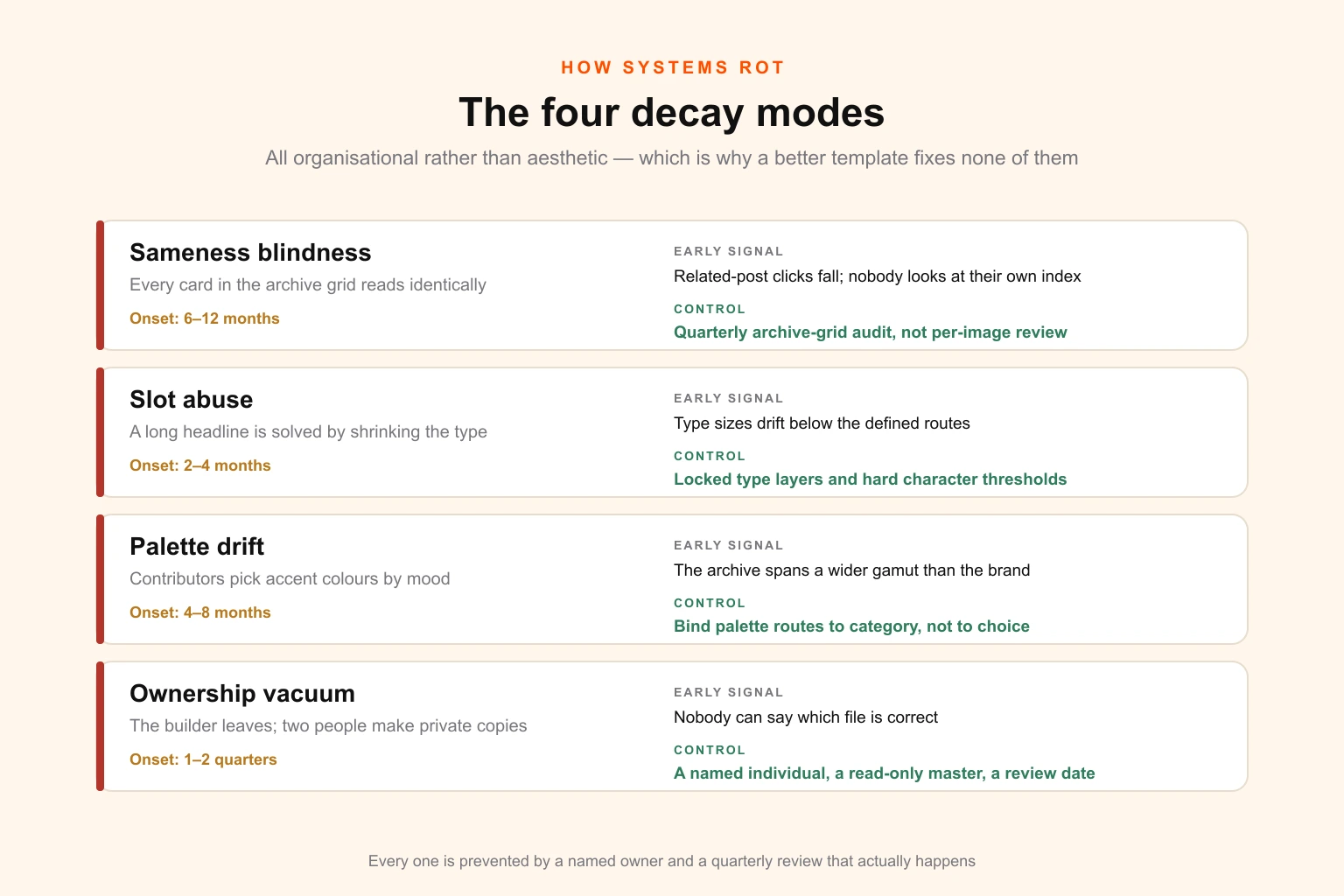
Every template system degrades. The ones that survive are the ones whose owners knew which four directions the degradation comes from and checked for them on a schedule. All four are organisational rather than aesthetic, which is why buying a better template never fixes them.
Sameness blindness. The system works exactly as designed, and eight months later the archive grid is a wall of near-identical cards that the eye slides off. Nobody notices, because nobody looks at their own archive page. The reader does — the index becomes unnavigable, related-post modules stop being clicked, and the visual monotony reads as low editorial investment. The fix is not more layouts. It is deliberate variation across the axes you already have: rotate background treatment by publication order rather than by preference, hold palette routes to categories so the grid gains colour structure, and audit the archive page as a whole every quarter rather than judging images one at a time as they are made.
Slot abuse. A headline arrives that does not fit. Under deadline, the person producing the image shrinks the type, or reduces the leading, or nudges the block up two hundred pixels. Each individual instance is defensible. Fifty of them means the system no longer has a type hierarchy, and the images that came out of it in month one and month nine belong to different families. This is what title-length routes exist to prevent, and it is why the type layers should be locked to the point where shrinking is not available as an option. The correct response to a title that does not fit is a shorter title for the image.
Palette drift. Where the system offers a palette choice rather than a palette rule, contributors choose by mood. Six months on, the accent colours across the archive span a wider gamut than the brand does. Bind palette routes to something non-discretionary — the category, most usefully — and the drift cannot occur, while the grid simultaneously gains a legible colour logic that helps readers navigate it. Getting those routes right in the first place is a genuine design task; colour theory for brand design covers why four routes that work together are harder to pick than four colours that each look fine.
The ownership vacuum. The most lethal and the least visible. The designer who built it moves on. Nobody inherits it. Two people make private copies to fix something small. Within a quarter there are four divergent versions and no authority to say which is correct, and the system has stopped existing while everyone still believes they have one. The prevention is a named individual owner, a version number in the master file name, a genuinely read-only master, and a quarterly review that actually happens.
What bespoke actually buys
The case against bespoke-everything is arithmetic and it is decisive. The case for bespoke-something is narrower than its advocates claim and stronger than its critics allow, and it rests on four things a template genuinely cannot deliver.
Explanatory work. A template can carry a headline. It cannot carry a diagram. When a post's central value is a framework, a comparison, a process or a set of numbers, an image that shows the thing is doing work that no amount of typographic styling replicates — and it is the image most likely to be screenshotted, cited, and lifted into someone else's deck with your URL still on it. This is the highest-return bespoke category by a distance, and it is systematically under-produced because it requires understanding the article rather than reading its title.
Off-site survival. In a feed, in Discover, in a Pinterest column or in an email, your image is competing against images that are not yours and is stripped of every contextual cue that makes the templated version legible on your own site. Templated cards perform respectably on-site, where the surrounding design does half the work, and unremarkably off-site, where it does none. If a post is going to be distributed rather than merely published, the image is a distribution asset and should be budgeted as one.
Reuse. The genuinely underestimated factor. An image commissioned once for a pillar post frequently ends up in a sales deck, a lead magnet cover, a conference slide, an ad and a newsletter header. Judged against a single blog post, ninety minutes of illustration looks expensive. Judged against the six places it eventually appears, it is the cheapest asset in the campaign. This is the same compounding logic as turning one campaign asset into fifteen channel formats, applied to editorial rather than campaign work.
Signal. Some posts are load-bearing for the brand's credibility — the pillar, the research piece, the one linked from the pricing page, the one you send to prospects. A templated card on those posts is not neutral. It reads as a post that nobody thought was important, which is precisely the wrong signal on the page you most want taken seriously.
Notice that none of those four arguments applies to the ordinary Tuesday post. That is the whole finding: bespoke earns its cost on a minority of posts, and the job is identifying which minority, in advance, without an argument.
The three-tier model
Almost every publishing operation that runs at volume for two years arrives at the same structure, usually after trying both extremes first. Three tiers, with an explicit ratio and explicit rules for entry.
Tier 1 — System. Fully templated. Headline, category, one background choice from the defined set. No design decisions, no designer involvement, five to eight minutes, produced by whoever is publishing the post. This is the default and it should cover roughly seventy per cent of output.
Tier 2 — Composed. The locked template skeleton, plus one commissioned or selected focal element — a spot illustration, a cropped photograph, an icon cluster, a simple data figure. The template still governs type, colour, crop-safety and structure; the focal element is what differs. Twenty to thirty minutes, needs a designer or a competent generative workflow feeding into a locked frame. Around twenty per cent of output.
Tier 3 — Bespoke. Original artwork built for this post. Illustration, a real diagram, directed photography, a designed data visualisation. Sixty to a hundred and twenty minutes, always a designer, always briefed. Ten per cent of output — four posts a month at a volume of forty.
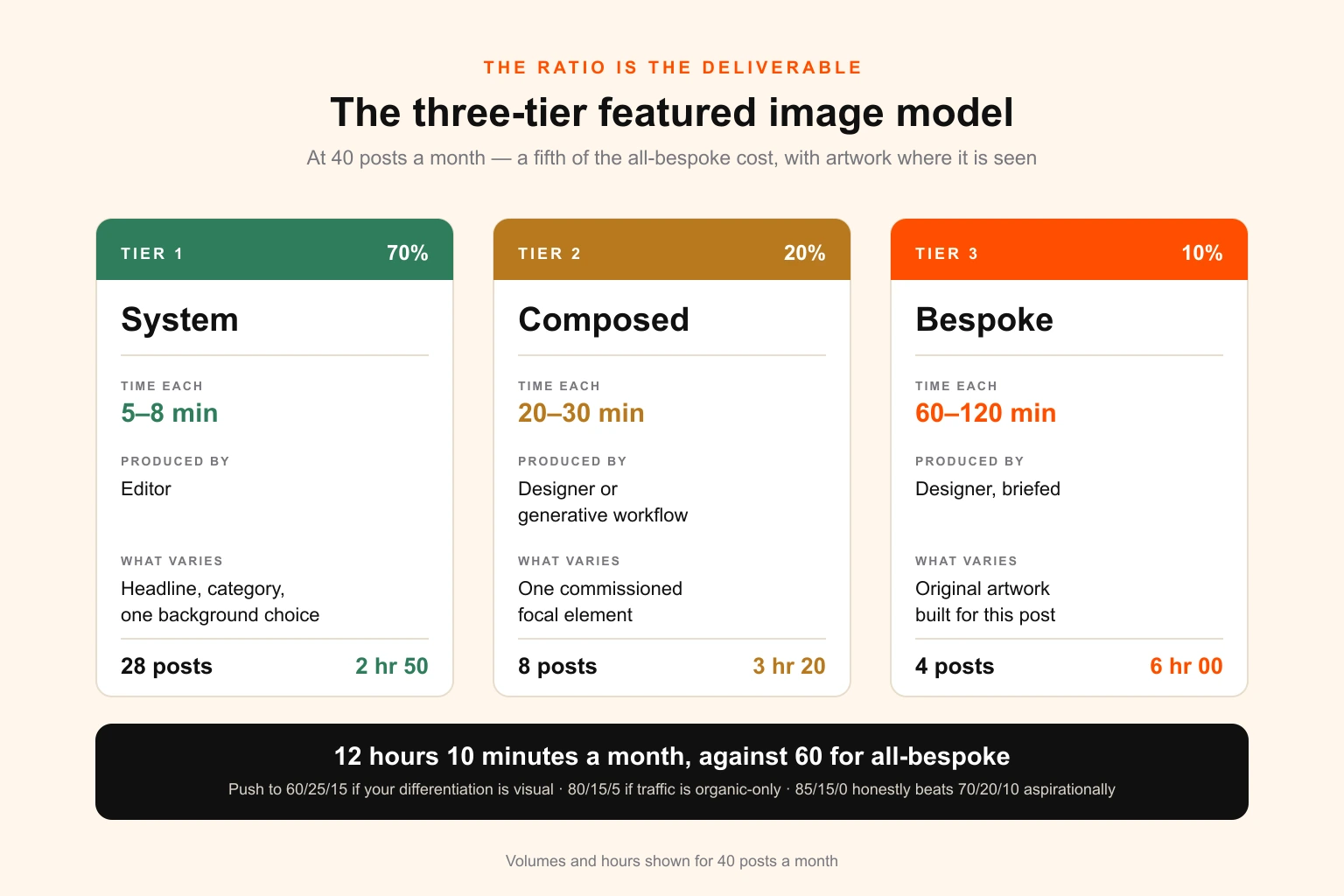
At forty posts a month the mix works out at twenty-eight system images at six minutes, eight composed at twenty-five minutes, and four bespoke at ninety minutes. That is two hours and fifty minutes, plus three hours and twenty minutes, plus six hours — twelve hours and ten minutes in total. A fifth of the all-bespoke cost, and an archive that does not look like a spreadsheet, because the four posts a month anybody actually shares are carrying real artwork.
The ratio is a starting point rather than a law. Three things justifiably move it. A brand whose differentiation is substantially visual should push toward 60 / 25 / 15. A publication whose traffic is overwhelmingly organic and whose posts are rarely distributed can defensibly run 80 / 15 / 5. And a team without the design capacity to sustain a bespoke tier at all is better off running 85 / 15 / 0 honestly than running 70 / 20 / 10 aspirationally and shipping the bespoke tier late, which is worse than not promising it.
Deciding which tier a post gets
This is the decision that quietly determines whether the model works, and it is the one most teams handle worst — by advocacy, at the point of publication, when the writer who cares most about their own post argues for the artwork and the writer who is busy gets a template. That produces a tier distribution that correlates with personality rather than with commercial value.
Score the post instead, at the point the brief is written, before anybody is emotionally invested. Five factors, two points each, ten in total.
Distribution intent (0–2). Will this post be pushed to social, paid or email? Zero for organic-only. One for an organic post plus a routine social share. Two for a post with a real distribution plan behind it.
Commercial proximity (0–2). How close does this sit to a page that makes money? Zero for a general interest piece. One for a post that links to a service page in passing. Two for a post that is a deliberate step in a conversion path.
Visual competitiveness (0–2). Is the surface it will appear on visually contested? Zero for a text-dominated SERP where nobody's thumbnail is doing anything. One where results carry images. Two for Discover, Pinterest or a feed-driven surface where the image is the click.
Shelf life (0–2). How long does this stay relevant? Zero for news or anything time-anchored. One for a piece with a year or two in it. Two for an evergreen pillar you intend to maintain and re-promote.
Reuse (0–2). Will the artwork appear anywhere else? Zero for nowhere. One for one other place. Two for a deck, a lead magnet, an ad or a sales asset.
Zero to three is Tier 1. Four to six is Tier 2. Seven to ten is Tier 3.
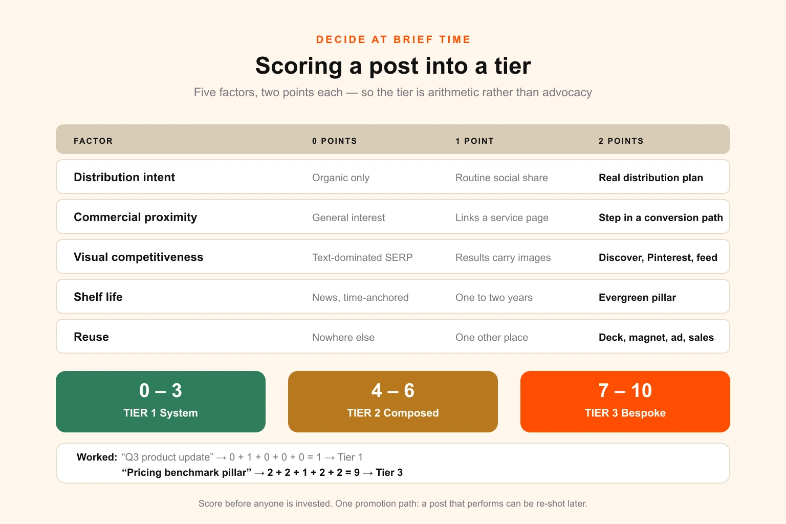
Two properties make this worth the minute it takes. It is auditable — when someone disputes a tier, you discuss the score rather than the taste. And it self-corrects the ratio: if forty posts a month are consistently scoring into Tier 3, your editorial calendar is either genuinely more commercial than you budgeted for or your scoring is generous, and either finding is worth having explicitly.
One caveat worth building in. Score at brief time, but allow one promotion path: a post that unexpectedly performs can be re-shot later. Upgrading the image on a post that has found an audience is among the highest-return design hours available to a content team, and almost nobody does it because the image is treated as a publication-day artefact rather than an asset with a lifecycle.
The specs: one master, many crops
Most featured image problems that look like design problems are actually crop problems, and they happen because the image was built for the one place its designer looked at it.
Design on a 2400 × 1260 master at 1.905:1. That ratio is the Open Graph and large-summary-card ratio, so the most consequential downstream use needs no reframing at all; the resolution gives you a clean 2x for the 1200-wide delivered hero; and it downsamples without artefacting to everything else you need.
Then respect the safe zone. Assume roughly ten per cent will be cropped from any edge by a surface you do not control, and keep all type and any critical subject inside the central region. The failure this prevents is specific and common: a headline that sits beautifully on your article page and loses its first and last words in a LinkedIn preview.
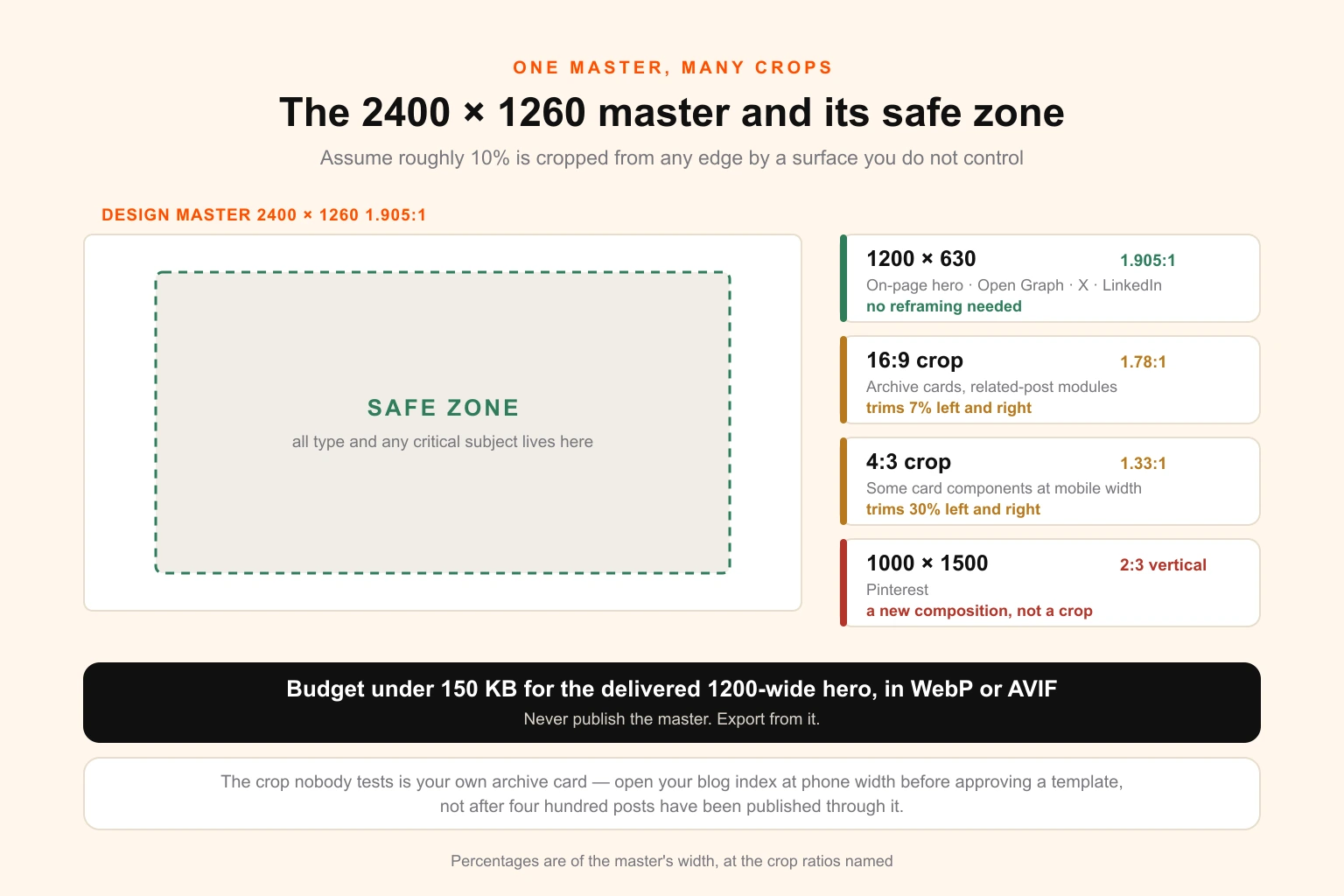
| Surface | Target size | Ratio | Notes |
|---|---|---|---|
| Design master | 2400 × 1260 | 1.905:1 | Source of truth; never published directly |
| On-page hero | 1200 × 630 | 1.905:1 | Usually the LCP element; budget under 150 KB |
| Open Graph / X large card | 1200 × 630 | 1.91:1 | Minimum 600 × 315; keep well under platform file caps |
| Archive and related-post cards | 16:9 and 4:3 crops | varies | Centre crop from master; the safe zone is what saves you |
| 1000 × 1500 | 2:3 | A genuinely different composition, not a crop — Tier 2 and 3 only | |
| LinkedIn share | 1200 × 627 | 1.91:1 | Effectively the OG image |
| Email header | 1200 wide, served at 600 | 2:1 | Retina-served; assume images-off for a share of readers |
Two lines in that table are load-bearing.
Pinterest is not a crop. A 2:3 vertical is a different composition with a different type layout, and centre-cropping a landscape master into it produces the worst image on the surface where the image matters most. Either build it as a genuine second artboard for the posts that warrant it — which is a Tier 2 or Tier 3 decision — or do not publish to Pinterest for that post. The composition rules differ enough by platform that they are worth treating separately; designing social media images covers the per-surface differences that a single landscape master cannot absorb.
And the archive card crop is the one nobody tests. Your card component almost certainly applies a different ratio to the hero, which means every image is being cropped on your own index page by a rule the image's maker never saw. Open your own blog index at a phone width before you approve a template, not after.
Weight, LCP and the part that is measurable
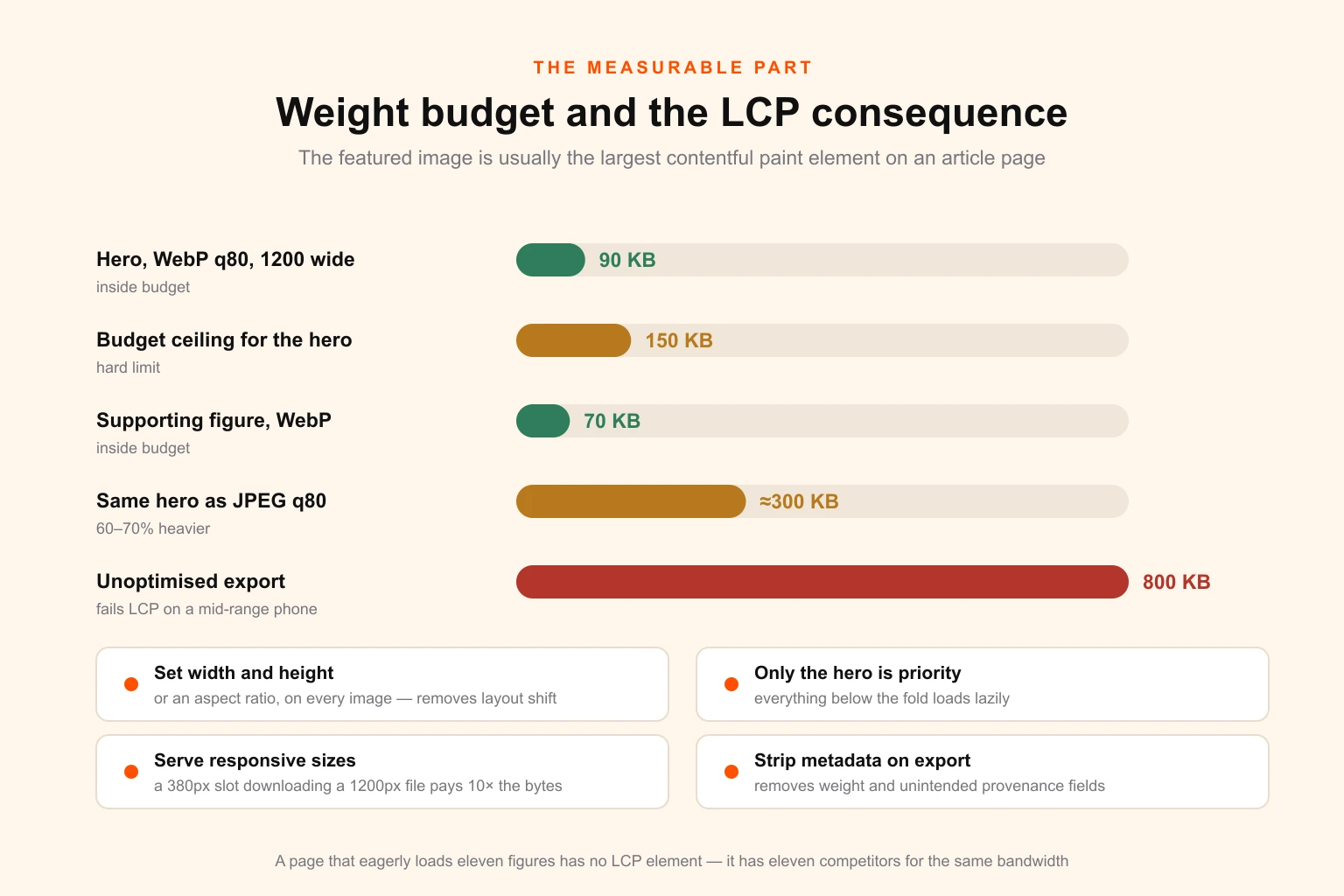
The featured image is usually the largest contentful paint element on an article page. That makes it one of the very few pieces of design work on a blog with a direct, measurable, unarguable performance consequence — which is worth knowing, because it is also the argument that reliably wins budget.
Set a hard budget: under 150 KB for the delivered 1200-wide hero, under 100 KB for supporting visuals, in WebP or AVIF with a JPEG fallback. A well-encoded WebP at quality 80 is routinely sixty to seventy per cent lighter than the equivalent JPEG, and the difference between a 90 KB hero and an 800 KB one is frequently the difference between passing and failing LCP on a mid-range phone on a mobile network — which is most of your readers, whatever your desktop analytics suggest.
Four operational rules follow from that.
Set explicit width and height, or an aspect ratio, on every image. This costs nothing and eliminates the layout shift that image-heavy article pages otherwise generate as each figure arrives.
Mark only the hero as high priority. Everything below the fold loads lazily. A page that eagerly loads eleven figures has no LCP element in any meaningful sense; it has eleven competitors for the same bandwidth.
Serve responsive sizes rather than one file. A phone downloading the 1200-wide file to display it at 380 CSS pixels is paying roughly ten times the bytes it needs.
And strip metadata on export. Generation and camera metadata adds weight, and on generated or stock imagery it can carry provenance fields you did not intend to publish. Re-encoding through a build step removes it as a side effect, which is the cleanest place to handle it.
Whether these hold in practice is a template question rather than a per-image question — which is another argument for the locked system, since a fixed export pipeline enforces the budget without anyone remembering to.
Building the system: what the twenty-five hours go on
If you commission this build, or run it internally, this is the actual scope. It is worth stating because the most common cause of a failed template system is a build that was scoped as "make us a template".
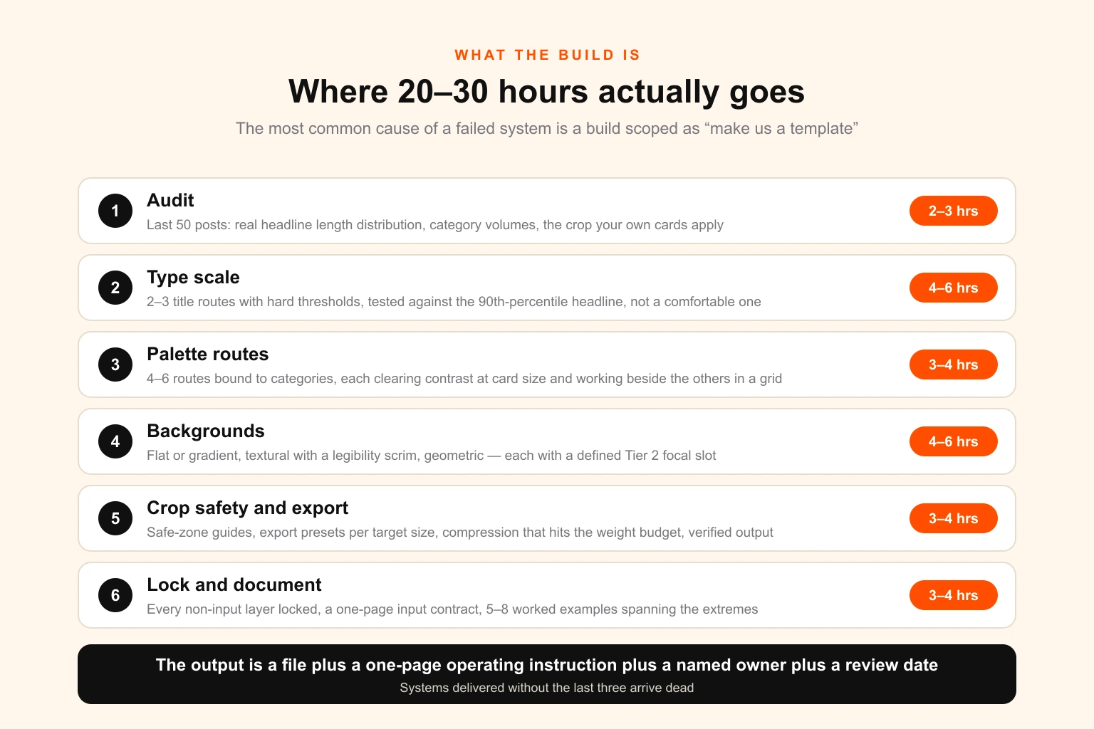
Audit first, two to three hours. Pull your last fifty published posts. Measure the real headline length distribution — the median, the ninetieth percentile and the worst case, because the worst case is what will break the system. Note which categories carry volume. Screenshot your archive grid and your related-post module at mobile and desktop widths, and identify exactly what crop each applies.
Type scale, four to six hours. Two or three title-length routes with hard character thresholds. Test each against the ninetieth-percentile headline, not a comfortable one. Decide the eyebrow and category-label treatment. Establish minimum sizes that survive an archive-card downscale, since a 1200-wide image displayed in a 340-pixel card is where undersized type dies. If you are choosing faces for this rather than inheriting them, serif vs sans serif is the relevant read, and check your licence covers this use before you commit — font licensing is the most commonly overlooked exposure in an otherwise careful pipeline.
Palette routes, three to four hours. Four to six routes bound to categories. Each must clear contrast requirements against its own type at the smallest rendered size — this is not decorative, it is the difference between a legible card and a pretty one, and contrast in design covers why the version that looks fine at full size can fail entirely at card size. Each route must also work beside the others in a grid, which is a harder constraint than each one working alone.
Background treatments, four to six hours. Two or three: typically a flat or gradient field, a textural or photographic field with a legibility scrim, and a geometric or pattern route. Each needs a defined behaviour for the focal-element slot that Tier 2 will use. Composition discipline matters more here than decoration — white space and visual hierarchy are what make a card readable at thumbnail size, where almost all of them are actually seen.
Crop-safety and export, three to four hours. Safe-zone guides on the master. Export presets for each target size. The compression settings that hit the weight budget. Verified output at the archive-card crop, at the OG crop, and at phone width.
Locking and documentation, three to four hours. Lock every layer that is not an input. Write the input contract in plain language. Produce five to eight worked examples spanning the extremes — the shortest headline, the longest headline, the highest-contrast palette route, the photographic background. The examples are what people copy, so they should demonstrate the system's edges rather than its comfortable middle.
The output is not a file. It is a file plus a one-page operating instruction plus a named owner plus a review date. Systems delivered without the last three arrive dead.
Briefing the tiers that need a designer
Tier 1 needs no brief; that is its definition. Tiers 2 and 3 need one, and the brief for a featured image is unusual in that its most important field is the one people leave out.
That field is the single idea the image must carry. Not the topic. Not the title. The one thing a reader should take from it in the second and a half they will give it in a feed. A brief that says "an image for our post about design retainers" produces a stock photograph of a handshake. A brief that says "the idea is that fixed monthly cost removes the negotiation from every individual request — show the absence of the transaction" produces something worth commissioning. The general shape of this is covered in how to write a graphic design brief; for featured images specifically, the fields that matter are these.
The single idea, in one sentence. The tier and therefore the time budget, stated up front so the designer is not guessing at scope. The template constraints that still apply — because on Tier 2 most of them do, and a designer who does not know the frame is locked will produce a focal element that does not fit it. The surfaces it must survive, listed, including whether a Pinterest artboard is required. Any reuse already known, since an image destined for a deck should be built with that in mind rather than retrofitted. And the crop-safety requirement restated, because it is the constraint most easily forgotten when someone is working outside the template.
Two further constraints belong in every brief at this tier. No text in the artwork beyond what the template's own type layer supplies — duplicated or competing text is the most common way a Tier 2 image ends up unusable across surfaces. And a stated position on licensed and generated assets: which sources are permitted, and who is responsible for the licence covering this specific use. Stock and generated imagery both carry terms that vary by end use, and stock asset licensing covers where the assumptions usually break.
The pre-publish check
Six items, thirty seconds, and they catch nearly everything that reaches production.
- The headline is inside the safe zone and legible at archive-card size — check it at that size, not at full size.
- The delivered file is under budget: 150 KB for the hero, in WebP or AVIF.
- Width and height, or an aspect ratio, are set so nothing shifts on load.
- Alt text describes the image for a reader who cannot see it, rather than repeating the post title.
- The OG image renders correctly in a preview — actually paste the URL into a debugger or a private message, do not assume.
- The palette route matches the post's category, so the archive grid keeps its colour logic.
Alt text is worth one further sentence, because it is the item most often reduced to a keyword. Its job is to convey what the image contains to someone using a screen reader. A templated card whose only content is the headline can honestly say so. A diagram needs its actual content described, which is also what makes it legible to the retrieval systems that increasingly summarise pages rather than rendering them — the same discipline serving accessibility and machine comprehension at once.
Who should actually produce these
The production model question usually gets settled by whoever is available rather than by the arithmetic, which is a shame, because the arithmetic is unusually clear here.
Do not hire for this alone. Twelve hours a month against a full-time designer's roughly 130 productive monthly hours is under ten per cent utilisation. Featured images justify a hire only as part of a much wider brief, and if you are weighing that decision properly the comparison in unlimited design vs hiring a full-time designer runs the utilisation case in full.
Per-asset freelance fits Tier 3 and fights everything else. For four genuinely bespoke images a month, a freelance illustrator you trust is an excellent arrangement. For the twenty-eight templated images it is structurally wrong — you are paying a per-asset price for six minutes of assembly, and adding a brief-and-wait cycle to a task that should happen at the moment of publication. Most teams that put their whole image workflow through a freelancer are paying Tier 3 prices for Tier 1 work, which unlimited design vs freelancers unpacks in more detail.
Editors run Tier 1. This is the intended outcome of the whole build. A locked template with a three-field input contract is not a design task, and routing it through a designer adds a queue to a job that takes six minutes. Solo publishers and small creator teams sit at the extreme end of this — the same structure applies, at a smaller build, and design for content creators and bloggers covers the thumbnail and channel-art version of the identical problem.
A retainer or subscription fits the mix. The reason is the shape of the demand rather than the price: your monthly requirement is predictable in volume and unpredictable in composition — one month is four diagrams, the next is a photo-led campaign and a Pinterest set — and that is precisely the pattern per-asset quoting handles worst and a fixed monthly cost handles best. It is the same argument that applies to design retainers for media buying, where volume is steady and composition never is.
Digital Polo runs this as a fixed monthly cost rather than per-asset: the template system build as a one-off project, then the Tier 2 and Tier 3 flow month to month on the same queue as everything else the business needs — social media design, infographics and data figures, decks, and the campaign adaptations that reuse the same artwork. Source files come with the work, so the template you commission is a template you own and can hand to anyone. Plans are $399 and $899 a month, and how the model works covers scope, turnaround and what a queue does and does not absorb.
If you want the numbers run against your own calendar before committing to a model, send your monthly post count, your headline length distribution and your distribution plan, and we will tell you honestly what the tier split and the hours look like — including the case where the answer is that you do not publish enough to justify a build.
The mistakes that cost the most
Building the template around a short headline. The most expensive twenty minutes you can save. Set the scale from your ninetieth-percentile title.
Treating the archive grid as an afterthought. Every image is judged twice: once alone and once beside eleven others. The second judgement is the one that determines whether your index is navigable, and almost nobody designs for it.
No named owner. The single strongest predictor of whether a system still exists in a year.
One policy for all posts. The failure this entire article is about. Both blanket answers are wrong in opposite directions and the ratio is the actual deliverable.
Letting the tier be decided by advocacy. Score at brief time or the loudest writer gets the illustrations.
Ignoring file weight until a Core Web Vitals report arrives. The budget is easy to hold in a template and painful to retrofit across four hundred published posts.
Never upgrading the image on a post that worked. A post with traffic and a templated card is the highest-return design hour on your board, and it sits unclaimed because nobody revisits published work.
Producing images without measuring the time. If you do not know your median minutes per image by tier, you cannot tell whether the system is delivering the saving it was built for, and the honest answer is frequently that it is not.
What to measure
Six numbers, reviewed quarterly. Median rather than mean throughout, because one ninety-minute outlier distorts a mean beyond usefulness.
Median minutes per image, by tier. The health metric for the system. Tier 1 creeping past ten minutes means the template has unlocked somewhere.
Percentage published without designer involvement. Should track your Tier 1 ratio. If it is materially lower, work is escaping into design that the template was built to absorb.
Template compliance rate. The share of published images that came out of the system unmodified. Falling compliance is the earliest visible signal of slot abuse and palette drift, and it shows up months before the archive grid looks wrong.
LCP at the 75th percentile on article pages. The one number in this list that an executive already cares about, and the one that makes the image budget defensible.
Click-through on shared posts, split by tier. The only direct read on whether Tier 2 and Tier 3 are earning their hours. If composed and bespoke images are not outperforming templated ones on the surfaces they were commissioned for, either the ratio or the artwork is wrong.
Tier distribution against plan. Drift here is informative in both directions: too much Tier 1 means the system is being used to avoid work rather than to save it, and too much Tier 3 means either the calendar has become more commercial or the scoring has gone soft.
For external benchmarks to set these against, the graphic design statistics roundup collects the industry figures on production volume, cost and turnaround that these numbers are usefully compared with.
Where to start
If you publish more than about fifteen posts a month and do not have a system, the sequence is fixed and the first step is not design work.
Audit fifty published posts for real headline lengths and count how many images you actually produced against how many posts you shipped. Score your next month's calendar with the five-factor rule and see what tier distribution falls out — that number, not an aspiration, is what you build for. Commission or build the template against the ninetieth-percentile headline. Lock it, document the input contract in one page, name an owner, and put a quarterly review in a calendar. Then run one month and measure the median minutes per image by tier before changing anything.
The system is not the win. The ratio is. The system is just what makes the ratio affordable — and what stops the four posts a month that genuinely matter from being produced at four in the afternoon by an editor resizing somebody else's template.
Frequently asked questions
Should blog featured images be templated or custom? Neither, as a blanket policy. At any real publishing volume the correct answer is a ratio, because posts do not carry equal commercial weight and a single policy either overspends on the majority or underspends on the minority that matters. The working split for most teams publishing 30 to 50 posts a month is roughly 70 per cent fully templated, 20 per cent templated with a commissioned focal element, and 10 per cent genuinely bespoke, with the bespoke tenth chosen deliberately rather than by whoever shouted loudest. That mix costs about a fifth of all-bespoke production and produces a visibly better archive than all-template, because the posts that get seen off-site are the ones carrying real artwork.
How long should a blog featured image take to make? Five to eight minutes for a fully templated image, twenty to thirty minutes for a templated image with a chosen or commissioned focal element, and sixty to a hundred and twenty minutes for genuinely bespoke artwork. If your templated tier is taking more than about ten minutes, the template is not a template — it is a starting point with unlocked layers, and someone is making design decisions inside it every time. That is the single most common reason a template system fails to produce the saving it was built for.
What size should a blog featured image be? Design on a 2400 by 1260 pixel master at a 1.905 to 1 ratio, and export from it. That master downsamples cleanly to the 1200 by 630 that Open Graph and X's large summary card expect, survives the 16:9 and 4:3 crops that archive cards and related-post modules apply, and leaves enough resolution for a 2x display. Keep all type and any critical subject inside a central safe zone about ten per cent in from every edge, because you do not control how the image is cropped once it leaves your site.
How much do blog featured images cost per month? At 40 posts a month, commissioning every image bespoke runs roughly 60 designer hours, which is about $2,700 at a loaded in-house rate near $45 an hour, or $3,000 to $6,000 buying them individually from freelancers at $75 to $150 each. A pure template system after the build costs about four hours a month. A tiered mix lands near twelve hours a month, plus a one-off template build of twenty to thirty hours. At forty posts a month that build is repaid inside the first month.
Do featured images actually affect SEO? Not directly as a ranking factor, and it is worth being precise about the two places they genuinely matter. The first is performance: the featured image is usually the largest contentful paint element on an article page, so its weight and loading behaviour affect a real Core Web Vitals metric. The second is distribution: the image is what gets rendered in Google Discover, in social previews, in Pinterest and in email, and those surfaces determine whether the post is clicked at all. The image does not lift the ranking. It affects the traffic the ranking converts into.
What makes a template system fail? Four decay modes, all of them organisational rather than aesthetic. Sameness blindness, where every card in the archive grid reads identically and the index becomes unnavigable. Slot abuse, where a title longer than the box gets solved by shrinking the type until the system's hierarchy is gone. Palette drift, where each contributor picks an accent colour by mood and the family stops being one family. And the ownership vacuum, where nobody is named as the system's owner, so it forks into four private copies and stops being a system at all. Every one of these is prevented by a named owner and a quarterly review, and none of them is prevented by a better template.
How large should a featured image file be? Budget under 150 KB for the delivered hero at 1200 pixels wide in WebP or AVIF, and under 100 KB for the supporting visuals. This is not fastidiousness: the hero is typically the LCP element, and the difference between a 90 KB WebP and an 800 KB JPEG is frequently the difference between passing and failing that metric on a mid-range phone. Serve modern formats with a fallback, set explicit width and height or an aspect ratio so the layout does not shift, and mark only the hero as high priority while everything below the fold loads lazily.
Can AI generate blog featured images at volume? It can generate them, and the useful question is which tier it belongs in. Generative imagery works well as the focal element in a composed image — a photographic or textural backdrop that a locked template then frames, types and colours. It works badly as the entire image, because it cannot reliably render legible text, it drifts off a brand palette across a batch, and forty of them side by side in an archive grid look conspicuously like forty of them. There is also a provenance question worth settling in writing before you build a workflow on it, in the same way you would for any licensed asset.
Do I need a designer if I have a template system? You need a designer to build it and to keep it alive, and you do not need one to run it. That is the whole point of the split: the build is a real design job of twenty to thirty hours involving type scale, palette routes, crop-safety and component logic, and the daily operation should be a five-minute task any editor can do without making a single design decision. Teams that skip the build and let editors assemble images from a blank canvas are paying designer-grade time at editor-grade quality, which is the worst available trade.
How many featured image templates do I need? Three to five layouts, not fifteen. The variation that keeps an archive readable comes from a small number of interchangeable parts rather than from a large number of layouts — typically one type scale with three title-length routes, four to six palette routes tied to your categories, and two or three background treatments. That combinatorial space is large enough that no two adjacent posts look identical, and small enough that it can be governed by one person. Fifteen layouts is not a system; it is a folder.
Should the featured image contain the post title? Usually yes on the templated tiers, and be aware of what it costs. Title-bearing images are far faster to produce and make an archive grid scannable, but they crop badly on surfaces you do not control, they cannot be reused when the headline is rewritten, and they need a genuine plan for the sixty-character title and the one-hundred-and-forty-character title. Set your type scale from your longest real headline rather than a comfortable one, use two or three defined size routes rather than auto-shrinking, and keep the text inside the central safe zone so a social crop does not decapitate it.
How do I decide which posts get bespoke artwork? Score each post out of ten across five factors, two points each: whether it will be pushed to social, paid or email; how close it sits to a commercial page; whether the SERP or Discover surface for it is visually competitive; how long the post is expected to stay relevant; and whether the artwork will be reused elsewhere, in a deck or a lead magnet or an ad. Zero to three is the templated tier, four to six is composed, seven to ten is bespoke. Scoring takes about a minute per post at the point where the brief is written, and it moves the decision from advocacy to arithmetic.