Your campaign concept was approved on a Tuesday. It was presented as a single beautiful 1080×1080, everyone nodded, and the media plan went out the same afternoon: Meta feed and stories, LinkedIn, a YouTube pre-roll companion, Google Display across six IAB sizes, an email header, a web hero, and a link preview card.
By Thursday the designer has fifteen files open, the headline no longer fits in nine of them, the logo is unreadable in the leaderboard, and someone has quietly cropped the product out of the story version to make room for the CTA. The campaign that was approved is not the campaign that ships.
This is not a talent problem. It is a sequencing problem. The asset was designed as a picture instead of as a system, and every format after the first one is now a negotiation with a file that was never built to be negotiated with.
The cost of that is measurable. Rebuilding formats after concept approval typically adds 40–60% to production hours on a campaign, and the rework lands in the worst possible window — after the media is booked and before the flight starts. Worse, the versions that ship in the constrained placements are the ones nobody art-directed. Those are usually the placements carrying the cheapest impressions and the highest volume.
This guide is the production system that fixes it: how fifteen formats collapse into five designs, what actually has to change at each step down, where the platforms silently crop you, the build order that removes the rework, what the whole kit costs in hours and dollars, and the QA pass that stops a broken file going live.
DigitalPolo has produced campaign format kits for agencies and brands since 2010, mostly as the white-label studio behind somebody else's account team. The specs, hour counts and failure modes below are what that work actually looks like.
The mistake: treating the master as a size
Almost every broken format kit starts the same way. Someone designs the campaign at the size of the placement they care most about — usually a square or a 4:5 — and every other format is derived by scaling that file up or down until it fits.
That works between adjacent ratios and fails everywhere else, for a reason that has nothing to do with skill. A design is a set of relationships: image to headline, headline to logo, logo to CTA, all of it to the edge. When you change the aspect ratio, you change every one of those relationships at once. Scaling preserves the proportions of the elements and destroys the proportions of the composition.
The fix is to treat the master as a specification, not a file. The master is the set of decisions the campaign is made of:
- The hero element. The image, product shot, or graphic device the campaign is recognised by, plus its focal point and its minimum viable crop.
- The headline ladder. The same claim written at three lengths — long, medium and short — approved together at brief stage.
- The logo lockup set. Primary horizontal, stacked, and mark-only, with a defined minimum size for each.
- The CTA treatment. Button, text link, and dropped — and the rule for when each applies.
- The colour and type scale. Type sizes expressed as a ratio of the canvas height, not as fixed points.
Once those five decisions exist, producing fifteen files is assembly. Without them, producing fifteen files is fifteen small design projects with no art director. If you are already maintaining brand guidelines, this is the campaign-level equivalent — a short-lived, campaign-specific extension of the same idea, and it belongs in the same place. Teams running on a formal design system rather than a static style guide will recognise the pattern: define the tokens once, compose the outputs cheaply.
Fifteen formats, five ratio families
Here is the structural insight that removes most of the work. The fifteen placements in a normal campaign do not represent fifteen designs. They represent five aspect ratio families, each with a handful of exports.
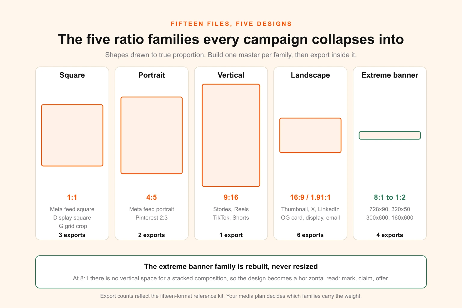
The families, and what falls into each:
| Ratio family | Shape | Placements it covers | Design cost |
|---|---|---|---|
| Square | 1:1 | Meta feed square, Google responsive display square, Instagram grid crop | 1 master |
| Portrait | 4:5 | Meta feed portrait, Pinterest (2:3 derives from it) | 1 master |
| Vertical | 9:16 | Instagram and Facebook Stories, Reels, TikTok, YouTube Shorts | 1 master |
| Landscape | 16:9 / 1.91:1 | YouTube thumbnail, X, LinkedIn single image, Open Graph card, responsive display landscape, email header, web hero | 1 master |
| Extreme banner | 4:1 and wider, plus tall skyscrapers | 728×90 leaderboard, 320×50 mobile, 300×600 half page, 160×600 skyscraper | 1 master, rebuilt not resized |
Five masters. Fifteen-plus exports. The economics of the whole exercise turn on that ratio, and on one rule: the extreme banner family is never a resize. It is a separate layout of the same idea, because at 8:1 there is no vertical space for a stacked composition and the design becomes a horizontal read — mark, claim, offer — rather than a picture.
The fifteen-format reference kit
This is the kit most campaigns actually need. Sizes are the working standards at time of writing; platform specs move, so confirm the current requirement in the ad manager before a large production run.
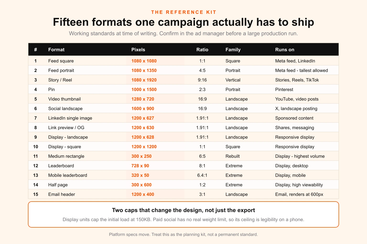
| # | Format | Pixels | Ratio | Family | Runs on |
|---|---|---|---|---|---|
| 1 | Feed square | 1080×1080 | 1:1 | Square | Meta feed, LinkedIn, display |
| 2 | Feed portrait | 1080×1350 | 4:5 | Portrait | Meta feed — the tallest the feed allows |
| 3 | Story / Reel | 1080×1920 | 9:16 | Vertical | IG & FB Stories, Reels, TikTok, Shorts |
| 4 | Pin | 1000×1500 | 2:3 | Portrait | |
| 5 | Video thumbnail | 1280×720 | 16:9 | Landscape | YouTube, video posts |
| 6 | Social landscape | 1600×900 | 16:9 | Landscape | X, general landscape posting |
| 7 | LinkedIn single image | 1200×627 | 1.91:1 | Landscape | LinkedIn sponsored content |
| 8 | Link preview / OG card | 1200×630 | 1.91:1 | Landscape | Open Graph, shares, WhatsApp |
| 9 | Responsive display — landscape | 1200×628 | 1.91:1 | Landscape | Google responsive display |
| 10 | Responsive display — square | 1200×1200 | 1:1 | Square | Google responsive display |
| 11 | Medium rectangle | 300×250 | 6:5 | Square-ish, rebuilt | Display — the highest-volume unit |
| 12 | Leaderboard | 728×90 | 8:1 | Extreme banner | Display, desktop |
| 13 | Mobile leaderboard | 320×50 | 6.4:1 | Extreme banner | Display, mobile |
| 14 | Half page | 300×600 | 1:2 | Extreme banner (tall) | Display, high viewability |
| 15 | Email header | 1200×400 | 3:1 | Landscape / banner | Email, renders at 600px |
Two constraints worth flagging because they change the design rather than just the export:
Display units cap the initial file load at 150KB. That is a design constraint, not a compression one. A photographic full-bleed background in a 300×600 will fight that cap; a flat colour field with a cut-out product will not. Decide which you are making before you build the master, not in the export dialog.
Paid social has effectively no weight limit — Meta accepts up to 30MB — so the constraint there is human, not technical. The real ceiling is whether a headline survives being viewed at 4cm wide on a phone in daylight.
If the campaign also has a print leg — a flyer, a roll-up, in-store signage — that is a sixth family with its own rules. It runs in CMYK rather than RGB, needs bleed and outlined type, and cannot borrow the same source files. The print-ready file checklist covers the handoff, and CMYK vs RGB covers why the on-screen colour will not be the printed one.
What actually changes at each step down
This is the part most format guides skip. They tell you the pixel dimensions and stop, as though the only difference between a 1080×1350 and a 300×250 were arithmetic.
Five things change as a format gets smaller or more extreme, and they change in a predictable order.
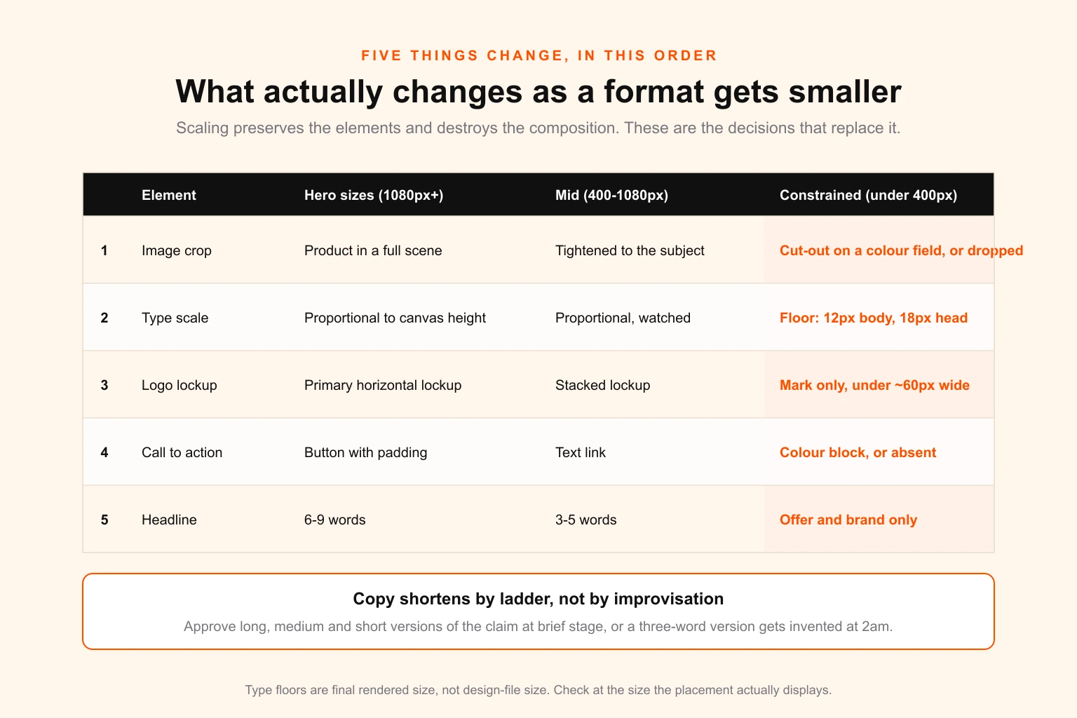
1. The image crop tightens, and eventually inverts. At hero sizes, the image can carry context — the product in a scene, a person in an environment. Below roughly 400px in the shortest dimension, context reads as noise. The crop tightens to the subject. Below 150px, the image usually stops being a photograph and becomes a shape: a cut-out product on a colour field, or nothing at all.
2. Type stops scaling proportionally and hits a floor. Set your type scale as a percentage of canvas height in the masters, and it will behave correctly from 1920px down to about 400px. Below that, proportional scaling produces type nobody can read, and you switch to absolute minimums. Practical floors: no body copy below 12px at final render size, no headline below 18px, and in a 320×50 mobile banner you are usually down to a single line at 14–16px plus the mark. When the floor and the proportional size collide, the copy shortens — it does not shrink.
3. The logo steps down through the lockup set. Primary horizontal lockup at hero sizes, stacked lockup when width is constrained, mark-only below roughly 60px of available width. This is the single most common reason a campaign looks unprofessional in display: someone scaled a horizontal wordmark into a 728×90 and it is now 9px tall and illegible. If the brand does not have a mark-only version, that is a gap in the identity, not a problem to solve in the banner.
4. The CTA degrades from button to text to absent. A button needs padding, a hit area, and enough width for the label. In a 320×50 that geometry does not exist, and the honest answer is that the whole unit is the click target — so the CTA becomes a colour block or disappears entirely, and the offer carries the persuasion. Forcing a 3mm-tall button into a mobile leaderboard is worse than omitting it.
5. The headline shortens by ladder, not by editing. This is why the headline ladder gets written at brief stage. Rough capacities, assuming legible type:
| Format | Comfortable headline length |
|---|---|
| 9:16 story, 4:5 feed | 6–9 words |
| 1:1 feed, 1200×628 | 5–7 words |
| 300×250 | 3–5 words |
| 728×90 | 2–4 words plus the offer |
| 320×50 | Offer and brand only |
If the campaign line only exists at nine words, someone is going to improvise a three-word version at production time, and that improvised line will run on the highest-volume placement in the plan. Write all three versions upfront and get them approved together. This is exactly the kind of decision that belongs in the creative brief rather than in a designer's head at the end of the process.
The safe areas that silently crop your headline
Every vertical and social placement has interface furniture sitting on top of your creative. It is not visible in your design file, it changes between app versions, and it is the single most common cause of a campaign shipping with its call to action underneath a caption.
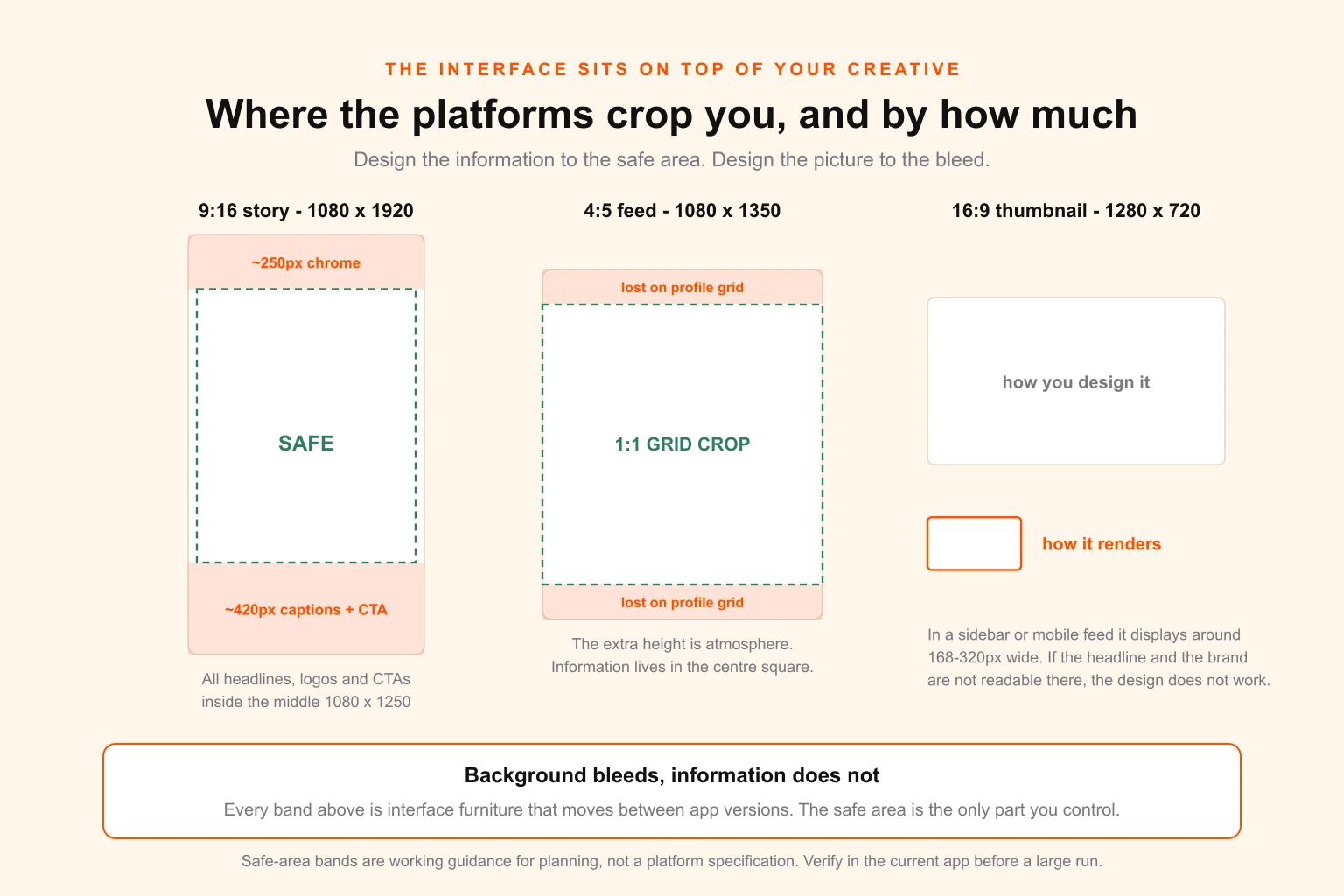
9:16 vertical (1080×1920). Keep all information — headline, logo, CTA — within roughly the middle 1080×1250. That leaves about 250px clear at the top for profile chrome and about 420px clear at the bottom for captions, link stickers and the platform's own CTA. Background imagery should still run full bleed; it is only the information that has to respect the band. Designing to the safe area and letting the picture bleed is the whole technique.
4:5 portrait feed (1080×1350). Two things crop it. On a profile grid, the post is displayed as a 1:1 centre crop, so anything in the top or bottom 135px vanishes from grid view. In some feed contexts the post is further constrained. Rule: the headline and logo live inside the central square; the extra height is atmosphere.
16:9 thumbnails. A 1280×720 thumbnail is very rarely viewed at 1280×720. In a sidebar or a mobile feed it renders somewhere around 168–320px wide. Design it, then look at it at 15% zoom. If you cannot read the headline and identify the brand at that size, it does not work — regardless of how good it looks at full size.
1.91:1 link preview cards. Different platforms crop this differently, and some crop to nearly square on mobile. Keep the critical content within the central square of the 1200×630 and treat the outer thirds as extendable background.
Display units. No platform chrome, but there is a border problem: many publishers place ads on white backgrounds, so a white-background creative with no border floats ambiguously and loses measured attention. A 1px neutral border on light-background display units is a small thing that consistently earns its place.
The general rule underneath all of these: design the information to the safe area, design the picture to the bleed. Once a team internalises that, most cropping accidents stop happening. It is visual hierarchy applied to a moving frame — decide what must survive, and let everything else be flexible.
The build order that removes rework
Production order matters more than production speed. Here is the sequence that avoids the Thursday problem.
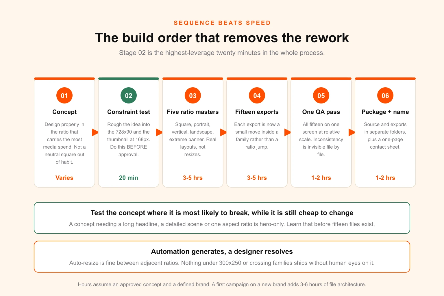
Stage 1 — Concept in the spend ratio. Design the idea properly in whichever ratio carries the most media spend. If 70% of budget is Meta feed, that is 4:5. If it is display, that is 300×250. Do not design in a "neutral" square out of habit if nothing runs square.
Stage 2 — The constraint test, before approval. Take the approved-in-principle concept and rough it into the two most hostile formats in the plan: usually the 728×90 and the thumbnail-at-168px. This takes twenty minutes and it is the highest-leverage twenty minutes in the whole process. If the idea survives, everything else is production. If it does not, you have learned it while the concept is still cheap to change instead of after fifteen files exist.
A concept fails the constraint test when it depends on: a long headline, a detailed scene, a subtle colour relationship, small type as a design element, or a composition that only reads at one aspect ratio. Those are all fixable at concept stage and expensive at production stage.
Stage 3 — Build the five ratio masters. Square, portrait, vertical, landscape, extreme banner. Each one is a real layout decision, not a resize. Budget roughly 3–5 hours total for this stage with a defined brand. This is where the campaign is actually designed.
Stage 4 — Export the fifteen. Now the arithmetic works, because each export is a small adjustment inside a family rather than a ratio jump. Pinterest's 2:3 comes off the 4:5 master. The OG card, LinkedIn ad and responsive display landscape all come off the same 1.91:1 layout. The 320×50 comes off the leaderboard.
Stage 5 — One QA pass across the whole kit, not per file. Reviewing files one at a time hides inconsistency. Put all fifteen on one screen at their real relative sizes and look at them together. Inconsistent crops, drifting colour, three different versions of the CTA and one file still carrying last week's headline are all obvious in a contact sheet and invisible one file at a time.
Stage 6 — Package and name. Covered below, and it matters more than it sounds.
Where automation genuinely helps, and where it does not
Automated resizing — Canva's Magic Resize, Adobe's equivalents, and the generative expand tools — has a real and specific place in this workflow.
Use it for: adjacent-ratio moves inside a family (1:1 to 4:5, 16:9 to 1.91:1), generating the starting file for a format so the designer edits rather than builds, and organic social where the stakes and the spend are low.
Do not rely on it for: any ratio jump across families, anything below 250px in its shortest dimension, anything with a headline longer than four words, and anything where a specific focal point — a face, a product, a logo — must stay intact. Auto-crop optimises for saliency, and saliency is not the same as the thing you are advertising.
The practical policy most production teams land on: automation generates, a designer resolves, and nothing below 300×250 ships without human eyes on it.
What the kit costs, in hours and in dollars
Here are the numbers that decide how you resource this.
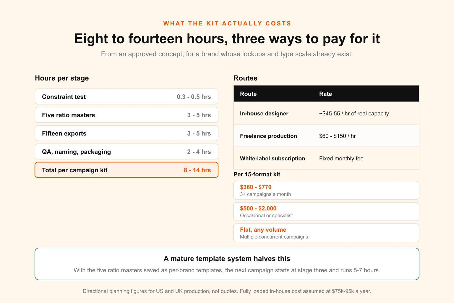
Time, from an approved concept, for a defined brand:
| Stage | Hours |
|---|---|
| Constraint test | 0.3–0.5 |
| Five ratio masters | 3–5 |
| Fifteen exports, including the rebuilt banners | 3–5 |
| QA, naming, packaging | 2–4 |
| Total | 8–14 hours |
The first campaign for a new brand runs long — add 3–6 hours for building the lockup set, type scale and file architecture that did not exist. Every campaign after that runs shorter, and a mature template system gets a fifteen-format kit down to 5–7 hours. That compounding is the entire argument for doing the master-file work properly the first time.
Cost, three ways:
| Route | Effective rate | Per 15-format kit | When it makes sense |
|---|---|---|---|
| In-house designer | ~$45–55/hr of real capacity at $75k–95k fully loaded | $360–770 | Consistent volume, 3+ campaigns a month |
| Freelance production | $60–150/hr | $500–2,000 | Occasional campaigns, specialist work |
| White-label subscription | Fixed monthly | Flat, regardless of campaign count | Multiple concurrent campaigns, variable volume |
The in-house number looks cheapest per kit and is the most expensive per year if the seat is not busy. A designer at 60% utilisation is a fixed cost you are paying to be idle 40% of the time — the in-house versus subscription comparison works through where that crossover actually sits. The freelance number is honest but variable, and it carries a coordination cost nobody puts on the invoice: briefing, chasing, and the hour you spend fixing the file that came back wrong.
The subscription route is why most agencies running several campaigns at once end up outsourcing the format kit specifically. Adaptation work is high-volume, spec-driven and repeatable — which makes it the single best candidate in the whole creative process for a fixed-cost external team. Concept stays in-house where the client relationship lives; the fifteen files get made somewhere they cost the same in a heavy month as in a light one.
DigitalPolo's Partner plan is $399 a month for unlimited requests with 48-hour turnaround, unlimited revisions and full source files including reseller rights; Soulmate is $899 with 24-hour priority turnaround. For an agency running four campaigns a month, that is the difference between roughly $2,000–8,000 of freelance production and a fixed line item. The mechanics of that model are covered in how unlimited design works, and the reseller economics — running it under your own brand — in how to resell design services and the agency partnership page.
One thing to verify before you outsource adaptation work anywhere: that source files and font licences pass through properly. A format kit delivered as flattened JPGs is unusable the moment the offer changes, and font licensing has a specific trap when a studio, an agency and a client all touch the same files.
Naming, packaging and handoff
Fifteen files become sixty when you add language variants and offer versions, and sixty files with inconsistent names is how the wrong creative goes live.
Use a fixed, machine-sortable pattern:
brand_campaign_placement_WxH_version_language.ext

acme_springsale_meta-feed_1080x1350_v2_en.jpg
acme_springsale_story_1080x1920_v2_en.jpg
acme_springsale_display-leaderboard_728x90_v2_en.jpg
Rules that save real time:
- Dimensions in the filename, always. A media buyer sorting sixty files needs to find 728×90 without opening anything.
- Version number, never "final".
v2is a fact.final_FINAL_v3is a confession. - Separate source from exports. One folder of editable masters, one of flat deliverables. Clients and buyers get the exports folder. Mixing them is how a working file ends up on a live placement.
- Include a one-page contact sheet. A single PDF showing every format at relative scale, with filenames. It takes ten minutes, it makes approval a single conversation instead of fifteen, and it is the artefact people actually forward.
The pre-handoff QA checklist
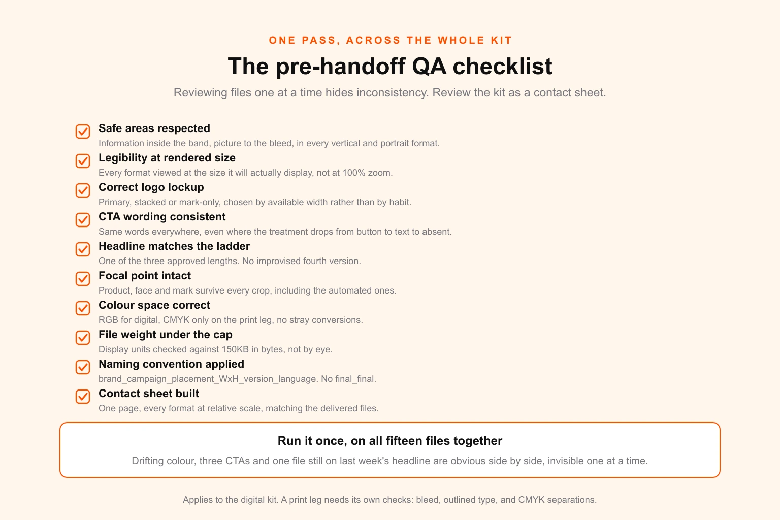
Run this across the whole kit, once, before anything leaves:
- Safe areas respected in every vertical and portrait format — information inside, picture to the bleed.
- Legibility at rendered size — view every format at the size it will actually appear, not at 100% zoom.
- Correct logo lockup in each format, with the mark-only version used wherever width is genuinely constrained.
- CTA consistent in wording across all formats, even where its treatment changes from button to text to absent.
- Headline matches the approved ladder — no improvised fourth version.
- Focal point intact in every crop. The product, face or mark is not clipped anywhere.
- Colour space correct — RGB for every digital format, CMYK only for the print leg, and no stray CMYK export in a display unit.
- File weight under the cap — check display units against 150KB in bytes, not by eye.
- Naming convention applied to every file, with no
final_final. - Contact sheet built and matching the actual delivered files.
Scaling this beyond one campaign
Everything above describes one campaign. The compounding returns arrive when the system outlives it.
Build a permanent ratio-master template per brand. Not per campaign. Five files with the type scale, logo lockups, safe-area guides and export presets already in place. The second campaign then starts at Stage 3, and the fifteen-format kit that took 14 hours takes 7.
Keep a live spec sheet. Platform dimensions change — placements get added, safe areas move, aspect ratios get deprecated. One maintained document, checked quarterly, beats fifteen designers each half-remembering a spec from 2024.
Standardise the brief, not just the output. The single highest-leverage change most teams can make is adding the headline ladder, the focal point, and the format list to the brief itself. That converts fifteen small design decisions into one approved decision executed fifteen times. If your campaigns are ad-heavy, the same discipline is what makes a design retainer on a media account profitable rather than chaotic — volume is only survivable when adaptation is systematised.
Treat format capacity as a planning number. If you know a fifteen-format kit is 8–14 hours, you can forecast. Four campaigns a month is 32–56 hours — most of a full-time seat, before anyone has designed anything new. That is the number that tells you whether to hire, freelance or outsource, and it is the calculation most teams never run. The same reasoning applies whether you are a SaaS team shipping feature launches, a creator producing thumbnails and channel art at volume, or an agency fulfilling for clients.
Push repeated formats into templates with locked structure. Where a format recurs unchanged campaign to campaign — email headers, OG cards, story frames — the layout should be a locked template with editable content slots. That is design tokens thinking applied to campaign production: fix the structure, vary the content.
The short version
- Fifteen formats are five designs. Square, portrait, vertical, landscape, extreme banner. Build a master per family, export the rest.
- The master is a specification, not a file: hero element, headline ladder, logo lockup set, CTA treatment, type scale.
- Extreme banners are rebuilt, never resized. At 8:1 the composition is a horizontal read, not a scaled picture.
- Five things change as formats shrink: image crop, type scale, logo lockup, CTA treatment, headline length — in that order.
- Design the information to the safe area, design the picture to the bleed.
- Run the constraint test before concept approval, not after. Twenty minutes there saves half a production cycle.
- Automation generates, a designer resolves, nothing under 300×250 ships unreviewed.
- A full kit is 8–14 hours from approved concept, and 5–7 once the ratio-master templates exist.
- QA the kit as a contact sheet, not as fifteen separate files.
Getting the kit made
If format adaptation is eating your designers' week — or if it is the reason concepts get approved late and campaigns launch with the display units unreviewed — it is worth separating the two halves of the job. Concept and client relationship stay where they belong. Production of the fifteen files is spec-driven, repeatable work that costs the same whether you do it at 2am or somebody else does it in a queue.
DigitalPolo runs that half for agencies, media buyers and in-house teams: unlimited requests, 48-hour standard turnaround, unlimited revisions, and full editable source files with reseller rights, on a fixed monthly fee.
- Start on Partner — $399/month
- Start on Soulmate — $899/month
- Social media design · Compare plans · How agency partnerships work · What design costs
Start with one thing this week: take your current live campaign, open all its formats side by side at their real rendered sizes, and see whether the same campaign is running in all of them. In most accounts, it is not.