A sign that cannot be read is not a cheap sign. It is a sign you paid for twice.
The letters get specified in a design file, approved on a screen at 40% zoom, fabricated in aluminium and acrylic, permitted, craned into place, and then somebody stands across the street and cannot read it. At that point the cost is not the design fee. It is the fabrication, the permit, the installation, the removal, and the whole thing again — routinely five figures for a storefront, considerably more for a monument sign or a building-top identity.
The frustrating part is that the maths to prevent this fits on an index card. What makes it go wrong is that almost every published guide gives a different answer, none of them explains which question it is answering, and the single most common specification error — confusing point size with letter height — is not mentioned in any of them.
This guide fixes all three problems. It covers where the conflicting rules come from and how to reconcile them, how to derive viewing distance when nobody has told you what it is, the four variables besides height that decide whether a sign works, what the ADA actually requires, and the artwork spec that makes a fabricator build what you drew.
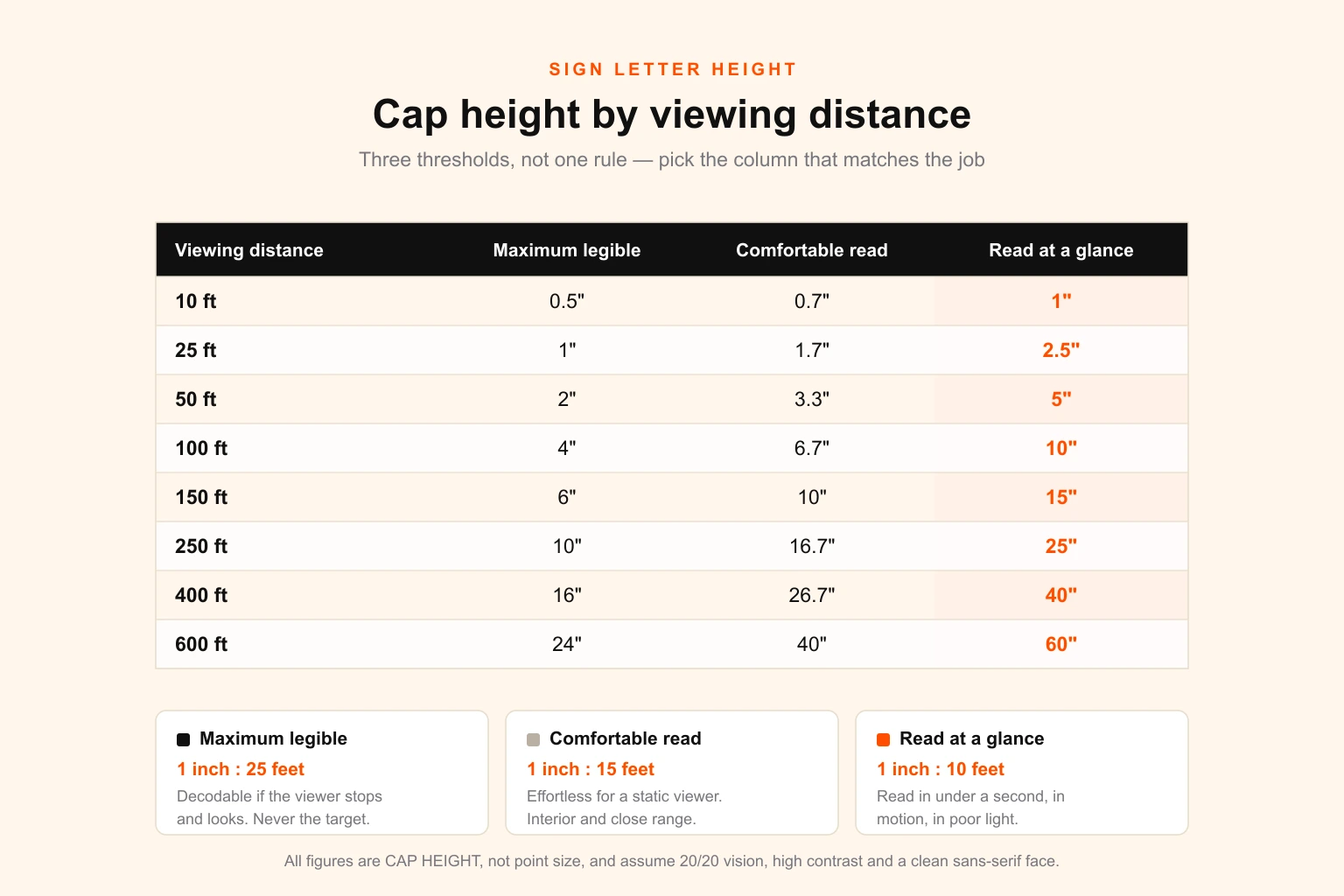
If you only need the number, the table above is the answer, and the sign letter height calculator will do the arithmetic for a specific distance or traffic speed. If you need to defend the number to a client, a landlord or a planning committee, keep reading.
The rule everyone quotes, and why the charts disagree
Search for sign letter height and you will be told, with total confidence, that every inch of letter height buys 10 feet of readability. A 3-inch letter reads at 30 feet, a 10-inch letter at 100 feet.
Then you find a chart from a sign manufacturer saying a 4-inch letter is good for 100 feet — two and a half times further. Another says the rule of thumb is 30 feet per inch. A letter-sizing calculator from a major sign company says a 6-inch letter can be read up to 150 feet away but is easily readable from 60 feet.
These sources are not sloppy. They are describing genuinely different things and none of them says so.
The common thread is hiding in that last one. Six inches at 150 feet, and six inches at 60 feet, are the same letter at two distances — and the ratio between them is exactly the ratio between the conservative charts and the 1-inch-per-10-feet rule. Every published guide is quoting the same underlying quantity at a different threshold: the angle the letter subtends at the eye.
The arcminute, and why it settles the argument
Human visual acuity is angular, not linear. A letter three inches tall at 30 feet and a letter six inches tall at 60 feet are optically identical — same angle, same difficulty, same result. This is why the rules can be expressed as a ratio at all.
That angle is measured in arcminutes, one sixtieth of a degree. Normal 20/20 vision is defined as the ability to resolve detail one arcminute across, and a standard Snellen letter is built five detail-units tall — so a letter at the absolute threshold of legibility subtends about 5 arcminutes. That is the eye chart, in a lit room, with the viewer trying.
Signage is not an eye test. Real reading, of unfamiliar words, at a glance, needs considerably more angle. Convert each of the published rules and the picture resolves immediately:
| Common rule | Angle subtended | What it actually describes |
|---|---|---|
| 1 inch : 50 ft | ~5.7 arcmin | Threshold detection. Not usable for signage. |
| 1 inch : 30 ft | ~9.6 arcmin | The conservative end of manufacturer charts |
| 1 inch : 25 ft | ~11.5 arcmin | Maximum legible distance — decodable if you stop and look |
| 1 inch : 15 ft | ~19 arcmin | Comfortable read — effortless, stationary viewer |
| 1 inch : 10 ft | ~28.6 arcmin | Read at a glance — instant, in motion, in poor light |
The arithmetic is simple enough to run yourself. For a viewing distance D in feet and a target angle θ in arcminutes, the required cap height in inches is:
Cap height (in) = D × θ ÷ 286.5
Or, running it the other way, the ratio you should use is 286.5 ÷ θ feet of distance per inch of height. At 11.46 arcminutes that gives exactly 25 feet per inch. At 28.65 it gives exactly 10.
Test it against that sign company's figures: a 6-inch letter at 150 feet works out at 11.5 arcminutes — their "maximum readable". The same letter at 60 feet is 28.6 arcminutes — their "easily readable". The two numbers they publish side by side are the two ends of the same scale. So is every other chart in the results.
Which threshold to design against
The threshold is a design decision, not a fact, and it should follow from how the sign gets used.
Use 1 inch : 25 ft (maximum legible) only to establish an absolute floor, or where the viewer is genuinely stationary and motivated — a directory board someone walks up to, a plaque, a specification label. Never treat it as a target. It assumes 20/20 vision, clean contrast, good light and an unhurried reader, and real viewing conditions supply none of those reliably.
Use 1 inch : 15 ft (comfortable read) for interior signage, close-range wayfinding, menu boards, exhibition graphics and anything read at leisure from a fixed position.
Use 1 inch : 10 ft (read at a glance) for essentially all exterior business signage — storefronts, monument signs, banners, vehicle graphics, anything roadside. This is the number that survives rain, dusk, a driver with three seconds of attention, and the fact that a substantial share of your audience is over 50 and no longer has 20/20 vision. Age alone is reason enough: contrast sensitivity and acuity both decline steadily from around 40, and designing to the threshold quietly excludes a large part of the market.
When in doubt, take the bigger number. Over-sized letters look confident. Under-sized letters look like a mistake, because they are one.
Cap height, not point size
This is the error that costs the most money, and no ranking guide on the subject mentions it.
Every figure in this article — and in every legibility chart you will find — is cap height: the distance from the baseline to the top of a capital letter. It is not point size.
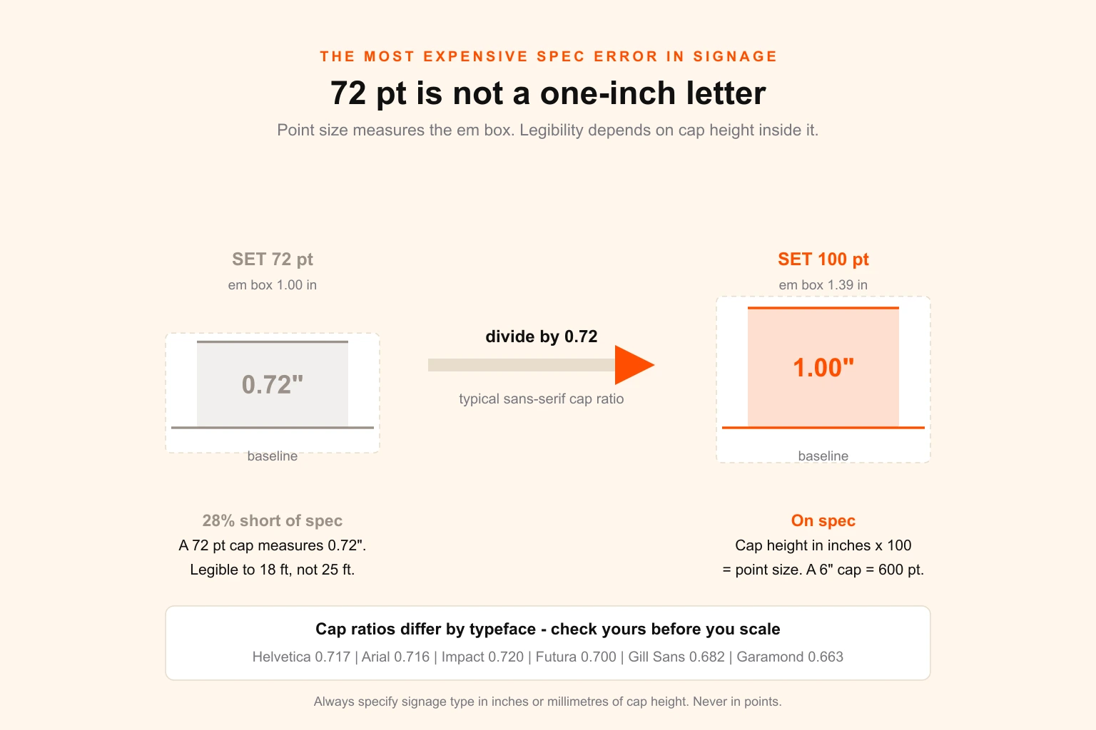
Point size measures the em box, the invisible slug the letter sits inside, sized to accommodate ascenders, descenders and a little breathing room. The capital letter occupies only part of it. In most sans-serif faces the cap height is around 0.70 to 0.72 of the em.
So 72 pt — which is exactly one inch of em box — gives you a capital roughly 0.72 inches tall. Twenty-eight percent short. Specified for a 25-foot glance-read, it delivers about 18 feet. On a storefront that is the difference between being read from the far kerb and being read from the parking space directly outside.
The conversion is easy in both directions:
Point size = cap height in inches × 100 (near enough, for a typical sans serif)
More precisely: point size = cap height in inches × 72 ÷ cap ratio
A 6-inch cap height needs about 600 pt. A 15-inch cap needs about 1,500 pt. Some applications will not even let you type a number that large, which is itself a useful signal that you should be working at 1:10 scale.
Cap ratios vary by typeface, so check yours rather than assuming:
| Typeface | Cap height (em units) | Point size for 1" cap |
|---|---|---|
| Impact | 0.720 | 100 pt |
| Helvetica | 0.717 | 100 pt |
| Arial | 0.716 | 101 pt |
| Futura | 0.700 | 103 pt |
| Gill Sans | 0.682 | 106 pt |
| Times New Roman | 0.662 | 109 pt |
| Garamond | 0.663 | 109 pt |
Two practical rules follow from this.
Never specify signage type in points. Write the cap height in inches or millimetres on the drawing, dimension it on a locked annotation layer, and let the fabricator hit that number. Points are a typesetting unit; a sign shop works in inches.
Measure the actual letterform, not the text box. Set the type, draw a rule from the baseline to the cap line of a capital, and measure that. If the sign uses lowercase-heavy mixed case, sanity-check the x-height too — a face with a small x-height relative to its caps will read shorter than the cap dimension implies, which is a real argument for choosing a large-x-height face for signage. The same kerning, leading and tracking fundamentals that govern body text govern this, just at fifty times the scale, where the errors are visible from the street.
Working out the viewing distance nobody gave you
The formula needs a distance. Clients almost never supply one, and the number they offer when asked is usually wrong — they measure from where they stand, which is not where the customer stands.
Static viewers: measure the decision point
For a pedestrian or a stationary viewer, the distance that matters is the point at which the viewer needs the information, not the furthest point from which the sign is visible.
Someone walking a shopping street needs to identify your storefront early enough to change course — call it 60 to 100 feet, not the 300 feet at which the sign first appears. Someone in a lobby needs to read a directory from where they naturally stop, which is a few feet, not across the atrium.
Walk the site. Stand where the customer will stand. Measure from there.
Two adjustments people forget:
Line of sight, not ground distance. A sign mounted 30 feet up a façade and read from 80 feet along the pavement is about 85 feet from the eye, by Pythagoras. On tall buildings the difference stops being trivial fast.
Viewing angle. Letters read from a steep angle below are foreshortened vertically, and letters read from far off-axis are compressed horizontally. For high-mounted signage, stretch the cap height modestly — 10 to 20% for a steep upward view is a reasonable allowance — and check the artwork in perspective, not flat on screen.
Moving viewers: speed sets the distance
For anything read from a vehicle, the viewing distance is not a property of the site. It is a property of the speed.
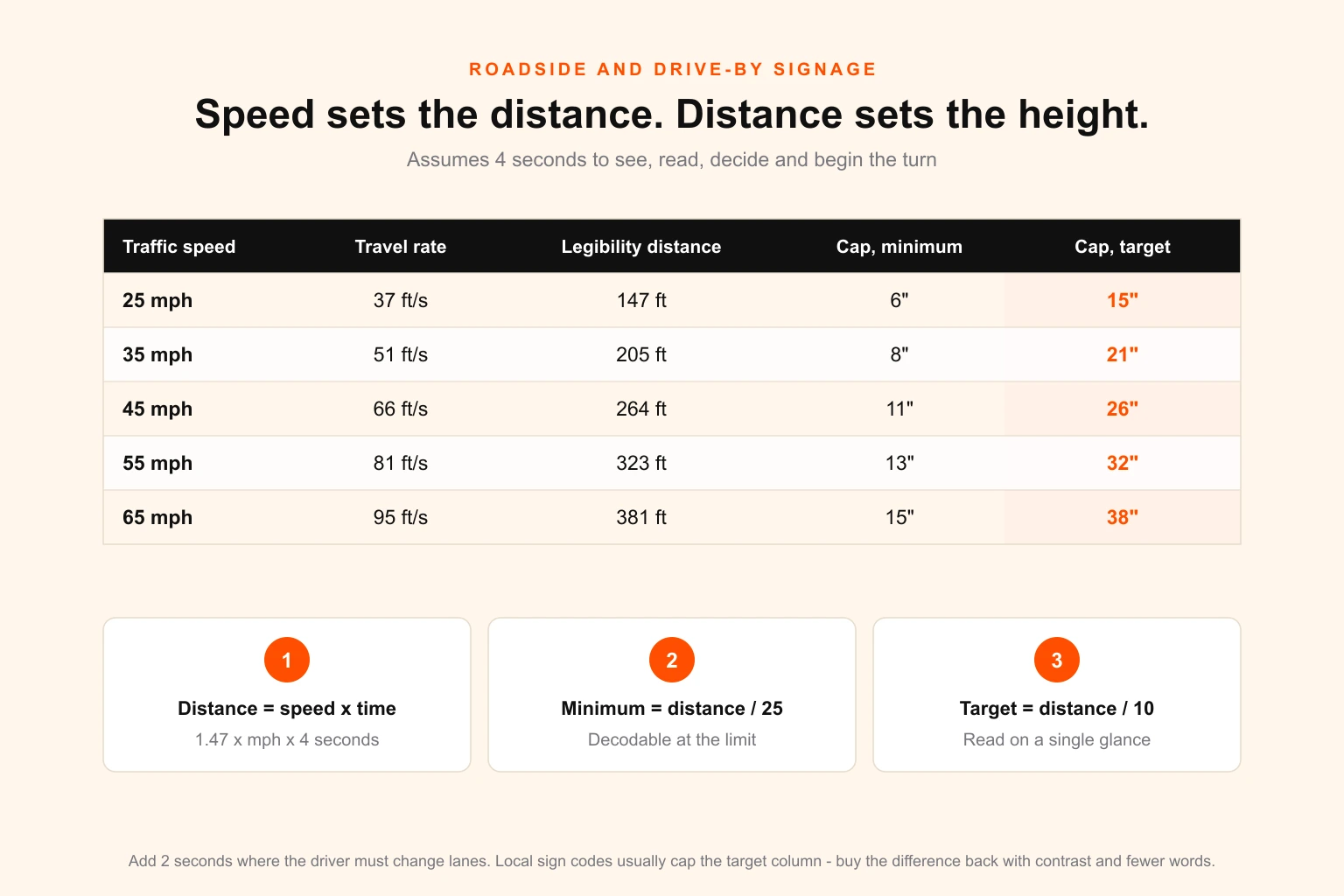
A driver needs time to notice the sign, read it, decide, and act. Multiply the time they need by how fast they are travelling and you get the distance at which the sign must already be legible:
Legibility distance (ft) = 1.47 × speed in mph × time in seconds
Four seconds is a reasonable planning figure for a simple business identification sign where the driver may need to slow and turn in. Six seconds is more realistic where a lane change is required, or where the message carries more than a few words. Traffic engineers work with similar reasoning when sizing guide signs, and the direction of travel is always the same: faster road, bigger letters, fewer words.
At 45 mph and four seconds that is 264 feet — which demands an 11-inch cap as an absolute floor and a 26-inch cap to be read at a glance.
Two things usually happen next. The client sees 26 inches and flinches at the cost. Or the local sign code caps the total sign area well below what that letter height needs. Both are normal, and neither is solved by quietly shrinking the letters and hoping.
What you do instead is buy the legibility back elsewhere: cut the message to the minimum number of words, raise the contrast, open the letter spacing, choose a face with a larger x-height, and drop any secondary copy that will not be read at speed anyway. A three-word sign at 18 inches beats a seven-word sign at 26 inches, every time.
The four variables that decide whether the height works
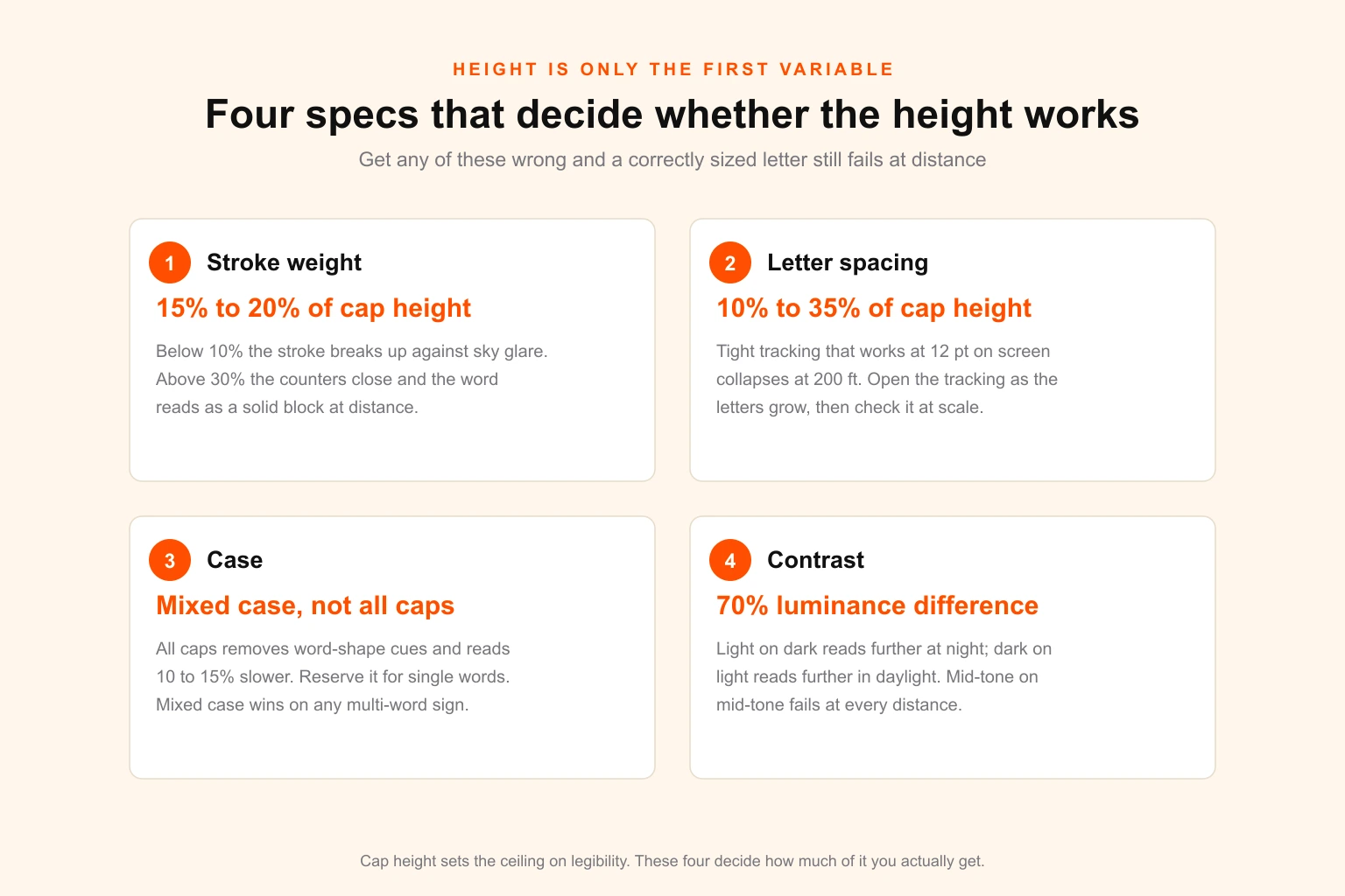
Cap height sets the ceiling on legibility. Four other specs determine how much of that ceiling you actually get, and getting any of them wrong will sink a correctly sized letter.
Stroke weight
Target 15 to 20% of cap height. Below roughly 10% the stroke starts to break up against bright sky or wash out under floodlighting. Above roughly 30% the counters — the enclosed spaces in letters like O, A, e and R — begin to close, and at distance the whole word degrades into a solid block.
This is why ultra-thin brand typefaces, which look elegant on a website, frequently fail outdoors. It is also why heavy condensed faces fail: they lose on counter size what they gain in weight.
Letter spacing
Allow 10 to 35% of cap height between letters. Tracking that looks correct at 12 pt on screen is far too tight at 200 feet, because adjacent letters begin to merge visually before the individual forms become illegible. As letters grow, open the tracking. Then check the result at the real scale rather than trusting the number.
For dimensional letters mounted individually, this stops being a typographic setting and becomes an installation drawing. Give the fabricator a spacing dimension, not just a rendered layout.
Case
Use mixed case for anything longer than one word. All caps strips out the ascender and descender profile that lets readers recognise whole words by shape, and it measurably slows reading — the figure usually cited is 10 to 15% for phrases. It also consumes more horizontal space at the same cap height.
All caps is fine for a single word or a short label, where word-shape recognition contributes little. For multi-word wayfinding and roadside signage, mixed case reads faster at identical cap height, which is free legibility.
Contrast
Aim for at least 70% luminance difference between the characters and their background — a widely used wayfinding benchmark, and a far better predictor of real-world legibility than most designers expect.
Light characters on a dark field generally read further at night; dark characters on a light field generally read further in daylight. Mid-tone on mid-tone fails at every distance, no matter how large the letters are. The role of contrast is doing more work here than the height is once you get past the threshold.
The five-second test: desaturate the artwork to greyscale. If the text stops separating cleanly from the background, the sign will fail outdoors regardless of what the letter height calculation says. Colour choice interacts with production too — spot colours specified for vinyl or paint will not behave like a process build, which is worth checking against a Pantone reference before anything goes to the shop.
Choosing the face
The typefaces that survive at distance share a profile: open counters, generous x-height, unambiguous letterforms, and moderate stroke contrast. Helvetica, Univers, Frutiger, Interstate and Clearview are all safe. Highway agencies use faces from this family for the same reason.
Avoid condensed and extra-condensed weights, hairline weights, scripts, and any face where C, G, O and Q or I, l and 1 are hard to tell apart. The difference between serif and sans serif matters less here than counter size and weight do — a well-drawn serif at generous size is perfectly legible — but sans serif remains the safer default, and it is what accessibility standards require. If you are still selecting a brand face and know signage is in its future, pick something that scales rather than discovering the problem after the identity is signed off.
What the ADA actually requires
For signage inside and around buildings in the United States, the 2010 ADA Standards set legal minimums. These are floors, not targets — a fully compliant sign can still be difficult to read.
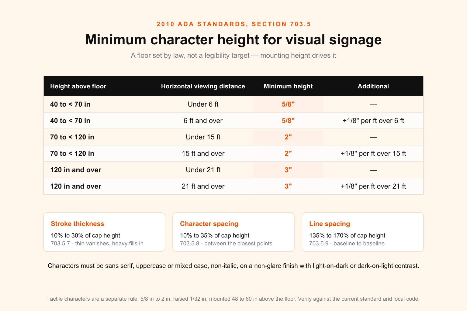
The key distinction is between visual characters — anything meant to be read with the eyes — and tactile characters, the raised lettering and braille required on permanent room identification. They are governed by different rules and are frequently confused.
For visual characters, minimum height scales with mounting height and viewing distance (§703.5.5). A baseline 40 to under 70 inches above the floor requires at least 5/8 inch, growing by 1/8 inch for every foot of viewing distance beyond 6 feet. From 70 to under 120 inches the minimum is 2 inches, with the same per-foot growth beyond 15 feet. At 120 inches and above it is 3 inches, growing beyond 21 feet.
Alongside height, section 703.5 also fixes the specs covered above:
- Stroke thickness 10% to 30% of character height (§703.5.7)
- Character spacing 10% to 35% of character height (§703.5.8)
- Line spacing 135% to 170% of character height (§703.5.9)
- Character width 55% to 110% of character height (§703.5.6)
- Sans serif, non-italic, uppercase or mixed case, on a non-glare finish, light-on-dark or dark-on-light
Tactile characters run to a separate rule: 5/8 inch to 2 inches, raised at least 1/32 inch, uppercase sans serif, mounted 48 to 60 inches above the floor.
Two cautions. First, verify against the current published standard and your local code before you rely on any summary, including this one — jurisdictions adopt amendments, and building codes frequently layer additional requirements on top. Second, exterior signage is governed by local sign ordinances rather than the ADA, and those ordinances usually regulate total sign area and height above grade, not letter size. That constraint tends to bite exactly when your legibility calculation asks for the most.
Letter height by sign type
Typical viewing distances and the cap height they imply, using the glance-read threshold for exterior work and the comfortable-read threshold for interior:
| Sign type | Typical viewing distance | Cap height |
|---|---|---|
| Desk or door plaque | 3–5 ft | 0.5–1" |
| Interior directory | 5–10 ft | 0.75–1" |
| Retail shelf and aisle signage | 8–15 ft | 1–2" |
| Menu board | 8–15 ft | 1–2" |
| Trade show booth header | 20–40 ft | 3–4" |
| Window graphics, pedestrian street | 15–30 ft | 2–3" |
| Storefront fascia, pedestrian | 50–100 ft | 5–10" |
| Storefront fascia, low-speed road | 100–200 ft | 10–20" |
| Vehicle lettering | 20–50 ft | 3–5" |
| Yard and real estate signs | 30–60 ft | 3–6" |
| Monument sign, 35 mph road | 200 ft | 20" |
| Building-top identity | 400–800 ft | 40–80" |
| Highway-adjacent pylon | 500–1,000 ft | 50–100" |
Read this as a starting point and then check the site. A monument sign set back 40 feet from the kerb on a 45 mph road is a different problem from one flush to a 25 mph street, and the table cannot know which you have.
Vehicle graphics deserve a note: the viewing distance is short but the available reading time is very short, since both vehicles are usually moving. Prioritise a single legible message — company name and one contact route — over a comprehensive service list that nobody can read at either speed. The same discipline applies whether it is a full wrap or cut vinyl lettering.
Retail and hospitality have their own trap: interior signage gets designed at desk scale and printed at wall scale. A menu board at 1.5-inch caps reads comfortably at 22 feet, which is fine for a queue but not for someone deciding from the door. The same goes for in-store merchandising graphics — the sight line from the aisle entrance is the one that matters, not the one from arm's length.
Five mistakes that keep recurring
Designing at screen scale and approving at screen scale. A 4-foot sign viewed at 33% zoom on a 27-inch monitor is a 16-inch object about 24 inches from your face — visually equivalent to standing 6 feet from the real sign. Everything looks legible. Always proof to scale and step back.
Specifying in points. Covered above, and worth repeating because it is the most expensive single error in the category. Cap height in inches, dimensioned on the drawing.
Measuring the wrong distance. Ground distance instead of line of sight, first-visible instead of decision point, or the client's vantage point instead of the customer's.
Letting the copy grow after the height is fixed. A sign specified for three words and delivered with seven has effectively had its letter height cut. Lock the message before you lock the size, and treat any addition as a request to re-run the calculation.
Ignoring the lighting condition the sign will actually live in. Halo-lit channel letters, face-lit acrylic, external floodlighting, non-illuminated and retroreflective all behave differently at night, and some read materially smaller in the dark than the daylight calculation suggests. Ask how it will be lit before you size it.
Producing artwork a fabricator can build
Correct specification is worth nothing if the file loses it in transit. A sign shop receives your artwork and reproduces what is in it, not what you intended.
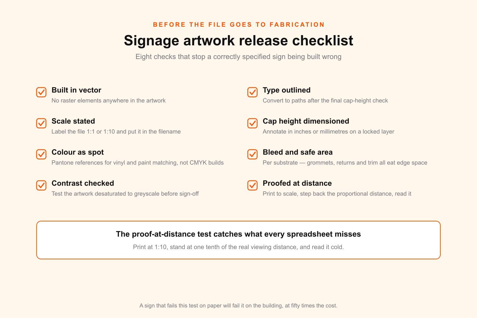
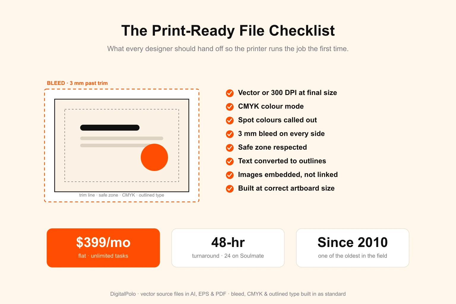
- Build in vector. No raster elements anywhere in the artwork. A sign enlarges to hundreds of times its design size, and anything pixel-based falls apart. This is the clearest practical case for understanding vector versus raster before the file leaves your machine. Where a photographic element is unavoidable, size it against the resolution table for large format rather than defaulting to 300 DPI.
- Outline the type after the final cap-height check, so font substitution cannot silently change the letterform or its metrics.
- State the scale. 1:1 or 1:10, noted in the artboard and in the filename. Ambiguous scale is a leading cause of a sign being built at the wrong size.
- Dimension the cap height on a locked annotation layer, in inches or millimetres. Do not make the fabricator infer it.
- Specify colour as spot references. Vinyl, paint and acrylic are matched to Pantone, not built from process inks — the reasoning behind CMYK versus RGB applies with even less latitude here.
- Allow bleed and safe area appropriate to the substrate. Grommets, letter returns, trim and mounting hardware all consume edge space.
- Check contrast in greyscale before sign-off.
- Proof at distance. Print at 1:10, stand at one tenth of the true viewing distance, and read it cold.
That last check is the one that catches what the spreadsheet misses, and it takes two minutes. A sign that fails it on paper will fail it on the building, at roughly fifty times the cost.
If you are already running a print-ready file checklist for other production work, this is the signage-specific extension of it — the fundamentals are shared with any print-ready design discipline, from dielines to cut-line specs for vinyl. What changes for signage is the scale of the consequence.
Two worked examples
A storefront on a 30 mph street. Customers approach on foot from up to 90 feet and by car at 30 mph. The driving case governs: 1.47 × 30 × 4 seconds = 176 feet of legibility distance. At the glance threshold that is a 17.6-inch cap; call it 18 inches. The landlord's sign band is 24 inches tall, which accommodates it with 3 inches of clearance top and bottom — tight but workable. In Helvetica that is 1,800 pt. The message is cut to the business name alone; the service list moves to the window graphics, which are sized for the 20-foot pedestrian sight line at 2-inch caps.
An interior directory in a lobby. Visitors stop about 6 feet away, and the sign is mounted with its baseline at 55 inches. ADA §703.5.5 sets a floor of 5/8 inch. The comfortable-read threshold at 6 feet asks for 0.4 inch, so the ADA minimum governs — but the client wants it readable from the entrance 25 feet away as well. Two type sizes solve it: 2-inch caps for floor headings, readable at a glance from the door, and 5/8-inch caps for the tenant listings, read from directly in front. This is visual hierarchy doing structural work rather than decorative work.
Getting it built
Most of the cost of getting sign letter height wrong is not the design. It is everything downstream of the design.
The calculation is straightforward once you know which threshold you are designing against and that you are specifying cap height rather than point size. The judgement — which threshold, which distance, how much message the sign can carry at that size, what the local code will allow — is where experience earns its keep, and where a second pair of eyes before fabrication is cheap insurance.
Digital Polo has produced print and signage artwork for brand owners, sign shops and print resellers since 2010, including white-label production for sign and banner shops who need dimensioned, fabrication-ready files without carrying a studio. If signage sits inside a wider identity rollout, the letter height spec belongs in the brand guidelines alongside the colour and typography rules, so the next sign — and the twentieth — comes out consistent without anyone re-deriving the maths.
For teams producing signage continuously, our design plans cover print-ready artwork on a flat monthly fee, and agencies and manufacturers reselling design under their own brand can do the same white-label. If you would rather just check a number, the letter height calculator is free and needs no sign-up.