There is an enormous amount written about internal communications, and almost none of it is about what the thing looks like.
Search the topic and you get strategy. Align messages to business goals. Segment your audience. Empower middle managers. Build two-way feedback loops. Audit your channels. It is not wrong — most of it is sensible — but notice who wrote it. Slack, Workvivo, ContactMonkey, Simpplr, LumApps, Axios HQ. Every high-ranking guide on this subject is published by a company selling an internal communications platform, and platform vendors write about the problems a platform solves. Distribution. Cadence. Analytics. Channel consolidation.
None of them write about the part that decides whether anyone reads it, because it is not a problem their product fixes.
Here is the situation an internal comms manager is actually in. They have a message that matters — a benefits change, a policy update, a restructure, a safety procedure, a quarterly result. They have to get it into the head of someone who did not ask for it, is not in a receptive mindset, and will encounter it in an inbox alongside a vendor campaign that cost four thousand dollars to produce and a product newsletter built by a team of three designers. The internal message was assembled that morning in whatever tool was open.
That is not a strategy problem. That is a production and design problem, and it is the one nobody writes about.

This piece is the missing half. The asset inventory a company of your size actually generates, the format specifications for every channel worth using, the template tiering that keeps quality up as volume climbs, the production hours behind all of it, and how to tell whether any of it is working.
The competition nobody accounts for
Start with the arithmetic, because it reframes everything downstream.
The average corporate employee receives somewhere between 100 and 120 emails a working day. Some of those are from colleagues. A significant share are not — they are newsletters, vendor campaigns, product announcements, industry roundups, all of them produced by people whose entire job is capturing attention and most of them designed by professionals.
Your internal message lands in that stream. It does not get a lane of its own because it came from inside the building. It gets the same two-second glance everything else gets, and it loses that glance for reasons that have nothing to do with whether the content is important.
This is the thing the strategy literature misses. It treats internal audiences as captive. They are not captive; they are unwilling, which is a much harder audience. A customer opted in. An employee had the message pushed at them during a workday that already had too much in it. Marketing gets to earn attention with relevance. Internal comms has to earn it with clarity, and clarity at a glance is a design property.
There is a second competition running at the same time, and it is worse. Every employee has a phone in their pocket containing several of the most carefully designed interfaces ever built. Their expectations for how information should be presented were set by those products, not by your intranet. An unstyled wall of text does not read as serious or no-nonsense. It reads as not important enough for anyone to have spent time on, and people apply that judgement in well under a second.
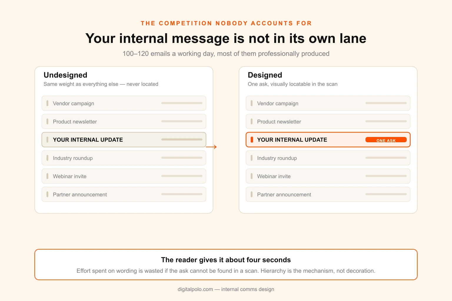
The practical consequence: the effort you put into wording an announcement is largely wasted if the reader cannot locate the ask in four seconds. Design is not decoration applied after the writing. It is the mechanism by which the writing gets read at all.
Four ways internal comms design fails
These are not stylistic complaints. Each has a specific, cheap fix, and each is responsible for a category of message that gets sent and never lands.
1. The undifferentiated wall
Everything on the page has the same visual weight, so the reader has to actually read it to find out what matters. Since nobody reads to find out what matters, they leave. The message was not rejected — it was never parsed.
The fix is hierarchy, and hierarchy in internal comms is more aggressive than in marketing. One headline that states the outcome rather than the topic. One highlighted ask. Everything else demoted hard. If your announcement has three equally important points, it is three announcements, or it is one announcement with two links. Visual hierarchy and white space do more work here than any other design decision available to you.
2. Silent template drift
This one is invisible while it happens and obvious afterwards. A company sets up a decent template. Fifteen people get edit access. Each of them makes a small, locally reasonable adjustment — nudge a margin, swap a typeface because the right one was not installed, drop in a screenshot at the wrong ratio. No single change is wrong enough to flag. Two quarters later, no two documents in the company match, and the brand reads as careless from the inside.
Drift is a permissions and template-construction problem more than a discipline problem. If the fast path and the correct path are the same path, drift mostly stops. That means locked elements, restricted colour and type choices, and pre-sized image placeholders — the same logic behind a proper design system versus a loose style guide.
3. Channel mismatch
A 900-word email sent to warehouse and retail staff who do not sit at desks. A PDF attachment sent to a workforce that reads everything on a phone. A dense slide repurposed as digital signage for people walking past at four miles an hour.
Each of these is a design decision disguised as a distribution decision. The content might be perfect. It is arriving in a form the recipient's actual situation cannot process, and no amount of rewriting fixes a format problem.
4. Accessibility treated as optional
Internal comms has an obligation marketing does not: you cannot choose your audience. Some portion of your employees have low vision, are colour-blind, read the message on a cracked phone screen in bad light, or are reading in their second language. Low-contrast grey-on-grey body text, information carried by colour alone, and eight-point type in a PDF are not minor issues internally. They are exclusions, and in some jurisdictions they carry legal weight.
A 4.5:1 contrast floor for body text and never encoding meaning in colour alone costs nothing at design time and is expensive to retrofit across an established template set.
What you actually produce: the internal comms asset inventory
Most teams underestimate their own output by a factor of three, because they count messages and produce files.
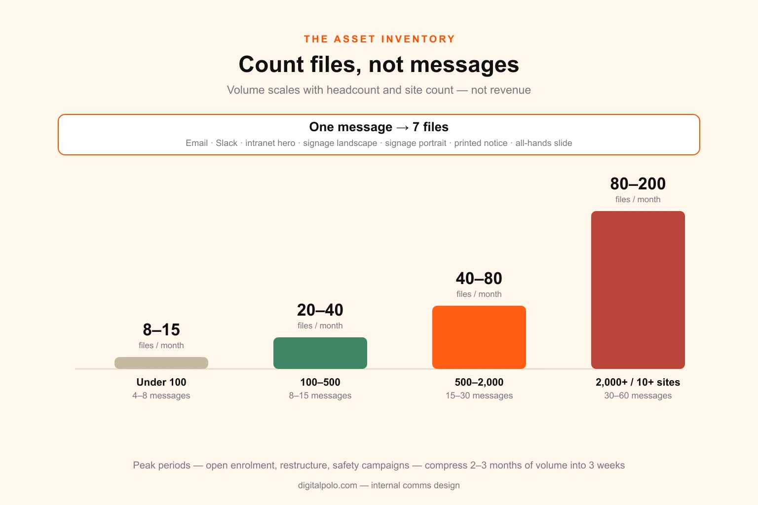
One benefits announcement is one message. It is also: an email, a Slack post graphic, an intranet hero banner, a landscape signage frame, a portrait signage frame, a printed breakroom notice, and a slide for the next all-hands. That is seven files from one message, and if you operate across regions with different benefits, multiply again.
Here is what the annual volume looks like, keyed to headcount rather than revenue — headcount and site count are what actually drive it.
| Company size | Messages / month | Files / month | Recurring items | Typical peak load |
|---|---|---|---|---|
| Under 100 | 4–8 | 8–15 | Monthly newsletter, all-hands deck | Open enrolment, annual planning |
| 100–500 | 8–15 | 20–40 | Newsletter, all-hands, onboarding pack, policy sheets | Enrolment, restructure, compliance cycle |
| 500–2,000 | 15–30 | 40–80 | Above, plus signage, site notices, manager cascades | Enrolment, safety campaigns, multi-site rollout |
| 2,000+ or 10+ sites | 30–60 | 80–200 | Above, plus localisation and per-site variants | Enrolment, M&A, brand or system migration |
Two things fall out of this table.
The first is that the file-to-message multiplier sits between two and four for almost everyone, and it rises with site count rather than headcount. A 300-person company on one floor has a much lighter production load than a 300-person company across nine locations, even though the org charts look similar. If you are budgeting internal comms design, budget against sites and channels, not people.
The second is the peak. Open enrolment, a restructure or a safety campaign will compress two or three months of normal volume into three weeks. Teams staffed for the average are underwater for those three weeks every single year, and the quality drop shows up exactly when the stakes are highest. This is the same seasonal capacity problem that shows up in campaign work, and it has the same answer: plan the peak, not the mean.
Format specifications, channel by channel
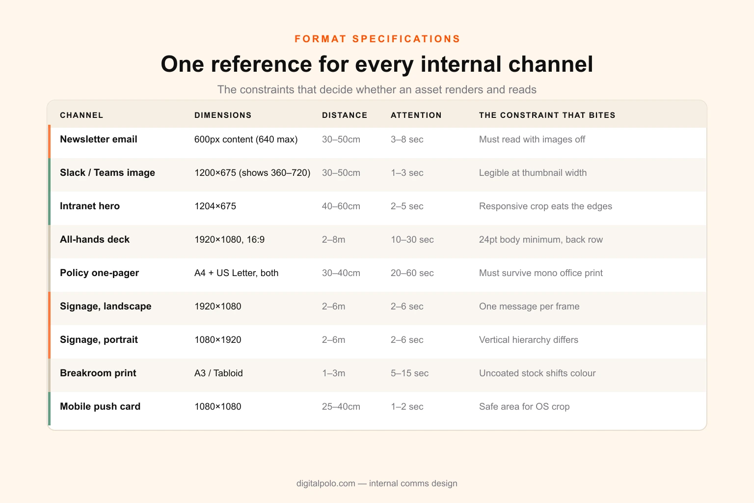
This is the reference section. These are the constraints that decide whether an asset renders correctly and reads quickly, gathered in one place because they are otherwise scattered across a dozen vendor help pages.
| Channel | Dimensions | Reading distance | Attention window | The constraint that bites |
|---|---|---|---|---|
| Newsletter email | 600px content width (640 max), full-bleed background | 30–50cm | 3–8 seconds to the ask | Outlook rendering; must work with images off |
| Slack / Teams in-channel image | 1200×675 upload, displays ~360–720px | 30–50cm | 1–3 seconds | Text must survive downscaling to thumbnail width |
| Intranet / SharePoint hero | 1204×675 (2:1 crops vary by template) | 40–60cm | 2–5 seconds | Aggressive responsive cropping at the edges |
| All-hands deck | 1920×1080, 16:9 | 2–8m projected | 10–30 seconds per slide | Back-row legibility; 24pt minimum body |
| Policy / benefits one-pager | A4 and US Letter, both | 30–40cm | 20–60 seconds | Must print legibly in mono on office stock |
| Digital signage, landscape | 1920×1080 | 2–6m | 2–6 seconds | One message only; cap height by distance |
| Digital signage, portrait | 1080×1920 | 2–6m | 2–6 seconds | Vertical hierarchy differs from landscape |
| Breakroom / notice board print | A3 or Tabloid | 1–3m | 5–15 seconds | Uncoated stock shifts colour; check in situ |
| Mobile push / SMS card | 1080×1080 | 25–40cm | 1–2 seconds | Safe area for OS chrome and notification crop |
A few of these deserve expansion, because they are where most of the avoidable failures live.
Email at 600 pixels. That number is not arbitrary and it is not aesthetic. It is the content width at which Outlook's rendering engine — still the dominant corporate client, still built on a word-processing layout model — behaves predictably, and it is comfortably inside the desktop preview panes people actually use. You can push to 640 safely. Above about 700 you start collecting rendering complaints you cannot reproduce on your own machine. Beyond width, two rules matter more than anything else: design single-column, because multi-column email layouts collapse unpredictably on mobile, and make sure the message survives with images disabled, because a meaningful share of corporate mail clients block them by default. If your entire announcement is text baked into a graphic, a portion of your workforce receives a blank email. The broader mechanics of email design go deeper on this.
Signage and the distance rule. The single most common signage failure is a slide repurposed as a screen asset. Slides are designed for a seated reader roughly three feet away. Signage is read by someone walking past at a distance of two to six metres, giving it two to six seconds. The professional rule of thumb is about one inch of cap height for every ten feet of viewing distance, which for a screen ten feet away means a headline of roughly one inch — far larger than any slide typography. We built a sign letter height calculator for exactly this, and the full explanation of letter height by viewing distance covers the underlying logic. One message per frame. One number, one instruction, or one date. Nothing else.
The all-hands deck. The recurring failure here is designing for the person building the slide rather than the person in the back row. A deck projected in a large room is read at two to eight metres, which puts 24pt on body text as a floor and rules out most of what a laptop screen makes look reasonable. Build it as a layout set rather than a deck — a dozen fixed layouts covering the shapes that recur every quarter, so nobody is arranging boxes at 11pm before the meeting. The same constraints apply to any presentation design intended for a room rather than a screen.
Print for internal use. Internal print is almost always uncoated office stock, run on a shared device that has not been calibrated this decade. Colours shift, fine type fills in, and large flat areas of dark colour band visibly. Design internal print for that reality: heavier type weights, higher contrast, no hairline rules, and no critical information carried by a subtle colour difference. Always check that the sheet still works in monochrome, because someone will print it that way. The general print-ready file checklist applies, with the tolerance widened.
The three-tier template system
The instinct when internal comms quality is poor is to design more things. That is backwards, and it produces a team permanently behind on a queue.
The correct move is to sort output by how much design judgement each item genuinely needs, then resource each tier differently. Almost everything a company sends internally falls into one of three tiers, and the split is remarkably consistent.
Tier 1 — Templated, produced by non-designers
The recurring, high-frequency, structurally identical items. Monthly newsletter. Standard policy sheet. Routine announcement graphic. Standard all-hands deck.
These should be built once, properly, with every meaningful decision locked, and then produced by the comms team without a designer in the loop. The success criterion is specific: someone with no design training produces a correct-looking asset in under fifteen minutes without asking anyone a question. If they have to ask a question, the template is not finished.
This tier is 60 to 70 per cent of your volume and should consume close to zero ongoing design hours.
Tier 2 — Adapted from components
Items that recur but vary meaningfully in content shape. Benefits explainers. Onboarding materials. Campaign sets for a safety push or a values rollout. Site-specific signage.
These need a component library rather than a fixed template — a kit of headers, data blocks, icon sets, photography treatments and layout patterns that assemble into something appropriate. A designer builds the kit and periodically extends it; the comms team assembles from it, with a design review before anything with legal or safety weight ships.
Roughly 20 to 30 per cent of volume, consuming a modest but real ongoing design allocation.
Tier 3 — Bespoke
The genuinely high-stakes, low-frequency items. A restructure announcement. An acquisition integration. A values or brand relaunch. The annual report to employees. Anything where getting it wrong has consequences measured in attrition or trust.
This is 5 to 10 per cent of volume and deserves real design time — proper concepting, revisions, and someone senior looking at it. It is also, tellingly, the tier most often produced in the same rushed afternoon as a routine newsletter, because no distinction was ever drawn.
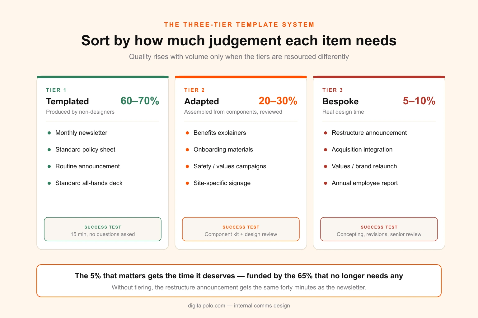
The reason this tiering matters more than any individual template: it is what lets quality rise while volume rises. Without it, every item competes for the same undifferentiated pool of attention and hours, so the restructure announcement gets the same forty minutes as the newsletter. With it, the 5 per cent that actually matters gets the time it deserves, funded by the 65 per cent that no longer needs any.
The same logic governs external campaign work, where one asset has to become fifteen channel formats without fifteen separate briefs. Internal comms is the same problem with a less forgiving audience.
Working out what your own tiering looks like? Send us the list of what you actually produce in a month and we will map it against the three tiers, flag what should be templated, and tell you what the build would cost. No obligation — book a 15-minute call or see what a design partnership includes.
What internal comms needs that your brand guidelines do not contain
Companies with perfectly good brand guidelines still produce poor internal comms, and the reason is that marketing guidelines are written to solve a different problem.
Marketing guidelines optimise for persuasion at a distance from a self-selected audience. They specify logo clear space, colour values, type pairings, photography mood, tone of voice. All necessary. None of it tells an internal comms manager what to do with 800 words of mandatory policy text.
The gap list is consistent across almost every company we see:
- Density rules. How much text per page, per slide, per email module before it stops being read. Marketing never needs this because marketing copy is short by construction.
- A hierarchy convention for skimming. A specified pattern for headline, ask and supporting detail that holds up under a four-second scan, applied identically every time so employees learn where to look.
- An accessibility floor. Minimum contrast, minimum type size per channel, and a rule against colour-only encoding. Non-negotiable internally in a way it rarely is in marketing.
- Internal print rules. Behaviour on uncoated stock and uncalibrated office printers, and a monochrome fallback.
- A signage tier. Type scales for 2–6m viewing distances, which marketing systems almost never define.
- Long-form document standards. Handbooks, policy packs and onboarding materials — multi-page, text-heavy artefacts with running heads, tables and forms that no marketing system addresses.
- Photography rules for real employees. Which is a genuine problem: internal photography is unstaged, inconsistently lit and shot on phones, and it needs a treatment specification that makes it cohere.
Typography deserves a specific note, because internal comms is far more text-dense than marketing ever is. The type choices that work on a landing page frequently fail across eight pages of policy text, and the fixes are unglamorous — a genuine text face rather than a display one, and deliberate kerning, leading and tracking settings for long-form reading. If your system only specifies a serif or sans-serif pairing for headlines, it has not addressed the case internal comms lives in.
The right artefact is not a second brand. It is an internal communications appendix to the existing system — typically 12 to 20 pages, sitting alongside the main brand guidelines and inheriting every identity decision from it while adding the rules above. If you are unsure which document you actually have, the distinction between a brand book and a style guide is worth settling first. Building two separate brands is the failure mode here, and employees notice the split long before customers do.
There is an adjacent artefact worth knowing about: much of what internal comms produces for new joiners overlaps with the employer brand asset kit, and companies routinely build both in isolation and end up with two inconsistent onboarding experiences.
The production math
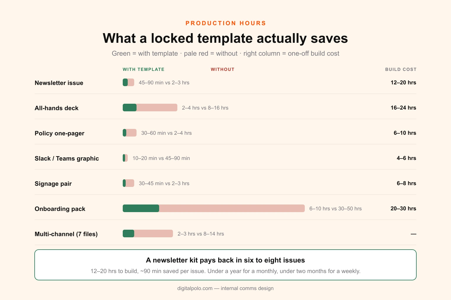
Internal comms teams tend to be small — often one or two people, frequently with the role bolted onto HR or marketing — and are measured against message counts. Here is what the underlying hours actually look like.
| Asset | With locked template | Without template | Template build cost |
|---|---|---|---|
| Newsletter issue | 45–90 min | 2–3 hrs (first issue 4–8) | 12–20 hrs |
| All-hands deck (15–25 slides) | 2–4 hrs | 8–16 hrs | 16–24 hrs |
| Policy / benefits one-pager | 30–60 min | 2–4 hrs | 6–10 hrs |
| Slack / Teams graphic | 10–20 min | 45–90 min | 4–6 hrs |
| Signage pair (landscape + portrait) | 30–45 min | 2–3 hrs | 6–8 hrs |
| Onboarding pack (10–15 pieces) | 6–10 hrs | 30–50 hrs | 20–30 hrs |
| Multi-channel announcement (7 files) | 2–3 hrs | 8–14 hrs | — |
The ratio in that table is the entire argument for template investment. A newsletter kit costs 12 to 20 hours to build properly and saves roughly 90 minutes per issue against the untemplated case. It pays back in about six to eight issues — under a year for a monthly, under two months for a weekly — and every issue after that is profit.
Now run the capacity question. A 400-person company across three sites generates roughly 30 files a month. Templated, at Tier 1 rates, that is perhaps 25 to 35 hours. Untemplated, it is 90 to 130 hours — most of a full-time role — and that is before the enrolment peak, which will add 40 to 60 hours into a three-week window.
This is why the staffing conversation almost always arrives at the wrong answer. The volume at 400 employees does not justify a full-time designer, but it very obviously exceeds what a comms manager can produce between meetings. The two options that get considered are hire someone and keep struggling, and the first is too much while the second is what is already failing.
The option that fits the shape of the work is a design relationship sized to the actual load: a front-loaded template build, then ongoing capacity for Tier 2 assembly and the Tier 3 pieces that matter, without a headcount. That is the arithmetic behind comparing a full-time designer against a design partner, and internal comms is close to the cleanest example of it — the load is lumpy, the peaks are predictable, and 65 per cent of the volume should not touch a designer at all.
Measuring whether any of it works
Internal comms measurement is unusually prone to vanity metrics, because the easiest number to collect is also the least informative.
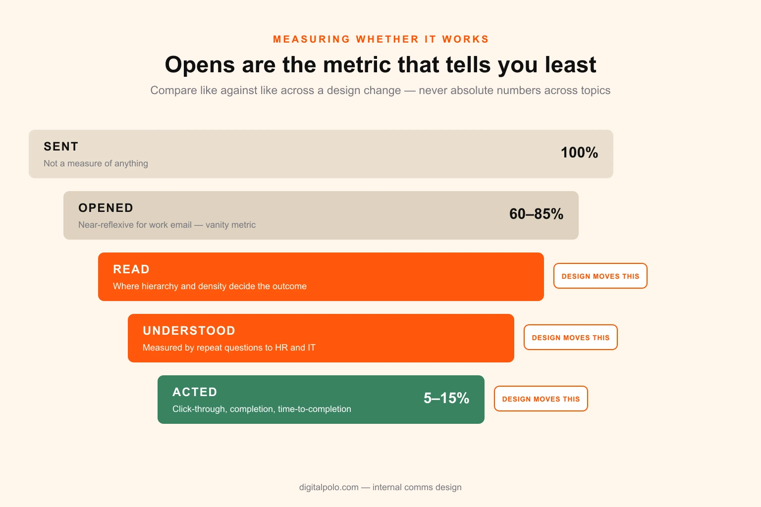
Internal email open rates run between 60 and 85 per cent. That looks like a triumph next to marketing benchmarks, and it means almost nothing — opening work email is close to reflexive. An 80 per cent open rate is entirely compatible with nobody having read anything.
The measures that actually respond to design changes are downstream:
- Click-through on the primary action. Typically 5 to 15 per cent. This is the honest one, and it is sensitive to whether the ask is visually locatable. Define exactly one primary action per message — a message with five equally weighted links has no primary action and cannot be measured.
- Completion rate. Where the message requires something — enrol, acknowledge, complete training, update a record — what percentage finish. This is the number leadership actually cares about.
- Time-to-completion. How long between send and action. A design that makes the ask obvious compresses this sharply, often more visibly than it moves the completion rate itself.
- Repeat-question volume. How many clarifying questions land with HR, IT or managers after the message ships. This is the most honest measure of comprehension available and almost nobody tracks it. If a benefits announcement generates forty follow-up emails, the design failed regardless of what the open rate said.
The methodological point that matters more than the metric list: compare like against like across a design change, not absolute numbers across topics. Completion rates are dominated by subject matter — a bonus announcement outperforms a policy update no matter how either is designed. The only clean read is the same category of message, before and after a template change.
And before anything important ships, run the cheapest test available. Show it to five people who were not involved for four seconds, take it away, and ask what the message was and what they are supposed to do. If three of five cannot answer both, the design is not finished. It takes fifteen minutes and it catches more failures than any analytics dashboard.
Mistakes worth naming
Designing for the sender rather than the reader. Internal comms is frequently structured around what leadership wants to say, in the order they want to say it, at the length they want it to be. Readers do not care about that ordering. Lead with the outcome and the ask; move the context below it. The executive who wanted three paragraphs of preamble is not the person who has to find the deadline.
Treating the intranet as a destination. Almost nobody visits an intranet voluntarily. Messages that depend on someone navigating there have a hard ceiling on reach. Design for push channels and use the intranet as the durable record, not the primary vehicle.
Overproducing routine messages. The opposite failure. Not every announcement needs a custom graphic, and an over-designed routine update dilutes the visual signal you need available when something genuinely important ships. If everything is a designed campaign, nothing reads as urgent. Tiering exists to prevent exactly this.
Ignoring the deskless majority. In manufacturing, retail, logistics, hospitality and healthcare, a large share of the workforce has no desk, no corporate email in practice, and reads everything on a personal phone during a break. Email-first internal comms simply does not reach them. Signage, print and mobile-first formats are not a supplement in these environments — they are the primary channel, and they need real design attention rather than a scaled-down slide.
Letting the template set go stale. Templates decay. Brand evolves, tools update, channels change. A template kit needs a review roughly annually, and a proper refresh when the brand moves. A kit built against guidelines two rebrands ago is actively producing off-brand material at scale.
No named owner. When internal comms design belongs to everyone it belongs to nobody, and quality converges on whatever the least design-literate person with edit access produces. Someone owns the standard, or the standard does not exist.
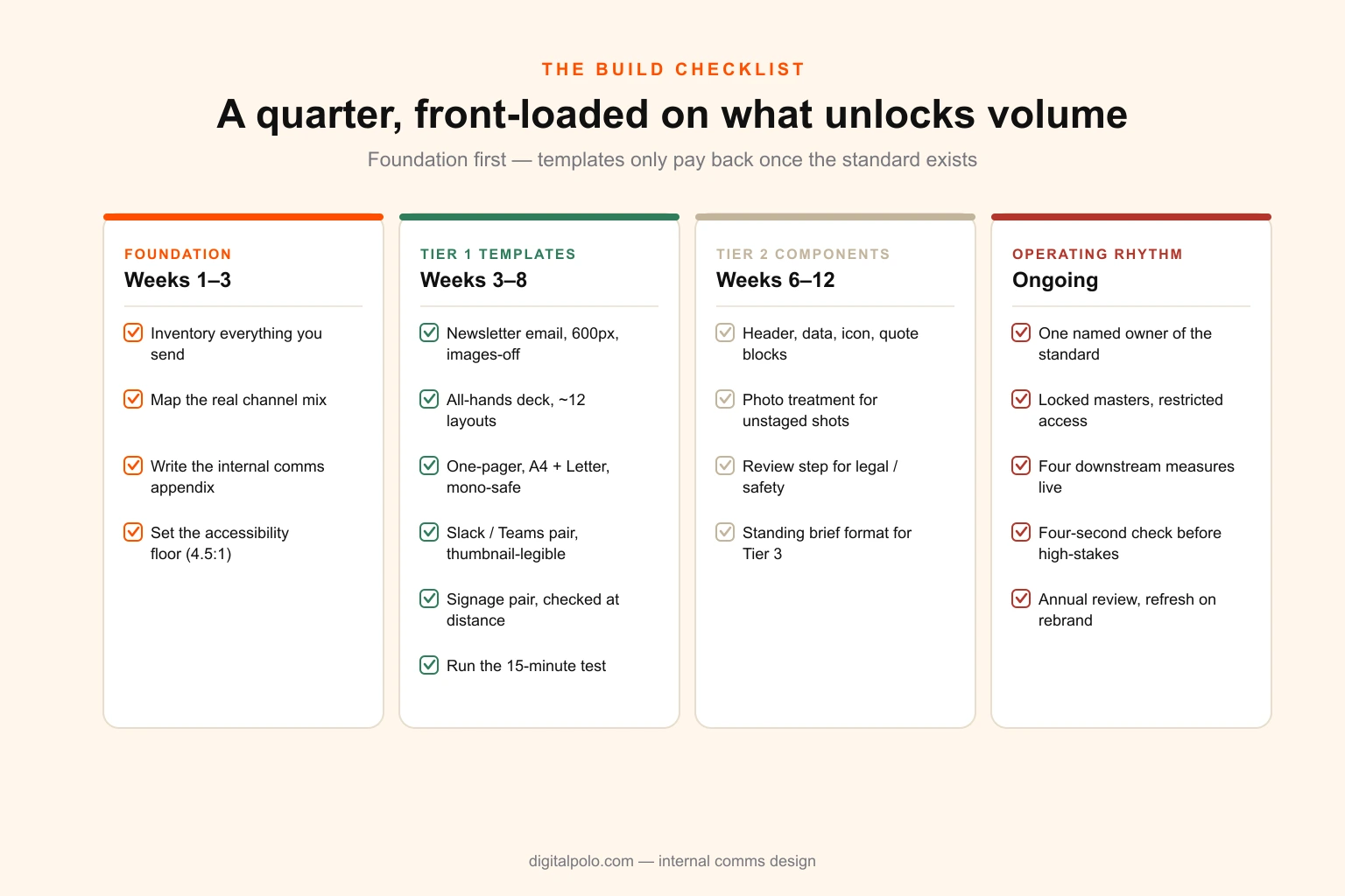
The build checklist
If you are starting from nothing, this is the order that works. It is roughly a quarter of elapsed time and front-loads the items that unlock the most volume.
Foundation — weeks 1–3
- Inventory what you actually send. Every channel, every recurring item, every peak-period surge. Most teams find 30 to 50 per cent more than they expected.
- Identify your real channel mix, weighted by workforce reality rather than org chart — specifically, what proportion of staff are deskless.
- Write the internal comms appendix to your brand guidelines: density, hierarchy convention, accessibility floor, internal print rules, signage tier.
- Set the accessibility floor explicitly. 4.5:1 minimum contrast on body text, per-channel minimum type sizes, no colour-only encoding.
Tier 1 templates — weeks 3–8
- Newsletter email at 600px, single column, three to four modular block types, tested with images disabled.
- All-hands deck, 16:9, roughly a dozen layouts, 24pt minimum body type.
- Policy and announcement one-pager in A4 and US Letter, verified in monochrome on office stock.
- Slack and Teams graphic pair, legible at thumbnail width.
- Signage pair, 1920×1080 and 1080×1920, checked at real viewing distance.
- Run the fifteen-minute test on every template with someone from outside the comms team.
Tier 2 component kit — weeks 6–12
- Header, data-block, icon, quote and photo-treatment components that assemble into new layouts.
- A photography treatment specification that makes unstaged internal photos cohere.
- A documented review step for anything with legal, safety or HR weight.
- A short standing brief format for Tier 3 requests, so high-stakes work does not start from a Slack message — the principles in how to write a design brief apply unchanged internally.
Operating rhythm — ongoing
- One named owner of the standard.
- Locked master files with restricted edit access; the fast path is the correct path.
- The four downstream measures instrumented, compared like-for-like across template changes.
- Four-second comprehension check before anything high-stakes ships.
- Annual template review; full refresh on brand change.
Where this usually lands
The pattern repeats with enough consistency to be worth stating plainly.
A company grows past roughly 150 employees. Internal comms, which used to be a message in a group chat, becomes a real function with real volume. It gets assigned to someone in HR or marketing who is capable and busy and not a designer. They do a reasonable job in a template tool for a while. Then volume climbs, sites multiply, an enrolment period lands, and the output quality falls off a cliff exactly when the messages start mattering more.
Nobody makes a bad decision at any point in that sequence. It is a structural mismatch between a load that grows with headcount and sites, and a resourcing model that assumed internal comms was a writing job.
The fix is not more effort from the person already doing it, and it is usually not a headcount either. It is a template system built once so that two-thirds of the volume stops needing design attention, plus a way to reach real design capacity for the fraction that genuinely does — the restructure announcement, the benefits campaign, the values rollout.
That is roughly what a design partner arrangement is for, and internal comms is one of the cleaner cases for it: predictable recurring load, sharp seasonal peaks, and a large templatable majority. If you want the mechanics, how a design partnership actually works covers the operating model and our pricing covers the cost side. If you are earlier than that and just want the template set built properly once, that is a defined project rather than an ongoing relationship — tell us what you send and we will scope it against your actual inventory.
The employees you are trying to reach are giving you about four seconds. Design is what you do with them.