There are currently over 4.5 billion email users worldwide — more than any social media platform. Email delivers a median ROI of $36 for every $1 spent, a return that has remained consistent for over a decade while social media returns fluctuate. And unlike social platforms, email reaches the inbox directly, without an algorithm deciding who sees what.
But email volume is also at record highs. The average business professional receives over 120 emails per day. Your email is competing with everything else in that inbox for the 2 seconds of attention that determines whether it gets opened, skimmed, clicked — or deleted.
Email design is what tips that balance. This guide covers every element of it.
What Is Email Design?
Email design is the process of creating emails that are visually compelling, easy to scan, on-brand, and structured to drive a specific action. It encompasses every visual and structural decision: the subject line and preheader, the layout, typography, imagery, CTA placement, spacing, and the rendering experience across different email clients and devices. For the underlying composition rules that govern every visual decision, see our principles of design explainer.
The goal of email design is not aesthetic beauty — it is behavior change. Every design decision should serve the email's single objective: getting the recipient to take a specific, defined action.
1. Write a Subject Line That Earns the Open
Nothing else in email design matters if the email isn't opened. The subject line is the first and often only thing recipients see when deciding whether to open or delete.
An effective subject line:
- Captures attention in 40–50 characters (the typical mobile preview cutoff)
- Communicates a specific value the recipient will receive by opening
- Creates genuine curiosity or urgency without being deceptive
- Previews the content accurately — misleading subject lines inflate open rates and tank click-through and trust
Subject line frameworks that consistently perform:
- Specific benefit: "Your Q3 report is ready — 3 things to act on now"
- Curiosity gap: "We made a mistake in last week's email"
- Numbered list: "7 website changes that double conversion rates"
- Direct question: "Are you making these invoicing errors?"
- Personalization: "[First name], your renewal is coming up"
Test subject lines with A/B splits before scaling — a 0.5% open rate difference on a list of 50,000 is 250 additional readers per send.
2. Optimize the Preheader
The preheader is the preview text that appears beside or below the subject line in most email clients — typically 85–130 characters visible before opening. Most senders leave this as default, meaning it pulls the first line of the email body ("View this email in your browser" is a common result).
The preheader is additional open-rate real estate. Use it to extend the subject line's value proposition, add urgency, or preview a specific benefit that complements rather than repeats the subject.
Subject line: "7 website changes that double conversion rates" Preheader: "Most of these take under an hour. We timed them."
That combination is significantly more compelling than the subject line alone.
3. Be Ruthlessly Concise
Email recipients are not reading — they are scanning. Eye-tracking research shows that most email recipients spend 11–23 seconds on a given email before deciding to click, forward, or delete. Long paragraphs, dense copy, and multiple competing messages all reduce that time.
Concision principles for email:
- One primary message per email — if you have five things to communicate, send five emails
- Paragraphs of maximum 3–4 lines
- Use bullet points for lists of benefits, features, or steps
- Front-load the value: the most important information goes in the first 100 words
- A single, prominent CTA — not three competing CTAs at different points in the email
If your email requires more than 300–400 words to deliver its message, ask whether the message is too complex for email, or whether it is not concise enough.
4. Design for Responsive Display
Email is viewed across an enormous range of devices and email clients: iPhone Mail, Gmail on Android, Outlook 2019, Apple Mail on desktop, Gmail in a browser, and dozens more — each of which renders HTML and CSS differently.
A responsive email design adapts its layout to display correctly on each of these contexts:
- Single-column layouts are the safest — they reflow naturally on mobile without requiring media queries
- Font sizes should be at minimum 16px for body text and 22px for headlines (smaller sizes on mobile screens are nearly unreadable)
- Touch targets (buttons and links) should be a minimum of 44×44px for mobile tapping accuracy
- Maximum email width is typically 600px — wider than this and Gmail clips the content with "View entire message"
Test every email across at least 5–7 major email clients before sending. Tools like Litmus and Email on Acid render previews across dozens of clients simultaneously.
5. Design for Dark Mode
Approximately 35% of email opens in 2024 occurred in dark mode — a substantial and growing segment. Emails designed exclusively for light mode can appear broken in dark mode: black text on white backgrounds inverts to white text on black backgrounds (functional), but images with white backgrounds become jarring white boxes, and transparent PNGs may expose unintended background colors.
Dark mode email design principles:
- Use transparent PNGs for logos and icons rather than images with white backgrounds
- Test all color combinations in both light and dark mode before sending
- Avoid relying solely on background colors to create visual sections — they may invert unexpectedly
- Use CSS media queries to specify explicit dark mode styling:
@media (prefers-color-scheme: dark)
If you cannot implement dark mode-specific CSS, design emails that are at minimum tolerable in dark mode — neutral backgrounds, dark-colored logos with transparent backgrounds, and sufficient contrast in both modes.
6. Include an Accessible Unsubscribe Path
Beyond being a legal requirement in most jurisdictions (CAN-SPAM in the US, GDPR in Europe), an accessible unsubscribe option is a trust signal. Brands that hide the unsubscribe link or make it difficult to find create friction that results in spam reports — which damage sender reputation and email deliverability far more than unsubscribes do.
Make the unsubscribe link:
- Visible in the footer of every email
- One-click (not requiring login to unsubscribe)
- Confirmed immediately — don't require subscribers to wait days for the request to process
A subscriber who unsubscribes cleanly may return. A subscriber who marks you as spam damages your domain reputation in ways that affect everyone on your list.
7. Design CTAs That Convert
The CTA is the single most important design element in a transactional or marketing email. Every other element exists to deliver the recipient to the CTA in a state of readiness to click.
Effective CTA design:
- One primary CTA per email. Multiple competing CTAs reduce overall click-through rates. Pick the most important action and design for that exclusively.
- Button over text link. Buttons are visually distinct, easy to tap on mobile, and signal that an action is being invited. Text links are less visually prominent and harder to tap accurately on small screens.
- Descriptive label. "Download the guide" converts better than "Click here." "Start your free trial" converts better than "Sign up." The label should communicate exactly what clicking produces.
- Contrast. The CTA button must stand out from the email background — high contrast between button color and surrounding elements.
- Whitespace around the CTA. The button should have breathing room on all sides. Surrounding visual clutter suppresses click rates.
Personalized CTAs — CTAs tailored to the recipient's known behavior or attributes — consistently outperform generic ones. If your email platform supports dynamic content, use it for CTAs.
Need professionally designed email templates that match your brand and convert? See Digital Polo's plans →
8. Test Before You Send
Email design is an iterative discipline. A/B testing elements of your emails — subject lines, preheaders, CTA copy, button colors, send time, image usage — generates data that compounds into significantly better performance over time.
Testing protocol:
- Change one variable per test to isolate causality
- Run tests on segments large enough for statistical significance (minimum 500 per variant for most metrics)
- Define success metrics before running the test, not after
- Document results and apply learnings to future sends
The most reliably impactful variable to test first: subject line. It affects every downstream metric because it determines who opens the email.
9. Use Emojis Strategically
Emojis in subject lines can increase open rates — or reduce them — depending on the brand context and audience. Professional services audiences often respond negatively to emojis in subject lines. Consumer brands and e-commerce audiences often respond positively.
Rules for emoji use in email:
- Test emoji impact on your specific audience before assuming positive effect
- Use emojis that are universally supported (standard emoji set, not vendor-specific characters)
- Verify rendering across email clients — emojis display differently on Outlook vs. Apple Mail vs. Gmail
- In body copy: use emojis to add visual interest to bullet point lists or to replace decorative elements, not as substitutes for words
10. Personalize for the Recipient
Personalization in email extends far beyond "[First name]" in the subject line. Behavioral personalization — triggering emails based on what a recipient has done, purchased, or clicked — consistently outperforms batch-and-blast campaigns.
Personalization opportunities:
- Name personalization in subject line and greeting
- Location or timezone-based send time optimization
- Product recommendations based on purchase or browse history
- Lifecycle-stage content (onboarding emails vs. retention emails vs. winback emails)
- Triggered emails based on specific actions (abandoned cart, first purchase, inactivity)
Most email marketing platforms (Mailchimp, Klaviyo, HubSpot, ActiveCampaign) support these personalization features. Using them meaningfully — not just adding "[First name]" — is what separates high-performing email programs from average ones. For agency teams managing email programs across multiple clients, see how DigitalPolo handles white-label email design at scale.
11. Design Layouts for Visual Clarity
Layout is the architecture of the email — it determines how the reader's eye moves through the content and what they notice in what order.
Effective email layout principles:
- Inverted pyramid structure: Lead with the broadest appeal (the primary value proposition), narrow to the specific details, end with the CTA
- Single column for mobile: Multi-column layouts break on small screens — single column ensures consistent display everywhere
- White space is not wasted space: Generous margins and padding between sections improve readability and focus attention on key elements
- Image-to-text ratio: Emails with very high image-to-text ratios (image-only emails) are often filtered by spam algorithms. Maintain a balance of 60% text, 40% images as a baseline.
- Email width: Cap at 600px to prevent clipping in Gmail and ensure correct display across clients
Hierarchy in the layout: headline first, supporting information second, CTA third. Every section of the layout should have one job.
12. Keep Every Email On-Brand
Every email your brand sends is a brand impression. The email should use your brand's logo, colors, typography, and tone consistently — so that a recipient who receives your email recognizes it as yours immediately, without needing to check the sender address.
Practical brand consistency in email:
- Logo in the email header on every send
- Brand color palette applied to the header, CTA buttons, and accent elements
- Brand typography (or web-safe equivalents that approximate it)
- Consistent tone of voice — emails should sound like your other content, not like a different writer
- Social media links and website link in the footer
An email that looks and sounds like your brand compounds recognition with every send.
13. Design a Professional Email Signature
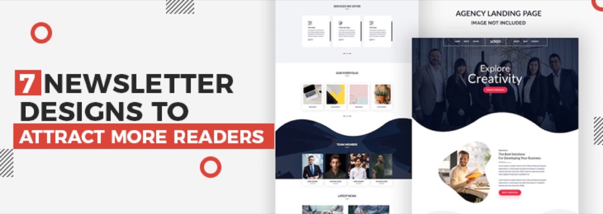
For transactional and 1:1 emails, the email signature is the final element of brand presence. A well-designed signature communicates professionalism and provides every piece of information the recipient needs to take the next step. For a dedicated treatment of this often-overlooked element, see our guide to newsletter design concepts that attract more readers — many of the same layout and hierarchy principles apply to signature design too.
Effective email signature elements:
- Full name and job title
- Company name with link to website
- Phone number
- One professional social link (LinkedIn for B2B contexts)
- Optional: small branded logo or headshot
Keep signatures concise — long signatures with multiple images, legal disclaimers, and every social platform you exist on create visual clutter and slow email loading.
Email Design Tool Recommendations
| Tool | Best For | Cost |
|---|---|---|
| Mailchimp | Small-to-medium lists, all-in-one | Free up to 500 contacts |
| Klaviyo | E-commerce, behavioral automation | Free up to 250 contacts |
| HubSpot | B2B, CRM-integrated email | Free tier available |
| Stripo | Email template builder | Free / $15/mo |
| Litmus | Cross-client testing | From $99/mo |
| Canva | Design assets for email | Free / $15/mo |
Conclusion
Email design is simultaneously a brand exercise, a UX exercise, and a conversion optimization exercise. The best-performing emails are not the most visually elaborate ones — they are the ones that are clear, on-brand, easy to scan, optimized for every display context (including dark mode and mobile), and structured to deliver the recipient to a single, well-designed CTA.
Every element of the email — from subject line to footer — either adds to the likelihood of that CTA being clicked or works against it. Apply the principles in this guide systematically, test what you can, and iterate based on data.
Need email templates that match your brand's professional standard and drive real results? Digital Polo designs email templates, newsletters, and campaign assets as part of a flat monthly design subscription with unlimited revisions. Start for $399/mo → | Soulmate at $899/mo →
Frequently Asked Questions About Email Design
What makes a good email design? A good email design is clear, scannable, and structured to deliver the recipient to a single CTA in a state of readiness to click. Practically: a compelling subject line, a 600px-wide single-column layout, 16px+ body text, a prominent CTA button, high-contrast color choices, and correct rendering across email clients and devices — including dark mode. The visual design serves the email's objective; it does not exist independently of it.
What size should email designs be? The standard maximum width for email is 600px — wider than this and Gmail clips the content with a "View entire message" prompt. For mobile, single-column layouts are the safest approach. Font sizes should be minimum 16px for body text and 22px for headlines. CTA buttons should have a minimum height of 44px for comfortable mobile tapping.
How do I design emails for dark mode?
Use transparent PNG format for logos and icons (avoids white-background artifacts in dark mode). Test all color combinations in both light and dark mode. Use CSS @media (prefers-color-scheme: dark) queries to specify explicit dark mode styling. Design with sufficient contrast in both modes — colors that work in light mode may become unreadable when inverted. Tools like Litmus and Email on Acid include dark mode preview capabilities.
What is the best layout for an email newsletter? The inverted pyramid structure: lead with the broadest appeal (the hook or primary value proposition), follow with supporting details and content, end with a clear CTA. Single-column layout ensures correct mobile display. Limit to 3–5 content sections per newsletter. White space between sections improves readability. Cap width at 600px. One primary CTA per email — multiple competing CTAs suppress overall click-through rates.
What tools do designers use for email design? Email marketing platforms with built-in template editors (Mailchimp, Klaviyo, HubSpot) handle both design and sending. Dedicated template builders like Stripo offer more design control with drag-and-drop editors. Litmus and Email on Acid test rendering across dozens of email clients. Canva and Figma are used to design email assets (banners, product images) before importing them into templates.