Minimalism emerged as an art movement in the 1960s, but its influence on branding has only grown stronger. Apple, Nike, Uber, Airbnb — the most recognized brands in the world are built on the principle of "less is more."
Minimalist branding strips a brand identity down to its most essential elements: a clean logo, a limited color palette, simple typography, and deliberate use of negative space. When done well, it creates identities that are immediately recognizable, easy to reproduce across every medium, and built to remain relevant for decades.
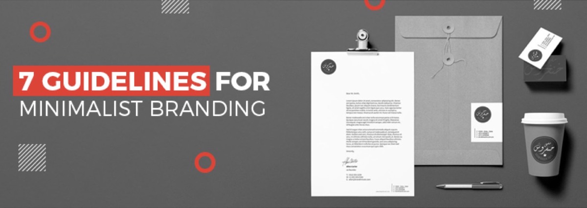
Here are 7 guidelines for applying minimalism to your brand identity effectively.
1. Ensure Simplicity in Every Design Decision
Simplicity in minimalist branding means that every element you include has a clear reason to be there. This is not about making things look plain — it is about making deliberate choices that remove visual noise.
In practice, this means:
- Using no more than 2–3 colors in your primary brand palette
- Limiting your logo to a single icon or wordmark — rarely both combined
- Choosing one typeface for headlines and one for body text
- Removing decorative elements (drop shadows, gradients, textures) that don't add meaning
The goal is a design that communicates your brand's identity without distraction. If a design element can be removed without changing what the brand communicates, it should be removed.
2. Use Negative Space Deliberately
Negative space — the empty area surrounding or between design elements — is one of the most powerful tools in minimalist design. Most designers underuse it; the best minimalist brands treat it as a design element in its own right.
Well-used negative space:
- Draws attention to the most important part of a design
- Creates a sense of luxury, confidence, and breathing room
- Makes logos and marks more memorable (the FedEx arrow, the Amazon smile)
- Improves legibility across sizes — from business card to billboard
Avoid the instinct to fill empty space. In minimalist branding, space is not wasted — it is purposeful.
Want to apply minimalist principles to your brand without the guesswork? Digital Polo's designers specialize in clean, timeless brand identities — delivered as part of a flat monthly subscription. Explore plans →
3. Select a Restrained Color Palette
Color does more work in minimalist branding than in any other design style — because there are fewer other elements competing for attention. The right color palette becomes the primary way your audience recognizes your brand before they even read your name.
Minimalist color guidelines:
- Limit your primary palette to 1–3 colors
- Choose colors that align with your brand's personality (blue for trust, black for luxury, green for sustainability)
- Include one neutral — white, off-white, or light grey — for backgrounds
- Define specific Pantone, HEX, and CMYK values to ensure consistency across all applications
Most effective minimalist palettes use one strong brand color, one neutral, and one accent. Think Airbnb's coral-and-white, or Spotify's green-on-black.
4. Choose Simple, Contemporary Typography
In minimalist branding, typography often carries the brand's entire personality — especially in wordmark-only logos. A poorly chosen font undermines everything else you've done right.
Typography guidelines for minimalist brands:
- Choose clean sans-serif or geometric typefaces: Helvetica, Futura, Gill Sans, and Gotham are classic choices
- Avoid script or decorative fonts unless they are central to the brand concept
- Use no more than two typefaces across all brand materials
- Define clear typographic hierarchy: one weight and size for headlines, one for body, one for captions
Your type choices should feel appropriate for your specific audience. A law firm and a tech startup might both use minimalist branding, but their typeface choices should feel distinct to their respective worlds. A design agency that specializes in branding can help you narrow down the right typographic direction for your category.
5. Avoid Crowded Designs
Minimalist brand identity falls apart the moment you start adding "just one more thing." Crowded design is the most common failure mode for brands attempting a minimal aesthetic while still trying to communicate too much. Many of the smart branding strategies that work at scale are built on restraint rather than addition.
Signs a design is overcrowded:
- Multiple icons or illustrations competing for attention
- More than 3 colors in active use at once
- Body text set at small sizes to make room for more content
- Logo marks with too much internal detail to reproduce cleanly at small sizes
When you catch yourself thinking "we should add X to make it clearer," consider whether improving the existing elements would communicate that message better. Usually, it does.
6. Maintain Brand Consistency Across All Channels
Minimalist branding only works at scale when applied consistently everywhere. One off-brand social post or a brochure with the wrong color tone breaks the visual consistency that makes minimalist identities so powerful.
Consistency in minimalist branding means:
- The same logo treatment across your website, social profiles, email, and physical materials
- The same color values reproduced correctly across print (CMYK) and digital (RGB/HEX) applications
- The same typographic system across every content format
- A documented brand style guide that every designer — internal or external — follows
Consider creating a corporate identity kit that captures all your brand rules in one reference document. Without one, consistency degrades every time a new person creates something on behalf of your brand.
7. Let Your Brand's Personality Define the Minimalism
Minimalist branding done poorly looks generic. Done well, it expresses your brand's specific personality with remarkable economy. The difference is intentionality.
Apple's minimalism communicates innovation and simplicity because Steve Jobs's design philosophy and product philosophy were the same thing. Their minimal aesthetic is not a style choice — it is the brand's belief system made visible. Nike's swoosh communicates movement and ambition in a single brushstroke.
Before finalizing your minimalist identity, ask: what specific emotion or idea does our brand need to communicate? Every design decision — the curve of your logo, the exact shade of your brand color, the specific weight of your typeface — should serve that single idea.
When Minimalist Branding Works (and When It Doesn't)
Minimalist branding is not the right choice for every business — and different industries have very different visual conventions. Even specialized sectors have their own rules: branding guidelines for adult-industry websites, for example, require a different kind of restraint than a law firm or a tech startup. It works best for:
- Technology companies — clean aesthetics align with precision and innovation
- Premium and luxury brands — restraint signals exclusivity and quality
- Professional services (law, finance, consulting) — where trust and clarity are the primary brand goals
- Direct-to-consumer brands targeting millennials and Gen Z
It tends to work less well for:
- Children's products and entertainment — where warmth, color, and playfulness are expected
- Food and hospitality brands — where richness and sensory detail drive appetite and desire
- Businesses that need to stand out in crowded markets — a generic minimal logo doesn't differentiate when every competitor looks the same
Conclusion
The world's most valuable brands spent significant resources developing minimalist identities. The appeal is not just aesthetic — minimalist branding is easier to reproduce consistently, more adaptable across digital and physical media, and more likely to remain relevant as trends change.
Getting it right requires skilled designers who understand restraint, proportion, negative space, and the specific personality of your brand.
Digital Polo delivers unlimited design revisions, consistent quality, and fast turnarounds — all for one flat fee. Start your subscription today →
Frequently Asked Questions About Minimalist Branding
What is minimalist branding? Minimalist branding is a design approach that uses the fewest possible visual elements — limited colors, simple typography, and generous negative space — to communicate a brand's identity clearly and memorably. The goal is for every design element to serve a purpose; anything decorative or redundant is removed.
What brands are known for minimalist design? Apple, Nike, Google, Uber, Airbnb, and Muji are widely cited as minimalist branding leaders. All use fewer than 3 brand colors and clean, geometric logos that are instantly recognizable at any size. Apple's logo, Nike's swoosh, and Airbnb's "Bélo" symbol are all examples of minimal marks with strong emotional resonance.
How do I create a minimalist logo? Limit your palette to 1–2 colors, choose a clean sans-serif or simple geometric typeface, maximize negative space around all elements, and avoid gradients, drop shadows, or textures. A practical test: if your logo is not recognizable as a single-color silhouette at 16px, it has too much complexity.
Is minimalist branding right for every business? No. Businesses in entertainment, food, children's products, or lifestyle categories often benefit from richer, more expressive branding. Minimalism works best for tech companies, premium goods, and professional services — where clarity, trust, and longevity are the primary brand goals.
What's the difference between minimalist branding and a plain brand? Minimalist branding is intentional — every element is deliberate and serves the brand's core message. A plain brand lacks intention and simply feels unfinished. Good minimalism requires more design skill and strategic thinking than a complex identity, because there is nothing to hide behind.