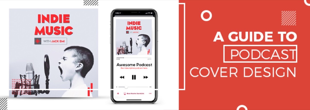
There are over 4 million podcasts on Spotify. Every one of them has cover art. Most of it looks nearly identical — generic microphone, bold sans-serif title, gradient background — which is exactly why well-designed podcast cover art stands out so dramatically.
Your cover art is the first thing a potential listener sees in directory search results, algorithmically recommended lists, and social media shares. It has to communicate your show's topic and tone at 100×100 pixels, earn a click at 300×300 in a directory listing, and look good at full size in a player.
This guide covers everything you need to design podcast cover art that works: platform specs, design principles, the most common mistakes, and what separates forgettable cover art from art that converts browsers into subscribers.
What Is Podcast Cover Art?
Podcast cover art is the primary visual representation of your show across all podcast directories — Apple Podcasts, Spotify, Google Podcasts, Amazon Music, and others. It appears as the show thumbnail in search results, category listings, and listener libraries.
Podcast cover art is distinct from a podcast logo, though the two are related. A podcast logo is a flexible brand mark that can be used across merchandise, social media, and promotional materials. Podcast cover art is a specific formatted asset designed to the square dimensions required by podcast platforms. Your logo will typically appear within your cover art, but the cover art itself is a separate deliverable.
Specs for Podcast Cover Art: Size & Dimensions
Platform requirements are consistent across the major directories:
- Recommended size: 3000 × 3000 pixels (square)
- Minimum size: 1400 × 1400 pixels (Apple Podcasts minimum; some platforms accept 1400×1400 but 3000×3000 ensures future-proofing)
- File format: JPEG or PNG
- Color space: RGB
- Resolution: 72 DPI
- Aspect ratio: Square (1:1) — required by all major platforms
Always design at 3000×3000 and export as JPEG for submission. The square constraint is non-negotiable — platforms will reject non-square images or crop them automatically in ways you can't control.
Design at full resolution even if you're primarily targeting mobile listeners. Platform apps render cover art at varying sizes depending on context (search results, now playing screens, recommendation carousels), and a low-resolution image will show pixelation at larger display sizes.
6 Design Principles for Effective Podcast Cover Art
1. Let Your Content Lead the Design
The most effective podcast cover art immediately communicates what the show is about. Before designing, be specific about:
- What is the show's core topic?
- What is the tone? (Authoritative and serious? Conversational and warm? High-energy and entertaining?)
- Who is the target listener?
A business strategy podcast and a true crime podcast both need cover art — but they should look nothing alike. The design should reflect both the subject matter and the tone so that potential listeners who encounter it in a directory can immediately assess whether it's for them.
2. Design for Your Target Listener
Know exactly who you're designing for. A podcast for C-suite executives in financial services has a very different visual register than a podcast for first-time homebuyers or competitive gamers. The cover art should feel like it was made specifically for your listener persona — using visual language (color, typography, imagery style) that resonates with them.
Cover art that tries to appeal to everyone typically appeals to no one. Specificity in design signals specificity in the show — and that attracts committed listeners rather than casual browsers.
3. Keep It Simple
Podcast cover art is viewed primarily at small sizes in competitive directory environments. Complexity that reads well at large sizes often collapses into visual noise at the 100–300px sizes where most listeners first encounter a show.
Design principles for small-size clarity:
- Limit text — show title only; keep episode/season information off the cover art entirely
- High contrast — text must be legible against the background without zooming
- One or two focal elements — a face, an icon, or an abstract visual; not both a face and multiple icons and complex backgrounds
- Bold typography — thin or lightweight fonts disappear at small sizes; use medium weight or heavier for any text on the art
Podcast cover art is one of the clearest applications of minimalist branding principles — strip everything back to what communicates the show's identity at a glance.
The "thumbnail test": shrink your design to 100×100 pixels and look at it. Can you read the show name? Does the core visual element still communicate? If not, simplify.
Not a designer? Digital Polo creates professional podcast cover art as part of its flat-rate subscription — no per-project fees, delivered fast. See what's included →
4. Give the Edges Adequate Margin
Platform players and directories sometimes crop or clip the edges of cover art — particularly on smaller screens and in notification previews. Any important element (text, logo, key visual) placed too close to the edge risks being cropped.
Keep a safe zone of at least 5–10% padding from each edge. This ensures the full design reads correctly at every size and on every platform, regardless of how the image is displayed.
5. Test in Dark Mode
A significant percentage of podcast listeners use dark mode on their devices and in the apps they use to listen. Cover art with white backgrounds or light edges can appear jarring against a dark UI.
Test your cover art design against both light and dark backgrounds before finalizing. If your design uses a white background, consider whether a slightly off-white, cream, or lightly tinted background would preserve the aesthetic while performing better in dark mode.
6. Apply Your Brand Consistently
Your podcast is a brand touchpoint. The cover art should use your brand's color palette, typography, and visual style — not a completely independent aesthetic that has no relationship to your website, social media, or promotional materials.
If your podcast is an extension of a business or personal brand, the cover art should feel like part of the same visual family. For solo hosts building a show around their expertise, a strong personal brand is the foundation the cover art expresses. Use your brand fonts for the show title. Apply your brand colors as the primary palette. Include your logo where appropriate.
Consistent branding across the podcast and its broader ecosystem means listeners who encounter your show in one context (social media ad, recommendation from a friend) immediately recognize it when they find it in a directory. A documented brand identity kit makes that consistency easier to maintain as your show grows and collaborators get involved.
What Makes Podcast Cover Art Stand Out in a Directory
In a crowded directory, the covers that earn clicks share a few characteristics:
- A human face — shows featuring the host's face consistently outperform abstract designs in click-through tests, particularly for interview and conversation formats
- Strong color contrast — the cover should be identifiable at a glance in a scrolling list; low-contrast designs get overlooked
- Bold, specific typography — the show name should be readable without effort; a distinctive font choice helps memorability
- A clear visual hook — something that triggers curiosity or communicates the show's distinctive angle in a single look
The covers that underperform: too much text, illegible font choices, complex backgrounds that compete with the show title, overly generic stock imagery that signals nothing specific about the show.
Conclusion
Your podcast cover art is working 24 hours a day in directories, search results, and recommendation lists — making first impressions on potential listeners who may never click if the cover doesn't give them a reason to.
Great podcast cover art isn't about being visually impressive at large sizes. It's about communicating your show's identity clearly and compellingly at the sizes where listeners actually encounter it — which are small, fast, and competitive.
Invest in cover art that earns the click. With over 4 million podcasts competing for attention, the ones that grow are the ones that look like they belong.
Your podcast cover art is the first impression every potential listener sees. Make it count with professionally designed artwork from Digital Polo. Unlimited designs, unlimited revisions, one flat monthly fee. Get started for $399/mo → | Soulmate at $899/mo →
Frequently Asked Questions About Podcast Cover Art Design
What makes good podcast cover art? Effective podcast cover art is readable at small sizes (100×100px), communicates the show's topic and tone instantly, has strong contrast between text and background, uses minimal text (show name only), and aligns with the host's or show's broader brand identity. The single most important test: shrink the design to thumbnail size and check whether the show name is still legible and the visual communicates something specific.
What size should podcast cover art be? The standard recommended size is 3000×3000 pixels, square aspect ratio, JPEG or PNG format, RGB color space, 72 DPI. Apple Podcasts requires a minimum of 1400×1400 pixels. Always design at 3000×3000 — the larger file ensures clarity at all display sizes across platforms, now playing screens, and social media sharing.
How do I create podcast cover art? Use vector design tools like Adobe Illustrator or Affinity Designer for text-heavy designs (ensures text remains crisp at all sizes), or raster tools like Photoshop for photography-based designs. Canva offers accessible podcast cover art templates for non-designers. For professional results — particularly for shows tied to a business brand — hire a graphic designer or use a design subscription service.
What is podcast cover art called on Apple Podcasts? Apple Podcasts refers to it as "podcast artwork." It's submitted through Apple Podcasts Connect during show setup or when updating the feed, and appears as the show thumbnail across all Apple Podcasts listing pages, search results, and the Now Playing interface.
Do I need separate cover art for each episode? No. The show artwork is the standard identifier across all episodes — it appears consistently in directories regardless of which episode a listener is playing. Episode-specific artwork is optional and primarily relevant for video podcasts on platforms like YouTube, where episode thumbnails are displayed differently. For audio-only formats, your show artwork is your persistent brand asset across the entire library.