Your newsletter design is the first thing subscribers judge before reading a single word. A cluttered layout, mismatched fonts, or poor mobile optimization can tank engagement — no matter how strong the content is.
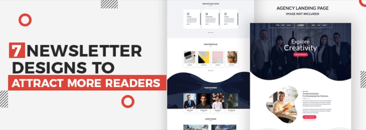
Good newsletter design is not just about aesthetics. It affects deliverability, click-through rates, and how long readers stay engaged. Here are 7 proven design concepts that make the difference between newsletters that convert and ones that get deleted.
1. Use Eye-Catching Headings and Titles
Your subject line gets readers to open the email. Your headline inside the newsletter gets them to keep reading. Both need to earn attention.
Studies consistently show that only about 20% of people who see a headline actually click through to read the content. That number is even lower in email — average newsletter click rates hover around 2–5%. Strong, benefit-driven headlines directly counter this drop-off.
When writing newsletter headings:
- Lead with a clear benefit or outcome, not just a topic label
- Use numbers when relevant ("5 ways to…", "3 things to know this week")
- Keep headers scannable — under 10 words where possible
- Test two subject line variants if your email platform supports A/B testing
2. Use a Column Layout That Matches Your Content
A well-structured column layout guides the reader's eye through your content in a predictable order. For most business newsletters, a single-column or two-column layout works best.
Single-column layouts are safer for mobile — no side-by-side content gets squished on a phone screen. Two-column layouts work well for showcasing multiple products or stories of equal importance.
Avoid three or more columns unless your readers are primarily on desktop. Most email clients render wide layouts poorly on smaller screens, and mobile now accounts for over 50% of email opens.
Want professionally designed newsletters that match your brand — delivered every time? Digital Polo handles all your email design as part of a flat monthly subscription. See plans →
3. Add Visual Elements to Make It More Appealing
Visual content in newsletters consistently outperforms text-only emails in click engagement. Images, icons, and branded graphics break up text and direct attention toward your most important content.
However, images come with trade-offs in email:
- Large images slow load times on mobile
- Some email clients block images by default — always include descriptive alt text so your message still lands
- Follow the 60/40 rule: aim for roughly 60% text to 40% images to balance visual appeal with inbox deliverability
Use visuals to reinforce your message, not replace it. The best-performing newsletters combine a strong hero image with supporting text that works even when images are turned off.
4. Include Social Media Buttons Strategically
Social sharing buttons in emails serve as a secondary call to action — extending your newsletter's reach beyond your existing subscriber base.
Place social buttons in a consistent location (usually the footer) and limit them to platforms where your audience is most active. Cramming in icons for 6+ networks creates visual noise without improving results.
Two types of social actions work well in email:
- Follow buttons — send readers to your profiles to grow your social audience
- Share buttons — ask readers to tweet, pin, or forward specific content from the newsletter
Pick one primary social action per newsletter issue rather than asking readers to do both.
5. Use Brand Colors and Fonts Consistently
Brand consistency in email design affects reader recognition and trust. Subscribers who see consistent colors and typography across your website, social media, and email are more likely to engage — because they recognize the sender the moment the email opens. The same principles that apply to brochure design — clear hierarchy, limited colors, readable type — translate directly to email layouts.
For email newsletter design typography:
- Use system-safe fonts (Arial, Georgia, Helvetica, Times New Roman) for maximum compatibility across email clients
- Keep body text at a minimum of 14px — anything smaller is difficult to read on mobile
- Limit yourself to two font choices: one for headings, one for body text
For color:
- Stick to your brand palette — 2–3 colors maximum
- Use contrast intentionally: your CTA button should be the most visually prominent element in the email
- Test dark mode rendering — more than 35% of email users now read in dark mode, and light text on a white background disappears entirely
6. Design for Mobile-Responsive Reading
Over 50% of emails are opened on mobile devices. A newsletter that looks polished on desktop but breaks on a phone will be deleted in seconds.
Key mobile design rules for newsletters:
- Use single-column layouts wherever possible
- Minimum touch target size for CTA buttons: 44px × 44px
- Keep body font at 14–16px; headlines at 22–28px
- Use inline CSS — many mobile email clients strip external stylesheets
- Test your design in at least three email clients (Gmail, Apple Mail, Outlook) before sending
Avoid treating responsive design as just "making it smaller." Good mobile email design starts from the mobile layout and scales up, not the reverse.
7. Maintain Brand Consistency Across Every Issue
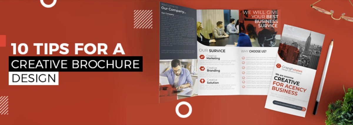
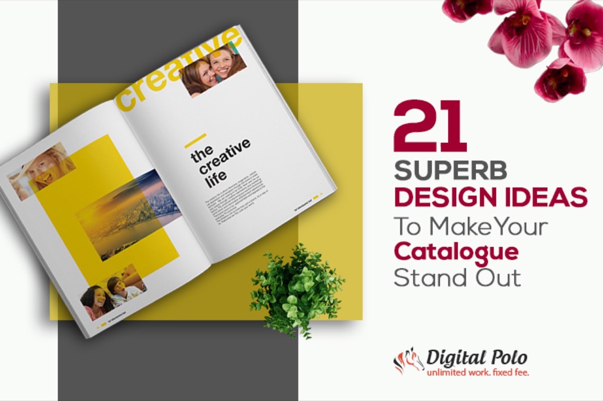
Your newsletter is a recurring touchpoint. Readers should instantly recognize each issue as yours — before they even read the sender name. If you also produce print marketing, catalogue design ideas that make your brand stand out in print will reinforce the same recognition you're building in email.
Consistency in email newsletter design means:
- The same header treatment or logo position every issue
- The same color palette and font choices throughout
- A repeatable content structure — for example: lead story → 2–3 shorter items → CTA → footer
- Matching your newsletter aesthetic to your website, social media, and other marketing materials
When your newsletter looks and feels consistent, subscribers build trust with the format. That trust translates directly into higher open rates and more clicks over time.
Conclusion
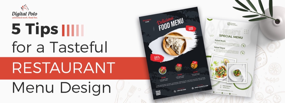
Good newsletter design is the difference between a subscriber who looks forward to your emails and one who unsubscribes after the third issue. If your audience includes hospitality or food businesses, the same attention to layout and visual appetite applies to restaurant menu design — both formats must earn the reader's attention at a glance. The 7 concepts above — clear headlines, strategic layouts, smart visuals, brand-consistent colors and fonts, mobile optimization, and consistency — are the foundation of email campaigns that actually perform.
The challenge is implementing all of them, every single send, without a dedicated design team.
Your newsletter is a direct line to your audience — make every issue count. Get unlimited newsletter designs, social media graphics, and more with a Digital Polo subscription. Start for $399/mo → or go all-in with our Soulmate plan at $899/mo →.
Frequently Asked Questions About Newsletter Design
What makes a good newsletter design? A good newsletter design has a clear visual hierarchy, consistent brand colors, scannable sections with short paragraphs, a mobile-responsive layout, and a single primary CTA per issue. The best-performing newsletters are immediately recognizable as belonging to the sender's brand — before the reader even looks at the sender name.
What is the 60/40 rule in email design? The 60/40 rule recommends a ratio of roughly 60% text to 40% images in email newsletters. This balance maintains visual appeal while avoiding spam filter triggers — some email clients automatically flag or block image-heavy emails, and all-image newsletters fail entirely when images are disabled by the reader.
What is the 3-2-1 newsletter format? The 3-2-1 newsletter format structures each issue with 3 short tips or insights, 2 useful resources or links, and 1 question or call to action. This structure maximizes engagement without overwhelming subscribers and works particularly well for curated newsletters and B2B audiences.
How do I make my newsletter mobile-responsive? Use single-column layouts, set body text to a minimum of 14px, make CTA buttons at least 44px tall for touch targets, use inline CSS styling, and test across Gmail, Apple Mail, and Outlook before sending. Most modern email platforms (Mailchimp, Klaviyo, ConvertKit) include mobile-preview modes.
What's the ideal length for a newsletter? Most high-performing newsletters are 200–500 words for general audiences. Long-form newsletters (1,000+ words) work for niche audiences with high engagement — industry analysts, researchers, or loyal subscriber bases built around specific expertise. When in doubt, shorter and more focused outperforms longer and comprehensive.