Physical catalogues have survived the digital revolution for a good reason: they work differently than screens. A catalogue can be held, flipped through, left on a coffee table, or handed to a colleague. It creates a tactile brand experience that digital can't replicate. For print shops, sticker manufacturers and packaging converters that produce catalogues at scale, see our graphic design for print shops landing — most catalogue jobs benefit from print-ready vector file prep more than they benefit from prettier covers.
But most catalogues fail before they're read. They're generic, forgettable, and too similar to everything else in the pile. The solution isn't a bigger budget — it's better thinking about format, design, and purpose.
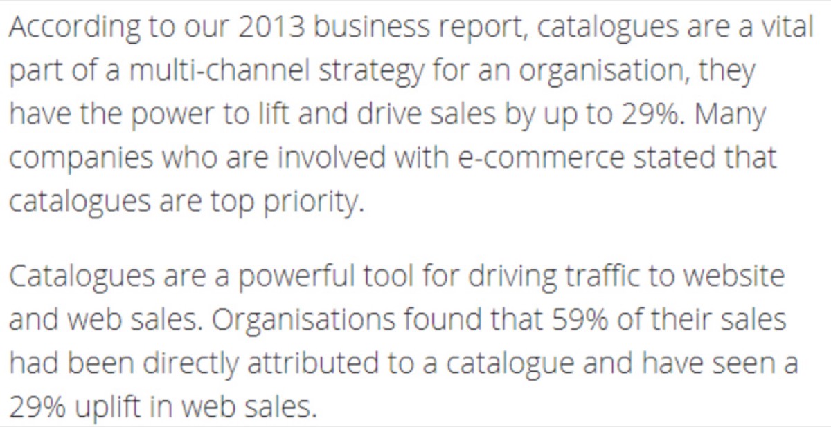
Studies consistently show that catalogues drive purchasing decisions in ways that banners and ads don't. 60% of direct sales connect to catalogue distribution. 30% of web sales increases have been directly linked to catalogue campaigns. 55% of companies have maintained catalogue programs for over a decade and report strong ROI.
The catalogue that gets kept — that sits on a desk and gets referred back to — is worth more than a hundred flyers that go straight in the bin.
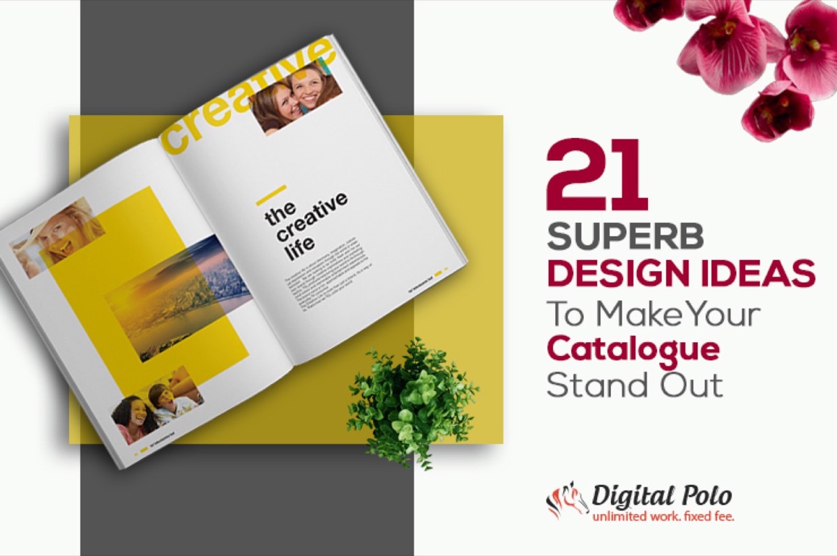
Here are 21 ideas to make yours the one that gets kept.
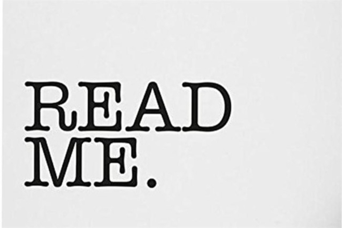
1. Use Words That Compel Action
The most powerful design element in any catalogue isn't visual — it's language. Words like "Read Me," "Open," or "Only 48 Hours Left" create psychological pressure that images alone can't generate. Curiosity-driven language invites interaction before a design element can.
Don't bury the invitation. Put compelling copy on the cover, on section dividers, and at every decision point. Design and copy work together — strong design with weak copy underperforms.
2. Make Typography a Design Element
Typography is more than text choice — when used boldly, it becomes the visual focal point of the design. Large-scale letters, text shaped into illustrations, and words that form images are all legitimate design techniques that turn information into visual interest.
Typography-driven design works especially well for product catalogues with limited photography. When the product images aren't spectacular, let the type carry the visual weight.

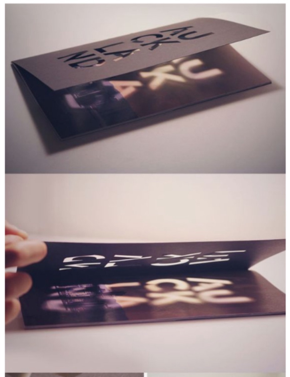
3. Use Die Cuts to Create Mystery
Die cuts are shapes cut into catalogue pages that reveal partial views of the next page. They create curiosity — the reader's brain fills in what's partially hidden, creating a compulsion to turn the page.
They can also add depth to multi-page designs: concentric die cuts across several pages reveal layers, creating a three-dimensional effect from flat paper. Every cut removes weight from the catalogue while adding visual interest — subtraction as a design tool.
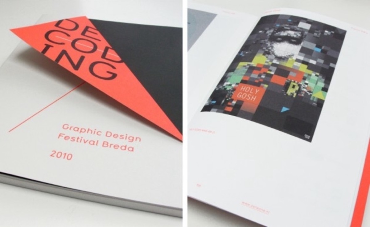
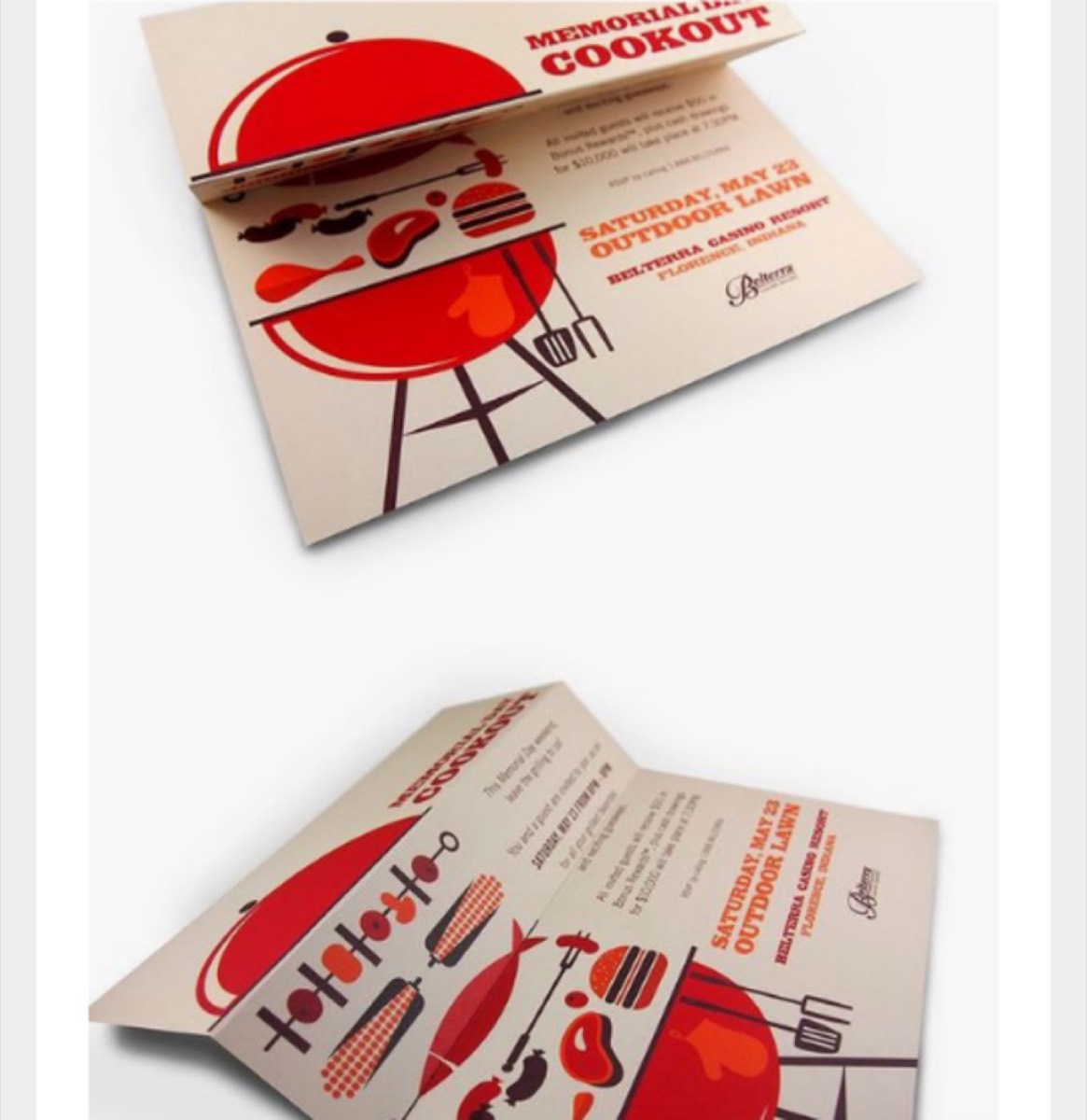
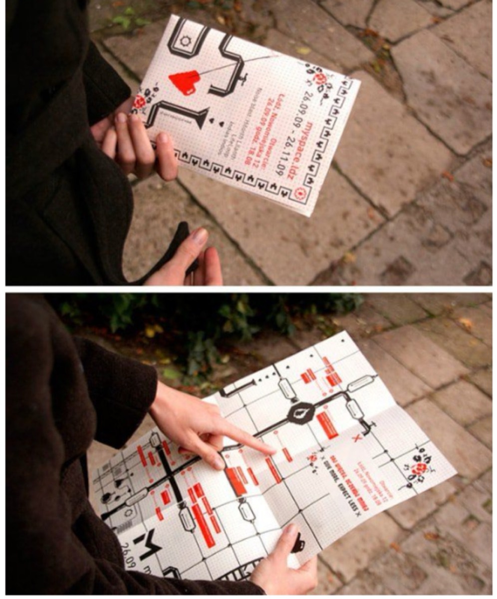
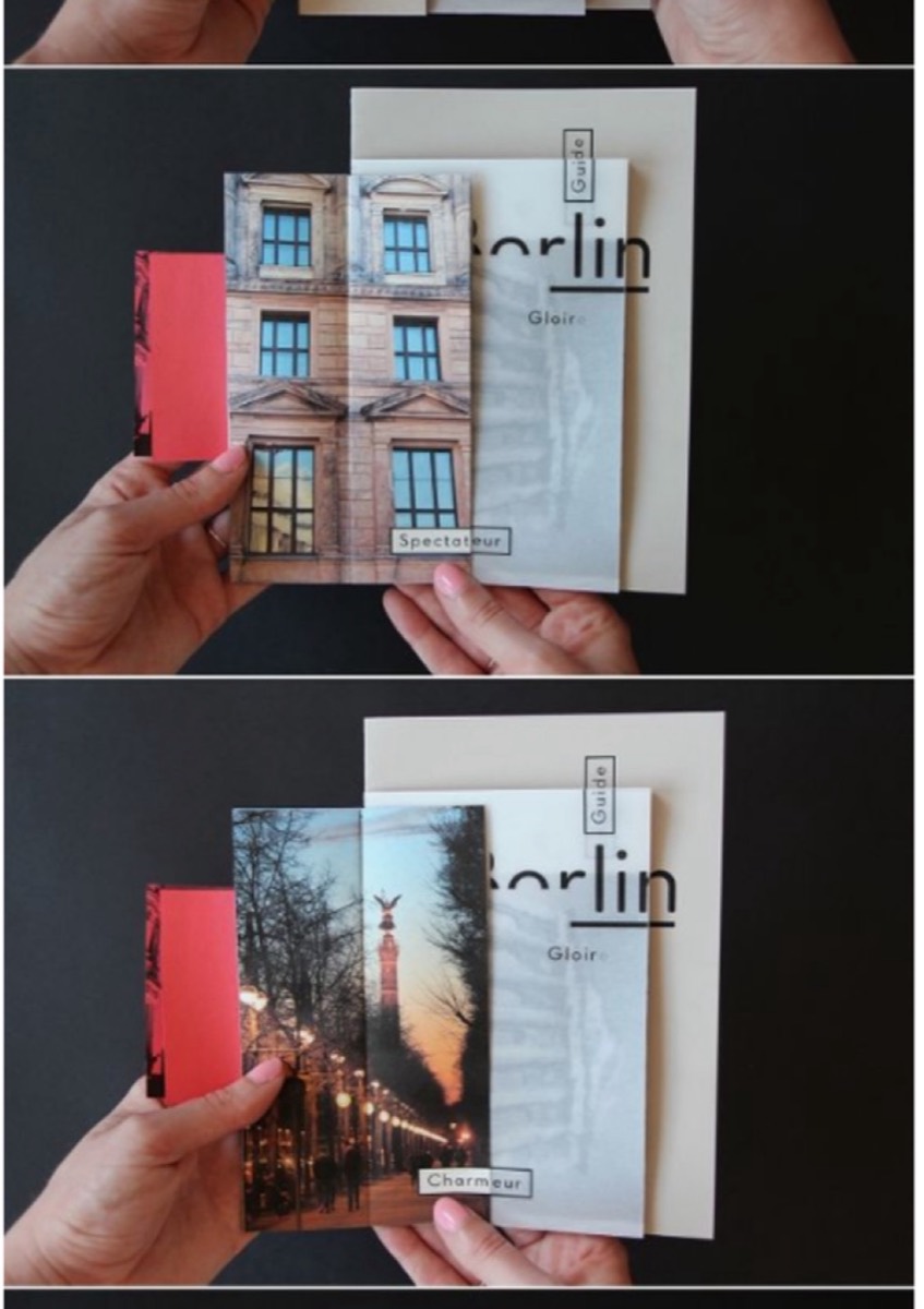
4. Experiment with Unusual Folds
Most corporate catalogues use standard accordion folds because it's what everyone does. Unconventional folds — angular cuts in the upper edges, gatefolds, Z-folds, accordion variations with die-cut details — create a physical interaction that sets your catalogue apart from the moment it's picked up.
The fold is often the first physical interaction a reader has with your catalogue. Make it memorable.
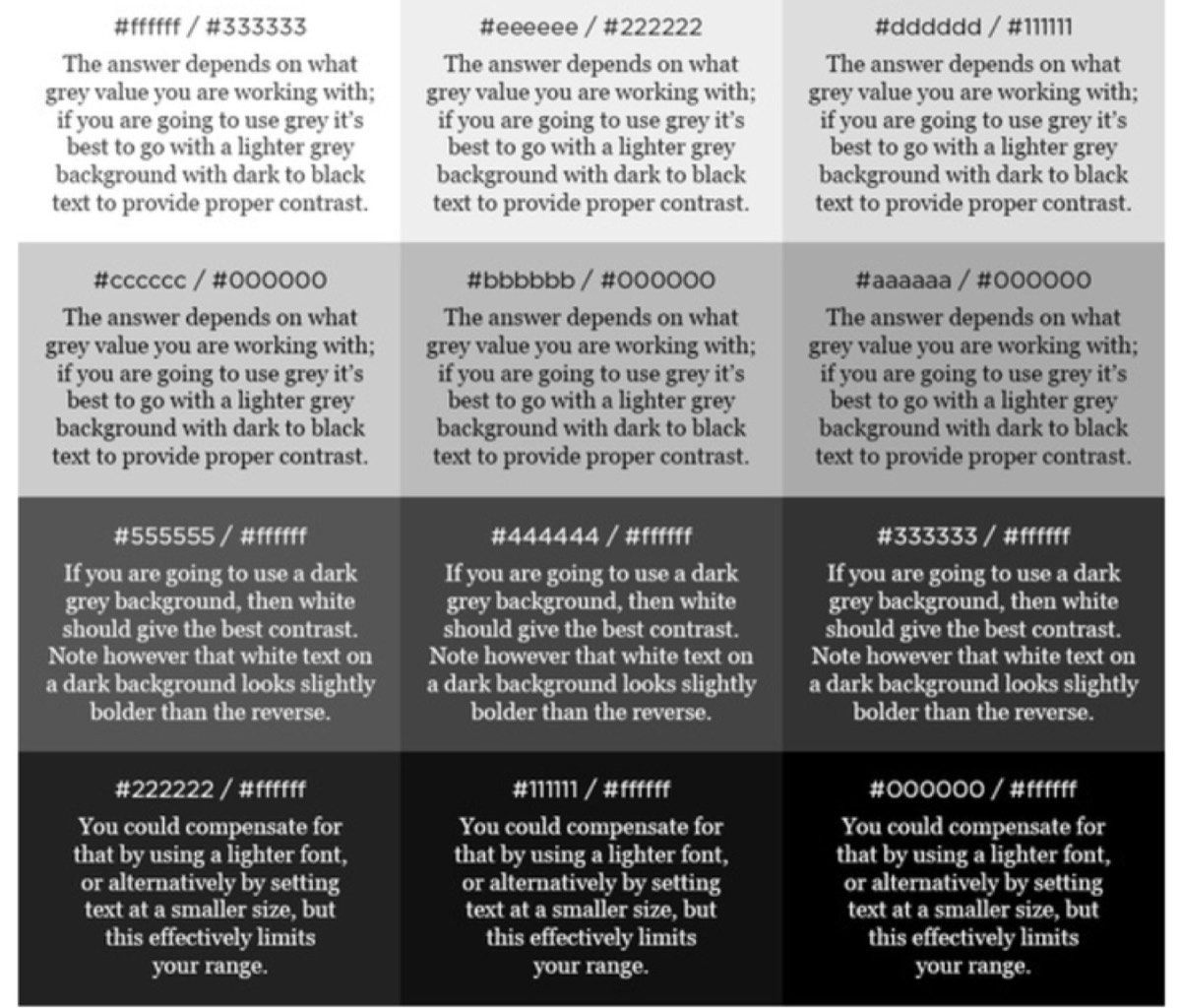
5. Reverse the Colors
Most catalogues use dark text on white or light backgrounds. This is the default precisely because it's familiar — which means it's invisible. A catalogue with light text on a dark background stands out from the stack immediately.
Research shows that dark backgrounds with light text (off-white, cream, or light grey on dark navy or black) reduce eye strain compared to bright white. The "reversed" look signals confidence and premium positioning.
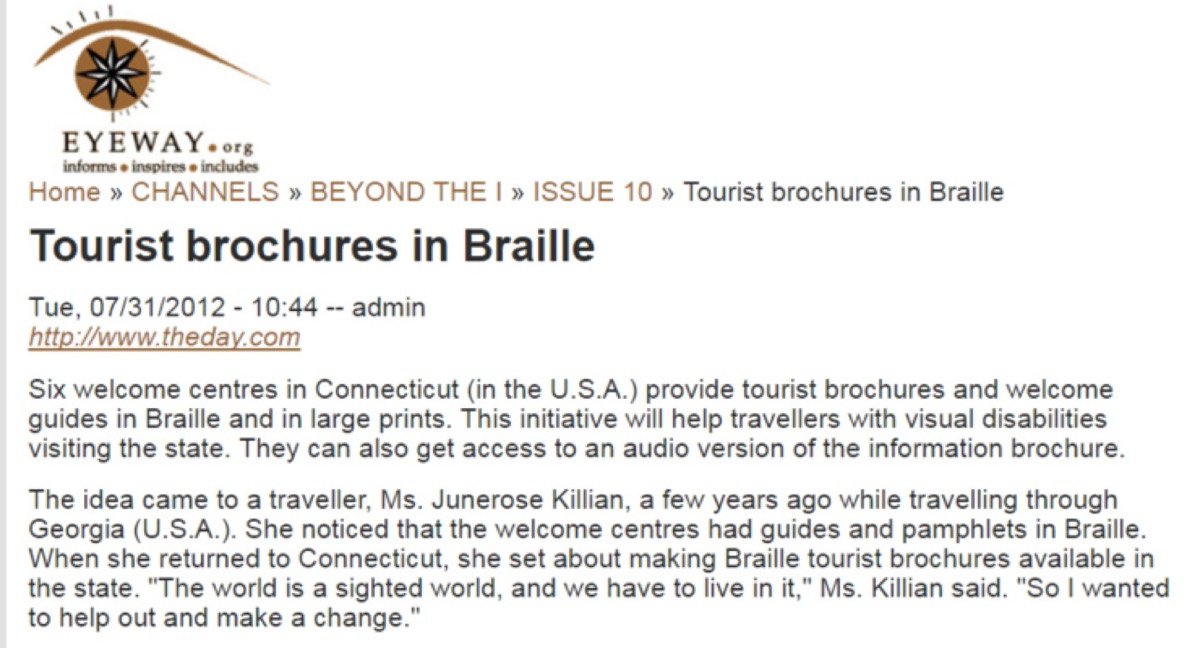
6. Consider Braille for Inclusivity
Around 40 million people globally are completely blind, and 250 million have visual impairments. Including Braille text — for product names, prices, or key information — extends your catalogue's reach to an audience most competitors completely ignore.
This isn't just ethical design: it's differentiation. A perfume catalogue with Braille labeling, or a food catalogue accessible to visually impaired shoppers, creates a brand story about genuine care for all customers.
Need professional catalogue design that converts readers to customers? See Digital Polo's plans →
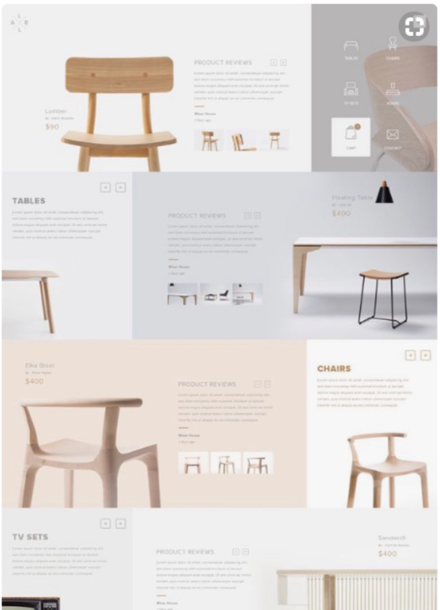
7. Use Fewer Words and More Design
"A picture is worth a thousand words" is a cliché because it's accurate. Product catalogues that lead with strong visuals and use minimal copy consistently outperform text-heavy equivalents. The human brain processes images 60,000 times faster than text.
Image-centric doesn't mean no text — it means letting visuals carry the primary communication burden, with copy reserved for specific details that images can't convey. Large, high-quality product photography paired with concise copy drives both engagement and conversion.
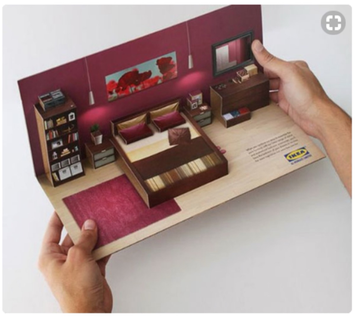
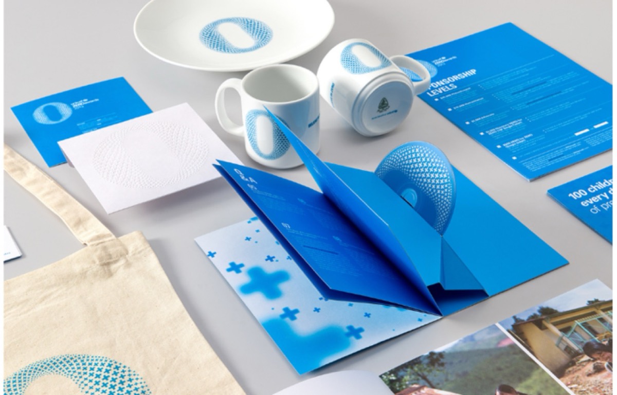
8. Add a Pop-Up Element
Pop-up structures inside catalogues create a physical interaction that's unexpected and memorable. When a section of the catalogue reveals a three-dimensional element — a product display, a visual highlight, a conceptual illustration — the tactile surprise creates a lasting impression.
Unlike pop-up ads on websites (which people ignore or dismiss), a physical pop-up inside a catalogue invites engagement. It rewards the reader for opening the piece and creates a moment worth sharing.
9. Match Fonts to Illustrations
Fonts communicate personality before a reader processes the words. A minimal sans-serif font feels different from a hand-drawn script. When fonts and illustrations are mismatched — a playful illustrated design paired with a rigid corporate typeface, or vice versa — the visual communication breaks down.
The rule: choose fonts that reinforce the feeling of the visual design, not fonts that work in isolation. Look at the illustration style, understand its emotional register, and select typography that operates in the same mode.
10. Use Accordion Folds With Modifications
Accordion folds are standard for a reason — they're practical and familiar. But "standard" doesn't have to mean "generic." A cut pattern along the top edge of an accordion fold, a varied panel size, or a die-cut integrated into the fold structure transforms a familiar format into something distinctive.
Small modifications to conventional formats signal creativity without alienating readers who expect usable structure.
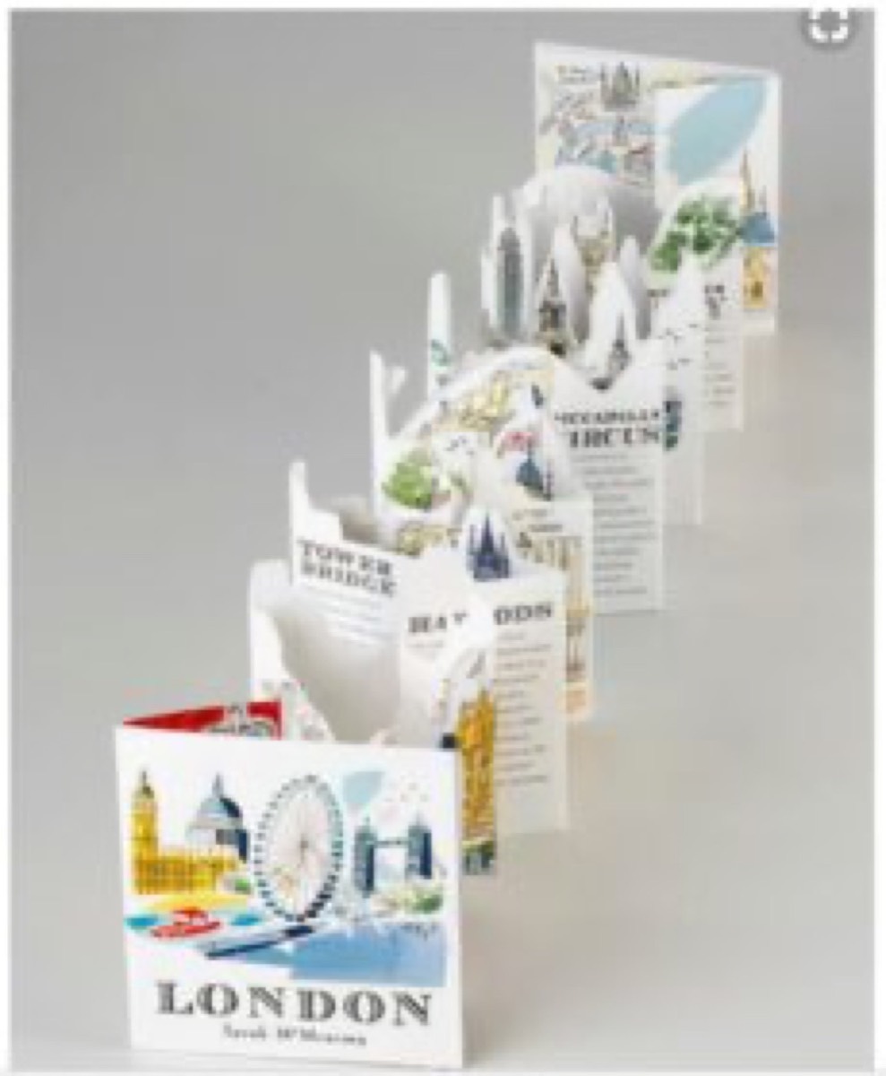
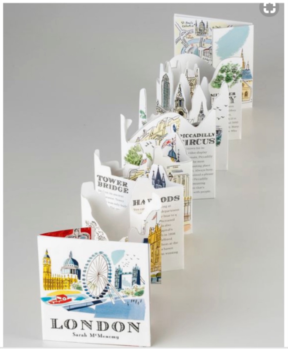
11. Give the Catalogue a Second Purpose
A catalogue that serves as something else — a reference guide, a map, a poster, a calendar — is less likely to be thrown away. When a reader keeps the piece for the secondary purpose, your brand stays in sight long after the initial browsing moment.
A retail catalogue with a city map on the back cover. A trade catalogue with a reference table on the inside back. A restaurant catalogue that doubles as a reservation guide. Purpose extension creates retention.
12. Keep It Small and Portable
Heavy, oversized catalogues intimidate. Pocket-sized or compact catalogues get carried. If a customer takes your catalogue home — or into a meeting — it's worth more than a large catalogue left on a trade show table.
The goal is information density at a scale that fits in a bag or pocket. Edit ruthlessly. Prioritize the most important products and messages. A focused 8-page catalogue will outperform an unfocused 40-page one.

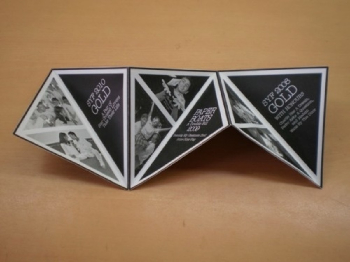
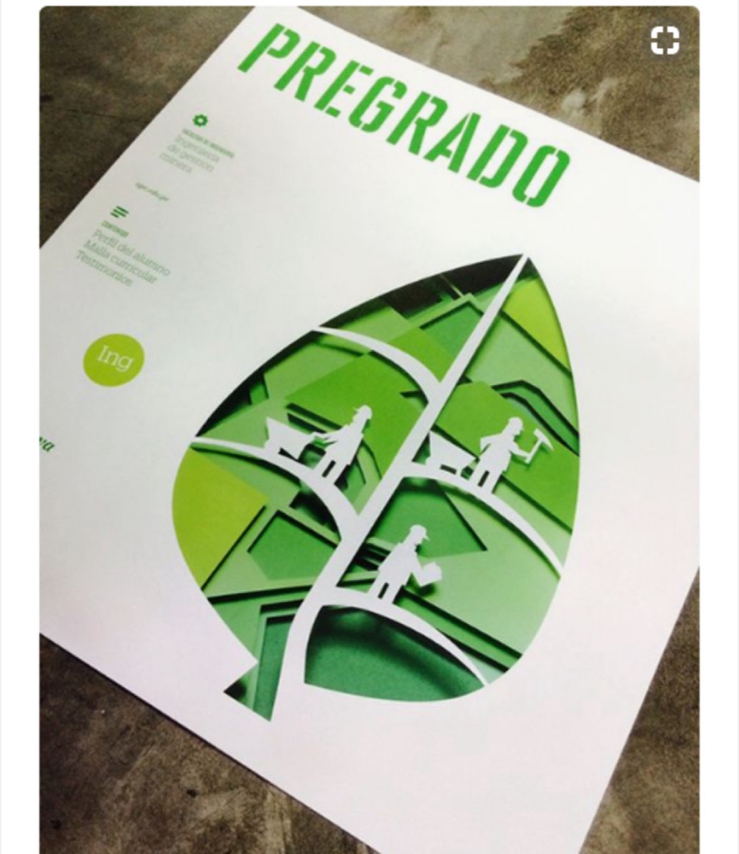
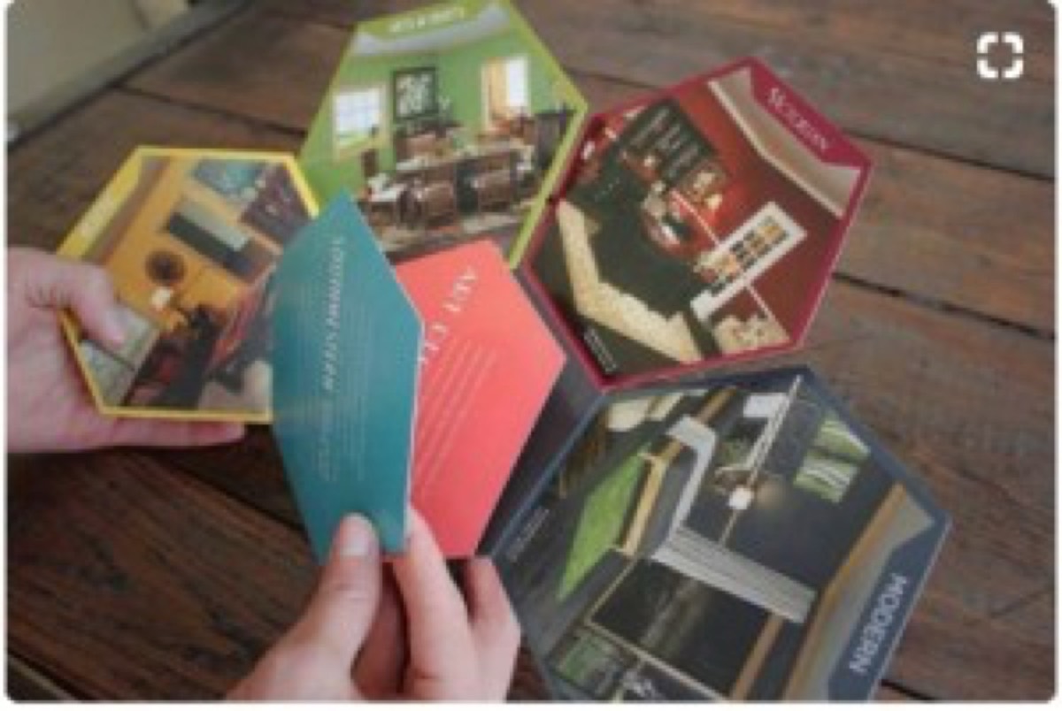
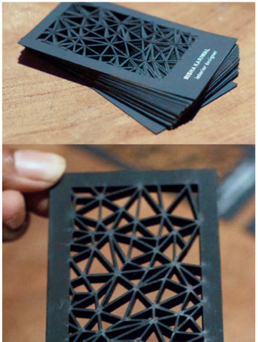
13. Break Conventional Page Shapes
Rectangular pages are the default. Non-rectangular pages — die-cut into a product shape, a branded silhouette, or an unexpected form — break the visual monotony of standard catalogues.
Custom shapes require custom cutting and add cost, but the effect is disproportionate to the investment. A catalogue with unusual page geometry is noticed and remembered because it violates expectations.
14. Include an Inserted Gift or Bonus
An unexpected insert — a discount card, a sample, a USB drive, a CD with additional content — transforms a catalogue from marketing material to gift. Receiving something extra creates reciprocity and positive brand association.
UNICEF included a CD in catalogues for campaign materials. Retail brands include samples. Service brands include reference cards. The insert's cost is typically small relative to the conversion value of a genuinely engaged prospect.
15. Use Non-Page Formats
A catalogue doesn't have to use pages. A scroll format, a series of cards on a ring, a folded poster, or a booklet without traditional page structure creates a different physical interaction that stands out from conventional catalogue formats.
If the format serves the content and the audience, the non-standard choice becomes a brand differentiator. Architecture firms, fashion brands, and premium retailers have used non-page formats effectively.
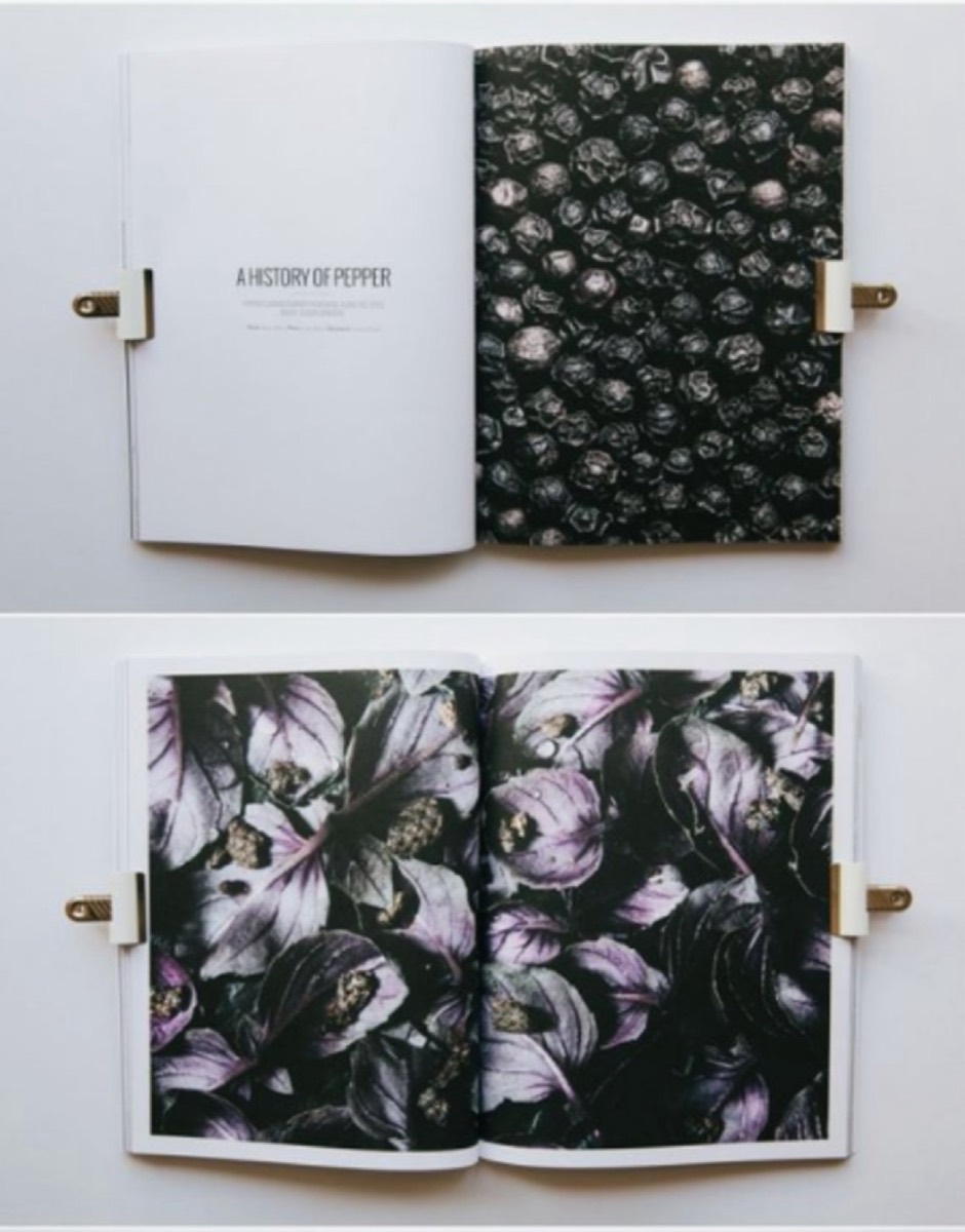
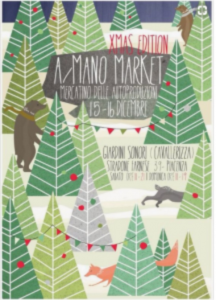
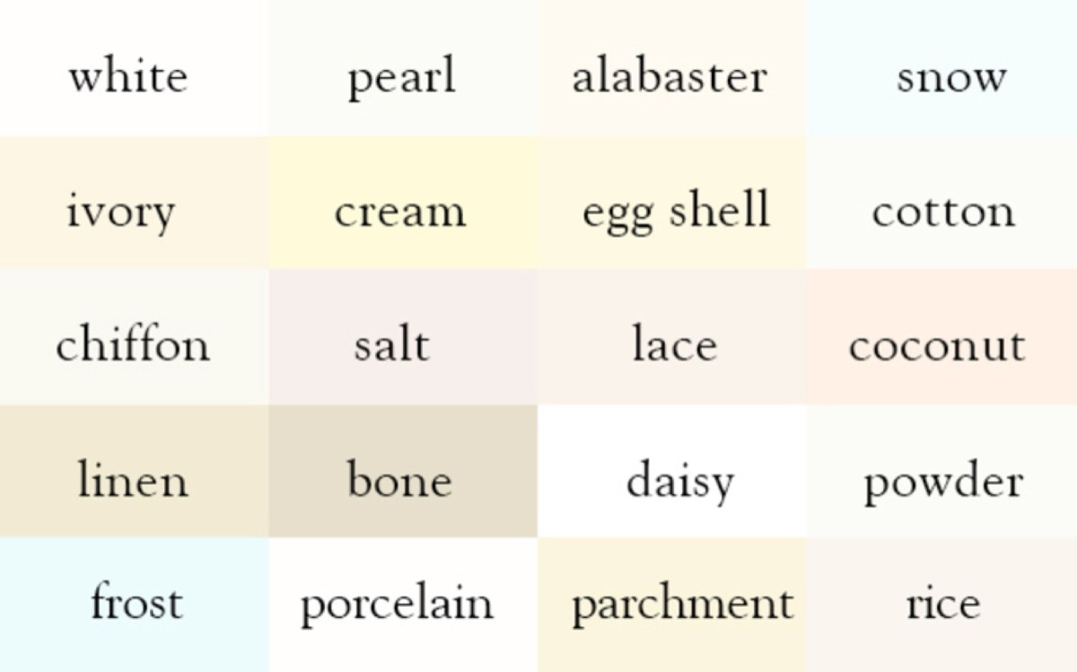
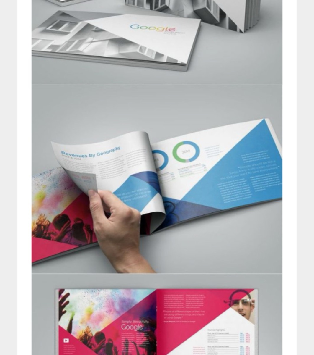
16. Be Deliberate with Color Palette
Color is the first thing a prospective reader notices. Architecture firms use neutral, muted palettes to communicate precision and taste. Media and entertainment brands use bold primaries to signal energy and excitement. Luxury brands use restrained, often monochromatic palettes to communicate exclusivity.
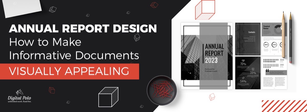
The color palette should be chosen based on what you want the reader to feel, not just what looks current. And if your brand's category calls for a restrained palette — even an all-white one — explore how many variations of that single color you can deploy. The same principle governs annual report design, where color restraint often produces the most professional result.
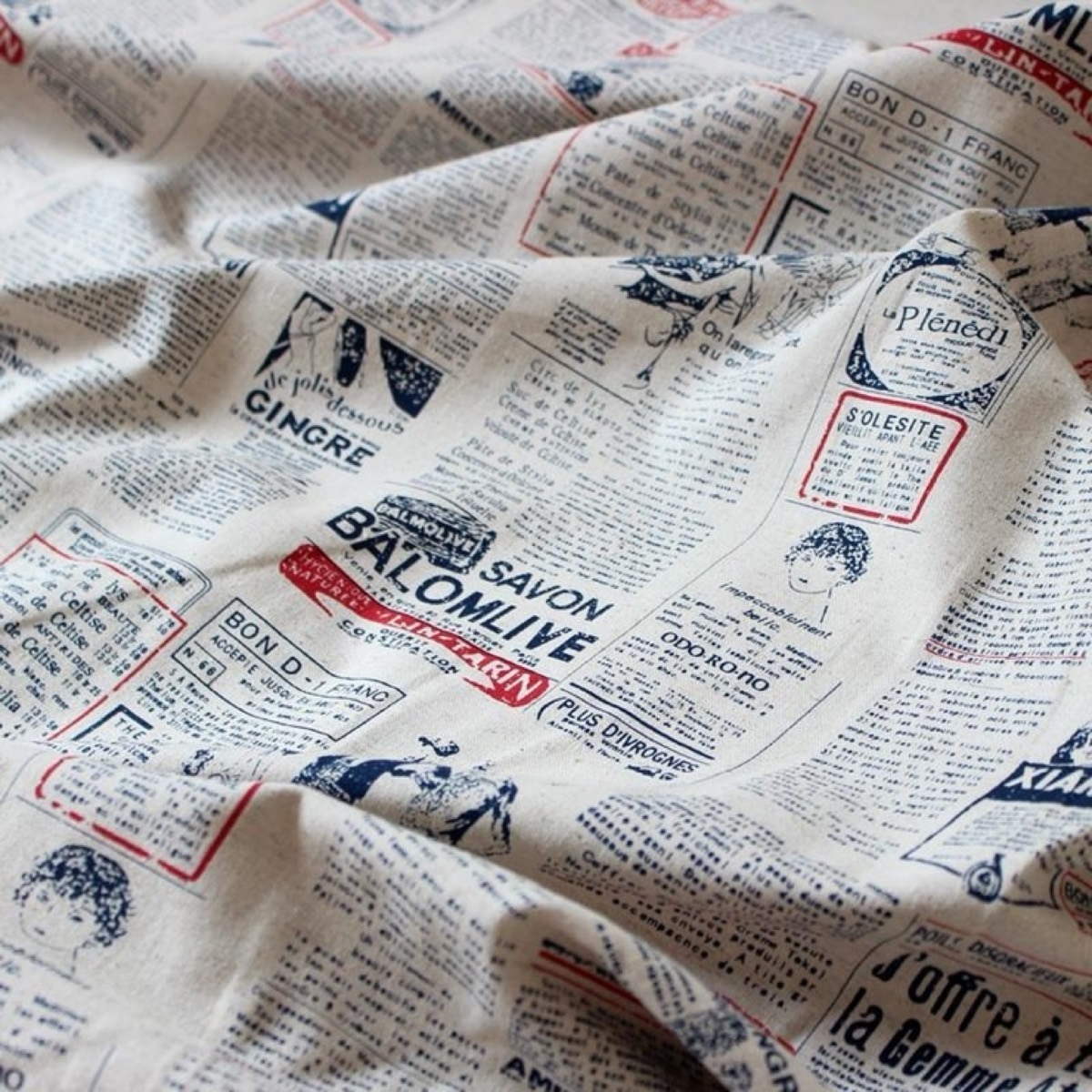
17. Use Alternative Materials
Paper isn't the only substrate for a catalogue. Fabric, wood veneer, metal, or transparent plastic creates a completely different tactile experience. The material choice communicates brand values before a single word is read.
A clothing brand printing a brief catalogue on fabric samples. A restaurant printing its seasonal menu on parchment. A jewelry brand using a thin wood-veneer folder. These material choices are expensive but unforgettable.
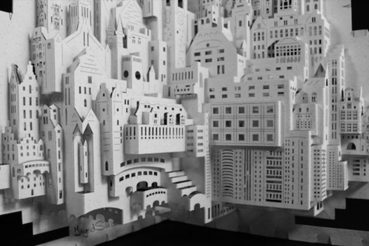
18. Explore Three-Dimensional Design
Origami-style three-dimensional elements, pop-up structures, and folded paper engineering transform a flat catalogue into a physical object with real depth. Architecture firms can create scale models of buildings. Product companies can create display structures. These designs require additional engineering investment but deliver memorable results.
19. Use Texture Deliberately
Different paper stocks communicate different brand values. Glossy coated stocks signal modernity and precision. Uncoated matte stocks feel more approachable and editorial. Textured stocks (linen, laid, or cotton) communicate heritage and luxury. Parchment suggests authenticity and craft.
The choice of paper texture should align with the brand's positioning. A premium food brand using rough parchment paper communicates authenticity. A technology company using glossy coated stock communicates precision. The physical experience of holding the catalogue is part of the brand experience.
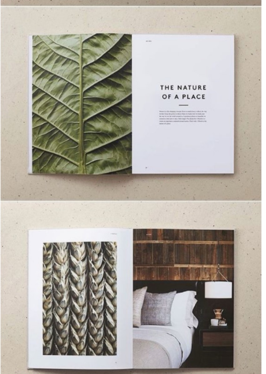
20. Embrace Minimalist Design
Minimalism in catalogue design means removing everything that doesn't serve a clear purpose — leaving only the product, the essential information, and generous white space. The white space is not emptiness; it's breathing room that focuses attention on what matters.
Minimal catalogue designs work especially well for premium, luxury, or precision-positioned brands where the impression of quality matters as much as the information conveyed.
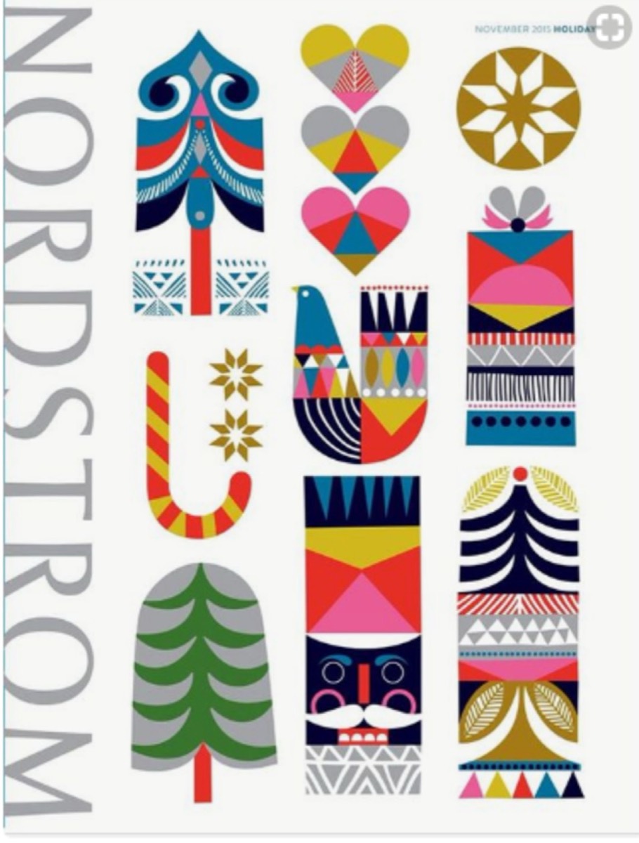
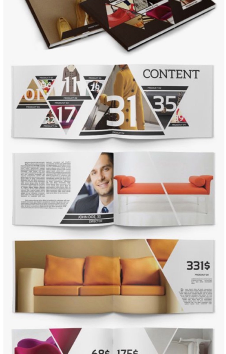
21. Use Geometry to Create Professional Structure
Geometric shapes and patterns create visual order that the eye finds satisfying. They communicate precision and professional structure — useful for B2B catalogues, architecture firms, technology companies, and any brand that wants to project competence and clarity.
Geometric designs also solve the composition problem: when you're not sure how to organize a page, a grid of geometric shapes provides a framework that makes all the elements relate to each other coherently.
Conclusion
The best catalogue isn't the most expensive one — it's the one that gets kept, shared, and acted on. That outcome comes from thinking seriously about format, material, structure, and purpose from the beginning of the design process. Many of these same considerations apply to creative brochure design as well — the two formats share far more than most marketers realize.
Apply two or three of these ideas to your next catalogue and measure the difference in engagement. The goal isn't novelty for its own sake — it's creating something that genuinely represents your brand and gives your customers a reason to interact with it.
Digital Polo creates professional catalogue and brochure designs — from concept through print-ready files — for one flat monthly fee with unlimited revisions. Start for $399/mo → | Soulmate at $899/mo →
Frequently Asked Questions About Catalogue Design
What makes a business catalogue effective? An effective catalogue combines strong visual design with clear, scannable information structure and a clear purpose for the reader. The best catalogues are easy to navigate, visually engaging enough to hold attention, focused enough to convey the key messages, and useful enough to be kept rather than discarded. They drive specific actions — visiting a website, making a call, or completing a purchase.
What size should a product catalogue be? Standard catalogue sizes are A4 (210mm × 297mm), A5 (148mm × 210mm), or US Letter (8.5" × 11"). Smaller sizes (A5 or smaller) are more portable and often get better engagement because readers are more likely to take them. The right size depends on the volume of products, the type of photography, and how the catalogue will be distributed — mailed, handed out at trade shows, or placed in-store.
How many pages should a product catalogue have? The ideal catalogue length is as few pages as it takes to communicate the key information effectively — typically 8 to 32 pages for most businesses. Longer catalogues require more commitment from the reader. If your product range requires a comprehensive catalogue, consider also offering a focused "best of" version for prospective customers who haven't yet committed to researching your full range.
What print finishing options work best for catalogues? Premium finishing options that add perceived value include: spot UV varnish (glossy highlights on a matte background), embossing or debossing (raised or recessed elements), foil stamping (metallic accents), and soft-touch lamination (a velvety matte surface). These finishes add cost but significantly increase the catalogue's perceived quality and the likelihood that it will be kept. For covers, thick stock (300gsm+) communicates premium positioning.
How do I design a catalogue that converts to sales? Catalogues convert better when they include: high-quality product photography that shows the product in context; clear, specific product descriptions that answer likely questions; visible pricing; and clear calls to action (website URL, phone number, QR code, or order form). The design should guide the reader through a logical journey — interest → information → action. Burying contact and ordering information makes the conversion step harder than it needs to be.