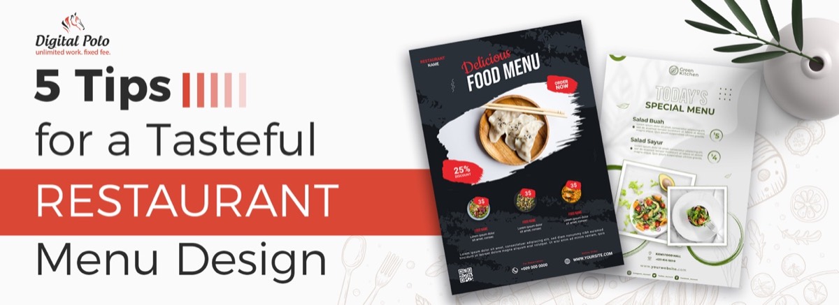
The brochure remains one of the most effective pieces of marketing collateral a business can produce. 79% of small and mid-sized businesses already use brochures in their marketing mix — because a well-designed brochure does something a website can't: it physically occupies a customer's hands, sits on their desk, and delivers a brand impression without requiring a screen or an internet connection. The same principles that make a great brochure apply to other multi-page print formats — see our guide to catalogue design ideas for more inspiration.
But a poorly designed brochure is worse than no brochure. A cluttered layout, mismatched fonts, or cheap printing undermine the brand instead of building it.
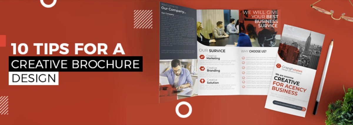
These 10 tips cover the design decisions that separate brochures that get read from brochures that get discarded.
What Are the Five C's of Brochure Design?
Before getting into specific tips, it's worth anchoring to the framework that governs every effective brochure:
- Content — Does the brochure communicate what the business does and why it matters to the reader?
- Clarity — Is the information organized clearly enough that readers can scan and find what they need?
- Color — Does the color palette reinforce the brand and create the right emotional tone?
- Creativity — Is there a visual idea that makes this brochure memorable and distinct from competitors?
- Call-to-Action — Does the brochure tell readers what to do next — and make it easy for them to do it?
Every tip below serves one or more of these five pillars. A brochure that scores well on all five is one that earns its place in the marketing mix.
Tips for Creative Brochure Design
1. Sketch a Layout Before You Open Design Software
A brochure's challenge is that it must integrate multiple panels into a single, cohesive flow. The front needs to earn a second look. The interior needs to guide the reader through the content in the right order. The back needs a clear call-to-action.
Getting this structure right before touching a design tool saves significant time. Sketch the full layout on paper first — including where headlines, body copy, images, and CTAs will fall on each panel. Show this sketch to a stakeholder before investing time in the digital execution. Structural changes are easy at the sketch stage; they're expensive after three hours of layout work.
2. Experiment with Layers for Depth
Layering is one of the most effective techniques for making a brochure look designed rather than assembled. Place text over a semi-transparent color block over a photographic background. Overlap graphic elements across panel boundaries. Use drop shadows and gradients to create visual depth.
Done well, layering creates a sense of production quality that cheap single-layer layouts can't match. Done poorly, it becomes visual clutter. The rule: layers should serve the hierarchy, not compete with it.
3. Use Color to Communicate the Brand — Not Just to Decorate
Color is one of the fastest signals a brochure sends about the brand it represents. A brochure with off-brand colors — or colors chosen purely for personal aesthetic preference — undermines the brand rather than reinforcing it.
Work from your existing brand color palette. If the brand uses navy and gold, the brochure uses navy and gold. If no formal brand palette exists, make the brochure's color choice a deliberate brand decision — because it will inform everything else. This kind of intentional color discipline also applies to other corporate documents like annual reports, where consistency builds credibility across your entire brand system.
You can introduce variation within the palette — adjusting transparency, adding neutral tones as breathing space, using tints and shades of your primary colors — without going off-brand.
Need a brochure that actually gets results? Digital Polo creates print-ready designs in 48 hours — unlimited revisions included. View plans →
4. Limit Typography to Two Fonts
Every font you add beyond two increases visual noise and reduces brand coherence. One headline typeface. One body copy typeface. That's the rule.
Use weight, size, and spacing to create hierarchy within the two-font system rather than introducing a third font:
- Headlines: primary typeface at large size, often bold
- Subheadings: primary typeface at medium size, medium weight
- Body copy: secondary typeface at standard reading size
- Captions: secondary typeface at smaller size, sometimes italic
A distinctive headline font — a custom display typeface or a strong serif — can carry significant visual interest on its own. The body typeface's job is readability, not personality.
5. Discuss Paper and Printing Specifications Early
The paper stock and finish you choose will affect how colors print, how the brochure feels in the hand, and how it performs over time. These decisions need to be made before the design is finalized — not after.
Key variables to discuss with your print supplier:
- Coated vs. uncoated stock — coated paper produces sharper images and more vibrant color; uncoated has a more natural, tactile feel and is often used for sustainability-positioned brands
- Gloss, matte, or soft-touch laminate — finish affects perceived quality significantly; soft-touch matte is currently considered premium
- CMYK color values — specify all colors in CMYK for print, not RGB; the same color can look very different between a screen and a printed sheet
- Bleed and safe zones — all background colors and images should extend at least 3mm beyond the trim line; critical content should stay at least 3mm inside the trim
Pantone coated and uncoated color swatches help bridge the gap between screen and print color accuracy. If color precision matters to your brand (it usually does), use Pantone references alongside CMYK values in your file.
6. Reduce Copy Ruthlessly
A brochure's job is to earn a next step — a visit to the website, a phone call, a meeting request. It does not need to answer every question a prospect might have. That's what your sales process, website, and team are for.
The most common brochure mistake: too much text. Walls of copy get skimmed at best and ignored at worst.
Principles for lean brochure copy:
- One primary message per panel
- Bullet points for benefits, not paragraphs
- Headlines that communicate value, not just describe the section
- A single, clear CTA — not three competing CTAs on the back panel
If you're struggling to cut, ask: "What is the single most important thing this panel needs to communicate?" Write that. Then consider whether anything else truly earns its space.
7. Use Textures Strategically
Special finishes and textures — raised spot UV, embossing, debossing, foil stamping — are premium production techniques that create tactile differentiation. When someone picks up a brochure with a soft-touch cover and a spot UV logo, they feel the quality before they read a word.
These techniques work best when applied selectively, not across the entire design:
- Spot UV on the logo or a key headline element
- Embossing on the cover panel only
- Foil on a single accent color
Restraint is what makes texture feel premium rather than overdone. If everything is textured, nothing stands out.
8. Use Die Cuts for Distinction
Die cutting allows the brochure to be cut into non-rectangular shapes or to have shapes cut out of panels — creating a window effect or an unusual outer form.
Die cuts are more affordable than most businesses assume, and they create immediate distinction in a competitive print environment. A brochure that fits a specific shape (product silhouette, brand icon, architectural form) communicates investment and specificity.
Keep functional considerations in mind: die-cut brochures still need to be readable, holdable, and easy to store. Test the physical form before committing to production quantities.
9. Source Photography Thoughtfully
Stock photography is a necessary evil in many brochure projects — custom photography is expensive and not always feasible. But low-quality, clichéd stock imagery (the handshake photo, the businesswoman looking at her laptop) immediately signals generic and undermines brand distinctiveness.
When using stock photography:
- Choose images that are specific, not generic — a real-looking person in context rather than a staged "business person" shot
- Ensure consistent visual style across all images (similar color temperature, similar tone, similar framing)
- Avoid images that look immediately recognizable as stock
If budget allows, a half-day brand photography session produces assets that can differentiate every piece of marketing collateral for years.
10. Explore Fold Formats Beyond the Standard Trifold
The trifold is the default — and sometimes the right choice. But it's not the only option, and exploring alternatives often produces a more distinctive finished piece. Many of the same fold and print format considerations that apply to brochures also inform restaurant menu design, where physical format directly shapes the customer experience.
Common fold types and when to use them:
| Fold Type | Panels | Best For |
|---|---|---|
| Trifold (letter fold) | 6 panels | Standard service overviews, event programs |
| Gatefold | 6 panels | Premium reveals, product launches |
| Z-fold (accordion) | 6+ panels | Step-by-step processes, timelines |
| Half-fold | 4 panels | Simple product sheets, event programs |
| Roll fold | 6 panels | Sequential information, map-style layouts |
| French fold | 4 panels | Luxury positioning, premium feel |
The fold determines the reading sequence — which panel is seen first, which is revealed last, and how information unfolds as the reader moves through it. Choose the fold based on the story you're telling, not just convention.
Conclusion
Effective brochure design is the intersection of aesthetics and function. A beautiful brochure that doesn't communicate clearly doesn't serve the business. A clearly written brochure with poor visual design doesn't earn a second look.
Apply the five C's as your evaluative framework, use these ten tips as your production checklist, and invest in print quality that reflects the quality of the business it represents.
Stop settling for generic brochures. Get professionally designed marketing collateral — brochures, flyers, annual reports, and more — for one flat monthly fee. Start your Digital Polo subscription → | Soulmate at $899/mo →
Frequently Asked Questions About Brochure Design
What are the five C's of brochure design? The five C's are Content (does it communicate what matters to the reader?), Clarity (can readers find what they need quickly?), Color (does the palette reinforce the brand?), Creativity (is there a visual idea that makes it memorable?), and Call-to-Action (does it tell readers what to do next?). Every effective brochure performs well across all five.
How do I make a creative brochure? Start with a layout sketch before touching design software. Use two fonts maximum. Apply brand colors intentionally, not decoratively. Reduce copy to the essentials. Consider a non-standard fold format. Use texture or die cuts for physical differentiation. And always design with a single clear CTA — not multiple competing ones — so readers know exactly what to do after reading.
What are common brochure design mistakes? The most frequent mistakes are: too much text on a single panel, too many fonts (more than two), using RGB colors instead of CMYK for print production, ignoring bleed and safe zone margins, using generic stock photography, and having no clear call-to-action. All of these are easy to avoid with a proper pre-production checklist.
What's the difference between a brochure and a flyer? A brochure is multi-panel, typically folded, and carries detailed information — company overview, service descriptions, process explanations, contact details. A flyer is a single sheet designed to communicate one message quickly — an event promotion, a single offer, a directional announcement. Brochures invest in depth and quality; flyers invest in speed and reach.
How much does professional brochure design cost? Freelance brochure design typically runs $200–$1,500 depending on complexity and panel count. Agency projects range from $1,000–$5,000+. A design subscription service like Digital Polo includes brochure design in a flat monthly fee starting at $399/mo — with unlimited revisions, no per-project fees, and print-ready file delivery.