Your logo is the most visible element of your brand. It appears on your website, your business cards, your packaging, your email signatures, and every piece of marketing material your business produces. It needs to communicate who you are, signal the right tone, and work at every scale — from a 16px browser favicon to a full-size banner print.
Picking the best logo isn't about finding something that looks nice. It's about making deliberate choices around color, form, type, and psychology — choices that serve your brand's goals over the long term.
This guide covers exactly those choices: the psychology behind logo design, the three golden rules, the 5 C's of branding, and how to evaluate options with confidence.
What Makes a Logo 'Good'?
A good logo does several things simultaneously:
- Represents the brand's values — not just aesthetically, but emotionally. The right logo makes the right feeling immediate.
- Is distinctive — generic logos don't build recognition. A logo needs to be specific enough to be owned.
- Works at every size — from app icon to billboard. Logos that rely on fine detail fail at small scales.
- Functions in one color — for print embossing, monochrome applications, and production contexts where color isn't available
- Is timeless enough to last — a logo that follows a trend too closely will look dated when the trend passes
A strong logo is not about how complex the design is — Nike's swoosh and Apple's apple are among the world's most recognized logos. Both work because they are distinctive, scalable, and consistently applied over decades.
Color Psychology in Logo Design
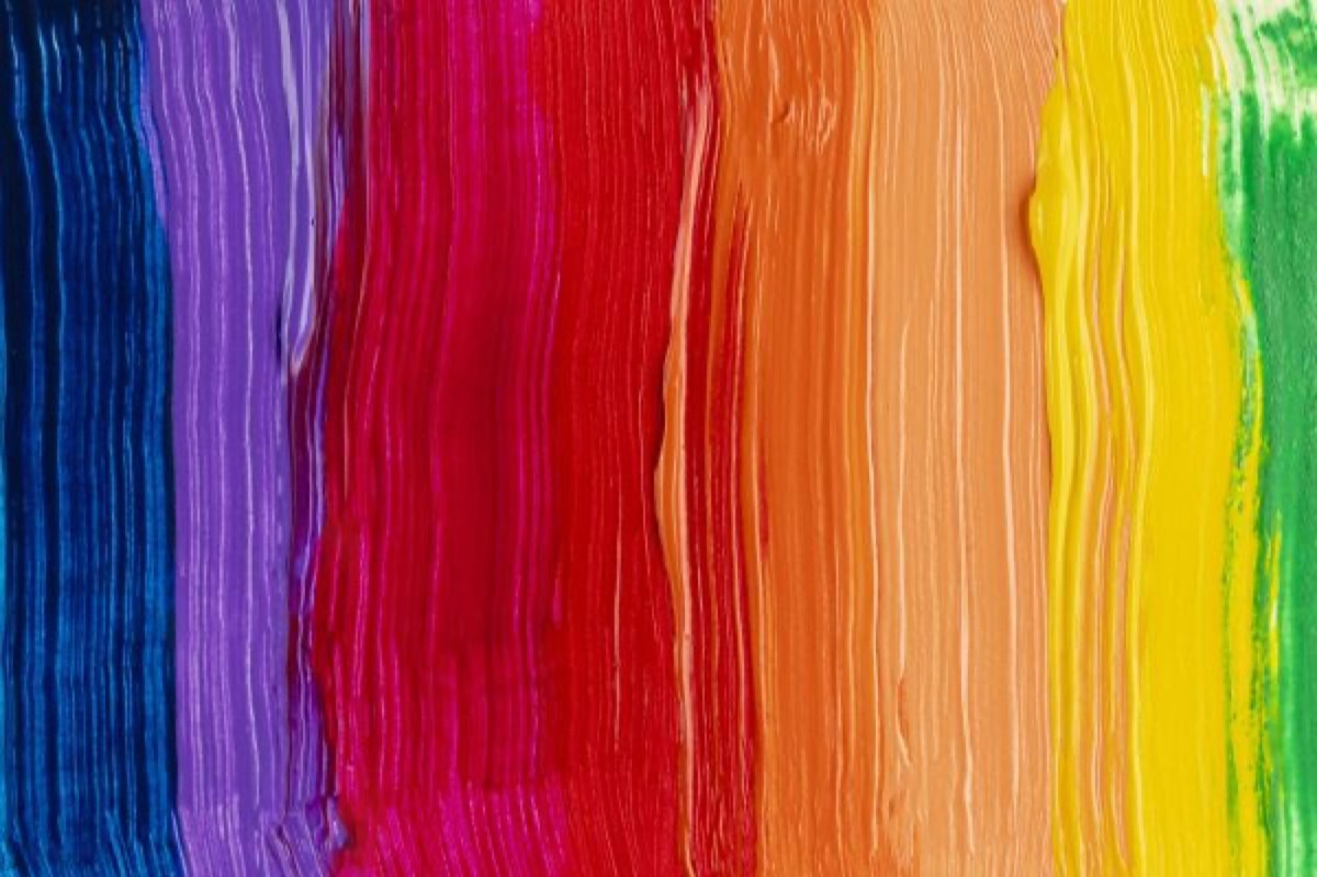
Color is the most immediate element of a logo — it registers before the viewer has processed the shape or read the name. Different colors reliably produce different psychological responses. For a deeper look at how specific color combinations work in practice, understanding logo color schemes and brand psychology provides detailed guidance on building a palette that reinforces your positioning.
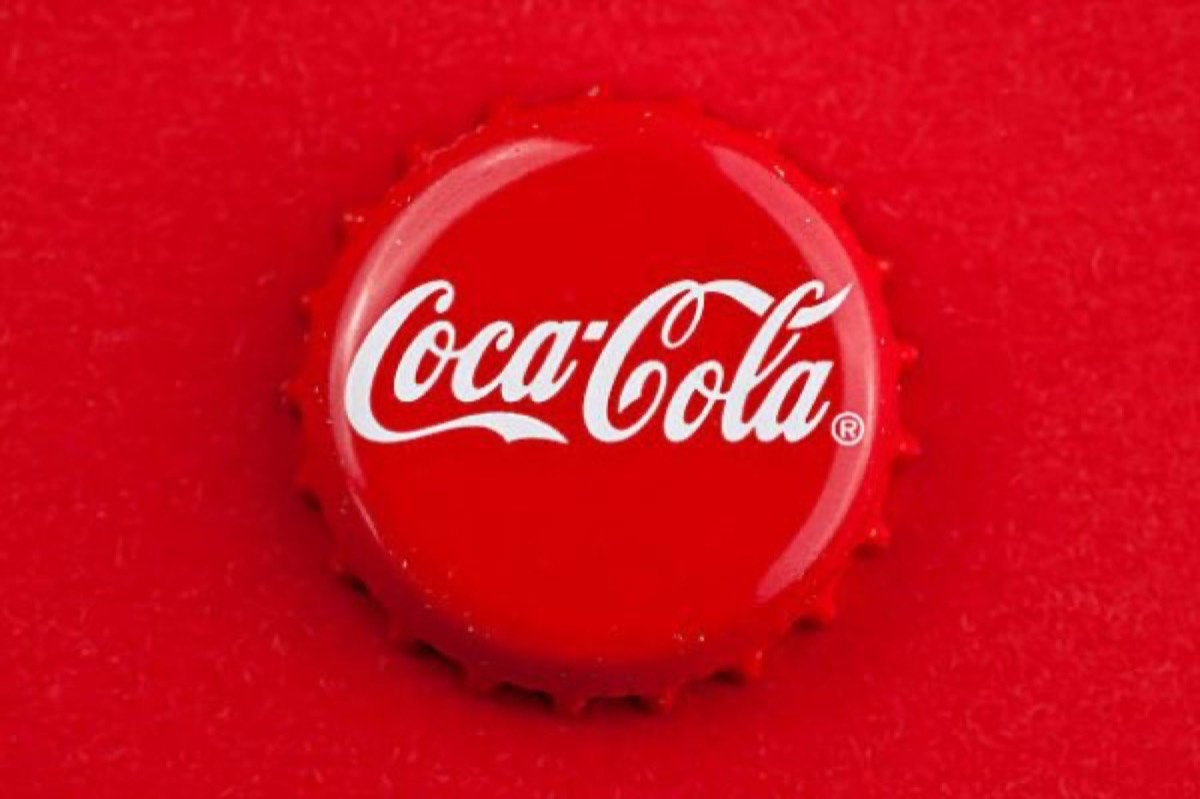
- Red — energy, urgency, appetite, passion. Coca-Cola uses red to evoke enthusiasm and energy in young consumers.
- Yellow — optimism, warmth, accessibility. McDonald's pairs yellow with red to create appetite and energy.
- Orange — warmth, creativity, friendliness. Less aggressive than red, more energetic than yellow.
- Blue — trust, reliability, calm. Samsung, Facebook, and most financial institutions use blue to signal stability and safety.
- Green — growth, health, nature, sustainability. Sprite uses green to signal freshness; organic brands use earthy greens to signal environmental values.
- Black — power, sophistication, luxury. Nike uses black to convey strength and authority.
- Grey — professionalism, neutrality, balance. WordPress uses grey for its understated professional positioning.
- White — simplicity, purity, space. Apple uses white and minimal color to signal elegance and restraint.
- Brown — warmth, stability, earthiness. Common in construction, legal, and food sectors.
- Purple — creativity, royalty, imagination. Used by brands wanting to suggest premium positioning with a creative edge.
The most important principle: your color choice should reinforce what your brand stands for, not just what you personally find appealing. The best logos are designed with the brand's target customer in mind, not the founder's preferences.
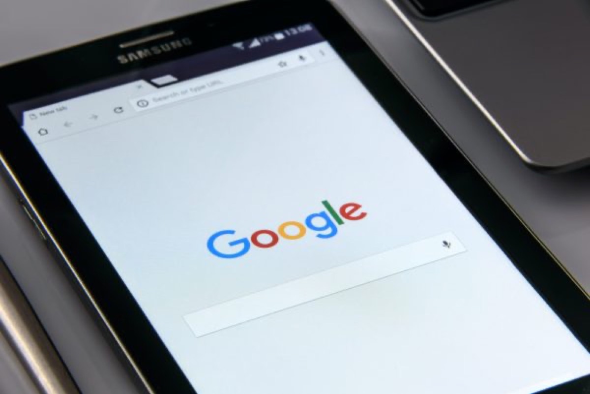
The Google logo is a masterclass in intentional color psychology — multi-colored to signal playfulness and accessibility, with specific brightness adjustments made between letterforms to prevent optical merging. Every detail was tested.
Logo Color Guide by Industry
When choosing logo colors, consider what your competitors are doing — both to ensure you don't get lost in the crowd (differentiation) and to understand the visual conventions your audience has been trained to expect in your category.
Common color conventions by sector:
- Food and restaurant: Red, yellow, orange (appetite and energy)
- Finance and legal: Blue, grey, navy (trust and authority)
- Health and wellness: Green, blue, white (health, calm, cleanliness)
- Luxury goods: Black, gold, deep navy (sophistication and premium positioning)
- Technology: Blue, grey, white, with increasing use of gradient and bright accent colors
- Sustainability/organic: Earthy greens, browns, natural tones
The Effect of Fonts and Forms
Logo typography communicates personality before any words are processed:
- Serif fonts (Garamond, Baskerville, Caslon) — traditional, established, trustworthy. Well-suited for legal, financial, heritage, and luxury brands.
- Sans-serif fonts (Helvetica, Futura, Gill Sans) — clean, modern, approachable. Dominant in technology, DTC, and contemporary consumer brands.
- Script fonts — personal, creative, artisan. Effective for lifestyle, food, and beauty brands; legibility at small sizes requires care.
- Display fonts — distinctive, high-impact, memorable. Use for brand moments and headlines; typically too complex for extended use.
Logo shapes carry psychological meaning too:
- Circles and ovals — community, warmth, inclusivity, completeness
- Squares and rectangles — stability, reliability, professionalism, trust
- Triangles — direction, energy, ambition, dynamic movement
- Abstract and organic forms — creativity, modernity, innovation, uniqueness
The most effective logos use typography and form choices that reinforce the same emotional message as the color — all three elements working in the same direction.
The Three Golden Rules of Logo Design
Every professional designer applies these three principles when evaluating a logo:
1. Simple A logo should be reducible to its core idea. Remove any element that isn't essential. Complexity creates production problems (embossing, small-scale printing, favicon use) and makes logos harder to remember. The logos that last decades are almost always the simplest ones in their category.
2. Memorable A logo should be distinct enough that a viewer who sees it once can recall it later. Memorability comes from a specific visual idea — not generic shapes or type treatments that look like every other logo in the category. Ask: if someone saw this logo today, could they sketch it from memory next week?
3. Versatile A logo must work across every context it will appear in: black and white, reversed (white on dark background), at 16px, at billboard scale, on screen and in print. Design on a white background is not enough — always test on colored backgrounds, at small sizes, and in single-color reproduction.
The 5 C's of Branding
Before finalizing your logo, evaluate it against the 5 C's of branding:
- Clarity — Does the logo immediately communicate what the brand is and who it's for?
- Consistency — Can this logo be applied consistently across every format and medium?
- Creativity — Is there a genuine visual idea here, or is it generic?
- Credibility — Does the logo signal the right level of professionalism for its market?
- Connection — Does it create an emotional response in the target audience?
A logo that scores well on all five is a logo worth investing in. A logo that scores well on one or two but fails on others needs rethinking before you commit.
Choosing the Right Logo Type
Not all logos are the same structural type. Understanding the options helps you make the right choice for your brand:
- Wordmark — the brand name in a distinctive typeface. Best for brands with short, memorable names: Google, Visa, FedEx.
- Lettermark — initials only. Best for brands with long names or when the initials are as well-known as the full name: IBM, HBO, NASA.
- Icon/symbol — a standalone graphic mark without text. Best for established brands with strong recognition: Apple, Twitter, Nike.
- Combination mark — text and icon together. The most versatile choice for new brands — can separate into standalone components as recognition builds.
- Emblem — text within a shape (badge, seal, crest). Traditional and authoritative; common in sports, education, and food brands.
For most new businesses, a combination mark is the safest starting choice — it builds recognition for both the name and the visual mark simultaneously.
Conclusion
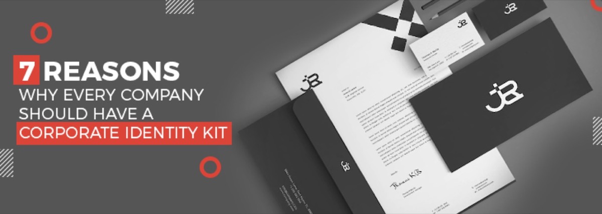
Picking the best logo for your business requires understanding more than aesthetics. It requires applying color psychology deliberately, choosing a form and typography that reinforces your brand's positioning, testing against the three golden rules, and evaluating the result against the 5 C's of branding. Once the logo is finalized, a full brand identity kit ensures every team member and agency applies it consistently across every touchpoint.
Once you've committed to a logo, changing it is expensive and disruptive — it requires updating every piece of marketing material, every digital channel, and every physical asset that carries the old version. Make the right choice at the start by working with professional designers who understand the business logic behind logo design, not just the visual craft.
Ready to get a professional logo designed? Digital Polo creates custom logos as part of our design subscription — starting at $299/mo with unlimited revisions and no long-term contracts. See plans → | Soulmate at $899/mo →
Frequently Asked Questions About Logo Design for Business
What are the three golden rules of logo design? The three golden rules are: Simple (reduce to the core idea; remove everything non-essential), Memorable (distinctive enough that a viewer can recall it after one exposure), and Versatile (works at every size, in one color, on any background, in print and digital). A logo that fails any of these three tests will create ongoing production problems and fail to build recognition over time.
What are the 5 C's of branding? The 5 C's are Clarity (does the brand communicate who it is and what it offers immediately?), Consistency (can it be applied uniformly across all formats?), Creativity (is there a genuine visual idea, not just a generic treatment?), Credibility (does it signal the right level of professionalism for its market?), and Connection (does it create an emotional response in the target audience?).
What colors should I avoid in a logo? Context-dependent rather than universally avoidable: neon colors are difficult to reproduce accurately in print and can look dated quickly; very light yellow or pale pastels often disappear on white backgrounds; red and green together create accessibility problems for color-blind viewers. More practically, avoid colors that are strongly associated with your direct competitors — differentiation in your category is more valuable than following established convention.
Should I use a wordmark, lettermark, or icon for my business logo? For most new businesses, a combination mark (text + icon) is the safest choice — it simultaneously builds recognition for both the brand name and the visual mark. Standalone icons work best for brands with very strong existing recognition (Apple, Nike). Wordmarks work well for distinctive short names. Lettermarks are best when the full name is long or when initials carry strong standalone recognition.
How much does a professional logo design cost? Freelance logo design typically costs $300–$2,500 for a professional result. Branding agencies charge $2,000–$15,000+ for a full identity system. A design subscription service like Digital Polo includes logo design as part of a flat monthly fee starting at $299/mo — with unlimited revisions and no upfront project cost.


