Your social media page is often the first place a potential customer judges your brand. Before they read a single product description or click through to your website, they are forming an opinion based on your profile picture, cover photo, post grid, and visual consistency.
Get it right and the page earns trust instantly. Get it wrong — inconsistent colors, low-resolution images, mismatched fonts — and visitors leave without engaging, often never returning.
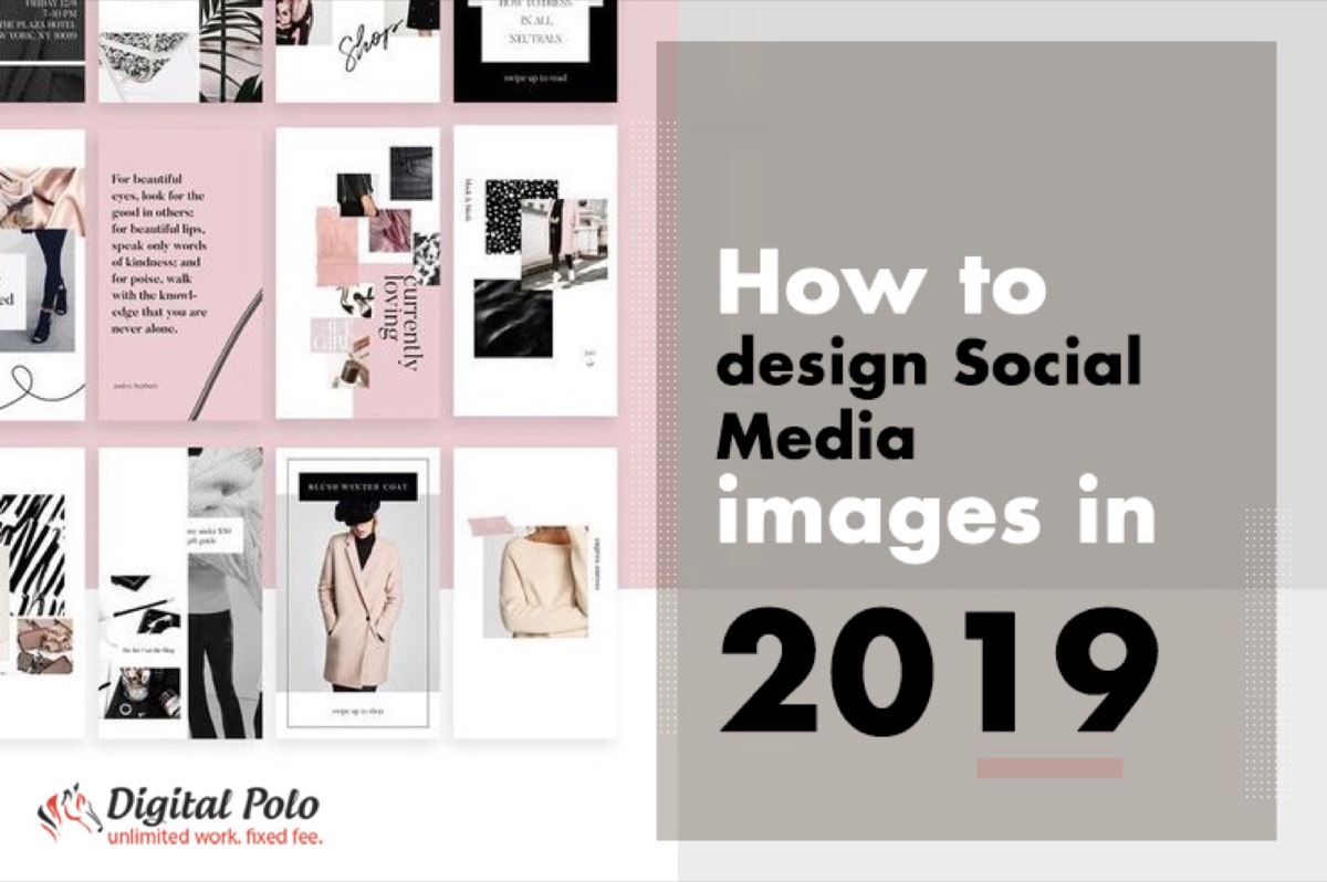
This guide covers the five principles that separate professionally designed social media pages from ones that undermine the brands they represent, plus the platform dimension specs you need to execute them correctly.
What Is Social Media Design?
Social media design is the process of creating and maintaining a brand's visual presence across social platforms — from the profile picture and cover image to the style of every post, story, and banner in the feed.
A well-designed social media presence does three things simultaneously:
- Communicates brand identity in the first few seconds of a visit
- Creates visual consistency that builds recognition across repeated exposures
- Produces content that is formatted correctly for each platform's technical requirements
The starting point for any social media design project is answering four questions about your brand:
- What is your brand's primary value proposition?
- Who is the target audience — their demographics, aesthetic preferences, and the platforms they use most?
- What do competitors' pages look like, and where is the visual opportunity to stand out?
- What content types will you publish consistently — photography, illustration, video, infographics?
Answering these questions before touching a design tool saves significant rework later. Once you know what you're publishing, getting social media image dimensions right for every platform ensures your visuals always display as intended across Facebook, Instagram, Twitter, and LinkedIn.
Social Media Platform Dimension Cheat Sheet
Every platform has different technical requirements for image dimensions. Designing without these specs creates images that get cropped, pixelated, or displayed incorrectly. Here are the current standard dimensions:
| Element | X (Twitter) | |||
|---|---|---|---|---|
| Profile picture | 170×170 px | 110×110 px | 400×400 px | 400×400 px |
| Cover/header image | 851×315 px | N/A | 1584×396 px | 1500×500 px |
| Feed post | 1200×630 px | 1080×1080 px | 1200×628 px | 1200×675 px |
| Story/Reel | 1080×1920 px | 1080×1920 px | N/A | N/A |
Always design at 2× the minimum resolution for retina display quality. Export as JPEG for photography and PNG for graphics with transparency.
Need professionally sized, on-brand social media creatives delivered in 48 hours? See how Digital Polo works →
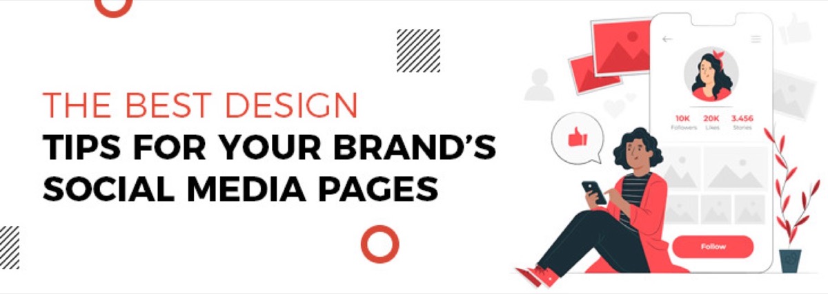
5 Social Media Design Principles for Your Brand
1. Ensure Cohesion Across the Entire Profile
Your social media page is not a collection of individual posts — it is a unified brand presentation. Every element should reinforce the same visual identity: the same logo as your profile picture on every platform, cover images that relate to your offerings, and a feed that reads as intentional rather than assembled.
The most common failure here is brand drift — using a slightly different version of the logo on Instagram than on LinkedIn, or letting personal preferences override brand standards when posting. Cohesion is what makes repeated exposure compound into recognition.
Apply this test: look at your profile from a stranger's perspective for five seconds. Can they tell what the brand is and what it does without reading anything?
2. Maintain a Consistent Color Aesthetic
Your brand's color palette should govern every visual element on your social pages. Color consistency is one of the fastest ways to build brand recognition — the human brain processes color before shape or text, which means consistent color application is working for your brand even before a viewer consciously notices.
The practical rule: your brand's primary and secondary colors should appear in your profile picture, cover image, and consistently throughout your feed. You can incorporate additional colors in individual posts, but the dominant palette should remain constant.
Food brands use red and yellow to signal appetite and energy. Financial services use blue and grey to signal trust and stability. If your brand has an established palette, the social media pages should reflect it without exception.
3. Format Every Asset for the Specific Platform
Designing a single image and posting it across all platforms is a common shortcut that consistently produces poor results. A square 1080×1080 Instagram post looks different when rendered at Facebook's 1200×630 aspect ratio. A portrait-format Reel designed for Instagram fails when shared natively on a LinkedIn feed.
Each platform has its own content consumption patterns as well as its technical requirements:
- Instagram is primarily visual discovery — aesthetics carry more weight here than on any other platform
- LinkedIn is professional context — content should reinforce expertise and credibility
- Facebook supports longer-form content and video natively
- X (formerly Twitter) is high-velocity text-first, with visuals supporting rather than leading
Design for the platform, not just the asset dimensions.
4. Apply the 70-20-10 Content Rule
A common social media design mistake is treating every post as a sales message. The 70-20-10 framework produces a feed that feels balanced and earns engagement rather than prompting unfollows:
- 70% — value-adding content: insights, tips, behind-the-scenes, educational posts
- 20% — shared or curated content from trusted sources in your industry
- 10% — promotional content: product launches, offers, direct CTAs
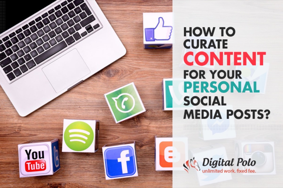
Applying this ratio visually means your feed should not look like a billboard. Posts that teach, entertain, or inform should outnumber promotional posts seven to one. The visual style of each content type should remain consistent with the brand palette even when the messaging varies. For the non-promotional portion of your feed, curating content from other sources is one of the most efficient ways to keep your feed active without generating every post from scratch.
5. Choose Imagery Over Text-Heavy Content
The human brain processes images 60,000 times faster than it processes text. Social media algorithms reflect this: image and video content consistently generates higher reach and engagement than text-only posts on every major platform.
Practical implications for social media design:
- Lead with strong visual content rather than overlaying large blocks of text onto images
- Use high-resolution photography or custom illustration rather than generic stock images
- For text-based posts, use bold typography, high contrast, and minimal copy to maintain visual impact
- Video and short-form video (Reels, TikTok) now consistently outperform static images in organic reach
If your brand can't produce original photography regularly, invest in a consistent illustration or graphic style that becomes recognizable across your feed.
Conclusion
The brands that build genuine social media audiences treat their pages as designed brand environments, not posting channels. Every profile picture, cover image, and post in the feed either adds to the cumulative brand impression or undermines it.
Apply consistent color, maintain proper dimensions for each platform, follow the 70-20-10 content balance, and design with the visual impact hierarchy of each network in mind. Done consistently, this approach builds the kind of social media presence that turns visitors into followers — and followers into customers.
Need consistent, professionally designed social media creatives without the per-project fees? Digital Polo delivers on-brand designs in 48 hours with unlimited revisions. View plans → | Soulmate at $899/mo →
Frequently Asked Questions About Social Media Design
What is social media design? Social media design is the process of creating a brand's visual identity across social platforms — encompassing profile pictures, cover images, post templates, stories, and the overall aesthetic of the feed. It differs from general graphic design in that it requires adapting assets to specific platform dimensions and designing for a scrolling feed environment where attention is limited.
What size should social media images be? The recommended sizes vary by platform. For Instagram: 1080×1080 px (square feed) and 1080×1920 px (Stories/Reels). For Facebook: 1200×630 px (feed) and 851×315 px (cover). For LinkedIn: 1200×628 px (posts) and 1584×396 px (banner). For X/Twitter: 1200×675 px (posts). Always design at 2× the minimum for retina quality.
What is the 70-20-10 rule for social media? The 70-20-10 rule is a content balance framework: 70% of posts should add value for followers (tips, insights, behind-the-scenes), 20% should be shared or curated content from trusted sources, and 10% should be promotional content featuring your products or services. This ratio keeps feeds engaging and prevents the audience from tuning out overtly sales-focused content.
How do I create a consistent brand on social media? Use the same logo as your profile picture across all platforms. Apply your brand's color palette to every post template. Maintain consistent typography. Establish a set of approved post templates rather than designing from scratch each time. Audit your feed regularly to check that new posts maintain the same visual standard as older ones.
What are the 5-5-5 rules of social media design? The 5-5-5 principle for social media content states that you have approximately 5 seconds to capture a viewer's attention, 5 words to communicate your core message, and 5 design elements maximum before a post becomes visually cluttered. It is a simplification rule — prioritizing visual hierarchy and message clarity over aesthetic complexity in competitive feed environments.