Branding, in simple terms, is the process of getting your brand recognized and remembered. A logo is the visual center of that effort — and color is the most immediate element of a logo. It registers before shape, before text, before any conscious evaluation.
Research consistently shows that color accounts for up to 85% of the reason a consumer chooses one product over another. More practically: when someone sees your logo for the first time, color is the first piece of information their brain processes. It sets the emotional context for everything that follows. Of course, color is just one dimension of a strong logo — if you're still working out the broader design direction, our guide to picking the best logo for your business is a good starting point.
![]()
Branding involves many elements — logo design, color combinations, taglines, partnership strategy, marketing channels — but color is the one that works fastest and reaches deepest. This guide covers what each major color communicates, how global brands deploy color psychology deliberately, and how to make the right color decision for your own brand.
![]()
![]()
Green: Harmony, Nature, and Growth
Green is the safest primary color in branding — the most universally positive in its associations. It is the most relaxing color for the human eye and triggers comfort and freshness. Green communicates harmony, peace, natural/organic positioning, and a general sense of calm well-being.
Green logos dominate brands associated with nature, food, and emotional well-being. Animal Planet, Spotify, and Lupin Pharmaceuticals all use green as their primary color.
![]()
![]()
Green also works effectively in multi-color combinations. Yellow and green (Subway) signal freshness and value. Red, black, and green (Heineken) signal premium natural quality. Blue and green together communicate both trust and health — common in wellness and healthcare brands.
![]()
![]()
Blue: Trust, Reliability, and Authority
Blue is the most widely used color in professional and institutional branding. It triggers feelings of professionalism, confidence, clarity, trust, and reliability — the foundational emotions for any brand where a customer is taking a leap of faith.
Blue dominates electronic industries, cloud-based services, financial services, and payment platforms — all sectors where the transaction depends on trust rather than impulse.
PayPal, Samsung, and Skype use all-blue logo designs.
![]()
![]()
![]()
Blue's versatility in combination is exceptional. Blue and yellow (Walmart) signal accessibility and value. Blue and orange (Mozilla Firefox) balance trust with energy. Blue and red (Pepsi) create a patriotic, dynamic combination. Blue can be combined with almost any other color while retaining its core trust signal.
![]()
![]()
![]()
Red: Energy, Urgency, and Appetite
Red is the strongest of the primary colors in its psychological impact. It is also the most volatile — different shades communicate entirely different things. Red can signify love, attraction, energy, and power; it can equally signal danger, conflict, and urgency. All of these emotions are intense and immediate.
Brands using red as a primary color are doing so to attract attention and drive activation — and notably, red has been shown to stimulate appetite, making it a dominant color in the food and restaurant industry.
Supreme uses bold red for its streetwear authority. Coca-Cola's red communicates energy, enthusiasm, and brand heritage. Food Network's red signals appetite and engagement.
![]()
![]()
![]()
Red and black (Netflix, YouTube) produce maximum contrast and signal premium entertainment. Red and yellow (McDonald's) combine appetite and energy for maximum food cue impact. Brands using red need to be precise about shade and combination — small variations in red can shift the emotional signal significantly.
![]()
![]()
![]()
Yellow and Gold: Optimism and Prosperity
Yellow signals the sun, energy, positivity, and brightness. It triggers feelings of friendliness, happiness, socializing, and mood upliftment. Gold signals prosperity, luxury, and premium quality — the specific weight of gold associations makes it a powerful signal for aspirational brands.
Social platforms Snapchat and Bumble use yellow to communicate fun, sociability, and youthfulness.
![]()
![]()
Lamborghini uses gold and yellow to signal that the brand is as premium and rare as gold itself — the color communicates value before the price tag is seen.
![]()
Yellow and red (Lays, Burger King) combine appetite and energy for maximum snack-food impact. Blue and yellow (IKEA) balance trust with accessibility. Yellow and black (Nikon) create technical authority and quality precision.
![]()
![]()
![]()
![]()
Pink: Femininity, Love, and Creativity
Pink is associated with feminism, love, joyfulness, creativity, and an overall positive, youthful energy. It is most prevalent in fashion, cosmetics, dating, and food sectors where emotional warmth and social connection are core to the brand promise.
Tinder uses pink to signal joy and love. Beauty brands like Nykaa use pink as a direct expression of their category. Barbie's iconic pink is one of the strongest single-color brand associations in consumer products.
![]()
![]()
![]()
Pink also arouses feelings of togetherness, which is why food brands like Baskin-Robbins and Dunkin' Donuts use it to signal warmth and social eating experiences.
![]()
![]()
Gray: Sophistication, Neutrality, and Precision
Gray signals clarity, superiority, stability, and modernization. It is associated with diamonds, precision, and refined taste — the color of things that don't need to shout.
Apple and Mercedes-Benz both use gray as their primary brand color, positioning themselves as premium without the aggression of black or the emotion of other colors.
![]()
![]()
Black: Power, Prestige, and Authority
Black is the color of prestige, power, control, and supremacy. Like red, it is a strong color with dual associations: on one hand, it communicates authority and luxury; on the other, it can signal darkness and severity. Black logos are almost always paired with descriptive text or distinctive symbols to prevent negative associations from dominating.
Chanel and Gucci use black to anchor their luxury positioning. WWF uses black for its authority and gravity.
![]()
![]()
![]()
Multicolor: Diversity and Expansiveness
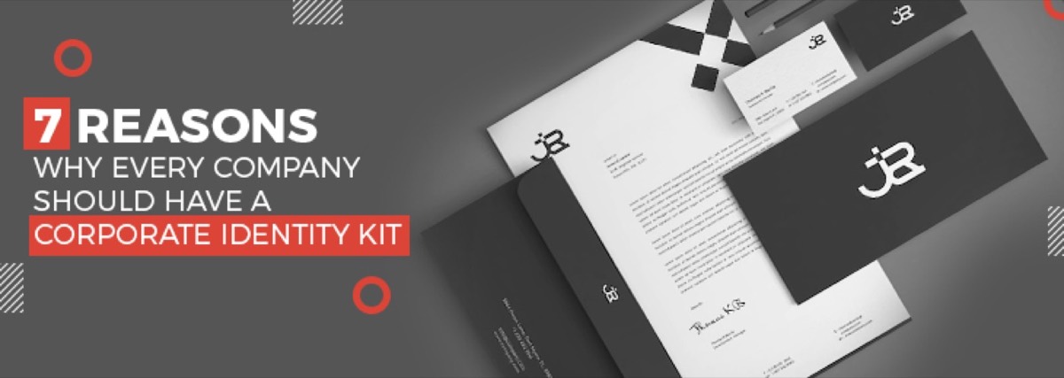
Multicolor logos communicate diversity, open-mindedness, growth, and the breadth of a brand's offering. When done well, they also signal the ability to balance competing forces — inclusivity alongside precision. A consistent color palette also anchors the broader brand identity kit — learn why every company needs a complete brand identity kit to apply those colors consistently across all touchpoints.
Google and Microsoft use multicolor logos to communicate the diversity of their products and their commitment to accessibility. NBC's multicolor peacock logo explicitly represents the diversity of its broadcasting.
![]()
![]()
![]()
![]()
Need a logo color scheme designed by professionals? See Digital Polo's subscription plans →
How to Choose Your Brand Color: A 5-Step Process
-
Define the emotion you need to trigger. Before looking at colors, write down three words that describe how you want customers to feel about your brand: trusted, energized, sophisticated, approachable, innovative. These words point toward a color range.
-
Research your category's color conventions. Understand what colors dominate your competitive landscape — both to identify the convention and to find differentiation opportunities. Standing out from blue-heavy competitors with a confident green can be more valuable than joining the blue majority.
-
Test your choice against the psychology. Check that the color's established associations align with your brand positioning. Avoid colors whose secondary associations actively contradict your brand message.
-
Define the exact values. Once a color is selected, specify it precisely: HEX code (for digital), RGB values, CMYK values (for print), and Pantone reference where color accuracy is critical. A color that "looks roughly like blue" becomes inconsistent across touchpoints.
-
Test in context. See your chosen color in your logo, on your website, and on printed materials before finalizing. Colors behave differently at different scales, on different substrates, and in different lighting conditions.
![]()
Key considerations when finalizing: the combination of color with text and symbol ensures the meaning of each supports the other; the markets you intend to operate in (color has different cultural associations in different regions); the color conventions adopted by direct competitors; and the specific perception you want to create in customers' minds.
Conclusion
Color is the fastest-acting element of brand communication. It precedes words, precedes shapes, and precedes conscious evaluation. Getting it right means choosing deliberately — based on the emotional associations you need your brand to trigger, the conventions of your category, and the specific audience you're trying to reach.
Once a logo color is selected, changing it is expensive and disruptive. The decision is worth the time to research, test, and validate against actual audience perception before committing. Once your color is locked in, put it to work across every channel with proven branding strategies that supercharge your marketing.
When you're ready to turn color strategy into a professional logo, Digital Polo creates complete brand identities — logo, color palette, typography, style guide — for one flat monthly fee with unlimited revisions. Start for $399/mo → | Soulmate at $899/mo →
Frequently Asked Questions About Logo Color Psychology
What color is best for a logo? There is no universally "best" color — the right choice depends on your brand's positioning and target audience. Green is the safest primary color with the fewest negative associations. Blue is the most widely used professional color. Red drives the highest activation and urgency. The best logo color is the one that most accurately triggers the emotional response you need in your specific target customer.
What does blue mean in a logo? Blue in a logo signals professionalism, trust, reliability, and authority. It is the dominant color in financial services, technology, healthcare, and corporate branding — all sectors where the customer relationship is built on trust. Blue's versatility in combinations (blue and yellow, blue and orange, blue and red) makes it the most widely deployed color in professional logo design globally.
How do I choose colors for my brand? Start by defining the emotional response you need your brand to trigger. Research the color conventions of your category. Select colors whose psychological associations align with your positioning. Define exact values (HEX, RGB, CMYK, Pantone) to ensure consistency across all applications. Test the chosen colors in your actual logo and on print before finalizing — colors look different at scale and on different materials.
What colors work best for luxury brands? Luxury brands most commonly use black (Chanel, Gucci), gold/deep yellow (Lamborghini, Versace), deep navy blue (Ralph Lauren, Brooks Brothers), and silver-gray (Mercedes-Benz, Apple). These colors signal exclusivity, sophistication, and premium quality. White space and minimal design amplify the luxury signal — cluttered luxury branding undermines the positioning it's trying to communicate.
What is the psychology of red in branding? Red communicates energy, urgency, passion, and — specifically — appetite. It is used extensively in food and restaurant branding (Coca-Cola, McDonald's, KFC, Food Network) because research shows red genuinely stimulates appetite. Red also drives urgency, which is why it is used for sales, clearance events, and CTAs. The risk with red is its volatile dual associations: poorly chosen shades or contexts can trigger associations with danger or aggression rather than energy and passion.