Know what the most successful businesses have in common? No, not just visionary founders. It's their logos. Take any famous company that comes to mind, and the first thing you'll visualize is its logo. That's the power of logo design — it gives brands their identity and makes them a force to reckon with.
A well-designed logo helps a brand distinguish itself from its competitors, which makes it much more than a simple icon. Statistics show that it takes customers only 10 seconds to form an impression of a company's logo, while it takes 5–7 views for them to recognize it. If you nail your logo from the start, you are bound to succeed. Color is one of the most powerful levers in that process — understanding which logo colors work best for different brand types can guide your design choices before you commit to a direction.
Experts agree that several companies that have failed can blame poor logo design as one of the reasons. Don't let that happen to your brand. If you manage to create a logo that stands out while staying true to your brand's values, you're set for victory. All you need is a little logo design inspiration to nudge you in the right direction.
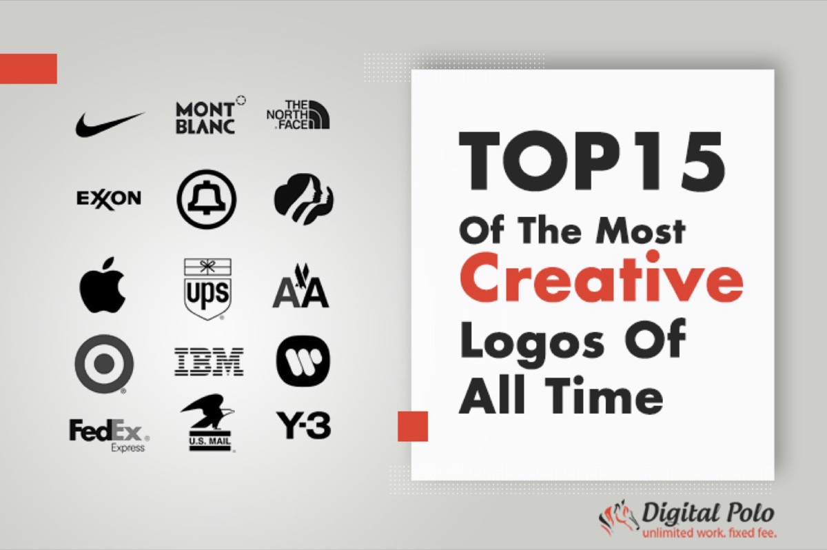
Here are 15 of the most creative and iconic business logos of all time.
1. Apple
The Apple logo isn't simply iconic or easily identifiable — it is a status symbol, an emblem of elitism and sophistication most people aspire to. The bitten Apple logo is as famous as the brand's products, and with good reason.
Apple's sleek and clean logo was not meant to look like this when it was first conceptualized. The very first Apple logo depicted Newton sitting under an apple tree, jotting notes. However, Steve Jobs wasn't happy with it, which led to the birth of the bitten apple. Apple's elegant logo represents the "byte" from the tech world and stands today as one of the best logos ever created.
2. MasterCard
If you look at the MasterCard logo today, you won't see any of the typography it once had. Developed in 1966, the earliest version contained the text "We Honor Master Charge: The Interbank Card" on top of the two iconic overlapping circles.
That text was removed and replaced with the word "MasterCard," signifying a rename for the entire brand. The new logo featured brighter colors and bolder text. In 1996, MasterCard's logo went through another redesign to become the 3D red and yellow logo it's known as today. The current text-less symbol signifies the brand's willingness and flexibility to evolve with the times.
3. McDonald's
You won't find a single person who does not associate two yellow arches merging to form an M with McDonald's. For the logo of a food chain restaurant, it doesn't even represent food — yet the sight of it can make anyone dream of the restaurant's legendary French fries.
McDonald's initial logo was very different from the current M. When the brand went through a name change in the late 1940s, it briefly had the logo of an animated cook. In the 1960s, McDonald's logo went through a major change, introducing the now-famous M-shaped golden arches. The logic behind the arches is quite simple: it represents the M of McDonald's.
4. Nike
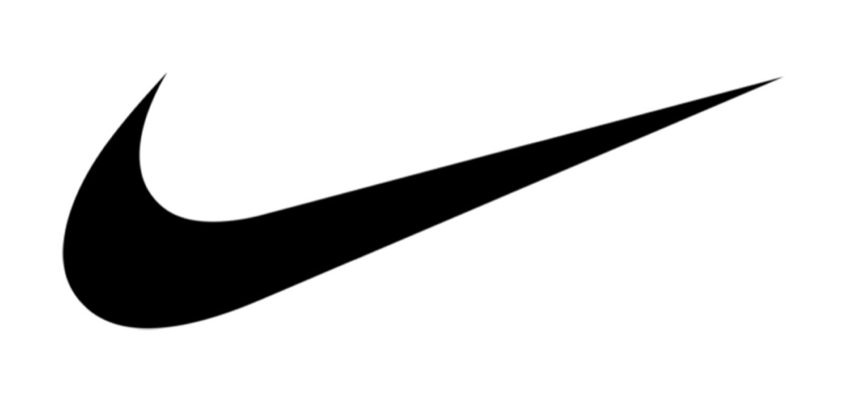
Swoosh! That's what Nike's tick mark shaped logo is famously known as. Nike's logo, which pairs perfectly with its tagline "Just Do It," was created by an intern. Surprisingly, the logo did not receive the love it now does when first unveiled. The founder of Nike, Phillip Knight, said he didn't love the logo but thought it would grow on him.
The designer, Carolyn Davidson, received only $35 for her work. She used the Greek goddess of victory, Nike, as her inspiration — the same name the brand shares. The Swoosh implies speed and movement. In 1995, the logo settled on its final form: a tilted Swoosh without the brand name.
5. FedEx
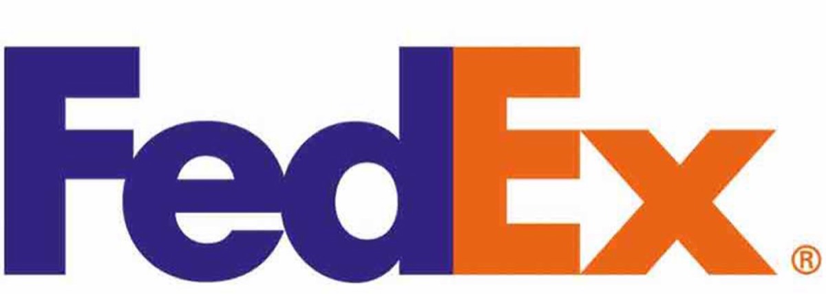
FedEx has one of the most creative business logos of all time. It might look like simple text at first glance, but if you look closely you'll find a cleverly hidden directional cue. Back in 1971, FedEx's logo featured the full name "Federal Express" in slanted text and blue and red tones, chosen to display the brand's American patriotism.
The current logo of the delivery and shipping giant makes brilliant use of negative space. Take a look at the space between the letters E and X — you'll see an arrow cleverly hidden there. This arrow serves as a sign of FedEx's commitment to accuracy and speed.
6. Microsoft
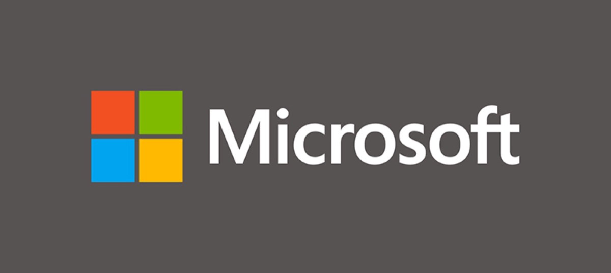
Microsoft's logo design has a rich history — going through several wildly varying changes through the years. The logo underwent a total of six notable alterations before settling on the four squares we so widely associate with this tech company.
The latest logo was launched in 2012 during the opening of the company's 23rd store in Boston. The tile-centric interface is modern in its approach. The four colors of the squares represent four major products: MS Office (red), Xbox (green), Windows (blue), and Bing (yellow).
7. Starbucks
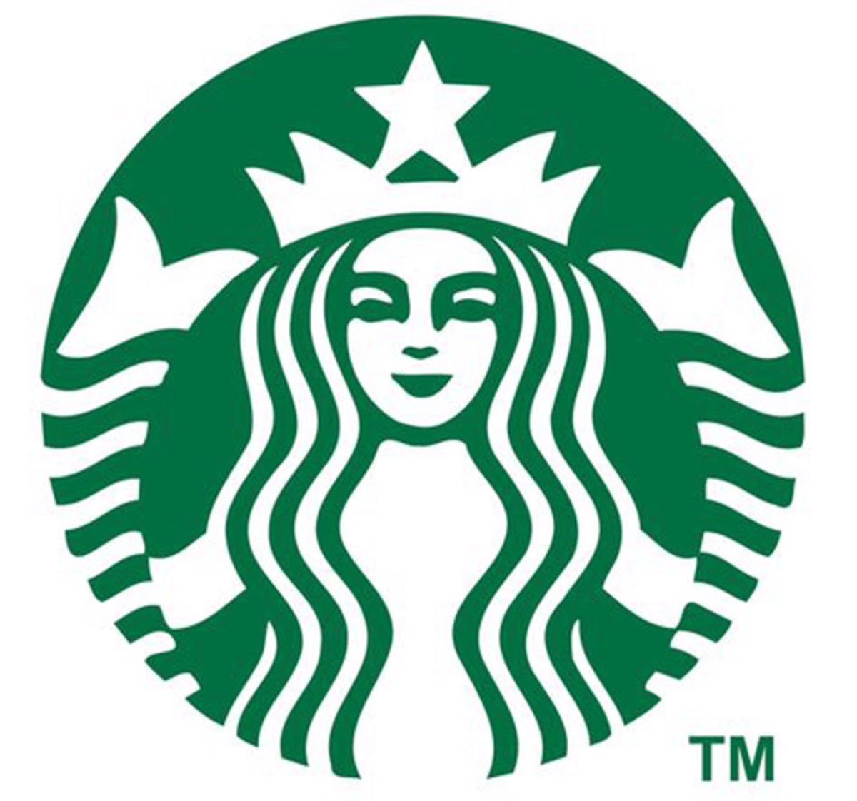
The two-tailed mermaid is so closely associated with Starbucks that you cannot imagine one without the other. But the Starbucks logo we see today is a heavily refined version of what it used to be.
The mermaid logo was first finalized in 1971 when the founders came across a Norse 16th-century woodcut featuring the famous two-tailed mermaid. At the time, the logo presented a bare-chested mermaid. In 1992, the logo was redesigned to show a more refined mermaid wearing a simple crown. In 2011, the outer circle mentioning the brand name was removed and the color shifted from black to Starbucks' trademark green.
8. World Wildlife Fund
The adorable panda of the WWF has to be one of the cutest corporate logos around. The black and white panda was first conceptualized and introduced in 1961. This design was the brainchild of Sir Peter Scott, the founding chairman of the organization.
Initially, the panda logo had a bit of fur texture. That was dropped in 1978 and the logo was further simplified. The WWF text was added below the panda over time, and in 2000, the font was altered slightly while keeping the rest of the design intact.
9. Audi
The first Audi logo looked very different from the classic four interlocking rings we now associate with the brand. Back in 1909, the logo featured an inverted black triangle containing the company name with the numeral 1 sitting atop it.
Like most companies, Audi went through a merger, which demanded a new logo. That's when the iconic four interlocking rings were born — symbolizing the merger of four different motor-vehicle manufacturers: Audi, Wanderer, Horch, and DKW. In 2009, the logo went through another revision, keeping the basic design but adopting a more modern look.
Looking for professional designs that apply these strategies? See Digital Polo's plans →
10. Twitter
Twitter's bird logo has achieved iconic status in a remarkably short span of time. From 2006 to 2010, Twitter's logo was simply the brand name written in blue lowercase letters. Later, a bird was added at the end of the word — known as Larry.
It was in 2012 that Twitter's logo received its final polish and emerged as a more refined blue bird without any typography. The new logo was designed to resemble the mountain bluebird.
11. Chanel
Chanel is one of those brands where almost everything is homegrown — including its logo. The Chanel logo was the work of Gabrielle Chanel, or Coco Chanel, as we all know her. Created in 1925, Chanel's logo garnered instant recognition, evoking a sense of luxury every time it was seen.
The logo features a pair of intersecting Cs, which stand for the initials of the legendary fashion designer's name. The logo's inspiration can be traced back to the orphanage Chanel grew up in — the windows were said to be shaped much like the logo of the fashion brand. The apparent simplicity of the logo reflects the "less is more" philosophy Chanel personally believed in.
12. Rolex
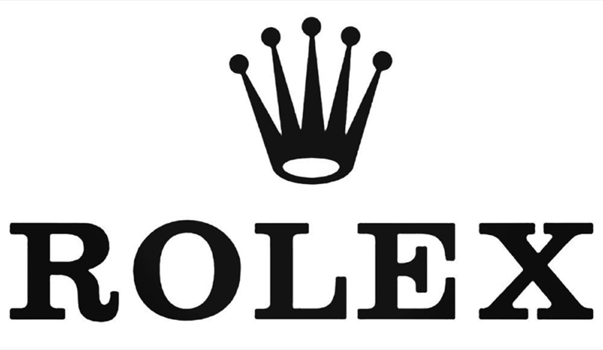
Every watch has a crown, and a traditional crown is a symbol of luxury, grandeur, and power. It's no surprise that one of the most esteemed watch brands in the world chose the crown as its logo. Rolex's logo comprises a simple pointed crown sitting above the brand's name — meant to be an emblem of perfectionism, prestige, and victory.
The most interesting thing about Rolex's logo is that, unlike other brands, it hasn't gone through any significant changes since the brand's inception. The slogan "A Crown for Every Achievement" fits perfectly with the logo.
13. MTV
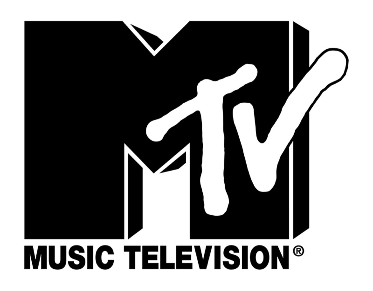
The MTV logo you see today was first designed by Manhattan Design in 1981. The agency was asked to create a logo for the music channel and came up with a design that became iconic from the start.
MTV's distinct logo has always had a very dynamic nature. Every now and then, the pattern and color scheme change to adopt and reflect new underlying themes and trends. Some consistency was achieved in the 1990s and 2000s, when the channel opted for a white logo while keeping the original design intact. The logo was refreshed again in 2009, with the M filled with dynamic images while the TV stayed solid white.
14. Warner Bros.
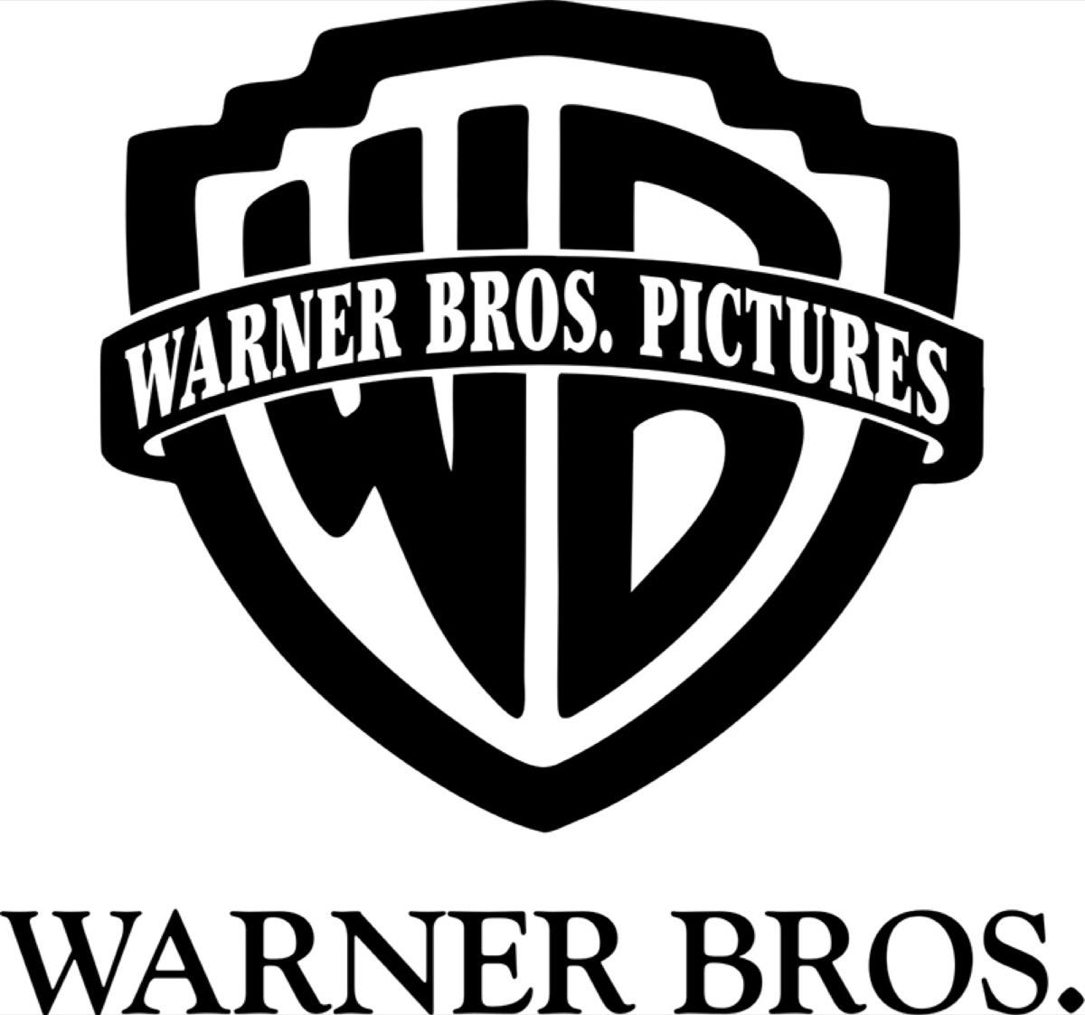
The Warner Bros. shield is one of the few logos that has achieved cult status. Introduced in 1923, the shield has been around since the very first version of the logo. Initially, the silhouette of the studio appeared above the WB lettering. In 1929, the studio outline was removed and "Warner Bros. Picture Inc." was curved to fit the area above the shield.
The logo went through many changes after that, including color changes and the addition of the parent company's name following acquisitions. Currently, the logo depicts the classic 1984 blue and gold design — though colors can change depending on the movie being promoted.
15. Amazon
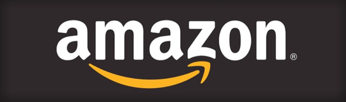
Amazon truly has one of the most creative logo designs the world has ever seen. In early 1998, the logo was a simple "amazon.com" in lowercase with the tagline "Earth's Biggest Bookstore" underneath. In late 1998, the tagline was dropped, the letters became uppercase, and a distinct yellow O was added.
The smiling arrow logo that is the current identity of the site was born in the year 2000. The arrow-shaped yellow smile stretches from A to Z in Amazon's spelling — depicting the brand's commitment to delivering products across every category (A to Z) quickly and with a smile.
We all easily associate logos with particular brands but rarely stop to think about the philosophy behind them and why they resonate so strongly. Every great logo tells a story — it communicates the brand's values in a single visual that travels across cultures and generations.
When you get down to creating a logo for your own brand, study what works in your industry and why. The best logos are simple, memorable, and deeply tied to the brand's core purpose. A great logo is not an expense — it is one of your highest-return brand investments. Once your logo is in place, applying proven branding strategies to your marketing compounds its impact across every channel.
Digital Polo creates professional logo designs and complete brand identities for one flat monthly fee with unlimited revisions. Start for $399/mo → | Soulmate at $899/mo →
Frequently Asked Questions About Creative Logo Design
What makes a logo design truly iconic? Iconic logos are simple, memorable, and meaningful. They communicate the brand's core values at a glance and work well at any size — from a business card to a billboard. Logos like Nike's Swoosh and Apple's bitten apple succeed because they are instantly recognizable and carry a clear story behind their design.
How long does it take to design a professional logo? A professional logo design typically takes between 1–2 weeks from initial brief to final delivery, depending on complexity and revision rounds. At Digital Polo, logo designs are delivered quickly through a subscription model, with unlimited revisions included so you get exactly what you need.
Should a logo include the company name? Not necessarily. Many of the world's most recognized logos — Nike, Apple, MasterCard — function perfectly without any text. However, for newer brands that are still building recognition, including the company name in the logo can help customers associate the visual mark with the brand more quickly.
How often should a brand redesign its logo? Most successful brands redesign their logos every 5–10 years to stay current while maintaining core identity elements. Rolex is a notable exception — its logo has barely changed since inception. The key is evolution, not revolution: update the logo without abandoning the visual equity you've already built.
What is the most important element of logo design? Simplicity is the single most important element. A logo needs to be legible at small sizes, reproducible in black and white, and immediately recognizable. Complexity tends to age quickly and creates problems with printing and digital applications. The best logos in history are all deceptively simple.
Ready to Design Your Own Iconic Logo?
A logo that holds up the way the ones on this list have isn't designed in an afternoon. It needs strategic positioning, deliberate typography choices (see our 35 best business fonts guide), a colour palette that survives every substrate, and the discipline to keep refining the same mark over years rather than redesigning every two.
DigitalPolo's Partner plan at $399/month covers logo design plus the full identity rollout — wordmark, logomark, monochrome variants, brand guidelines, every application after — with a 48-hour turnaround and unlimited revisions. 16 years of operating history behind every mark we ship.
See plans and pricing → | Book a 15-minute call | Learn what a logo mark is → | Learn what a wordmark is →
