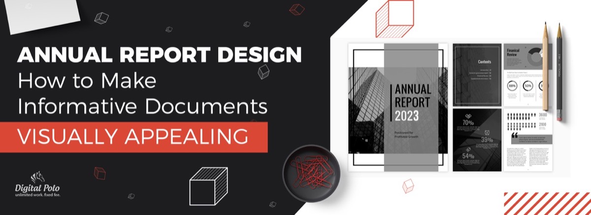
When companies think about graphic design, they typically focus on logos, websites, and social media. Annual reports rarely make the list — and that's a missed opportunity.
An annual report is an official account of a company's performance for the year. It typically includes a message from the CEO, the company's business profile, detailed financial statements, and a forward-looking analysis. Given the caliber of the audience — investors, board members, regulatory bodies, and senior stakeholders — the quality of annual report design has a direct impact on perception, trust, and engagement.
Even strong financial performance loses impact when it's buried in uninspiring black-and-white text blocks. Good design makes complex data accessible, reinforces brand identity, and transforms a compliance document into a compelling narrative.
Here are five essential annual report design principles that separate forgettable reports from ones that actually get read.
1. Go All-Out With the Cover
The cover of your annual report is the first impression for every stakeholder who receives it. An attractive, strategically designed cover signals that the organization takes its communications seriously.
Beyond aesthetics, the cover can serve strategic goals:
- Highlight a major milestone from the year (product launch, market expansion, an award)
- Set the visual tone for the report's theme — innovation, growth, stability, or transformation
- Reflect the brand's current visual direction, showing evolution without departing from core identity
Abstract cover designs work well for reports focused on forward-looking strategy. Product or people-centric covers work better for brands emphasizing tangible achievement.
2. Choose Your Content Strategically
Annual report design is inseparable from content strategy. The design must serve the content — and the content must be curated with purpose.
If your goal is a comprehensive state-of-the-company report, weight the content toward performance data, and let the design focus on making those numbers scannable and visually impactful through infographics, charts, and callout statistics. If the goal is stronger PR placement and media pickup, prioritize compelling stories, and use bold visual treatments to make key facts quotable and shareable.
Avoid the impulse to include everything. A focused annual report communicates more effectively than one that tries to document every initiative across every department.
Need your annual report designed by professionals — without a large agency retainer? Digital Polo's flat-rate subscription covers unlimited print design revisions. See plans starting at $399/mo →
3. Maintain Consistent Brand Identity Throughout
Annual reports are high-profile business documents distributed to your most important audiences. Designing them in line with the company's brand guidelines reinforces corporate identity and builds trust through visual consistency.
Brand consistency in annual report design goes beyond putting the company logo on the cover. The same visual discipline that makes a well-designed business brochure effective — clear hierarchy, consistent typography, purposeful use of color — applies directly to annual report layouts:
- Use the brand's approved color palette throughout — for section dividers, callouts, charts, and infographics
- Apply brand typography to all headings, subheadings, captions, and body text
- Ensure data visualizations (graphs, charts, tables) follow the same visual language as other brand materials
- The overall aesthetic — formal, modern, warm, data-forward — should align with the brand's personality
For established brands, brand consistency reassures stakeholders that the organization is well-managed. For growing companies, it demonstrates maturity and professionalism.
4. Avoid Crowding: Let the Layout Breathe
Annual reports carry a significant volume of information. The temptation is to fit as much as possible onto every page — but crowded layouts reduce comprehension and increase the likelihood that readers skip sections entirely.
Effective annual report layout principles:
- Use clear headings and subheadings to organize content into scannable sections
- Apply generous negative space (whitespace) around both text blocks and visual elements
- Use data visualizations — infographics, charts, graphs — to replace dense text explanations of financial data
- Break long text sections with pull quotes, key statistics in oversized type, or full-bleed imagery
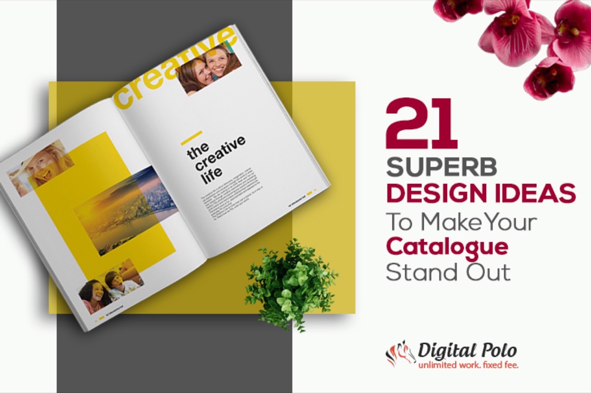
The goal is a layout where a stakeholder can scan the document in minutes and identify the key messages — then choose to go deeper on what interests them. This same approach — scannable structure over dense prose — is what makes catalogue design stand out in print, and the lessons transfer directly to annual reports.
5. Reflect Current Design Trends — Don't Repeat Last Year's Template
There is a natural temptation to reuse a successful annual report design year after year. Resist it. Design trends evolve, and audiences — even corporate ones — notice when materials look dated.
Current trends in annual report design include:
- Data storytelling: using narrative-driven infographics instead of static charts
- Interactive digital versions: HTML microsites or interactive PDFs alongside print
- Bold typography: large, expressive headlines replacing uniform body-text formatting
- Dark or rich color backgrounds: moving away from white-dominant layouts toward deeper, more distinctive palettes
- Photography integration: mixing brand photography with data graphics rather than keeping them in separate sections
The most reliable way to stay current is to work with designers who are actively producing annual reports for multiple organizations — they bring cross-industry trend awareness that in-house teams often lack. The same visual thinking that elevates a restaurant menu design — using layout and typography to guide the reader's eye — translates directly into effective annual report formatting.
Digital vs Print: Don't Forget the Online Version
Modern annual report design must account for both print and digital audiences. While a printed annual report remains important for regulatory and investor relations purposes, a digital version significantly extends reach.
Digital annual report options range from:
- PDF download: the minimum standard — easy to produce, accessible, searchable
- Interactive PDF: embedded hyperlinks, clickable table of contents, expandable charts
- Online microsite: a dedicated web page or series of pages presenting the report in HTML format — the most engaging format for investor relations
Designing for both formats from the outset is more efficient than adapting a print layout for digital after the fact.
Conclusion
A thoughtfully designed annual report does two things simultaneously: it fulfills a compliance obligation and builds confidence in the brand. Given the stakeholder audience — investors, board members, potential partners — the quality of execution reflects directly on the organization's standards.
Great annual report design starts with a strong brief, consistent brand application, strategic content curation, and layout discipline. And like any high-stakes print deliverable, it benefits enormously from professional execution.
Get a beautifully designed annual report delivered on time. Digital Polo subscribers get unlimited design requests, unlimited revisions, and dedicated support — all for one flat monthly fee. Start your subscription → | Go all-in with Soulmate at $899/mo →
Frequently Asked Questions About Annual Report Design
How do you design an annual report from scratch? Start by outlining the key sections — executive letter, company profile, financial highlights, and forward-looking analysis. Then apply your brand's design guidelines to typography, color, and layout. Treat financial data as a visual design challenge: replace text-heavy explanations with infographics, charts, and callout statistics wherever possible.
What are the 4 key parts of an annual report? Most annual reports include: (1) an executive letter from the CEO or President, (2) a company profile covering business overview and key metrics, (3) detailed financial statements for the year, and (4) a forward-looking analysis with commentary on strategy and outlook.
How long does annual report design take? Professional designers typically need 2–4 weeks depending on content volume, number of pages, and the complexity of data visualizations required. Subscription-based design services can scope work across multiple sprints if content is delivered in stages.
Should annual reports be print-only or digital? Both. A PDF digital version is now standard alongside print copies, and interactive online versions (HTML microsites) are increasingly common for investor relations. Designing for both formats from the start is more efficient than adapting a print layout for digital after the fact.
How much does annual report design cost? Agency projects typically range from $5,000 to $30,000+ depending on scope, page count, and data complexity. Subscription-based design services like Digital Polo offer significantly lower monthly rates with unlimited revisions — a cost-effective alternative for organizations that produce multiple reports or design assets throughout the year.