You sign up for a free trial, careful not to agree to anything paid. Then 30 days later your credit card is charged for an annual subscription. You check the original sign-up flow and find it: a pre-ticked checkbox buried in the fine print, labeled in light grey text against a white background, positioned just above the "Start Free Trial" button.
That's a dark pattern. And it was designed deliberately.
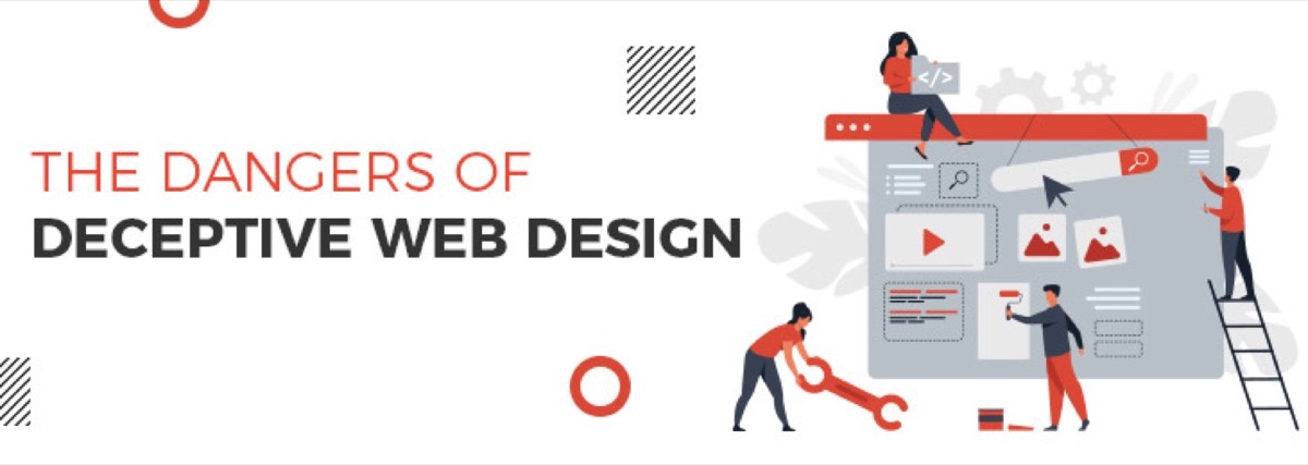
Deceptive web design — also called dark patterns — describes interface choices specifically engineered to override user intent. The user thinks they are making one decision; the interface steers them toward a different one. The tactics range from confusing language and hidden costs to fake urgency timers and forced continuity subscriptions.
This guide covers the most common techniques, why they backfire badly for businesses, the growing legal exposure they create, and a practical checklist for auditing your own site.
What Are Dark Patterns in Web Design?
Dark patterns are user interface design choices that manipulate users rather than serving them. The term was coined by UX designer Harry Brignull in 2010, who documented and categorized the techniques in use across major consumer websites.
They work because interfaces carry trust. Users follow visual cues — large buttons, bold text, prominent checkboxes — assuming the design is guiding them toward their own best interest. Dark patterns exploit that trust by making the brand's preferred action appear to be the user's intended action. Understanding how website design can make or break your business makes it clear just how much is at stake when that trust is violated.
While deceptive sales tactics are not new, the scale at which digital interfaces can deploy them is unprecedented. A dark pattern running on a website with one million visitors per month systematically redirects the decisions of every one of those visitors.
Common Techniques of Deceptive Web Design
Trick questions — opt-out language worded to confuse. "Uncheck this box if you do not wish to not receive promotional emails" is designed to make both checking and unchecking the wrong choice.
Misdirection via visual hierarchy — using a large, prominent button for the action the brand prefers (subscribe, pay extra, share data) and a small, low-contrast text link for the user's preferred action (skip, decline, cancel).
Disguised ads — content that appears to be editorial or organic results but is actually paid placement, without clear disclosure.
Forced continuity — using payment details collected for a free trial to enroll users in a paid subscription without clear notice at the moment of charge. The original example from the intro.
Roach motel — easy to enter, nearly impossible to exit. Subscriptions that require a phone call to cancel. Account deletion flows buried behind seven confirmation screens. Unsubscribe links that go to pages requiring you to log in first.
Cart sneaking — adding items to a shopping cart that the user didn't select. Travel booking sites have historically added travel insurance this way. Some add charity donations with an opt-out users must notice.
False urgency — countdown timers showing "Only 2 left" or "Offer expires in 00:03:47" when neither claim is true.
Friend spam — using contact data provided during sign-up to send promotional emails to the user's contacts without explicit consent.
The Business Case Against Dark Patterns
They Destroy Customer Experience
Dark patterns may produce short-term metric gains — higher sign-up rates, larger average order values, reduced cancellations — but the downstream effects are severe. A 2024 consumer trust study found that 82% of users stop doing business with a brand after a single experience of feeling deceived.
Worse, negative experiences are shared. A user who feels tricked becomes an active detractor. They share the experience publicly, dispute the charge with their bank, and leave a one-star review that appears on every purchase consideration search for years.
They Prevent Customer Loyalty
Brands deploy dark patterns to grow their user base or subscriber count. The irony is that coerced customers are the worst possible customers — they have no loyalty, churn the moment they realize what happened, and actively prevent the genuine loyalty that makes customer acquisition cost sustainable over time.
The brands with the highest long-term customer lifetime value are the ones with the most transparent, frictionless user experiences.
They Damage Brand Reputation
When a brand's dark patterns are publicly recognized, the reputational damage compounds over time. Microsoft faced prolonged backlash when Windows 10 upgrades were automatically triggered even when users explicitly declined by clicking the "X" on the upgrade pop-up — an interface that had been deliberately redesigned to make the close button trigger acceptance rather than rejection.
The backlash attached to the brand for years, became a case study in design ethics courses, and is still cited a decade later as an example of what not to do.
The Legal Landscape: Dark Patterns Are Now Illegal in Many Jurisdictions
What was once purely a reputational and user experience risk has become a legal one.
United States (FTC): The Federal Trade Commission has actively pursued dark pattern cases under Section 5 of the FTC Act (unfair or deceptive practices). FTC v. Amazon (2023) directly targeted subscription dark patterns. The FTC's "Click-to-Cancel" rule, finalized in 2024, requires that canceling a subscription be as easy as signing up for one. Fines can reach into the tens of millions.
European Union (EU DSA and GDPR): The EU's Digital Services Act (DSA), which applies to platforms operating in Europe regardless of where they are headquartered, explicitly prohibits dark patterns. The GDPR already prohibits pre-ticked consent boxes for marketing. Violations carry fines up to 6% of global annual turnover.
California (CCPA): California's Consumer Privacy Act prohibits dark patterns that prevent users from exercising their privacy rights, including opting out of data selling.
The regulatory trend is clear: dark patterns that were once a gray area are now explicitly illegal in the jurisdictions where most digital businesses operate.
Need an ethical design partner that builds trust through transparency? See how Digital Polo approaches web design →
Dark Pattern Self-Audit Checklist
Before you assume your site is clean, work through this checklist:
Subscriptions and sign-ups:
- Is the free trial-to-paid conversion process communicated clearly before payment details are entered?
- Is cancellation accessible from the user's account settings without requiring a phone call?
- Is the price of the paid tier displayed prominently at the point of free trial sign-up?
Checkboxes and consent:
- Are all opt-in checkboxes unchecked by default?
- Is consent language written in plain English, not double-negative phrasing?
- Is marketing consent separate from service terms consent?
Cart and checkout:
- Does the cart contain only what the user explicitly added?
- Are all fees (shipping, service charges, insurance) disclosed before the final payment screen?
- Is the "Continue without add-ons" option visually equal in size to the upsell button?
Urgency and scarcity:
- Do inventory and timer claims reflect actual data?
- Do countdown timers reset when refreshed? (If yes, they are fake.)
Exit and cancellation:
- Can users delete their account or cancel their subscription within the app or site?
- Does the cancellation flow contain more than two confirmation steps?
Any "no" on the first group or "yes" on the last two items represents a dark pattern that creates both legal exposure and customer trust risk.
Building Trust Through Transparent Design
The alternative to dark patterns is not naive generosity — it is clear, confident design that respects the user's intelligence. Brands that convert through genuine value, transparent pricing, and friction-free experiences build the kind of customer base that drives sustainable revenue. The eight foundational rules of web design offer a positive framework for building sites that earn trust rather than manipulate it.
Ethical web design means: making the preferred action obvious without hiding the alternatives, using urgency when it is genuine, making it as easy to leave as to sign up, and letting the product earn the conversion rather than engineering the user into it.
The brands with the strongest long-term conversion rates are not the ones with the most manipulative flows. They are the ones with the most trusted brands — and trust is built, or lost, in the design of every interaction. For a practical guide to building a website that actually converts through good design, see our pro tips for high-converting website design.
Get a website designed for trust and conversion — ethical UX, professional design, delivered in 48 hours with unlimited revisions. Start your Digital Polo subscription → | Soulmate at $899/mo →
Frequently Asked Questions About Dark Patterns in Web Design
Are dark patterns illegal? Yes, in many jurisdictions. The FTC's Click-to-Cancel rule (2024) explicitly prohibits dark patterns around subscriptions in the United States. The EU's Digital Services Act bans dark patterns across all platforms operating in Europe. GDPR prohibits pre-ticked consent checkboxes. California's CCPA prohibits dark patterns that obstruct privacy rights. Businesses operating in these jurisdictions face significant fines for using deceptive design.
What are the most common dark patterns? The most frequently encountered dark patterns are: forced continuity (using free trial payment details to charge without notice), roach motel (easy sign-up, deliberately difficult cancellation), cart sneaking (adding items the user didn't select), trick questions (confusingly worded opt-outs), and false urgency (countdown timers and inventory claims that aren't real). All five appear regularly on major e-commerce and SaaS websites.
How do I check if my website uses dark patterns? Audit your checkout flow, subscription sign-up process, and cancellation flow from a new user's perspective. Check: Are all opt-in boxes unchecked by default? Is the cancellation path as prominent as the sign-up path? Does the cart contain only what you explicitly added? Are all fees shown before the final payment screen? Any "no" to these questions likely indicates a dark pattern.
What is the difference between persuasive design and dark patterns? Persuasive design uses psychology to guide users toward actions that are genuinely in their interest — clear value propositions, social proof, strategic CTA placement, reduced friction in checkout. Dark patterns manipulate users into actions that serve the brand at the user's expense — hidden charges, forced subscriptions, confusing opt-outs. The distinction is whether the user would feel helped or deceived if they understood fully what had happened.
Can dark patterns damage a brand's reputation? Yes, severely and durably. Dark patterns that become publicly known generate sustained negative press, social media backlash, chargebacks, regulatory fines, and long-term drops in brand trust scores. The damage is asymmetric: a dark pattern that produces a short-term conversion gain often generates negative brand equity that lasts for years. The Microsoft Windows 10 forced upgrade (2015–2016) is still cited a decade later as a canonical example.