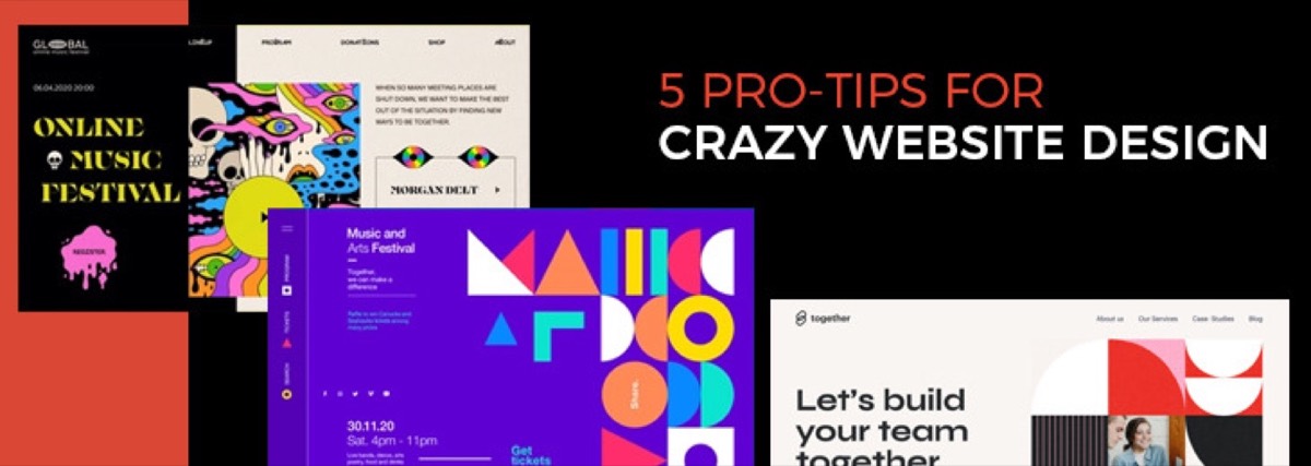
Web design is not purely a visual discipline. It's an exercise in communication and usability — creating interfaces that help people find what they need, understand what they see, and take the actions they came to take.
Whether you're building a landing page, an e-commerce store, or a complex web application, the same foundational rules apply. Violate them and the visual work doesn't matter. Follow them and even a modest design delivers a strong user experience. For the flip side — what happens when design is used deliberately to manipulate rather than serve — read our guide on deceptive web design patterns and dark patterns.
Rule 1: Maintain Consistency in Your Interface
Consistency is one of the most powerful forces in UX. When every page on your site uses the same navigation structure, typography system, color palette, and interaction patterns, users can transfer what they learn from one page to every other page. Cognitive load drops and confidence increases.
Consistency applies at multiple levels:
- Visual consistency — same fonts, same colors, same spacing across all pages
- Functional consistency — buttons that look the same do the same thing everywhere
- Content consistency — headings, labels, and error messages follow the same tone and format
A practical note: make the design usable before making it consistent. Consistency at scale amplifies both good and bad decisions. If your base design has a problem, consistently applying it makes that problem appear everywhere.
Rule 2: Create Simple, Predictable Navigation
Navigation is the primary method by which users engage with a website. If they can't find what they're looking for, nothing else matters.
Effective navigation follows predictable conventions:
- Keep the primary navigation at the top of the page — that's where users expect it
- Limit top-level items to seven or fewer — human working memory holds roughly seven items
- Use plain language for labels — "Products" is better than "Our Solutions Portfolio"
- Reflect the three-click rule: users should reach any destination within three clicks
- Include navigation options in the footer — users who reach the bottom of a page without finding what they want should have clear options
Sub-navigation with distinct categories is preferable to a cluttered top-level menu. Structure the hierarchy by how users think about your content, not by how your organization is structured.
Rule 3: Change the Color of Visited Links
This rule is small but important. When visited links don't change color, users lose track of where they've been. They revisit the same pages accidentally, grow frustrated, and give up faster.
The convention (blue for unvisited, purple for visited) exists because decades of web usage have trained users to read it automatically. You don't have to follow the exact colors, but you should make the distinction clear and consistent. Helping users understand their position in your site reduces confusion and encourages deeper exploration.
Need a website that applies these principles and converts visitors into customers? See Digital Polo's plans →
Rule 4: Design Pages for Scanning, Not Reading
Users don't read web pages like books — they scan. Eye-tracking research consistently shows that users move through a page in F-shaped or Z-shaped patterns, hitting headings, the first few words of paragraphs, and visual anchors.
Design for how users actually read:
- Use headings (H2, H3) to break content into scannable sections with descriptive labels
- Front-load the most important information — the first sentence of each paragraph carries disproportionate weight
- Use bullet points and numbered lists for items that don't need prose
- Create clear visual hierarchy: what's most important should be most prominent
- Use a grid-based layout to organize information predictably
The goal is to let a user scan your page in 10 seconds and understand what it contains and where to focus.
Rule 5: Treat Content with Respect
Design serves content — it doesn't compete with it. More than 90% of web information is text, and good design makes that text easier to read, scan, and understand.
Practical principles:
- Body text should be minimum 16px — anything smaller is genuinely difficult to read at typical viewing distances
- Line length should be 60–80 characters — lines that are too wide or too narrow slow reading
- Contrast matters — text needs sufficient contrast against its background (WCAG AA standard: 4.5:1 ratio)
- Every line of text should serve the reader — cut filler phrases, redundant explanations, and content that doesn't add value
Avoid jargon. Write for the least-specialized person who might visit the page. If you must use technical terms, define them in context.
Rule 6: Test Your Pages for Errors
A broken link, a missing image, or a form that fails silently can cost you visitors and conversions. These errors are common, easy to fix, and often go unnoticed by teams who built the page.
Regular checks should include:
- Broken links — internal and external links should be tested regularly; 404 errors frustrate users and harm SEO
- Broken images — images that fail to load leave blank boxes and make the page feel abandoned
- Media that doesn't play — videos and audio should load and work across browsers and devices
- Form errors — every form should be tested with valid and invalid inputs, and error messages should be specific and helpful
Build a simple QA checklist into your design and development workflow. Catching errors before launch is faster and cheaper than fixing them after.
Rule 7: Reduce the Number of Choices
Hick's Law states that the time it takes to make a decision increases logarithmically with the number of options available. More options mean slower decisions — and slower decisions mean users leave before completing what they came to do.
Apply this to:
- Navigation menus — fewer, well-organized items over exhaustive lists
- Form fields — only ask for what you genuinely need
- CTAs — one primary action per page, not five competing buttons
- Product pages — clear filters and sensible defaults reduce overwhelm
Reducing choices is counterintuitive — it feels like you're giving users less. But users who can act quickly are more likely to act at all.
Rule 8: Get Visitors to Scroll
Scroll depth correlates with engagement and conversion. Users who read more of a page are more likely to buy, sign up, or contact you. The challenge is that most users stop scrolling when they don't find what they expect.
What drives scroll behavior:
- The above-the-fold content sets expectations — if the first screen looks high quality and relevant, users scroll to find out more
- Visual cues invite scroll — a partially visible image or content section below the fold signals there's more
- Short paragraphs and visual variety maintain momentum — walls of text stop scrolling dead
Don't treat the below-the-fold section as less important. Structure the entire page to draw users progressively deeper, with the most compelling hook at the top and the CTA where scroll momentum naturally delivers them. For a more focused look at what makes websites genuinely high-converting, see our pro tips for website design that actually drives results.
Conclusion
These eight rules aren't design trends — they're the foundations of how users navigate, read, and interact with websites. They apply regardless of aesthetic style, industry, or technology stack.
If your current website violates several of them, that's where to start: fix navigation, improve content hierarchy, and test for errors. Those changes will improve performance faster than any visual refresh. If you're ready for a full overhaul rather than incremental fixes, our complete website redesign guide walks through the full strategy and checklist.
Need a website redesign built on these principles? Digital Polo creates professional website designs — landing pages, full site designs, and UI systems — for one flat monthly fee with unlimited revisions. Start for $299/mo → | Soulmate at $899/mo →
Frequently Asked Questions About Web Design Rules
What are the most important principles of good web design? The most impactful principles are: consistent interface design (same patterns across all pages), simple and predictable navigation, content written and formatted for scanning, clear visual hierarchy, reduced choice complexity, and error-free implementation. These principles address how users actually behave on websites — scanning rather than reading, expecting familiar patterns, and abandoning sites that create confusion or friction.
What is visual hierarchy in web design? Visual hierarchy is the arrangement of design elements to guide the user's eye in order of importance. It's created through size (larger = more important), contrast (high-contrast elements attract attention first), spacing (generous white space around elements increases their perceived importance), and position (top-left content is noticed first in Western reading patterns). Effective visual hierarchy helps users understand a page's structure at a glance without reading every word.
How do I improve website usability? Start with navigation — ensure every page can be reached within three clicks, and use clear, plain-language labels. Then improve content scanability: use descriptive headings, front-load key information, and use bullet points for lists. Reduce form fields to essentials. Test with real users who aren't familiar with the site — watching them navigate reveals problems you can't see from inside the design.
What is the three-click rule in web design? The three-click rule states that users should be able to reach any page on a website within three clicks from the homepage. While it's sometimes debated as an absolute rule, the underlying principle is valid: navigation should minimize the effort required to find content. Every unnecessary click adds friction and gives users another opportunity to abandon the journey.
How does page load speed affect web design? Page load speed directly affects user experience and conversion rates. Studies show that a 1-second delay in page load time can reduce conversions by 7%. Core Web Vitals — Google's standardized performance metrics — affect both user experience and SEO rankings. Designers impact load speed through image optimization, font loading strategies, and avoiding render-blocking resources. Performance should be considered a design constraint, not an afterthought.