
Designing a Shopify theme is a more demanding project than most designers expect. You're not designing a single website — you're building a flexible system that a merchant you've never met will customize, populate with their own products, and use to run their business. The design has to work for them and for their customers. Understanding how a custom-built website drives sales provides useful context on why merchants choose custom themes over generic ones in the first place.
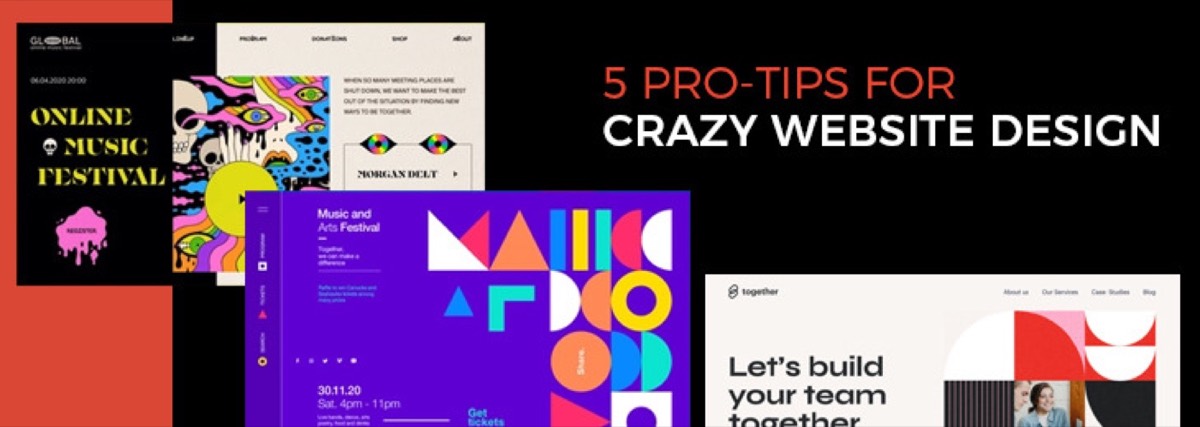
The Shopify Theme Store receives millions of merchant visits per month. Standing out in that environment requires not just good aesthetics but genuine utility — themes that are fast, flexible, mobile-native, and built for how merchants actually operate their stores. The same principles that make a Shopify theme convert apply broadly to high-performing websites — our pro tips for website design that drives results covers the fundamentals.
These are the principles that separate commercially successful Shopify themes from ones that look good in screenshots but underperform in production.
1. Find the Market Gap Before You Design Anything
The single most important decision in Shopify theme development is made before a single pixel is drawn: identifying a specific underserved audience.
The Theme Store already contains thousands of themes covering general retail, fashion, and standard e-commerce layouts. Building a competent general theme adds to the noise. Building a theme that solves a specific problem for an underserved niche creates a product with a natural audience.
The research process:
- Browse the Theme Store systematically by category and audience
- Identify niches where current offerings are sparse, outdated, or poorly designed
- Look for audience types whose specific workflow requirements (event scheduling, portfolio display, music player integration, subscription management) aren't addressed by existing themes
- Survey Shopify community forums and merchant groups to find recurring pain points
The Label theme by Giraffic Themes — one of the most successful Shopify themes built by an independent designer — was built for artists, musicians, and creative sellers. At the time of its launch, most themes targeting this audience were either overly complex or missing the specific functionality creative merchants needed: embedded music players, calendar integrations for events, social feed support. Label addressed all three and built its audience by solving real problems.
2. Design for Flexibility, Not Just Aesthetics
Every merchant who installs your theme will customize it. They will change colors, move sections, add their own images and copy, and often use the theme in ways you didn't anticipate. A theme that works only when it looks exactly like the demo has failed at its core function.
Shopify Online Store 2.0 (launched 2021) built flexibility directly into the platform architecture. Key OS 2.0 features that theme designers must understand:
- Sections everywhere: OS 2.0 allows merchants to add, remove, and reorder sections on any page — not just the homepage. Design themes where sections function independently and compose cleanly at any arrangement.
- App blocks: Integration points for third-party app blocks (reviews, loyalty programs, upsells) should be designed into section structures, not bolted on as afterthoughts.
- Metafields: Native metafield support in OS 2.0 allows merchants to add custom data fields without code. Design templates that surface metafield data in useful ways.
Practical flexibility principles:
- Reduce the total number of theme settings but make each one powerful
- Design sections that work well with one product image and with twenty
- Test with placeholder text and real copy — themes that only work with your demo copy fail immediately in production
- Design for inventory extremes: the merchant with 3 SKUs and the merchant with 3,000
3. Design for the Merchant as Much as for the Customer
A theme is two products: the storefront that customers browse, and the admin system that merchants manage. Both experiences matter.
Themes with too many settings overwhelm merchants during customization. They spend hours trying to understand options and often end up with a store that looks nothing like the demo — not because they changed too much, but because they couldn't navigate the settings structure.
The Giraffic Themes design process for Label reduced the theme from nearly 400 settings to a focused set of highly useful ones. The result was a cleaner product, a faster merchant onboarding experience, and a storefront that consistently looked close to the demo regardless of who was setting it up.
Merchant-centered design checklist:
- Group related settings logically — don't scatter typography settings across five different menus
- Write setting labels in plain language, not developer terminology
- Provide sensible default values so the theme looks good immediately on installation
- Document every non-obvious setting with contextual help text
- Test the customizer experience with someone who has never seen your theme
4. Build for Mobile-First Performance
Over 70% of Shopify store traffic now originates from mobile devices. A theme that delivers a beautiful desktop experience but a clunky mobile one is failing the majority of actual shoppers.
Mobile-first design principles for Shopify themes:
- Design the mobile layout before the desktop layout — constrained environments reveal what's essential
- Touch targets for buttons and interactive elements should be a minimum of 44×44px
- Navigation menus should be accessible with one thumb without requiring precise taps
- Product images must load fast and display correctly at small screen sizes
- Checkout flow on mobile should minimize typing (rely on autofill and saved payment methods)
Core Web Vitals are Google's standardized metrics for page experience and directly affect search ranking for merchants' stores. Theme designers are responsible for the base performance scores their themes produce. Key metrics:
- Largest Contentful Paint (LCP): Time for the main page content to load. Target under 2.5 seconds. Avoid hero images that aren't lazy-loaded.
- Cumulative Layout Shift (CLS): Visual instability as the page loads. Specify dimensions for all images and reserve space for dynamic elements to prevent layout shifts.
- Interaction to Next Paint (INP): Responsiveness to user interaction. Minimize JavaScript execution on the main thread.
Test performance using Google PageSpeed Insights on real merchant stores, not your demo — demo stores with optimized images and minimal content don't represent real-world conditions.
5. Identify the Market Gap — Then Stay in Your Lane
Once you've identified and solved for a specific niche, resist the temptation to add features for adjacent audiences. Label was designed for creative sellers with minimal product inventories. Attempts to make it work for high-volume product catalogs would have diluted its core proposition.
The commercial logic: a theme that does one thing exceptionally well for a specific audience builds a loyal user base that leaves strong reviews, recommends the theme to others in the same niche, and generates sustainable recurring revenue. A theme that tries to serve everyone typically serves no one particularly well and competes on price rather than fit.
Feature additions should be evaluated against the question: does this serve the specific audience the theme was designed for, without making the experience worse for existing users?
6. Design for the Unboxing Experience
The first 10 minutes after a merchant installs your theme are critical. If the theme looks nothing like the demo, or requires significant customization before it's presentable, merchant confidence drops immediately.
Best practices for a strong first-install experience:
- Include well-designed placeholder content in every section so the demo experience is visible immediately
- Provide an onboarding guide or setup checklist within the theme documentation
- Make the most impactful customization options (hero image, brand colors, logo placement) prominent and easy to access in the customizer
- Test the first-install experience with actual merchants who have never seen the theme
Conclusion
A successful Shopify theme is not measured by how it looks in a Figma file or a demo screenshot — it is measured by whether merchants can build a great store with it and whether those stores convert shoppers into buyers. Building a cohesive e-commerce brand identity around a strong theme is the next step — our complete guide to ecommerce branding strategy covers how to align visual design with brand positioning for maximum impact.
The path to that outcome runs through genuine niche research (building for a specific audience rather than generic retail), design flexibility (sections and settings that work at every customization level), merchant-centered UX (settings that onboard rather than overwhelm), mobile-first performance (Core Web Vitals scores that protect merchants' SEO), and a focused feature set that resists scope creep.
The Shopify Theme Store rewards themes that solve real problems for specific audiences. Every other design decision follows from that.
Need e-commerce design that drives conversions? Digital Polo creates Shopify-ready store designs, product page layouts, and brand systems for e-commerce businesses — with unlimited revisions and no per-project fees. Start for $399/mo → | Soulmate at $899/mo →
Frequently Asked Questions About Shopify Theme Design
What is Shopify Online Store 2.0? Shopify Online Store 2.0 is the platform architecture launched in 2021 that enables sections on every page (not just the homepage), native metafield support, and app block integration. For theme designers, it means building themes where every page template uses flexible, reorderable sections — giving merchants dramatically more customization control than the previous architecture allowed.
How do I make a Shopify theme stand out in the Theme Store? The most effective differentiation is audience specificity — building for a clearly defined merchant type with unmet design or functionality needs, rather than competing in the general retail category. Research the Theme Store systematically to identify underserved niches: specific product types, industries, or merchant sizes where current theme options are sparse or poorly designed. A focused, excellent theme for a specific audience consistently outperforms a competent general-purpose theme.
What are the most important performance metrics for a Shopify theme? Google's Core Web Vitals: Largest Contentful Paint (LCP, target under 2.5s), Cumulative Layout Shift (CLS, target under 0.1), and Interaction to Next Paint (INP, target under 200ms). These metrics directly affect Google search ranking for merchants' stores. Theme designers are responsible for the baseline performance scores their themes produce — poor performance in a theme creates a structural SEO disadvantage for every merchant who installs it.
How should I design Shopify themes for mobile? Design mobile-first: establish the mobile layout before the desktop layout. Key requirements: minimum 44×44px touch targets for interactive elements, single-thumb navigation accessibility, images that load fast at small screen sizes, and checkout flows that minimize typing. With 70%+ of Shopify traffic from mobile, a theme that is only truly well-designed at desktop is failing the majority of actual shopper interactions.
What makes a Shopify theme merchant-friendly? Merchant-friendliness comes from: a logical settings structure that groups related options clearly, plain-language setting labels, sensible default values that produce a good-looking store on first install, meaningful help text for non-obvious settings, and a limited but powerful set of options that don't overwhelm during customization. The goal is for a merchant to configure the theme to match their vision without needing to consult a developer.