The early 2020s produced a notable shift in graphic design: away from the muted, safe minimalism that had dominated the previous decade, and toward designs with more personality, more color, and more visual energy. These trends emerged from a combination of technological capability (better displays, faster rendering), cultural moment (a collective appetite for vivid, expressive visuals), and the influence of social media visual culture. For the underlying organising rules behind every era of design, see our principles of design explainer and the aesthetic branding guide.
Here are the key trends that defined this period.
1. Bold, Vivid Color Combinations
The defining color shift of the early 2020s was the rejection of safe, muted palettes in favor of combinations with real visual impact. Blue and violet pairings, tomato red with butter yellow, warm oranges against deep blacks — combinations that were considered too bold in the previous decade became mainstream.
The key to making bold color palettes work is balance. A single highly saturated color can anchor a design; two vivid colors need careful proportion to avoid visual conflict. Designers in this period became skilled at creating movement and energy through color alone, using contrast and saturation to direct the eye without relying on layout structure.
The psychological logic: after years of corporate minimalism, audiences responded positively to designs that communicated confidence and emotion through color. Safe palettes blend into the background; vivid ones get noticed.
2. Animated Elements and Motion Effects
Static design lost ground to motion. Animated elements — whether GIFs, CSS animations, animated SVGs, or video loops — became standard in digital design during this period.
The most effective motion designs used animation purposefully rather than decoratively: outlines that trace themselves to draw attention, elements that respond to user scroll position, loading states that communicate progress. Motion that serves communication beats motion that simply adds visual interest.
For brand design specifically, motion elements gave logos and identity systems a new dimension — a logo that moves becomes more memorable and creates more emotional engagement than one that stays still.
3. Asymmetrical Layouts
Grid-based symmetrical layouts gave way to designs that placed elements off-axis, used overlapping zones, and deliberately broke conventional compositional rules.
Asymmetry in design is not disorder — it's a different kind of balance. When done well, asymmetrical compositions create visual tension that guides the eye more effectively than symmetrical alternatives. The challenge is maintaining overall harmony while violating structural convention.
Asymmetrical layouts work particularly well for editorial design, poster design, and digital landing pages where the goal is to stop the audience and create genuine engagement rather than simply organize information clearly.
4. Expressive Typography
Typography moved from functional to expressive. Rather than choosing fonts for readability and neutrality, designers during this period chose — or custom-created — typefaces that communicated the brand's personality before a word was read.
Whether it be a poster, a website header, or a social media graphic, expressive typography could carry the entire visual weight of a design on its own. Oversized type, mixed weights within a single word, three-dimensional letterforms, and type that breaks out of its container became common design vocabulary.
The practical implication: typography became a brand asset as much as a color palette or logo. Companies that developed distinctive typographic styles created recognizable visual identities that worked across digital and print without any other design elements.
5. Bold Color with Calibrated Layout
The combination of bold color palettes with carefully considered layout — not just random color application — produced some of the strongest visual work of this period.
The principle: bold color applied within a structured layout creates impact without chaos. The layout does the organizational work; the color does the emotional work. When both are handled with skill, the result is designs that are simultaneously attention-grabbing and easy to navigate.
This trend drove significant adoption of bold color in digital advertising, print stationery, and social media content — contexts where standing out matters and generic visual approaches blend into background noise.
6. Nostalgic and Warm Photography
As counterpoint to the vivid, high-saturation design trends above, photography moved toward warmth and nostalgia. Warm filters, muted tones, and the visual characteristics of 1970s and 1980s analog photography became popular in lifestyle, fashion, and brand imagery.
The emotional logic: warm, slightly imperfect photography feels human and authentic in a way that polished studio shots don't. A design system that combines vivid brand colors with warm photographic imagery creates interesting contrast — the brand feels modern but approachable.
For specific categories (spa, wellness, artisan food, fashion), warm moody photography communicates sensory qualities that bright, clean photography doesn't. Making colors work for the context — warm for relaxation, sharp for precision — became a deliberate design skill.
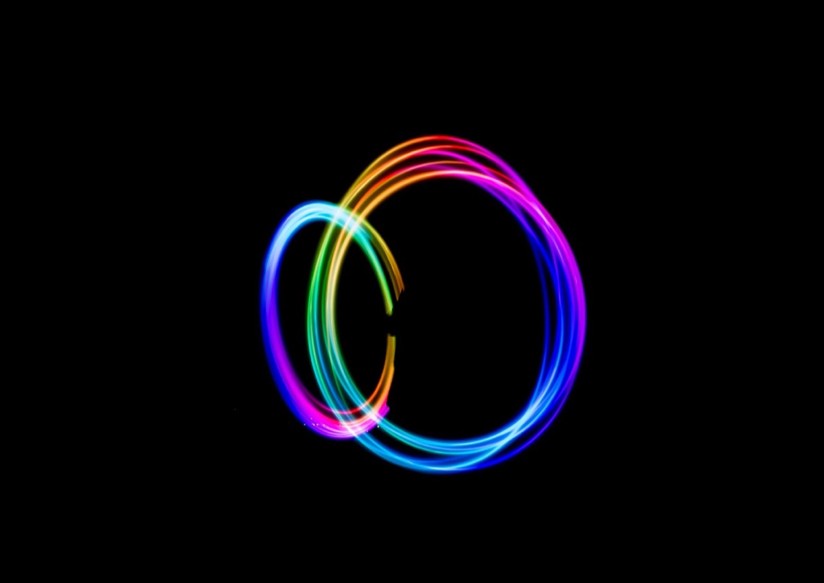
7. Duotones and Gradients
Duotone effects — replacing the tonal range of an image with two contrasting colors — saw a significant revival. The technique creates visually striking results that can be adapted to any brand color palette.
Gradients, which Spotify had popularized in the mid-2010s, continued to develop into more complex forms. Linear gradients became mesh gradients; two-tone became multi-stop with carefully tuned hue shifts. When applied well, gradients communicate fluidity and modernity; when applied carelessly, they feel dated quickly.
The combination of duotone photography with gradient UI elements gave many digital products a coherent, contemporary visual language that worked across both content and interface.
8. Minimalism with Textural Detail
Minimalism didn't disappear — it evolved. The strict black-and-white minimalism of the previous decade was replaced by minimalism with character: designs that used whitespace as deliberately as before, but added texture through strokes, doodles, splashes, and hand-drawn shapes.
Memphis design principles, which use small geometric shapes as compositional elements, saw influence in this approach. The result is designs that feel minimal in structure but warm in personality — accessible without being generic.
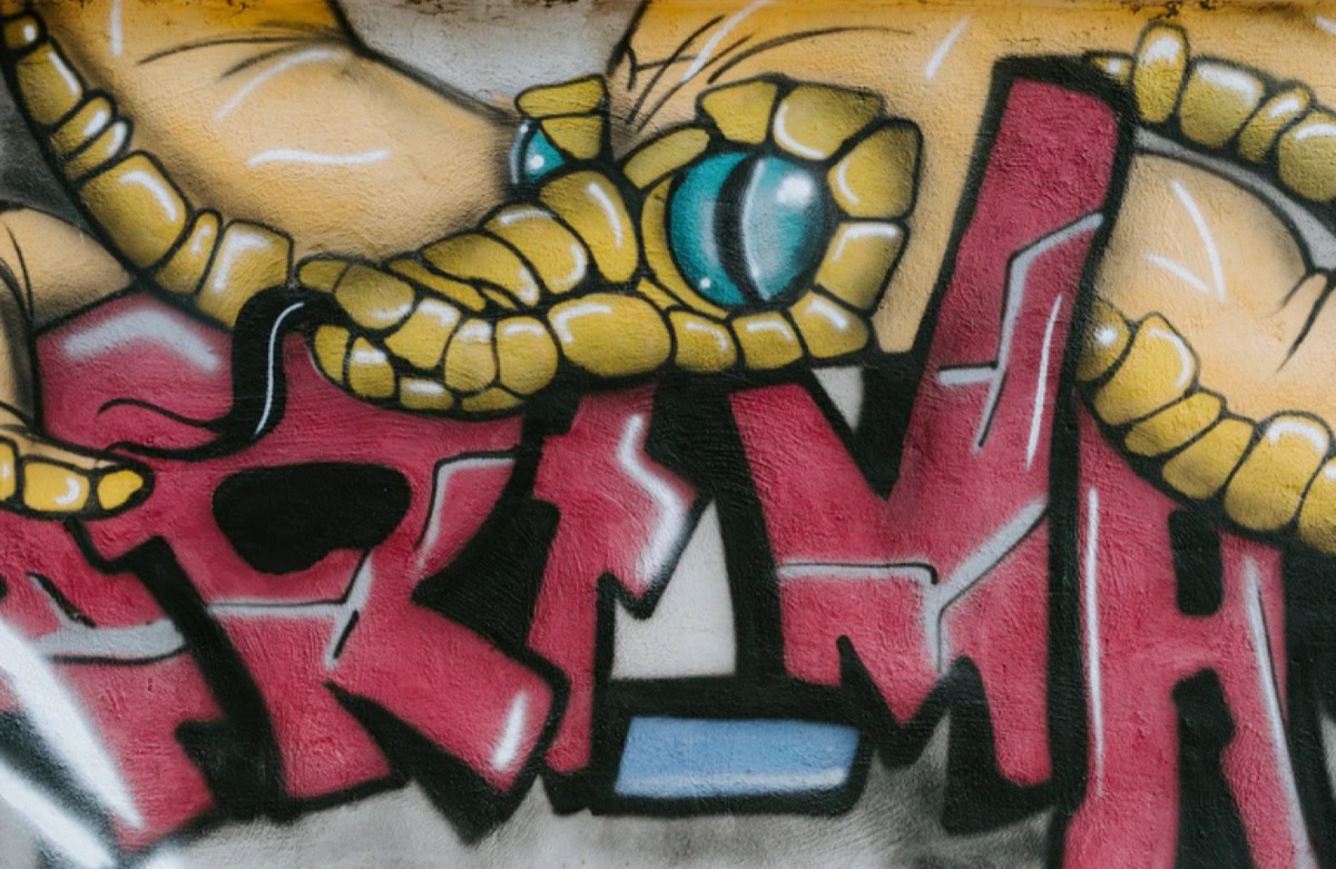
9. Hand-Drawn Illustrations
Drawing tools and tablets became genuinely professional instruments during this period. The Apple Pencil, Wacom tablets, and professional illustration apps enabled designers to create hand-drawn work at production quality.
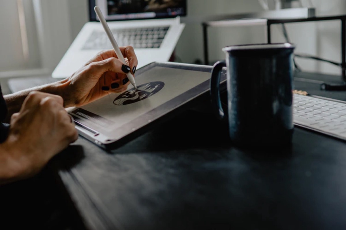
The appeal of hand-drawn illustration is its individuality — no two hand-drawn illustrations look exactly alike, which makes them impossible to replicate with stock imagery or template tools. For brands seeking visual authenticity, custom hand-drawn illustration became a genuine differentiator. For a broader view on building visual differentiation, see our aesthetic branding guide.
The style ranged from loose sketches with visible linework to detailed illustrations with sophisticated color work. Both ends of the spectrum found applications: loose illustration for brand personality work, detailed illustration for product and packaging design.
10. Metallic Effects
After years of being considered outdated, metallic design effects returned in earnest. Gold, silver, copper, and rose gold accents appeared in luxury branding, packaging design, and premium digital experiences.
The revival came with more sophistication than previous metallic design cycles. Rather than flat gold text on dark backgrounds, designers used metallic effects with realistic light interaction — iridescent shifts, reflective gradients, and metallic materials that behaved differently in different lighting contexts.
For brands where premium positioning matters — fashion, spirits, cosmetics, financial services — metallic effects communicate value in a way that no flat color can match. The challenge is restraint: metallic elements that dominate a design signal excess rather than premium quality.
Conclusion
The early 2020s design vocabulary — bold color, expressive type, motion, hand-drawn illustration, warm photography — remains influential. Many of these trends have graduated from trend to standard: animation in digital design, typographic expressiveness, and duotone photography all now appear in mainstream brand work across every category.
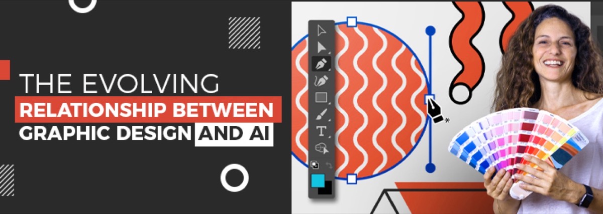
The takeaway for practitioners: trends reveal what audiences respond to at a moment in time. Applying them strategically — selecting trends that align with your brand positioning rather than following every direction simultaneously — produces work that feels current without looking temporary. One force reshaping how these trends are being applied is AI — our analysis of the evolving relationship between graphic design and AI explores what that means for working designers today.
Digital Polo creates contemporary brand identities and graphic design across all categories — digital, print, social, and motion — for one flat monthly fee with unlimited revisions. Start for $399/mo → | Soulmate at $899/mo →
Frequently Asked Questions About Graphic Design Trends
How quickly do graphic design trends change? Major design trends typically have a cycle of 3–5 years from emergence to mainstream adoption to feeling dated. Specific elements (a color treatment, a typographic style) can cycle faster — 12–24 months. The most durable trends are those that reflect genuine shifts in audience taste or technological capability rather than novelty. Following trends blindly produces work that ages quickly; understanding the underlying aesthetic logic lets you apply trends selectively.
Should your brand follow graphic design trends? Not uncritically. Trends are useful signals about what audiences are currently responsive to, but applying a trend that conflicts with your brand positioning creates inconsistency. A heritage brand that suddenly adopts vivid neon colors because they're trending confuses the audience it has built. The best approach: understand current trends, evaluate which align with your brand values and audience expectations, and selectively incorporate those that strengthen rather than dilute your brand's existing identity.
What design trends have had the longest staying power? Minimalism (now 15+ years), custom typography as brand identity (growing since mid-2010s), authentic photography over stock imagery (accelerated 2019 onwards), and motion/animation in digital design (now a standard expectation). These have moved from trend to baseline because they address real communication needs rather than just visual novelty.
How do duotones work in graphic design? Duotones replace the full tonal range of an image — normally expressed in shades of grey — with two colors. A dark purple and bright yellow duotone, for example, renders the image's shadows in deep purple and its highlights in yellow, with all intermediate tones blending between the two. The effect creates strong visual impact, works well with brand colors, and creates consistency across different source photographs. Spotify's long-running duotone visual identity is the most recognized application.
What is the difference between motion design and animation? Motion design uses movement to communicate — transitions that explain relationships, animations that clarify processes, micro-interactions that confirm user actions. Animation in the traditional sense creates characters or narrative through movement. In digital design, motion design typically encompasses logo animations, interface transitions, scrolling effects, and branded video content. Both serve communication purposes when used with intention.
Ready to Apply These Trends to Your Brand?
Trends are useful when they match the brand's strategy. They're expensive when they don't.
DigitalPolo's Partner plan at $399/month delivers brand identity work and ongoing design execution that's calibrated to the brand's customer — not the design world's current mood. 48-hour turnaround. Unlimited revisions. 16 years of operating history. See plans → | Read the aesthetic branding guide → | Read the principles of design →