A reader may love a particular genre and still pass over a book in that genre because the cover doesn't convince them to look further. The cover is the book's first and most powerful marketing tool — it communicates before the blurb is read, before the reviews are checked, before the author's name registers.
The cover establishes genre, tone, quality, and audience in a fraction of a second. Getting these signals right isn't just aesthetics — it's positioning. Here are 11 design approaches that consistently make book covers work harder.
Good design tools, techniques, and software continue to expand the creative possibilities for book cover design while the fundamentals remain constant: clarity, legibility, and genre appropriateness. Technological advances have made it easier to execute unconventional designs without sacrificing production quality. Many of the same visual principles apply across print formats — if you also produce brochures, our 10 tips for creative brochure design cover complementary ground.
Strong cover design must both represent the book and outperform competitors in the same genre. A memorable cover gets kept, shared, and discussed — and that discussion drives sales long after the initial publication.
1. Minimalist Design
Going minimal is not going boring — it's going deliberate. Minimalist book covers strip away everything except one central element, the title, and the author's name. The remaining space becomes breathing room that focuses all attention on what's left.
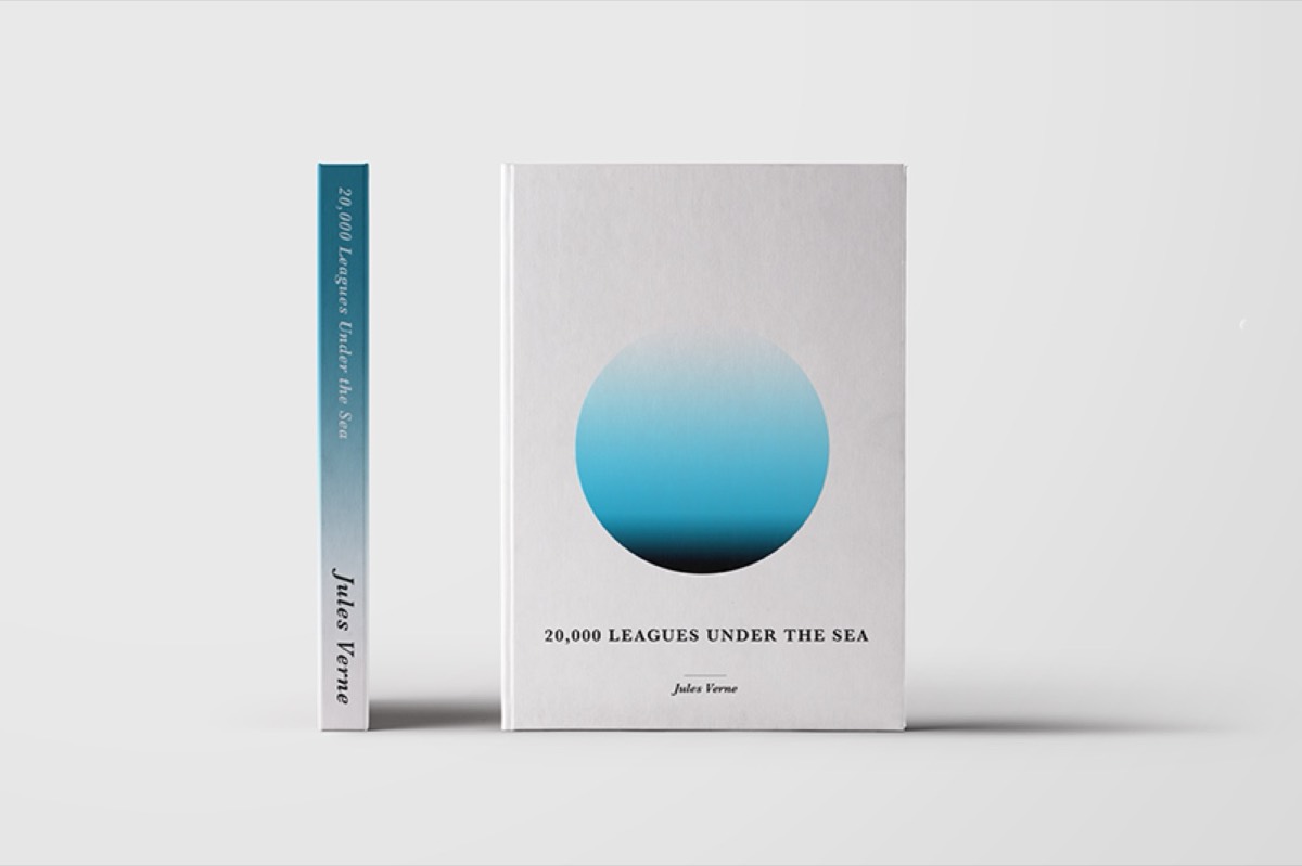
The benefit is clarity. When a reader's eye lands on the cover, there's one thing to see. That one element — a symbolic object, a face, a graphic — carries the entire emotional and conceptual weight of the book. Minimalist covers communicate confidence and tend to read as premium.
The white space in a minimal cover is not empty — it's the design element that gives the central subject its power. Removing the surrounding noise forces the reader's attention exactly where it belongs.
2. Bold Typography
Large, bold typography turns the book's title into a visual statement. When the title is readable at a distance, it functions as advertising — passersby see the title before they see anything else.
Capitalized bold fonts convey authority and make a clear statement about the book's character before its content is known. This approach works particularly well for non-fiction, thrillers, and books targeting confident, decisive audiences. Clean, large, and bold signals "this book knows what it is."
3. Retro Elements
Nostalgia is a reliable emotional trigger. Typographic styles, color palettes, and graphic treatments from the 1970s and 1980s carry associations of warmth, authenticity, and cultural familiarity that contemporary design often lacks.
The remake phenomenon in entertainment illustrates the principle: audiences respond to familiar aesthetics revisited through a contemporary lens. A book cover that evokes a beloved era while applying modern production quality creates a distinctive impression that feels both familiar and fresh.
Retro elements work particularly well for historical fiction, memoirs, humor titles, and books with nostalgia as a theme. For context on what was happening in the broader visual design landscape at the time these trends emerged, our look at web design trends that still define dazzling websites today covers the same era's digital influences.
Need a professional book cover designed from scratch? See Digital Polo's plans →
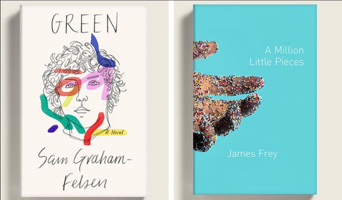
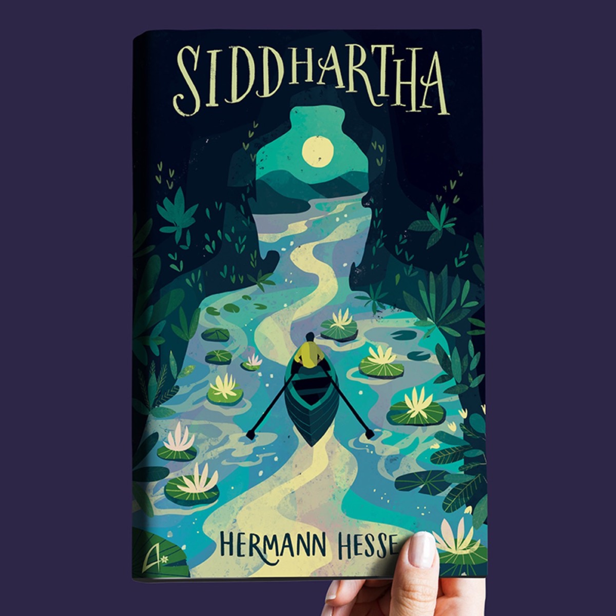
4. Hand-Drawn Lettering
Hand-drawn lettering combined with illustration gives book covers a personal, crafted quality that print-ready typefaces can't replicate. The approach works especially well for children's books, adventure stories, memoir, and titles targeting creative audiences.
The hand-drawn aesthetic communicates that the book was made by a person, not assembled by a template — which is particularly effective for author-driven titles where the writer's voice is the selling point. It reinforces authenticity at the moment when the reader first encounters the book.
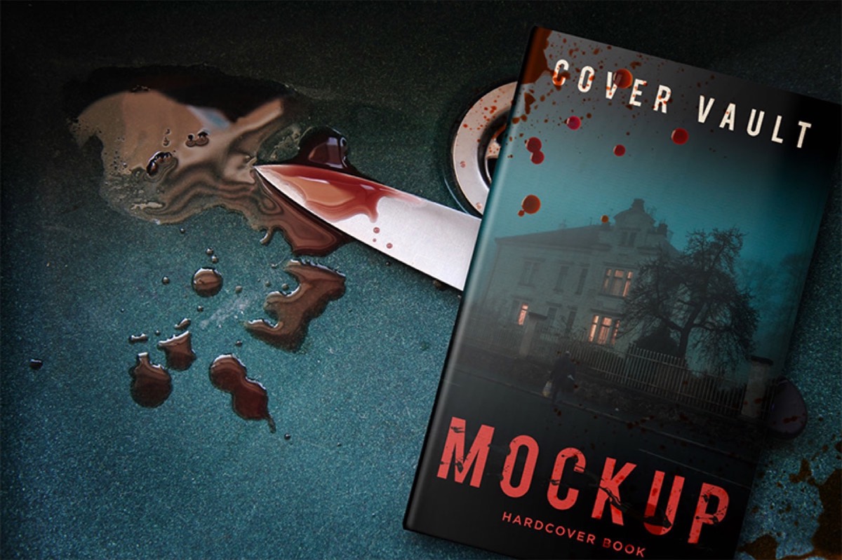
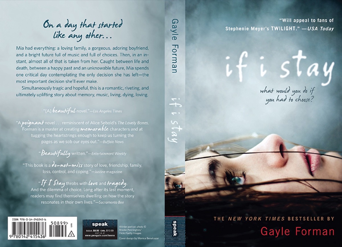
5. Real Photography
Authentic photography — sourced from real events rather than stock imagery — creates emotional connection that staged or generic photography doesn't. Real-life shots place the reader in a moment, which is particularly effective for narrative non-fiction, travel writing, and literary fiction.

Dan Brown's Angels and Demons uses Saint Peter's Basilica on its cover — a real place that immediately tells readers where the book is set. The specificity creates anticipation and grounds the reader's imagination before the first page.
High-quality photography eliminates the generic quality of stock images, making covers feel specific and authoritative. With modern cameras, professional-quality originals are increasingly accessible.
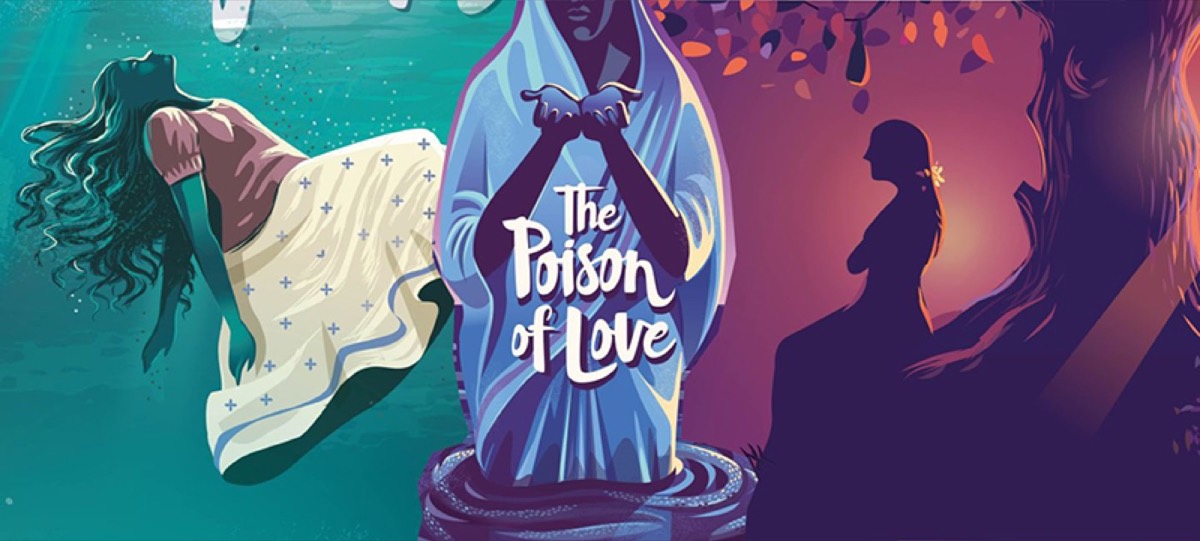
6. Collage
Collage gives book cover designers a highly flexible tool for creating covers that communicate multiple ideas simultaneously. Rather than a single image, collage assembles shapes, textures, and imagery into a composite that suggests the book's full scope.
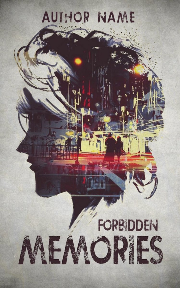
Collage can be applied across different styles — abstract, representational, or combinations of photography and illustration — which gives it broad applicability across genres. The visual complexity of collage also rewards repeated looking, which is exactly the quality that generates word-of-mouth and social sharing.
7. Premium Finishing and Paper Quality
The cover's physical quality is experienced before it's visually assessed. A cover that feels premium communicates quality instantly. Matte lamination with spot UV varnish, embossed titles, foil stamping, and heavyweight stock create tactile signals that reinforce the reader's confidence in the book.
For hardback jackets specifically, the finishing choices (embossing, foil, texture) create a physical experience that makes the book feel like an object worth keeping. This is particularly important for gift-market titles, collector's editions, and books positioning themselves at the premium end of a category.
The practical guideline: the finishing quality should match the price point. A premium-priced book with economy finishing creates cognitive dissonance that makes buyers hesitant.
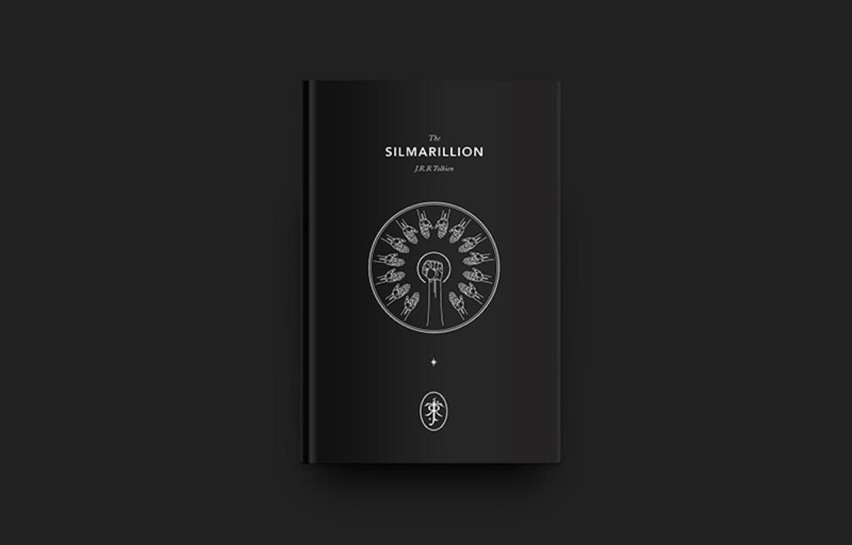
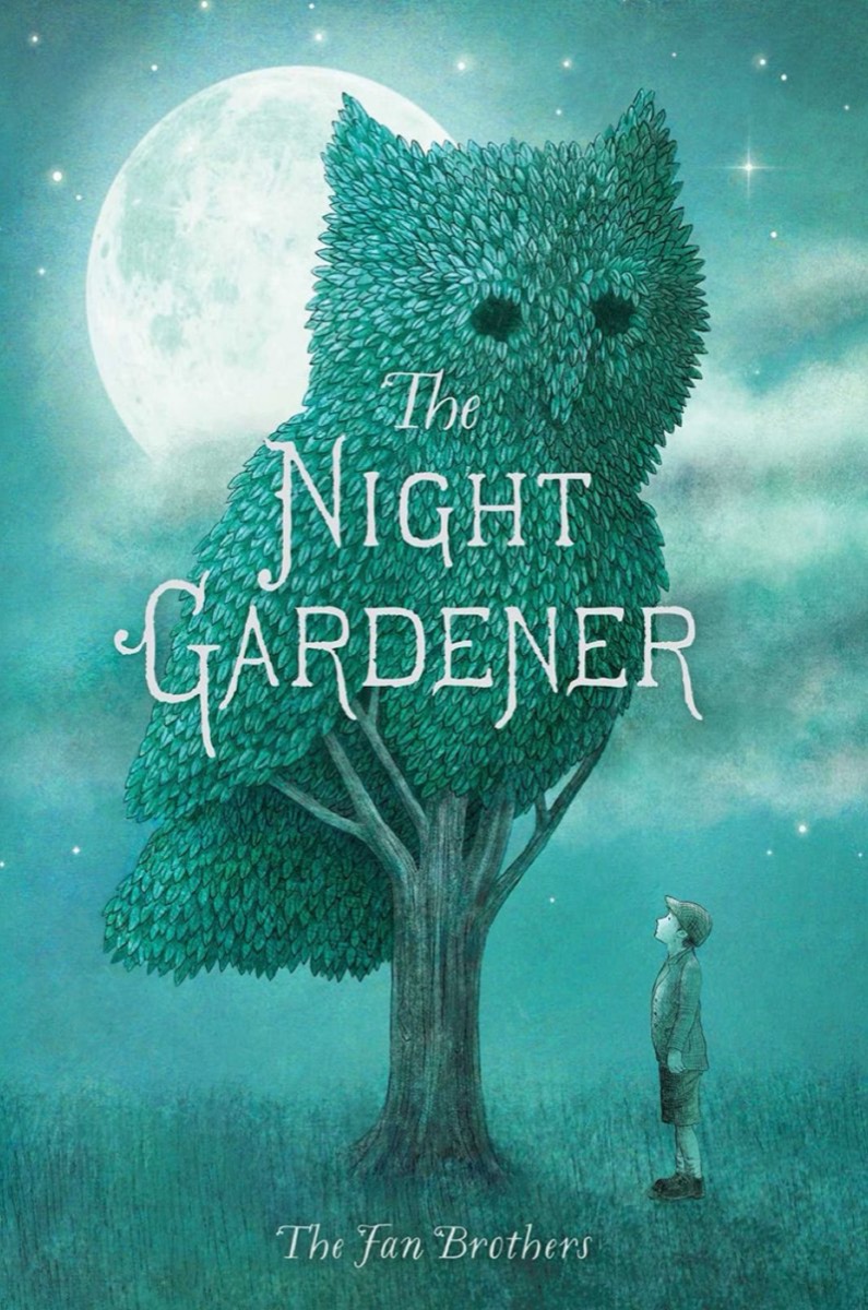
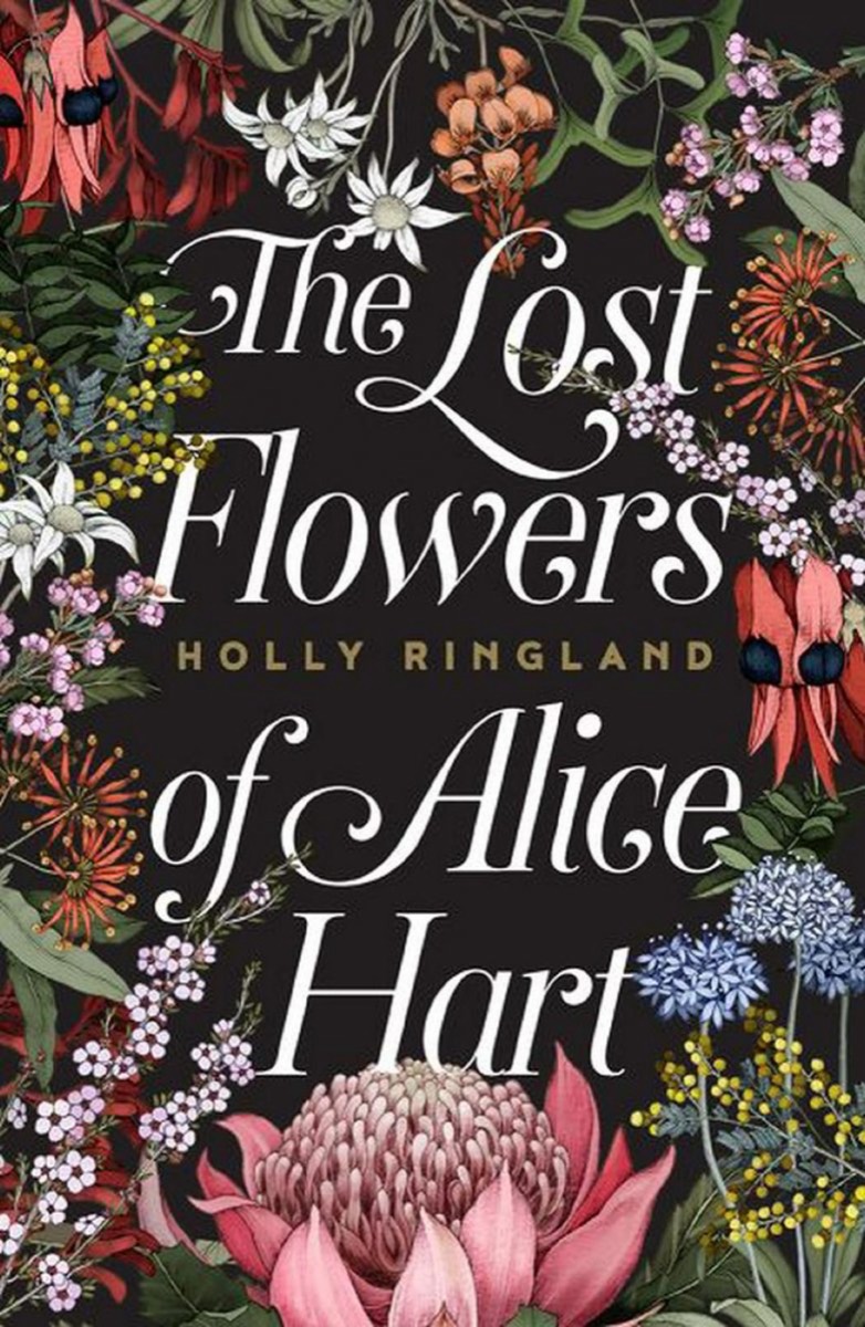
8. Detailed Illustrative Design
While minimalism dominates the current market, detailed illustrative covers serve specific audiences who value visual richness and craftsmanship. Dense, intricate black-and-white illustrations — typically printed on hardcover stock — communicate that the book is ambitious, layered, and worth extended attention.
This approach works particularly well for fantasy, magic systems, children's chapter books, and literary fiction. The cover signals that the reading experience will reward the same attention to detail that the cover demonstrates.
9. Bold Rainbow and Vivid Background Colors
Single-color backgrounds in vivid primary tones create immediate visual impact. Red, yellow, blue, and orange backgrounds project energy and confidence — and create strong shelf presence because they contrast against the muted or photographic covers typical in most categories.

The Harry Potter series demonstrates this at scale: the vivid, multi-colored covers appealed immediately to its target audience of children and created a visual identity that made the series instantly recognizable in any bookshop.
Bold backgrounds are a high-confidence choice — they work when the rest of the design is strong, and they amplify weaknesses when it isn't. Combined with a powerful central image and clear typography, a vivid background is one of the most shelf-visible design choices available.
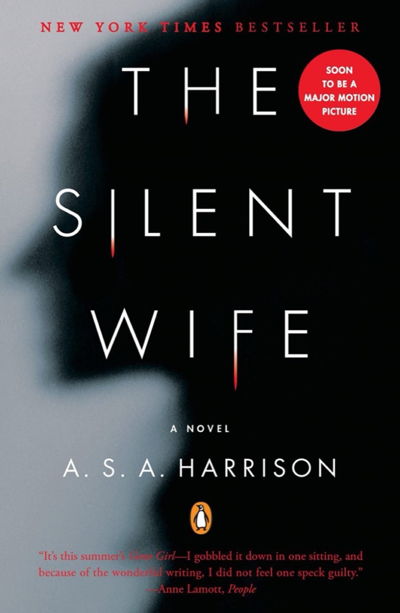
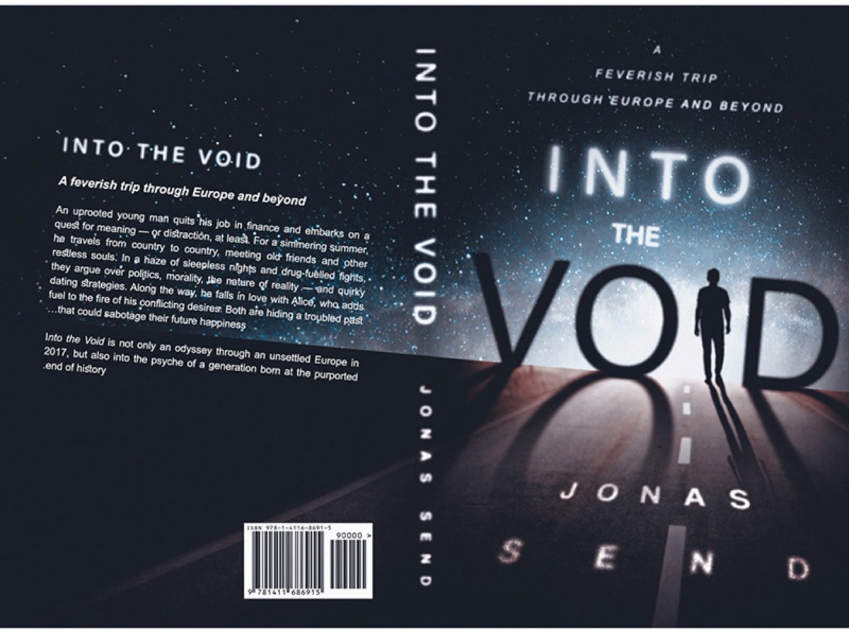
10. Text Over Image
Placing the title text over or within the main image — rather than positioning it separately above or below — creates a sense of integration between the title and the imagery. The two elements become one unified composition rather than separate layers.
This technique works particularly well for literary fiction and narrative non-fiction where the title and the visual subject are conceptually connected. Done well, text-over-image gives covers a cinematic quality — the same compositional language used in film posters.
11. Found Materials and Assemblage
Found material covers use elements from the environment — household objects, natural materials, fragments of text, everyday items — assembled into compositions that speak directly to the book's themes. The approach creates immediate visual intrigue: something familiar is being used in an unfamiliar way.

The reading experience of a found-material cover is often interpretive — the viewer assembles meaning from the objects presented, which creates engagement before a single word is read. For conceptual fiction, essay collections, and books with strong central metaphors, this approach creates cover experiences that are genuinely memorable.
Conclusion
A book cover works hardest when it serves three functions simultaneously: it communicates genre to browsers, creates emotional resonance with the book's intended audience, and distinguishes the book from competitors in the same category. If you also use print catalogues to market your work, see the 15 ways a business catalogue can skyrocket your sales for proven strategies that carry similar design principles.
No single design approach works for every book. Minimalism communicates premium; bold typography communicates confidence; retro elements communicate nostalgia. The design decision must be rooted in what the book is and who it's for — not in what happens to be trending in cover design at the time.
Digital Polo creates professional book cover designs, publishing materials, and complete brand identities for one flat monthly fee with unlimited revisions. Start for $399/mo → | Soulmate at $899/mo →
Frequently Asked Questions About Book Cover Design
What are the essential elements of a professional book cover? A complete book cover needs: a visual focal point (image, illustration, or typographic element) that communicates the book's tone and genre; the title in a typeface appropriate to the category; the author's name; and optionally, a subtitle or series designation. The back cover should include a blurb, author bio, barcode, and pricing. Every element should serve the goal of making the right reader want to pick up the book.
What book cover design mistakes do authors most commonly make? The most common mistakes: using a cover design that doesn't match the genre's visual conventions (confusing readers about what kind of book this is), attempting too much complexity on a small canvas (covers must work as thumbnails in online stores), using inconsistent typography (multiple fonts without a clear hierarchy), and using low-resolution photography that degrades in print. Cover design is one area where professional help typically pays back in sales.
How do I choose the right design style for my book's cover? Study the top-selling books in your genre and identify the visual conventions they share (color palettes, typography styles, image types, composition approaches). Your cover needs to work within those conventions while still standing out — a cover that looks completely unlike its genre confuses buyers about what kind of book it is. The goal is "distinctive but recognizable as X genre."
What is spot UV varnish and when should it be used on a book cover? Spot UV is a glossy varnish applied selectively to specific areas of a matte cover — the title text, a logo, or a particular design element. The contrast between the matte background and the glossy spot creates visual and tactile interest. It works particularly well for fiction titles, thrillers, and any book targeting a premium-positioned market. It adds production cost but creates a noticeably more refined result.
How should book covers be designed for online retail? Online retail (Amazon, etc.) displays covers as thumbnails — often as small as 100×150 pixels. The cover must communicate effectively at this size: the title must be legible, the central image must be recognizable, and the overall design must create a strong impression in a grid alongside competitors. Test your cover design at thumbnail size before finalizing. Designs that look beautiful at full size but lose all impact at thumbnail size will underperform in digital retail.