Most people see Instagram posts as individual images. What they rarely notice is that each image is one piece of a larger visual puzzle — the Instagram grid.
Your grid is your profile's first impression. When someone discovers your account and visits your profile page, they see your entire grid before they read a single caption or click a single post. A cohesive, well-planned grid signals that your brand is intentional, professional, and worth following. A chaotic one sends the opposite message. Growing that audience once the grid looks great is where hashtag strategy comes in — the right hashtags extend your reach far beyond your existing followers.

Importance of Grids
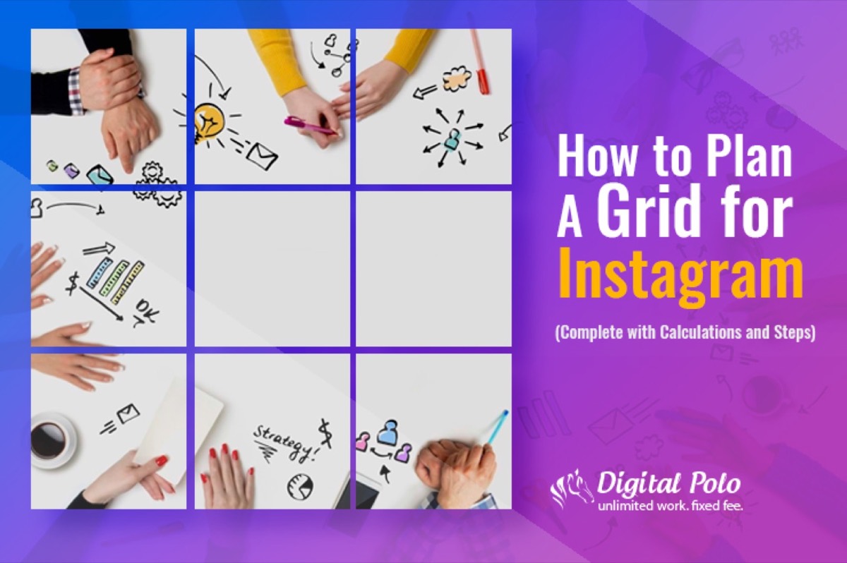
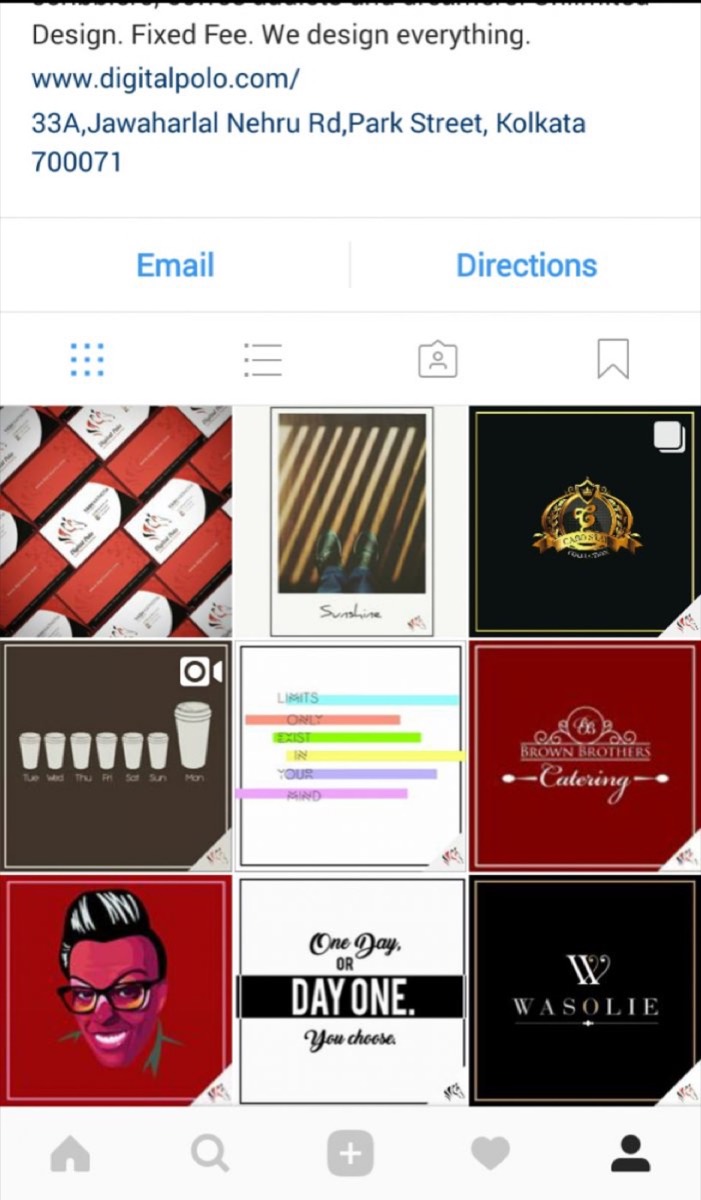
An Instagram grid is the arrangement of your posts in a 3-column pattern — the default layout Instagram uses on every profile page. Think of it as a gallery or portfolio that is constantly being built, one post at a time.
The visual appeal of a well-maintained grid is obvious. But what drives so many brands and creators to commit to the discipline is the second-order effect: a beautiful grid is a scroll stopper. When someone arrives at a profile with a perfectly planned grid, they do not just glance — they explore.
Some accounts build their grids around a consistent colour palette. Others tell stories that only become visible when you step back and look at three images at once. Some use geometric patterns, others rely on a single repeating theme. The approach is secondary to the consistency.
Lessons to Steal from Instagram Grid Pros
Looking at how top brands handle their grids gives you a fast education in what is possible.
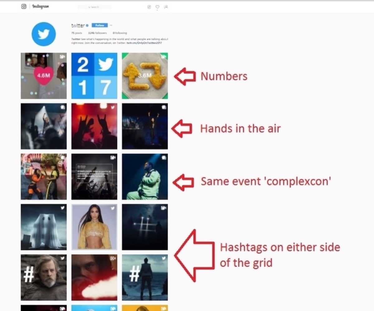
Twitter maintains a subtle, row-based grid that is easy to miss at first glance but immediately satisfying once you see it. Each row of three posts shares a common theme or colour story — and even when the exact subject changes, the visual harmony carries across rows. The result is a feed that rewards attention and keeps users scrolling.
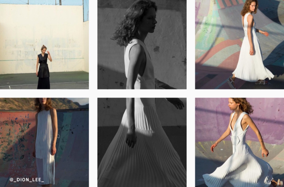
Forbes takes a column-based approach that is equally effective. Their rightmost column is dedicated to close-up portraits, their leftmost column focuses on female celebrities and influencers, and their centre column anchors the grid with solid quote cards and landscapes. Every element is placed with intent.
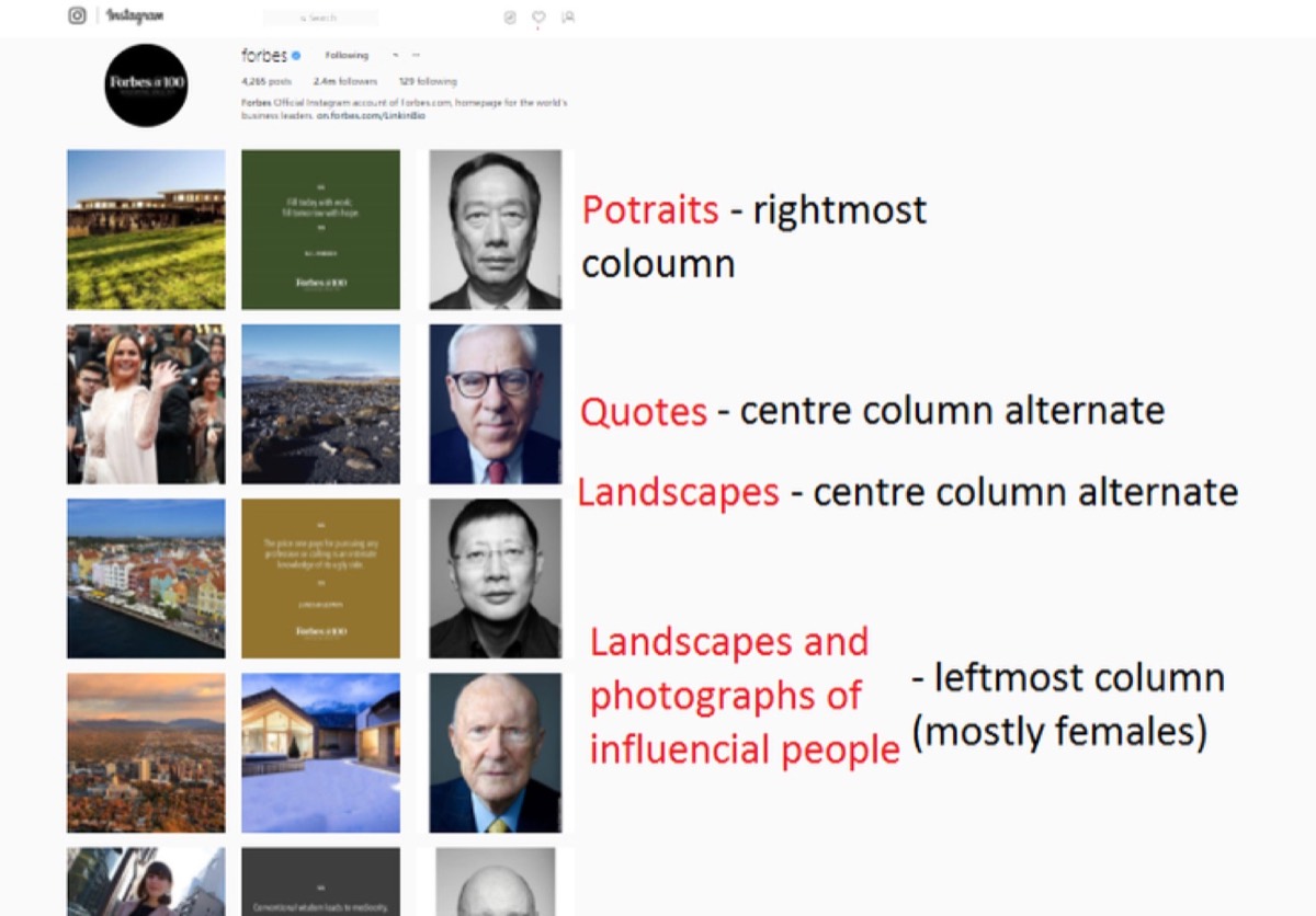
The result looks like a well-decorated room — every object purposeful, nothing out of place.
Most Popular Patterns for Instagram Grids
The patterns below range from beginner-friendly to more demanding. Each has its own logic, and each produces a distinct visual effect on the profile page.
Singular Colour Swatch
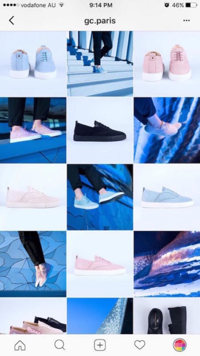
This is the simplest grid to maintain. Rather than planning specific post arrangements, you simply commit to a limited colour palette — two to four primary colours — and apply it consistently across all your images.
The colour swatch approach works well for brands with strong visual identities and pairs naturally with almost any other grid pattern. It is particularly effective for lifestyle brands, design studios, and anyone for whom colour is a core part of their brand identity.
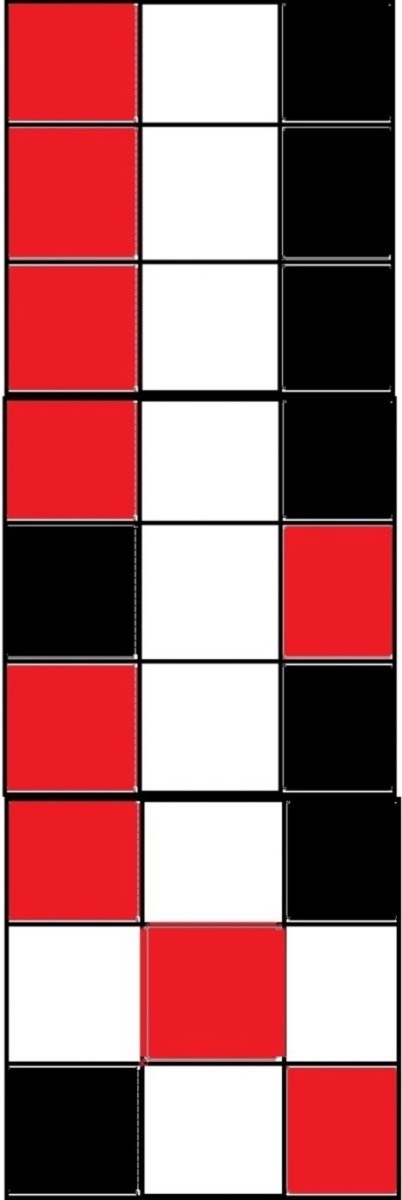
Checkered (Solid)
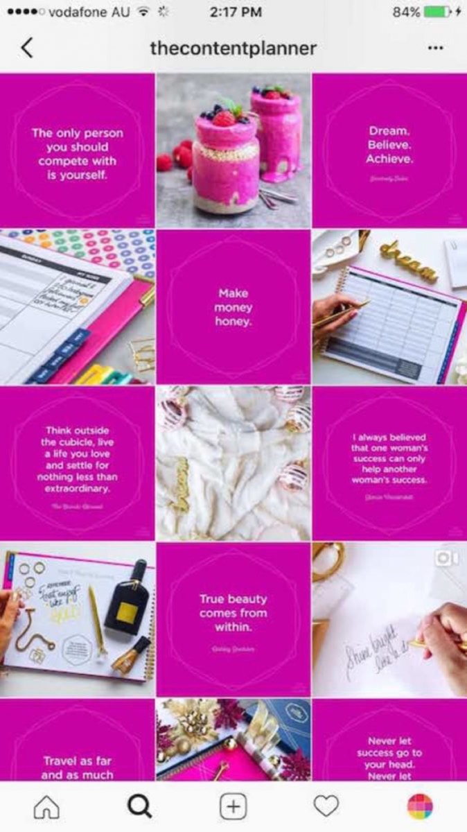
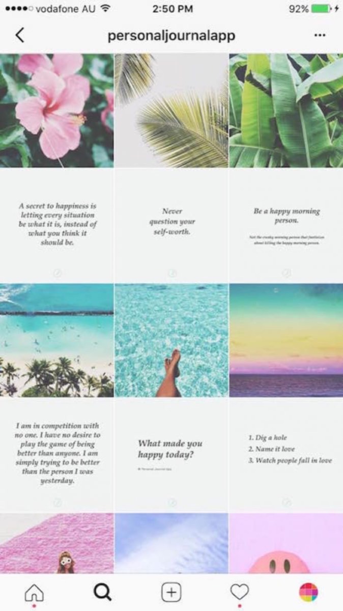
A checkered grid alternates between two types of content — for example, a photograph and a quote card with a solid background — so the grid looks like a chess board when viewed from the profile page.
To maintain this pattern, you must always have the alternate content type ready before posting. You cannot post two photographs in a row without breaking the pattern. The discipline required is real, but the visual payoff is striking.
Rows — Singular Picture (Horizontal)
A horizontal row spread is ideal for panoramic images — wide shots where the full composition only becomes visible across all three columns.
To create a horizontal row spread, your image needs to be 3240px wide by 1080px tall (three times the standard Instagram square width). Split it into three equal parts and upload them in reverse order — right first, then centre, then left — so they appear correctly in the feed.
Numbering your image files before uploading (Right = 1, Centre = 2, Left = 3) eliminates confusion during the upload process.
Looking for professional designs that apply these strategies? See Digital Polo's plans →
Rows — Singular Picture (Vertical)
A vertical column spread works best for tall subjects — portraits, architecture, trees, or any subject that has significant vertical presence.
For this pattern, your image should be 1080px wide by 3240px tall. Split it into three equal parts. Upload the bottom segment first, then post two unrelated images as spacers, then upload the middle segment, two more spacers, and finally the top segment. This sequencing ensures the column reads correctly from top to bottom as viewed on the profile grid.
Upload sequence:
- Post 1: Bottom section of your sequence image
- Posts 2–3: Filler/unrelated posts
- Post 4: Middle section of your sequence image
- Posts 5–6: Filler/unrelated posts
- Post 7: Top section of your sequence image
- Repeat
Rows — Colour Themed
Horizontal colour rows: Choose a dominant colour and create three posts that share it. Post them consecutively. Then switch to a different colour for the next three posts. Each row of three presents a unified palette, and the overall grid becomes a sequence of colour-coordinated rows.
Vertical colour columns: Choose a colour and create as many posts in that colour as you like, posting every two images to maintain column alignment. The interval is what creates the vertical stripe effect on the profile grid.
Endless Photo
The endless photo grid is the most ambitious pattern and the most visually spectacular. Every post connects seamlessly to adjacent posts so that the profile page looks like a single continuous image rather than a grid of individual photos.
Maintaining an endless grid requires detailed planning for every post before it goes live — you must know exactly how each image will connect to its neighbours on all sides. The time investment is significant, but brands that pull it off create profiles that stop visitors cold.
Planning Our Grid
When we decided to try grid planning ourselves, the process took two full days of work and calculation. We pre-planned our colour scheme by sketching a grid on paper, filling boxes with the intended colours, and using that as a visual preview before committing to uploads.
We started with a vertical row pattern and found it was not working as well as we had hoped. After reviewing the grid with fresh eyes, we switched to a horizontal alignment — and the feed improved immediately.
Before the switch:
After adopting the horizontal pattern:

Important disclaimer: Once a photo is posted, do not delete it. Removing a post breaks the grid pattern and can damage weeks or months of careful planning. Commit to your pattern before you start posting.
A planned grid is one of the most underrated tools in a brand's Instagram strategy. It transforms a random collection of posts into a cohesive visual identity that communicates professionalism and builds follower trust. The initial investment in planning pays back every time a new visitor lands on your profile page and decides — based on what they see — that this is an account worth following.
Start simple. A colour swatch or a row-based pattern is entirely achievable without any complex production setup. Build the habit of planning three to six posts ahead, and you will find that maintaining a beautiful grid becomes second nature. For broader inspiration on how brands use Instagram and Pinterest together to amplify their visual marketing, these Instagram and Pinterest marketing strategies are worth exploring.
Digital Polo creates consistent, on-brand Instagram graphics, grid layouts, and social media visual systems for one flat monthly fee with unlimited revisions. Start for $399/mo → | Soulmate at $899/mo →
Frequently Asked Questions About Instagram Grid Planning
What is an Instagram grid and why does it matter? An Instagram grid is the arrangement of your posts as seen on your profile page — a 3-column layout of all your published images. It matters because your profile page is often the first thing a potential follower sees when they discover your account. A cohesive, well-planned grid signals professionalism and encourages people to hit the follow button.
How far in advance should I plan my Instagram grid? Plan at least six to nine posts ahead before publishing any of them. This gives you enough buffer to see how the pattern will develop and make adjustments before anything goes live. Some highly organized brands plan entire months of content at once and use scheduling tools to queue everything up.
What tools can I use to preview my Instagram grid before posting? Apps like Preview, Planoly, and Later all offer visual grid planning features that let you drag and drop images to see how they will look on your profile before you publish. These tools save significant time compared to planning on paper and make it easier to experiment with different layouts.
Can I delete a post without damaging my grid? Deleting a post can seriously damage your grid pattern, especially if you are running a row spread, column sequence, or endless photo layout. Once you commit to a pattern, avoid deleting posts. If a post is underperforming, archive it rather than deleting it — this removes it from your feed without breaking the grid.
What is the easiest Instagram grid pattern to maintain? The singular colour swatch grid is the easiest to maintain because it does not depend on specific post types or upload sequences — only on consistent colour use. A colour-themed row grid is also relatively approachable, requiring only that you group posts by a shared colour palette in sets of three.