Email marketing is one of the most powerful and widely used marketing channels available to businesses today. Of all its formats, newsletters hold unique potential — they attract new customers, nurture existing ones, and drive repeat purchases when done right. The key is that every newsletter you send must deliver genuine value to your audience.
Your newsletter's visual design is just as important as its content. If the template is unattractive or poorly structured, readers won't even glance at your message. A marketing team must treat newsletter template design as a top priority — it's the first thing a subscriber sees before reading a single word. A visually stunning, on-brand, and informative newsletter template is what separates campaigns that convert from ones that get deleted. Before finalizing your template, it helps to understand which elements every effective business newsletter must include.

Below are the most effective newsletter design elements you can use to generate more sales.
The Most Effective Newsletter Design Structure to Generate More Sales
The structure of your newsletter is its foundation. Get it wrong and the entire email loses impact. Follow these widely used rules to build a strong newsletter structure.
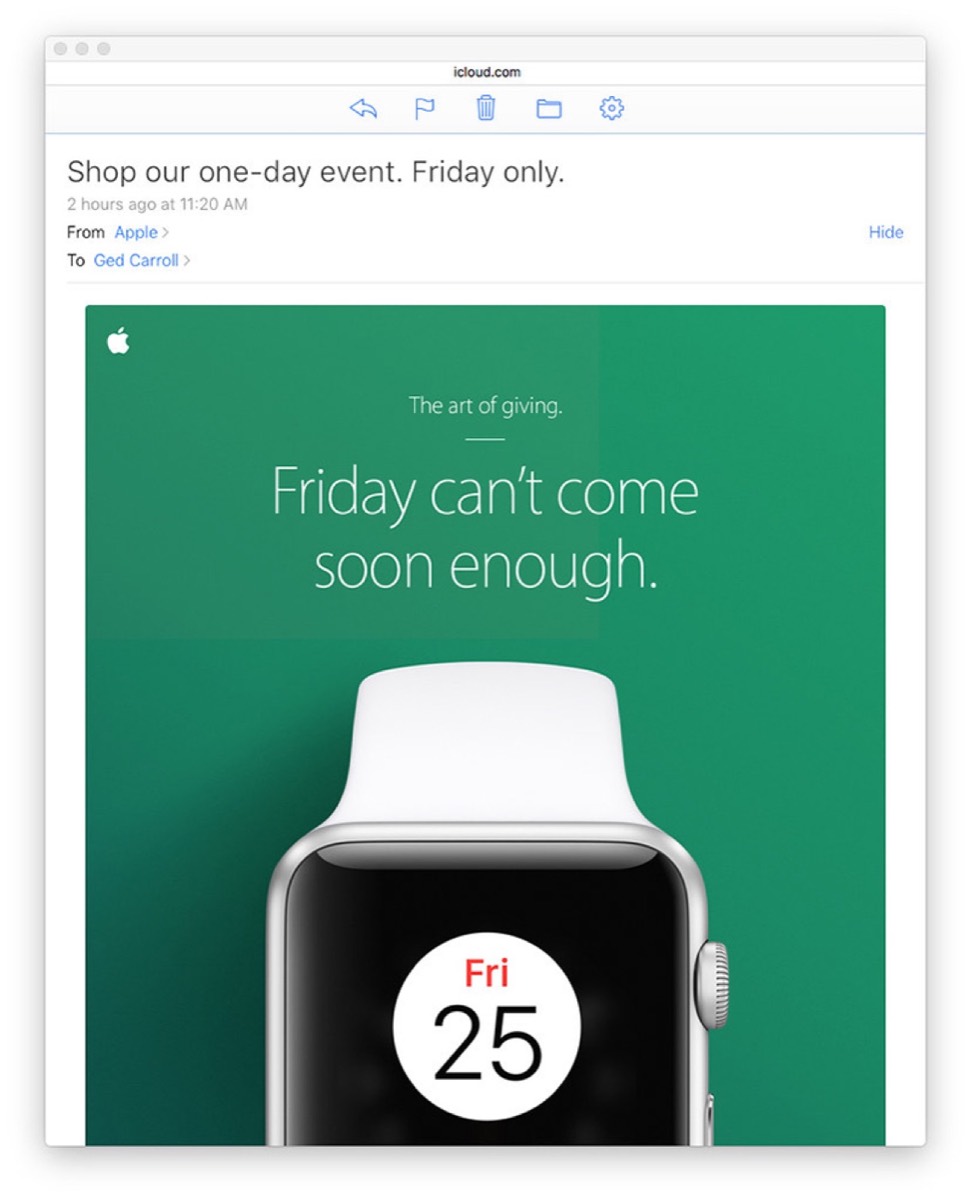
Pre-Header: A pre-header is the short summary text that appears right after the subject line in an inbox preview. It gives recipients a hint about the email's contents before they open it. Personalize your pre-header with information about your products, services, or promotions — and make sure it complements rather than repeats your subject line.
Template: Modern email marketing tools make newsletter design fast and simple. Use drag-and-drop builders with pre-built templates to create professional layouts in minutes. Choose a template that fits your brand, then customize it with your logo, brand colors, and content. Consistency in your template helps readers recognize your emails instantly.
Call to Action Button: The CTA button is your primary conversion tool. It should be large, colorful, and impossible to miss. Place one CTA near the top of the newsletter so readers see it immediately, and another at the bottom as a reminder. The three factors that drive clicks are placement, frequency, and visual appeal.
Images and Videos: Research shows that 70% of online shoppers say images play a decisive role in their purchase decisions. Use eye-catching visuals that reinforce your message. Experts recommend a 40:60 ratio of images to text for the best results. Videos are equally powerful — marketers who include video in newsletters report significantly higher conversion rates.
Footer: Your footer should include social media links, legal disclosures, an unsubscribe option, and a brief explanation of why the subscriber is receiving your email. These details build trust and credibility. You can also use the footer to share recent blog posts or contact information.
How Should Your Content Layout Look?
Newsletter content should be precise, crisp, and easy to read. Use readable font sizes and simple language that speaks directly to your audience's needs.
Divide content into subheadings: Break your newsletter into sections with clear subheadings, similar to a newspaper layout. This lets readers scan and quickly understand your main points. Keep sentences short, avoid unnecessary conjunctions, and maintain a logical flow throughout.
Optimum spacing: Add space between text lines to improve readability, especially if you use a smaller font. Use negative space strategically to draw attention to key elements like your CTA button or a featured product image.
Choose the right fonts: Select fonts that are semi-professional, attractive, and easy to read on both desktop and mobile. Arial and Times New Roman remain popular choices in email marketing. If you use multiple fonts, ensure they complement each other rather than clash.
Add links for accessibility: If your product or service range is wide, use images with embedded links for each category. Readers can click through to the specific information they want without being overwhelmed by a single long email.
Looking for professional designs that apply these strategies? See Digital Polo's plans →
Use Consistent Brand Identity Across All Marketing Channels
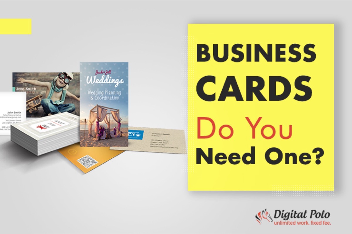
Your customers interact with your brand through your website, your social media pages, and your newsletters. A unified brand image across all three builds recognition and trust. Any inconsistency — in logo, color, or font — creates confusion and erodes credibility. Your business card is another touchpoint that should reflect the same visual identity — consistency across print and digital materials is what makes a brand feel cohesive rather than scattered.
Business Logo: Your logo is your brand's face. It creates visual recognition that words cannot replicate. Always place your logo at the top of your newsletter so subscribers immediately know who they are hearing from.
Keep colors consistent: Use the same color palette across your newsletter, website, and social media. Consistent color use makes your brand instantly recognizable and reinforces your identity with every send.
Use distinguishable images: Reusing the same professional product images across your website and newsletter reinforces brand consistency. However, avoid overloading your newsletter with images — too many visuals can slow load times and overwhelm readers on mobile devices.
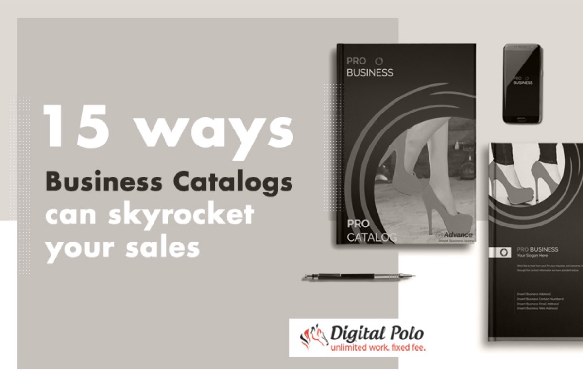
An effective newsletter design is not just about aesthetics — it is a revenue-generating system. When structure, content, and brand identity work together, your newsletter becomes a consistent sales driver rather than just another email in the inbox. If you're looking to diversify your print marketing alongside email, a business catalogue can generate sales in channels your newsletter never reaches.
Start by auditing your current newsletter template against the principles above. Identify what is missing — whether it is a compelling CTA, a consistent logo, or better content spacing — and address those gaps systematically. Small improvements in design can lead to measurable lifts in open rates and click-throughs.
Digital Polo creates high-converting email newsletter templates for one flat monthly fee with unlimited revisions. Start for $299/mo → | Soulmate at $899/mo →
Frequently Asked Questions About Newsletter Design
What is the ideal size for a newsletter template? Most email clients display newsletters best at a width of 600 pixels. This ensures your design looks good on both desktop and mobile devices without requiring horizontal scrolling.
How often should a business send newsletters? The right frequency depends on your audience and content quality. A weekly or bi-weekly newsletter tends to maintain engagement without causing subscriber fatigue. Consistency matters more than frequency.
What is the best image-to-text ratio for newsletters? Experts recommend a 40:60 ratio of images to text. Too many images can trigger spam filters and slow load times, while too much text without visuals makes the email feel dense and uninviting.
How do I improve my newsletter's click-through rate? Place your primary CTA button prominently near the top and repeat it at the bottom. Use action-oriented language like "Shop Now," "Get Your Free Guide," or "Claim Your Discount." A clear, focused message with one primary goal per email consistently outperforms cluttered newsletters.
Should I use a free or paid email marketing tool for newsletter design? Paid tools like Mailchimp, Klaviyo, or ActiveCampaign offer better deliverability, more templates, and robust analytics that free tools typically lack. For serious business use, investing in a proper email marketing platform pays off in better results and time savings.