Business cards have been a marketing staple for centuries. They work because they are physical — they occupy a drawer, a wallet, a desk, long after the conversation that produced them is over. But a poorly designed business card actively undermines the impression you made in person, signaling disorganization or amateurism before your follow-up call.
These are the 10 most common business card design mistakes — and exactly how to avoid each one.
1. Font Size Too Small
The standard business card is 3.5″ × 2″ — a small surface that has to carry your name, title, company, and contact information. Designers often try to fit everything by reducing font size, creating cards that require squinting to read.
The minimum readable font size for print is 8pt. Body information (phone, email, website) should be at least 8–9pt. Names should be 11–14pt. Job titles 9–11pt.
Test before printing: print a sample at true size on plain paper and have a colleague read it without prior knowledge of what's on the card. If they struggle, the font is too small.
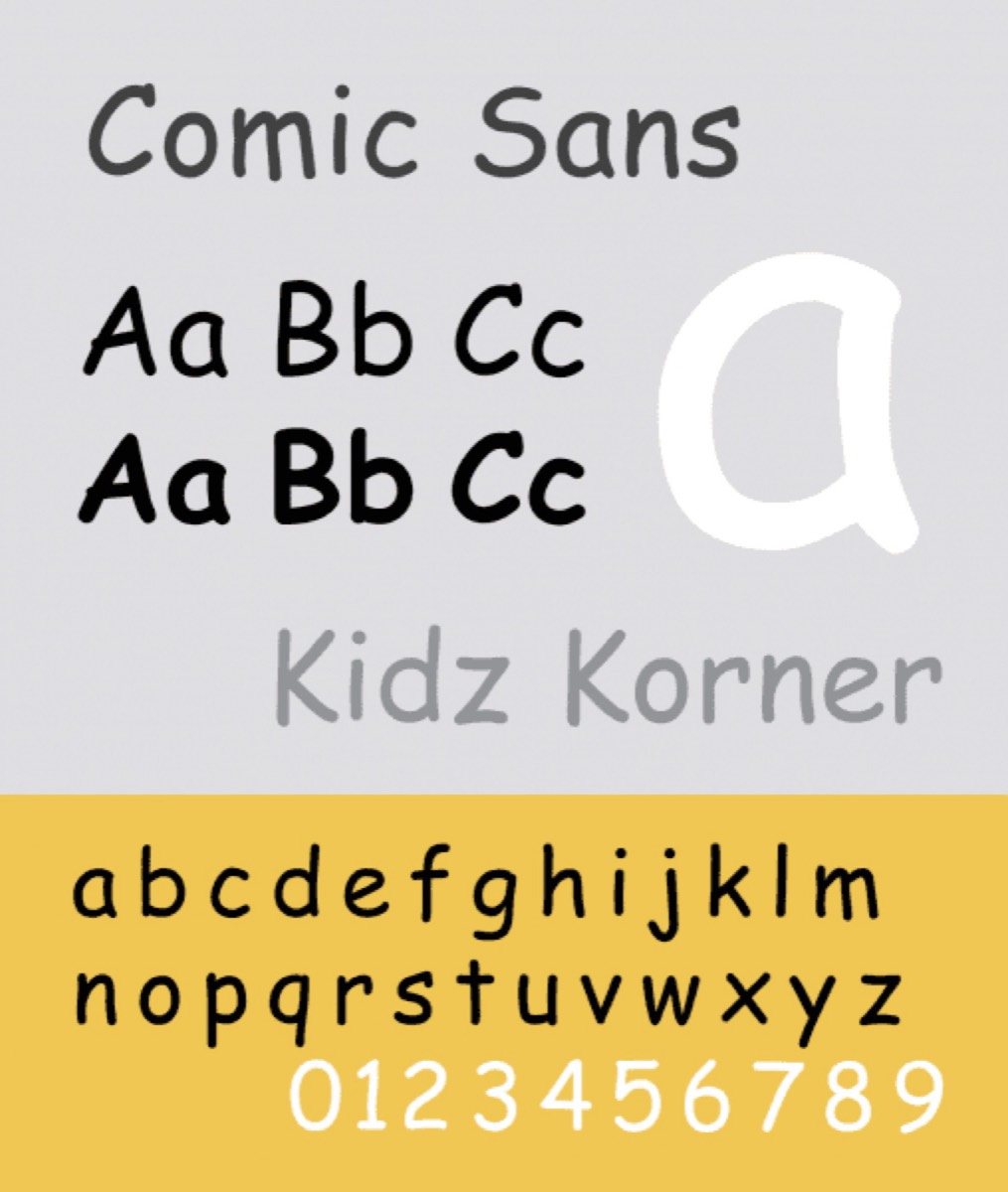
2. Poor Font Selection
Font choice communicates brand personality before any content is read. The wrong typeface choice creates a mismatch between what the card says and what it signals. Current design trends can help you identify typefaces that feel contemporary without sacrificing legibility.
The rule: a maximum of two typefaces on a business card. One for the name/company (can have personality and weight), one for contact details (should prioritize legibility). Avoid decorative or script fonts for contact information — they are difficult to read at the small sizes required.
Comic Sans in a medical practice signals a lack of professionalism. Times New Roman in a creative agency signals a lack of contemporary sensibility. Font selection should match the brand identity on every other marketing material.
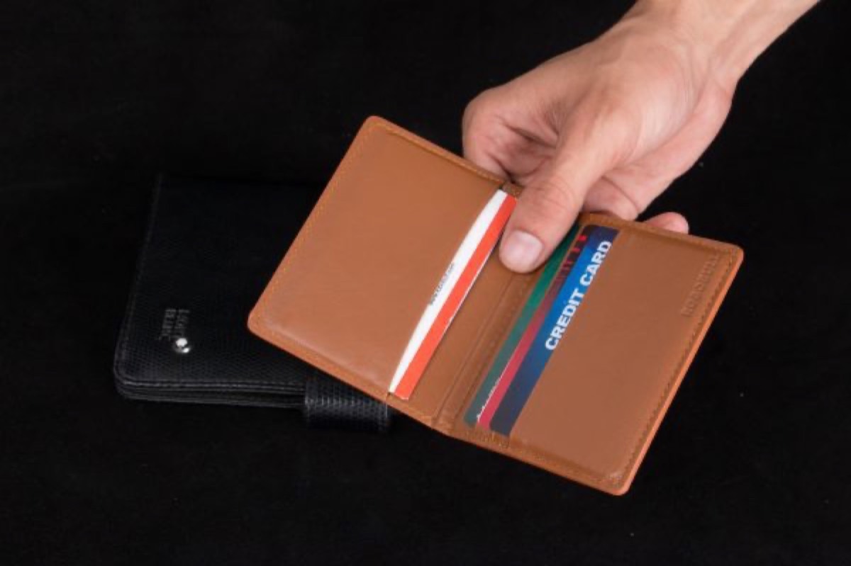
3. Non-Standard Card Dimensions
Distinctive die-cut shapes appear frequently in business card inspiration collections — circles, rounded rectangles, custom brand shapes. In practice, non-standard dimensions create a practical problem: they don't fit in wallets, cardholders, or Rolodexes.
A business card that gets noticed but can't be stored gets discarded. The standard 3.5″ × 2″ dimension (US) or 85 × 55mm (international) exists precisely because it fits everywhere business cards need to fit.
If you want differentiation within standard dimensions, pursue it through paper stock, finish, color, or layout rather than shape. If a non-standard shape is essential to the brand concept, design it to fit within a standard-dimension rectangle — a shape cut into the card, rather than a shape that extends outside standard proportions.
4. Cheap Paper Stock
Paper quality is felt before the card is read. A card printed on thin, flimsy stock communicates exactly what it costs — and in turn communicates something about what the brand values.
Standard printing paper (80–90gsm) is too thin for business cards. Business cards should be printed on a minimum of 300gsm coated stock. Premium options (350–400gsm, soft-touch matte laminate, textured uncoated stocks) create an immediate quality impression.
Ask your printer for samples before committing to production. The cost difference between standard and premium stock is modest; the perceived quality difference is significant.
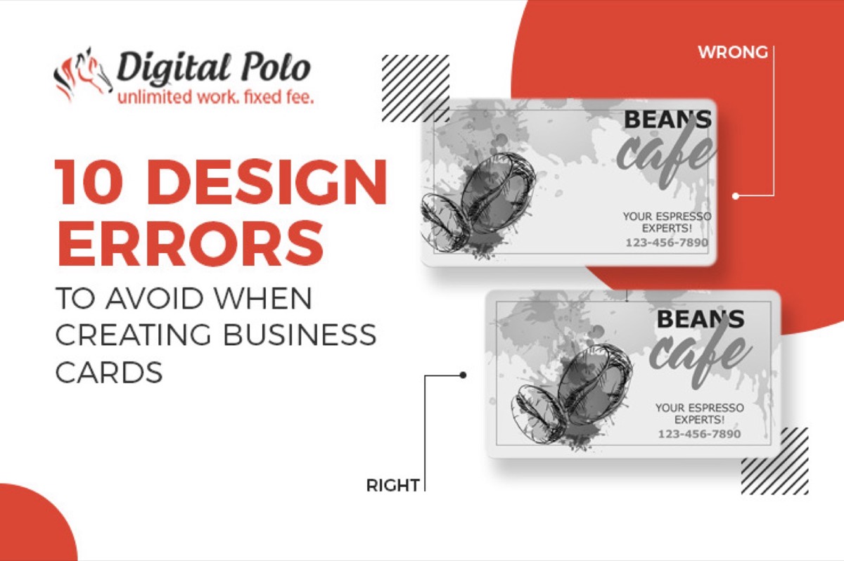
5. Poor Color Contrast
Readability depends on contrast between text and background. Text that is similar in color to the background — light grey on white, dark brown on black — is difficult to read and inaccessible to anyone with color vision deficiency.
Use high contrast for contact information and name text. If the brand palette includes low-contrast combinations, use them for decorative elements and backgrounds — not for text that needs to be read.
Test contrast against the Web Content Accessibility Guidelines (WCAG) AA standard: a 4.5:1 contrast ratio for normal text. Free online tools check this automatically.
6. Too Little — or Too Much — Information
Both extremes fail the card's purpose. A minimalist card with only a name looks stylish but useless if there's no way to follow up. An overcrowded card with every phone number, five email addresses, all social handles, and a tagline reduces readability and forces down font sizes to compensate.
The information hierarchy for most business cards:
- Essential: Full name, company name, primary email, primary phone number
- Often useful: Title/role, website URL, one or two social handles relevant to professional contact
- Usually unnecessary on the card itself: Secondary phone numbers, address (unless physical location is central to the business), every social platform you exist on
When in doubt: what is the single most important way you want this person to contact you? Emphasize that. Everything else is supporting.
7. Inconsistent Branding
A business card that uses different colors or fonts from the company website creates an impression of a business that doesn't know itself. It reduces recognition — people who know the brand from digital touchpoints may not immediately connect the card to the same company.
The card should use the same logo, the same hex color values (converted to CMYK for print), and the same typeface family as every other brand material. This is what a brand style guide enforces — and why every company that produces multiple collateral pieces needs a complete identity kit.
8. Insufficient White Space
White space on a business card is not wasted space — it is the breathing room that makes the elements that are present readable and visually distinct. Cards with content pushed to the edges and every square millimeter filled look cluttered and are harder to scan.
Maintain a minimum 3mm safe zone inside the card edge (printers also require bleed and trim margins). Use padding between information groups. A card that is 60% content and 40% white space will typically outperform one that is 90% content in readability tests.
9. No Unique Value Proposition
A business card that states your name and contact information but nothing about why someone should call you is a lost opportunity. The back of the card — often left blank — is prime real estate for a one-line value proposition, a key result, or a QR code linking to relevant content.
The card recipient may have met twenty people at the same event. The card that includes a specific, memorable value proposition — "We design logos businesses keep for 20 years" or "Free 15-min consultation: [QR code]" — is the one that earns the follow-up call.
Your brand promise should be included if space allows.
10. No Consideration of Digital Formats
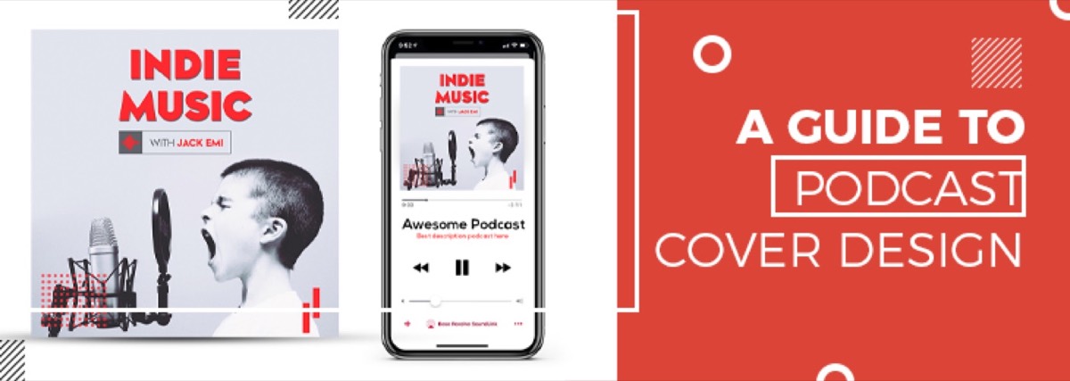
In 2026, the business card exists in a broader ecosystem of digital networking tools. The same attention to format and brand consistency that applies here also applies to other branded media — including podcast cover art, where small canvases demand the same discipline. NFC-enabled smart business cards (like those from HiHello or Popl) allow a tap-to-share interaction that transfers contact information, portfolio links, and social profiles instantly to a smartphone.
Physical and digital business cards serve different contexts: physical cards are still the norm at formal business meetings, conferences, and professional introductions. Digital formats work better at casual networking events, tech-industry contexts, and with audiences who prefer contactless interactions.
For many businesses, the optimal approach is both: a high-quality physical card that makes a strong first impression, with a QR code on the back that links to a digital profile page where the full contact information, portfolio, or booking link lives.
Conclusion
The business card is a small surface with outsized brand implications. It gets handed directly to the person who just decided you're worth remembering — and then it goes into a wallet, a drawer, or a bin. Which destination it reaches depends on how well it was designed.
Avoid these ten mistakes and your card becomes a brand asset that works in your absence. Make any of them and the card actively undermines the impression you made in person.
Get professionally designed business cards — and every other brand collateral you need — with Digital Polo's flat-rate subscription. Unlimited designs, unlimited revisions, delivered in 48 hours. Start for $399/mo → | Soulmate at $899/mo →
Frequently Asked Questions About Business Card Design
What information should be on a business card? The essential information is: full name, company name, primary email address, and primary phone number. Depending on your business: job title, website URL, and 1–2 professional social handles. The back of the card is valuable space for a QR code, a one-line value proposition, or a key credential. Avoid: secondary contact numbers, physical addresses (unless a physical location is central to your business), and all social platforms you happen to exist on.
What is the minimum font size for a business card? The minimum readable font size for printed business cards is 8pt. Contact information (email, phone, website) should be 8–9pt. Names should be 11–14pt. Job titles 9–11pt. Always print a proof at true size and test readability before committing to a production run.
What paper should business cards be printed on? Business cards should be printed on a minimum of 300gsm coated or uncoated stock. Premium options include 350–400gsm stocks with soft-touch matte laminate, gloss laminate, or spot UV varnish finishes. Avoid standard printing paper (80–90gsm) — the thinness is immediately perceptible and undermines the quality impression the card should create.
What are NFC business cards? NFC (Near Field Communication) business cards are smart cards containing a chip that transfers contact information, portfolio links, and social profiles to a smartphone when tapped. Brands like HiHello and Popl offer them. They work best in tech-industry and casual networking contexts. For formal business meetings and traditional industries, physical print cards remain the standard. The best approach for many businesses is both: a high-quality physical card with a QR code linking to a digital profile.
How do I make my business card stand out? Differentiation within standard 3.5″ × 2″ dimensions comes from: premium paper stock and finish (soft-touch matte, spot UV, letterpress), distinctive but on-brand color choices, strong visual hierarchy, a memorable one-line value proposition on the back, and a QR code linking to relevant content. Non-standard shapes stand out but fail practically — they don't fit in wallets or cardholders and tend to be discarded.