
Image courtesy: https://bit.ly/2IQF3VZ
Think about the time when you made a PPT for your school project. That was easy wasn’t it? Even if you put in some rough slides together that made sense, you could manage a decent grade. Unfortunately, brand PPTs are going to be much harder! You can’t use the age old formula of borrowed slides, stale design and boring content and get away with it.
Think of your brand PPT as a Christopher Nolan movie in the making. Once it’s ready, it should keep your audience on the edge of their seats, hanging on to know what’s coming next! But just like everything else that’s good and great, making such a PPT is far from easy. You need to have extensive knowledge on PPT creation (coupled with the skills of a talented designer) to come up with a PPT that wows.
Obviously when you have a deadline, you can’t waste your hours away researching what to do and what not do in order to create an awesome PPT. That’s why our design experts brainstormed together to come up with ways in which you can make your PPT stand out! We’ve listed these secrets down below in an easy-to-read format so you can access them anytime, anywhere.
1. Customize your slides
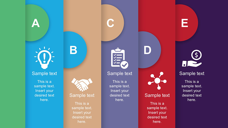
Image courtesy: https://bit.ly/2YiH96a
Default slides are absolutely cool. We have nothing against them and you can use them in most cases without any worries. However, if your presentation is a large one and meant to be displayed on a screen with an odd size, it might be a wise idea to customize your slides.
You can customize the size of your slides in a few simple steps. Select ‘File’ from the top-left corner and then choose ‘Page Set-up’ from it. You’ll be prompted to select the width and height of the slide. Once you’re done, click ‘OK’ and you’re done!
2. Customize the shapes
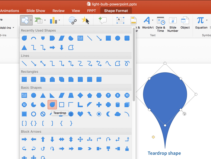
Image courtesy: https://bit.ly/2KF3VCg
The same old shapes get boring after a point of time right? You need something new in your slides to get the people in the boardroom stand up and take notice of your PPT. Enter, custom shapes! They are fun, they are unique, and they can be done easily. How? Here’s how-
When you create a shape in your slide, right click and select ‘Edit Points’. This will allow you to create custom shapes. You could also merge two shapes together to create a unique one. Just select both the shapes and then right click to choose the option ‘Grouping’. Over there, you’ll find plenty of options such as ‘Combine’, ‘Subtract’, ‘Intersect’ and ‘Union’, which you can use to merge the shapes.
3. Customize the image shapes
Image courtesy: https://bit.ly/2lQMNvf
By now you might be thinking we’re talking too much about customizing. And yes, we are. But only because customizing is key to a unique and attractive PPT!
Again, it’s perfectly fine to restrict your images in square-ish boxy shapes. But wouldn’t that picture of luxury shampoo you’re going to advertise look much better in a diamond-shaped frame? You can crop the image shape to whatever you want. PowerPoint allows you that freedom!
Put in the image in the slide and then select the tab ‘Format’ from the options ribbon on top. Select the option ‘Crop’ followed by ‘Mask To Shape’ and then pick the shape you want. And that’s it! Easy-peasy right?
4. Keep it coherent and stylish

Image courtesy: https://bit.ly/31Y0SKz
Sounds like a very vague advice, right? It’s actually useful though. The purpose of a PPT is to put across one message or a series of interconnected ones. That’s one single theme. So why then should you style each and every slide in a different manner? That’s actually a big no-no as it breaks the design language of the PPT by making each slide look part of a different whole.
PPTs that lack coherent style often appear confusing and haphazard. Those that have coherent styling though create a positive impression and are easier to remember. Besides, the same colors and patterns help your audience to focus on the content of your PPT too. However, in a bid to be coherent, don’t lose out on the style element. Keep them as stylish as you want.
5. Don’t let PowerPoint control you, control PowerPoint
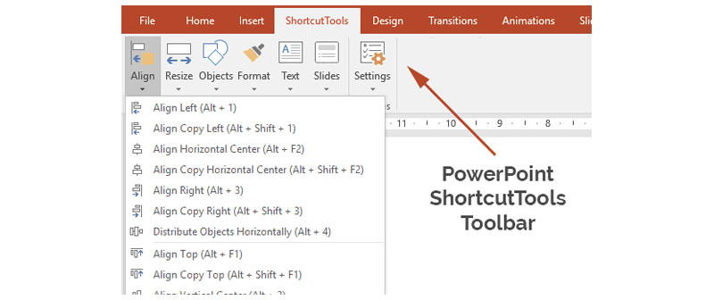
Image courtesy: https://bit.ly/2YelKeB
PowerPoint is loaded with several tools. But you don’t have to use them all you know. You only need to direct your focus to a select few to get awesome PPTs. When you get down to using PowerPoint for your slides, ensure that the theme you choose compliments the theme of your PPT. Try to avoid the use of default Word Doc fonts such as Cambria or Calibri along with PPT action sounds. Think if you really want to use bullets and remove the default shadows and shapes. Basically, don’t allow PowerPoint to rule your presentation.
6. Include infographics
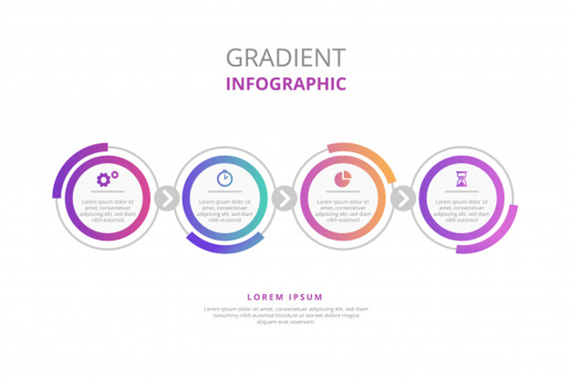
Image courtesy: https://bit.ly/2RDC7ie
See PPTs are really not the best place for long research reports. However, data matters and should be a part of the PPT. What’s the best way to include research data in your PPT? Infographics! You can fill your PPT with plenty of infographics to put your point across. In fact, PowerPoint gives you the option to create mind maps, timelines and diagrams etc. so you can get the message through in a much better way than paragraphs and bullets! Just don’t go overboard with them. Remember to intersperse them with texts, images and examples from time to time.
7. Keep it aligned straight
Image courtesy: https://bit.ly/2YemuQV
Alignment issues are equivalent to sinning in the PPT world! Misaligned objects in a slide make your PPT look untidy and quite frankly, a pain to look at. You could always try to manually align the images and other objects of your slides, but we all know what a big help that is.
Luckily, there’s a hidden tool in PowerPoint that can help you out! First, select all the objects you want aligned in a slide. You can do this by pressing the shift bar as you click on each of the objects. Next, select the tab titled ‘Arrange’ from the ribbon on top and then pick ‘Align or Distribute’ and then pick the alignment type you want. As easy as 1-2-3!
You could also arrange objects to the slide. Just follow all of the above steps and choose ‘Align to Slide’ from the dropdown you get after clicking on ‘Align or Distribute’. Next choose ‘Arrange’ from the top ribbon and then select ‘Align or Distribute’. Align as you want.
8. Break up the bullet lists
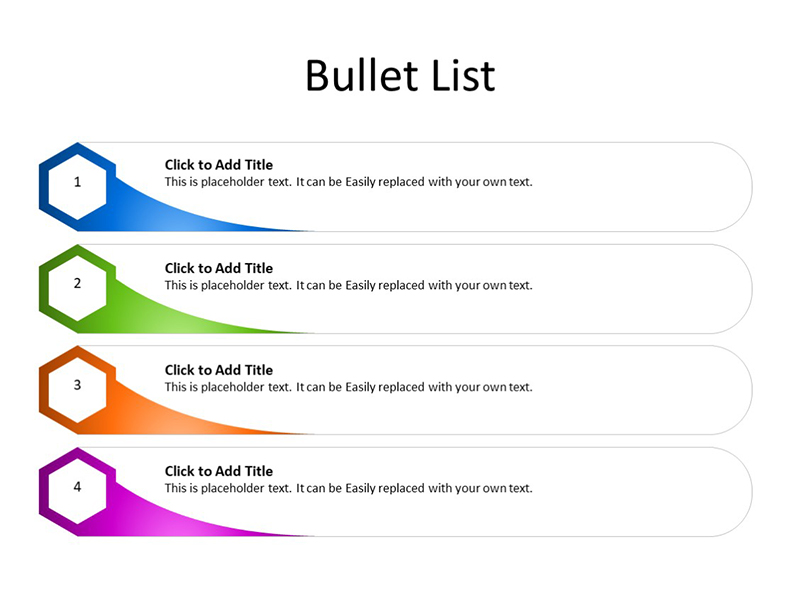
Image courtesy: https://bit.ly/2NdPLdl
The bad thing about PowerPoint is that it puts in bullet points by default. The good thing about it is, you don’t have to use them! Take your bullets up a notch by either breaking them up into a single slide or using them as a part of a detailed mind map. Which one of these tricks should you employ? Well, that depends on the point you are trying to make.
If you intend to cover every single point in greater detail, use one slide per point. However, if you plan to cover a few key basics, using a mind map would be the best idea. The lesser the content on a page, the more impressive it’ll look!
However, if you feel that bulleted lists are necessary, you can use them. Just try customizing them so they don’t appear bland or boring. You could use PowerPoint templates to do that. For example, the Amazing Lists template offers over 20 bullet list styles that look absolutely stunning!
9. Use PowerPoint shapes to your advantage
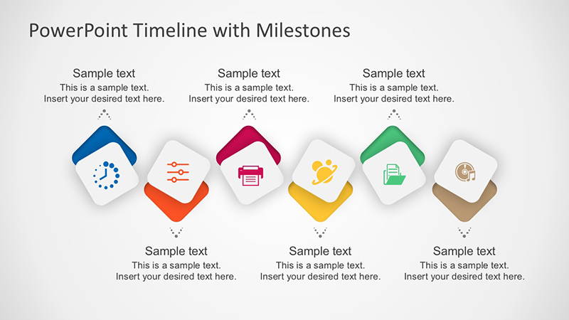
Image courtesy: https://bit.ly/2xj3oNm
PowerPoint shape tools are one of the most underused tools of this PPT creator. That’s partially because people don’t know that it’s no longer as rigid as it used to be! Now you get several format options so that you can create pleasingly excellent shapes with the help of PowerPoint. Apart from the regular oval and rectangle, you can choose from a multitude of shapes to give your slides some extra character. You also get the Smart Shapes ability, via which you can create flow charts and diagrams in a jiffy. Don’t underestimate shapes. They are a powerful tool that can help you put your message across in a clearer manner.
10. Employ fonts that engage

Image courtesy: https://bit.ly/2ISB639
As mentioned before, you should really ditch the traditional Microsoft Office fonts such as Calibri and Cambria or Time New Roman when creating your PPT. Those are boring and whatever’s boring is not the right choice. You see font is one of the primary ways of creating an impact on your viewers and making your PPT look super impressive. So instead of sticking to the boring old fonts, opt for those that are visually engaging but not distracting at the same time.
How do you know which font is the best choice for your PPT? You could simply run a Google search and find out which fonts are hot in the market right now and choose among them. Fonts that are generally popular are readable, bold and yet minimalistic as well as creative. A great example of that would be the font Helvetica, which is even used by famous brands such as Apple.
11. Put websites in your presentation
Image courtesy: https://bit.ly/2FzjxCU
Well, tradition will have you know that the only way to put a website in your presentation is to add its URL in one of the slides. We’ll have you know that that’s not the only way to do it. If you use a third party tool or software that’s well-integrated with PowerPoint, you can get a website embed in your presentation with the help of HTML iframe. Tools like LiveWeb are great if you wish to embed a website directly in your presentation.
12. Make use of Format Menus to control the design
Image courtesy: https://bit.ly/2ZS86OG
Format Menus can help you control the overall design of your slides with ease. Fine-tuning the smaller elements of your PPT becomes a lot easier with Format Menus. So to do that, simply select the object on a slide you want edited and then right click on it. Choose the option titled ‘Format’. You’ll get the option to adjust shadows, reflections, measurements and much more. You can use Format Menus from the toolbar as well but you won’t get as many options as when you select an individual object in a slide and right click on it.
13. Make it bright and bold
Image courtesy: https://bit.ly/2RCzeOA
Awesome PPTs are not black and white. Well, not always at least! They have color in them – bright and bold colors that grab attention and make your audience take notice. Bright visuals will make a strong point, making it harder for your audience to stare away from the screen. You could use images, infographics, diagrams and more to create a visual experience that stuns. Use high quality images to set the mood and choose colorful templates that attract but do not divert the attention from the content.
Also, make it a point to choose vibrant colors even if the subject of your PPT is a serious one. Accent colors can help highlight the points you make in your PPT in a clean yet engaging manner. Bright colors such as blue, red, orange, magenta or green will work well as a background for your slides.
14. Imbibe modern designs in your PPT
Image courtesy: https://bit.ly/2pbHyrx
Modern designs! How can you ignore them in your PPT when they’re all the rage right now? They’re part of all kinds of brand promo materials these days – from flyers and posters to website designs and beyond. If your PPT reflects the same modern design language, it is bound to be a sure-shot winner. Especially if you’re not a fan of outlandish colors and bold designs! A modern theme can help you make a minimalistic, simple and elegant PPT. If you abide by the rules of modern design such as balance between content and negative space, you could create a PPT that will wow you audience from the first look.
15. Steer clear of the common PPT mistakes
So far we’ve told you what to do to make your brand PPT awesome. But we haven’t told you what not to do! Saving the best for last, let us tell you of the common mistakes you shouldn’t make in order to have a stellar PPT.
- Don’t miss out on the passion or preparation! It’s important to prepare for your PPT and prepare with interest so you actually do a good job at it.
- Don’t create slides that are overly complex, have too many bullet points or are loaded with images of poor quality. These do not look good and make for a poor PPT example. Also make sure that your PPT doesn’t lack in focus.
- Never put more than 6 words in a single side unless absolutely necessary. Long sentences are far to focus on from a distance so keep it as short as possible.
- Don’t use fancy transitions. Don’t use any transition effects at all in fact. This is a professional slide show, and there should be no room for silly gimmicks in it.
If you style your slides right and follow all the rules we’ve laid down above, nothing can stop you from creating a PPT that makes the right kind of impact in the boardroom!
Hire Digital Polo And Get Brand/Business PPTs That Are Beyond Awesome!
Creating a stellar PPT sounds like a lot of work doesn’t it? Good news then! You don’t even have to undertake this complex task as long as you’ve got Digital Polo on speed-dial! At Digital Polo, we’ve created thousands of stunning PPTs for our clients over the last few years, wowing them and their audience alike with every slide. Want more good news? We’re not just good at creating business or brand PPTs for you, we can also do a lot more – be it logo designs, brochures, digital ads or more. Sign up with us to get your design requirements fulfilled at amazing prices!