

Image courtesy: https://mklnd.com/2Xz634x
Banner blindness. It’s a thing that you should be aware of. Do you know that a whopping 86% of consumers suffer from it? That means when you put up an ad banner, most people instantly ignore its existence. That’s not the only depressing figure though. 80% of them also think that the ads they last viewed were irrelevant. To add to the bad news, 11% of all users on the internet actively block display ads. What does all of this mean? You have to work extra hard to get click-throughs on your display ads!
Don’t lose hope though. It’s obviously more difficult than it used to be, but it’s not THAT hard. There are ways you can make people jump in on your ad bandwagon! Your biggest weapon in this regard is design. Never underestimate the role design plays in a digital ad. Most of the ads created fail because their design was not enough to lure the customers to carry out an action. It’s all about creating the right first impression you know!
So now the million dollar question is – how can you ensure people view your digital display ad? Most importantly, how can views be converted to click-throughs? You’ll find out soon enough if you keep reading! We’ve laid out the best practices of digital display ads in here for you-
1. Play with colors

Image courtesy: https://bit.ly/2G9CpcI
Colors rouse emotions is something we all know. So why not use them to your advantage when designing your display ad? Play with colors in your ads! Experiment. Try new shades. Don’t stick to the conventional. Use colors to evoke the emotions you want your target audience to feel! But also ensure that the color palette you choose does not clash with the essence of your brand/product or the site it is placed on. It should be just the right shade.
2. Use the right banner size

Image courtesy: https://bit.ly/2NjSiTa
Banners come in shapes and sizes galore. You’ve got to pick the right one for your ad to ensure it stands out from the already overpopulated websites. As per a Google Adsense analysis, a few banner sizes prove to be the most successful –
- Leaderboard size: 728x90px, this size is suitable for forum sites and is put above the main content of the page
- Half-page size: 300x600px, this size has ample space so you get the freedom to play around with visuals
- Medium rectangle size: 300x250px, this size will serve you well within sidebars, text blocks or end of articles
- Large rectangle size: 336x280px, this size works best if you put the ad at the end of articles or within text blocks
Which banner size should you choose among these? Well, that depends on a number of factors such as your budget, the size of your ad and more. No matter what the factors, make sure you choose a size from the list given above. These are proven hits!
3. Make your logo stand out

Image courtesy: https://bit.ly/2xeDlHo
Company logos are a must in any ad. Don’t even think you can skip it! Putting your company logo in your ad serves two purposes – one, it creates brand awareness; and two, it inspires brand trust. Keep your banner large enough so you can display your brand’s logo in a prominent place. However, ensure that the logo is not as dominantly visible as is the call to action or the main content of the ad. If you want a rough idea as to how much space your brand’s logo should occupy, aim at a good 10% to 15% of your total ad space.
4. Put your CTA in a button

Image courtesy: https://bit.ly/2ZRF41u
CTA or call to action is one the most important elements of a digital display ad. It’s used to incite your viewers to take an action, which is clicking on the ad you posted and being redirected to your home site. Since it serves such an important purpose, you need to make sure it is properly displayed. And that’s why the title of this subhead – make sure the CTA is ALWAYS in an easily accessible and highly visible button. If it’s directly in the line of sight of your viewers, it might just tempt them to click on the button. Examples of CTAs include ‘Buy Now’, ‘Order Now’ etc.
5. Put your ads in the right place
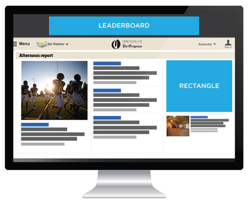
Image courtesy: https://bit.ly/2Ym9ybM
Placement of your ad is crucial if you want it to get noticed by your target audience. You can’t just put it anywhere on the site. It has to be one where people’s eyes naturally rest on – a spot they simply cannot ignore! The best space in this regard is the spot above the fold on a website where the central content of the site resides. You’ll have to purchase this space naturally if you’re posting the ads on other sites. It can get expensive so keep your budget in mind.
6. Have a strong CTA

Image courtesy: https://spoti.fi/2UdfnpK
The Call To Action (CTA) is a sacred space, and we cannot stress enough on its importance. While placing the CTA in an easy to reach button in your banner is good practice, it’s not enough. Your CTA has to convey value. That’s the only way it can incite your audience!
You see consumers are quite smart these days. They know that spammy ads pose a threat to their time and resources. So they won’t be that easily convinced to click on your ad unless you give them something they simply can’t refuse!
What can serve as a motive to make them click you ask? Entice them by offering value in terms of saving money, time or effort. A good example of this is a CTA like so –
Click here to save $5
$5 is a big amount! And there’s a high chance that your target consumer base might be interested in saving that amount and hence, will click on the CTA. Put in boring CTAs such as ‘learn more’ or ‘buy now’ and you won’t get many clicks on your CTA buttons, according to research.
7. Tell a story

Image courtesy: https://bit.ly/3030sBd
Rational engagement prevailed in ads of yore. Times have changed now and emotional engagement plays a very crucial role in capturing people’s attention. You have to rouse a specific emotion in your audience’s hearts now if you want to compel them to buy your product. It could be any kind of emotion – interest, joy, laughter, sadness. The easiest way to emotionally engage your audience is to tell a story in your ad. Show them why your product is worth buying into with the help of visuals and a strong message. Shock them, wow them – do whatever it takes with the visual and textual space in your ad to make them go ‘I want this now!’
8. Use a font that fits

Image courtesy: https://bit.ly/2XwOD8E
You’re likely not going to get an entire page to display your ad. So you can’t use fonts that take up most of your ad’s space. You have to be subtle yet noticeable with the fonts you use in your digital display ads. Sadly, that is the tricky part. As a general rule though, you shouldn’t use a font that’s smaller than 10pt. Anything lesser than that is too tiny and should not be used unless you intend to put in a disclaimer in your ad.
Also, bear in mind never to use cursive fonts or fonts that are very thin. Your message would be lost with fonts such as these. You’d be better off using larger, bolder fonts that are visible clearly against your chosen background color. Another thing you should be careful of is using too many fonts. A couple of complementary fonts usually do the trick.
9. Use a product picture or face as key visual
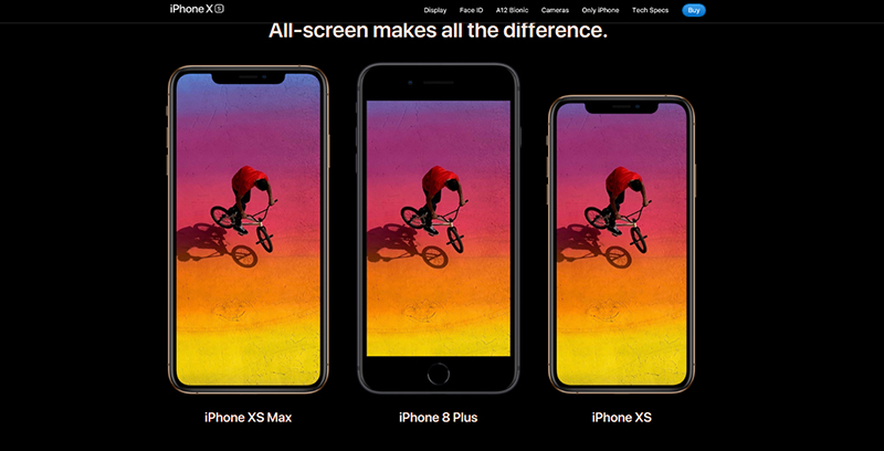
Image courtesy: https://apple.co/2IUc6s5
Recognizing faces comes naturally to us humans. It’s innate. Hence, it’s really not much of a surprise that ads with faces in them get higher clicks than say those with abstract shapes or forms. However, depending on what your ad is aimed to sell, inclusion of a face might not serve as the best visual cue for your target audience. In such a case, the next best thing to do is to make your product the highlighting visual of your ad. But don’t just put a bland picture. If you’re not putting the picture of a face with a relatable expression, ensure the product picture is appealing and beautiful to look at. Remember, the goal is always to attract and engage.
10. Create urgency

Image courtesy: https://bit.ly/2JamNWn
Urgency serves as a motivator to take action. And since the purpose of your digital display ad is to evoke action, your ad should create a sense of urgency. Give your viewers a reason to act instantly! How can you do that? By adding text! The text you add should convey your value message and make the proposition you make instantly desirable. The reason urgency works so well is because everybody is afraid to miss out on a good deal that proves to be of great value. Which means you know exactly what to offer to make them click that button! Words and phrases such as ‘The Sale Ends Soon’ or ‘Limited Period Only’ can help you create that sense of urgency.
11. Highlight the key features

Image courtesy: https://bit.ly/2YdYOvT
Your consumer base eagerly wants to know why they should buy your product. And you have to give them a good reason in crystal clear terms! So make it a point to tell your consumers what is important about your product in that ad. It’ll help your audience make a firm decision of whether to click or not to click. To ensure that your ad is clicked on, add the following 3 elements in it –
- Imagery
- Brand logo or headline
- CTA or call to action
Out of these 3 elements, make sure your CTA enjoys maximum visibility. Especially if you’re using animation in your ad. Placement, size and color of your CTA play an important role in deciding whether your CTA is noticeable or not. You could survey your colleagues and ask them what they notice first about your ad. If it’s not the CTA, you need to rework on it.
12. Make it perfectly proportionate

Image courtesy: https://bit.ly/2xg9Zs2
A digital display ad is made up of 3 vital elements as you already know – the imagery, the branding and the CTA. There could be other text too of course. Add all of it up together in the confined space of an ad and you have yourself a hotchpotch that is extremely difficult to get into proportion. But then that’s the challenge! You have to make each section the right size so the thing does not look like a mess.
Your ad should be of the right size and each element should be spaced out adequately. If you find any element to be indistinguishable from the other, revise the design of your ad. Make what’s small larger so it’s visible and not lost in the crowd of the other elements. Also, omit details that are not important to your ad. If you try to squeeze in more than the 3 elements, you may hurt the response rates your ad receives.
13. Keep it simple

Image courtesy: https://bit.ly/2KQBH7N
Compared to print ads, banners enjoy a much smaller space. Treat them like mini digital billboards of sorts. Billboards have minimal and simple content and that’s how your digital display ads should be as well. If you find any elements that are not necessary, chop them off without hesitation. Since your ad is going to be viewed on multiple screen sizes, you have to ensure that its content is simple enough to read on all kinds of devices. Otherwise your audience may not view your ad at all! So keep it short and sweet and as easy as 1-2-3.
Putting your ad in a frame, using animation, maintaining brand consistency, using the right file format and keeping the file size small are some of the best practices of digital display ads you should follow. If you need help in the process, you can always get some from a professional graphic designer.
Not Ready To Design Your Own Digital Display Ad? Digital Polo Is At Your Service!
Best practices on digital display ads might give you an idea on how to go about it, but actually designing one is no easy task! You simply can’t get an ad afloat without the help of a graphic designer. And if you’re looking for the best ones, you won’t find them anywhere else apart from Digital Polo! With a dedicated team of skilled, experienced and professional graphic designers, we can help you design a stunning, clickable ad that benefits your business to no end. Sign up with us to get stunning digital display ads. Our services are very affordable!